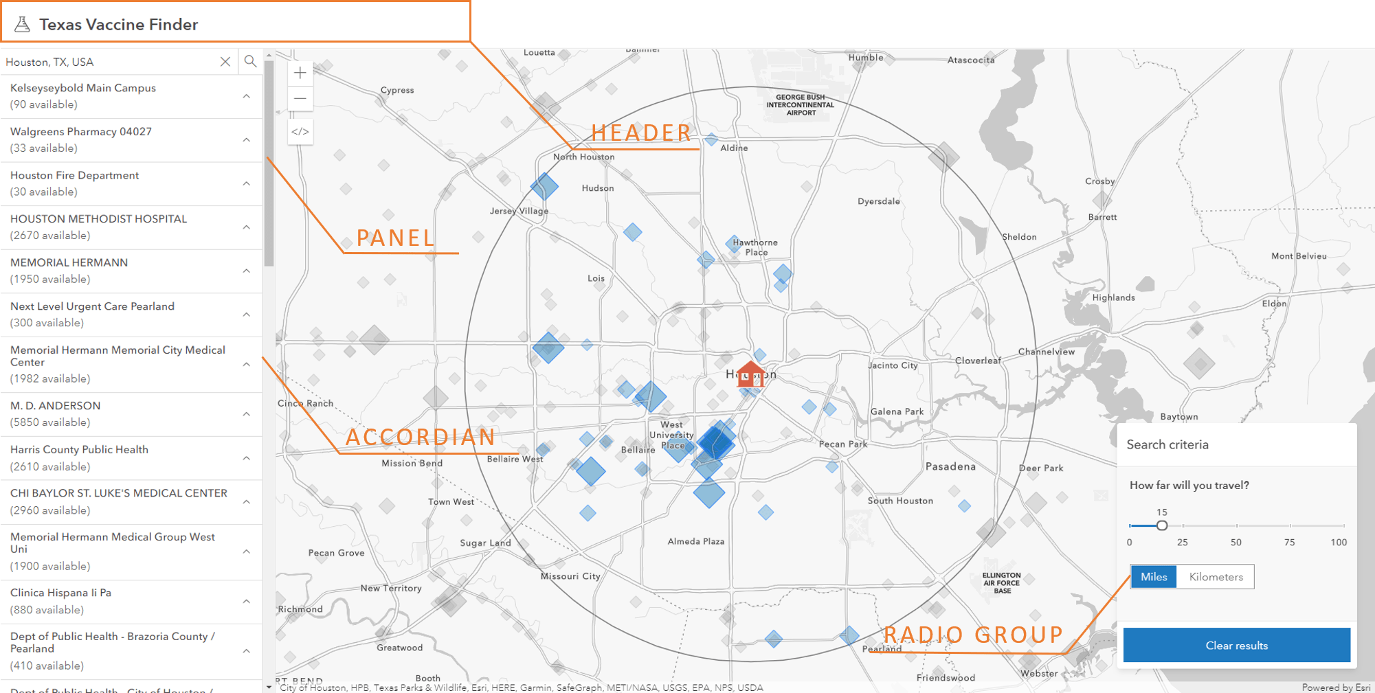
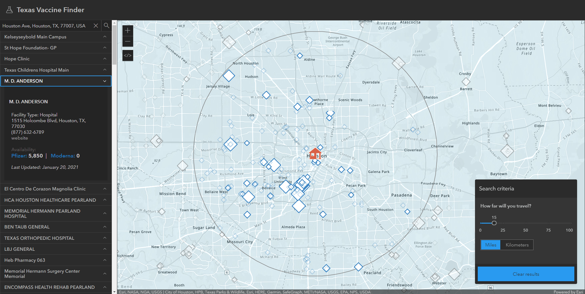
Build beautiful, consistent apps that seamlessly integrate with the ArcGIS ecosystem.
For several years, Esri designers and developers have been collaborating on a design system to be used across Esri products and websites to enable a unified user experience. It’s called the Calcite Design System. Today we released a beta version of Calcite for the developer community that is fully integrated with the Developer site. Using Calcite, developers can create beautiful, user-friendly, responsive, and consistent experiences across apps with minimal effort. It includes design best practices, icons, color schemes, and an accessible web component library with UI elements such as buttons, panels, accordions, alerts, and many more. It also manages spacing and layout with relative positioning so your app can achieve a clean, responsive design for any screen size.
Integration with the ArcGIS ecosystem
The design system originated as a collaboration between Esri’s design and development teams to create a unified visual standard of excellence. Using a shared collection of resources and guidelines, teams can create consistent, on-brand Esri experiences for use by ArcGIS products and Esri Professional Services projects.
As the design system evolved and improved, we realized that it could offer a significant benefit to the broader developer community. In addition to building beautiful apps faster, developers would have the ability to create a cohesive product experience by using the patterns and established best practices that are native to ArcGIS. Their apps could integrate with the ArcGIS ecosystem by offering the familiar ArcGIS look and feel – and at the same time showcase their own brand and style. Hence, we made the design system’s design and developer resources available through the ArcGIS Developers site.

UI building blocks: web components
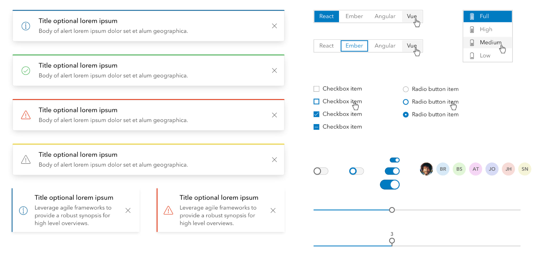
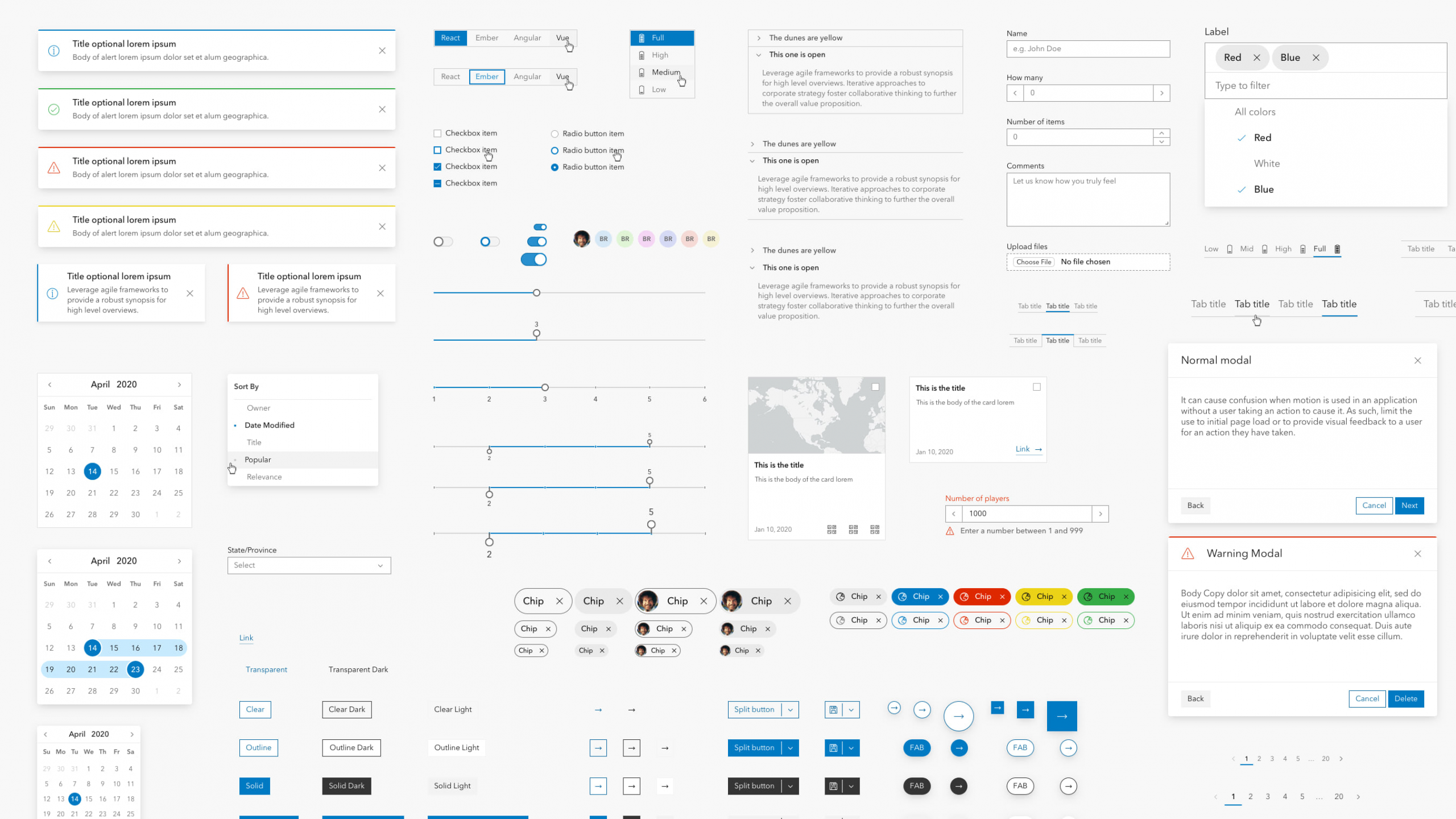
Developers can build their web apps using a collection of 50+ UI components that are the foundational building blocks of any web application. They all have the following characteristics:
- Flexible. They are flexible as they can be configured in a variety of ways (for example buttons with square edges vs rounded).
- Responsive. UI components have sizing options and other adaptive traits for adjusting to display sizes.
- Localizable. They support both left-to-right and right-to-left localization, and text properties can be set for any locale.
- Framework-agnostic. Because they are built on web component standards, they are framework-agnostic so developers can use them within their JavaScript framework of choice To use them, they require nothing more than vanilla JS/HTML/CSS.
- Accessible. Each of the components undergoes regular, formalized accessibility testing to ensure that they can be easily used by any audience.
- Themeable. Developers can apply a light or dark theme, or define their own custom theme to match their brand.
Esri heavily depends on the design system for creating the UI/UX of ArcGIS products – so as products evolve, new products are introduced, and the developer community begins to contribute requirements, the component library will expand and evolve.
Customize to match your own brand
Theming allows you to integrate your own style or company branding in your app.
By default, UI components will use the ArcGIS color palette, font, and component shape. If you want to adapt the look to match your brand or style preference, you can easily customize the components in a variety of ways:
- Light/dark theme. Using a single property, you can configure all components to use a dark or a light theme which are both designed for accessibility. The dark and light themes will style all components and their states (hover, selected, etc) to display well in the chosen theme.
- Colors. Using the components color variables, you can configure the color scheme in your app. For example, setting the following CSS will give all components a green color with a slightly darker hover state color:
--calcite-ui-brand: #00DBAA;
--calcite-ui-brand-hover: #C71585;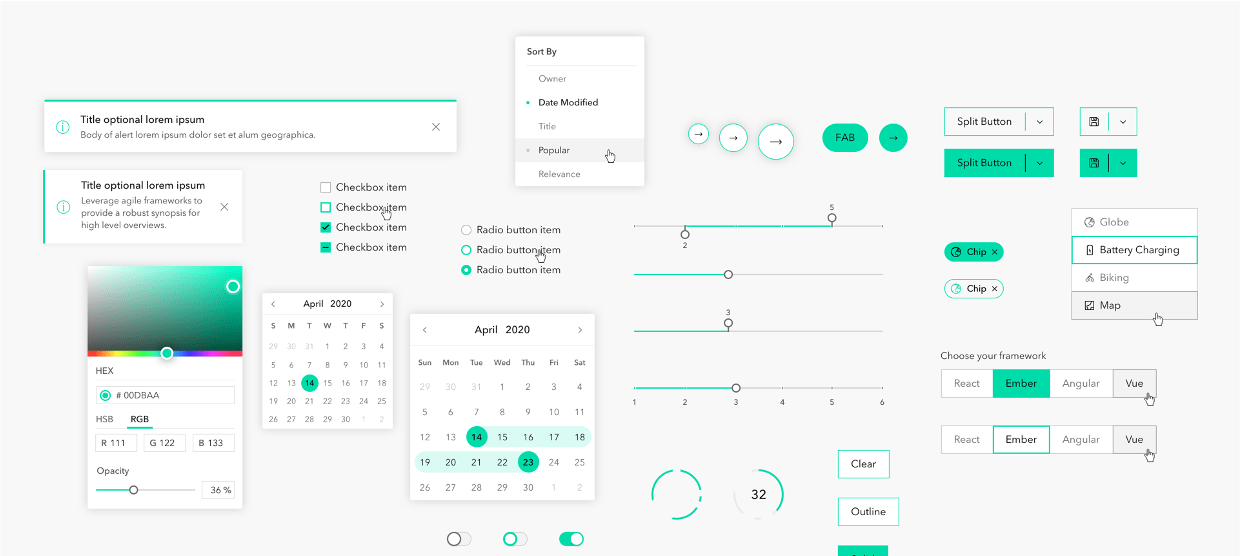
- Component shape. You can configure the shape of some UI components; for example, choose to use a rounded button style.
- Typography. If you want to use a specific font, you can apply it to the whole app or individually across components.
From design to app using UI Kits
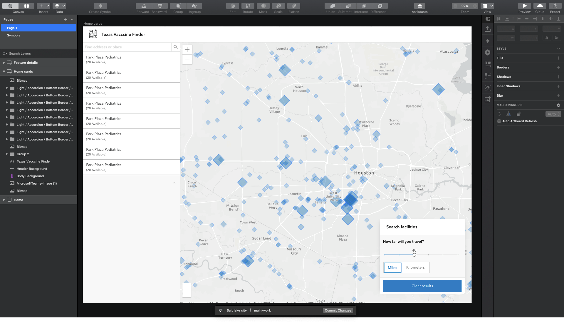
What is your process for designing your application? Perhaps you work with a design team to first create the experience, or maybe you design and develop the app yourself. In either case, you can choose to use popular design tools and our design system’s UI kit to easily drag and drop components into your app’s UI layout. (Note: With this first release, only Sketch is supported but we are working to add support for Figma and Adobe XD later this year.)
In the UI Kit, you’ll find symbolized versions of all the web components calcite-components, colors, icons, and fonts that are part of the design system. As you construct your designs in Sketch, developers will be able to implement them in code.
Icons
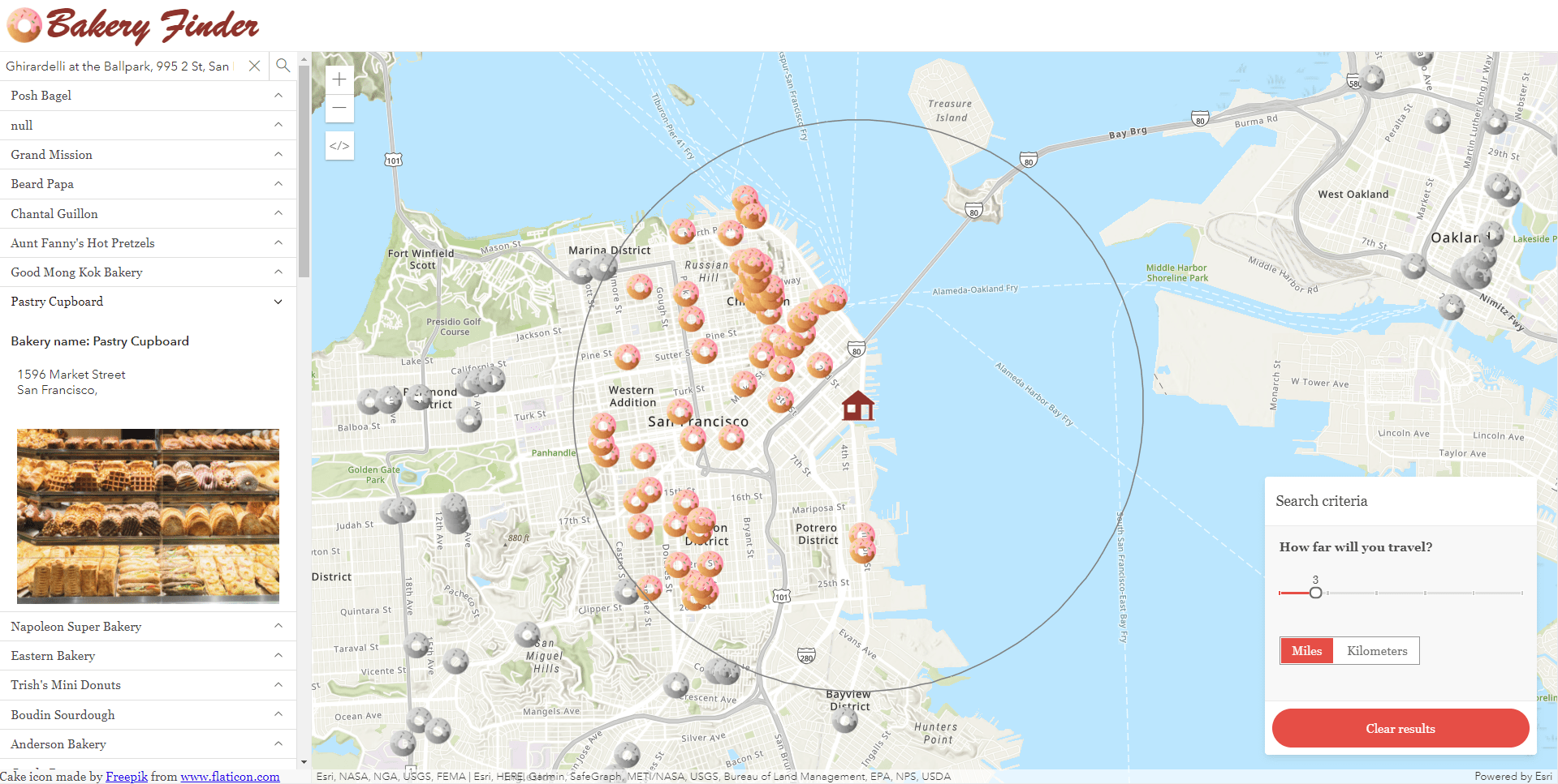
Our icon and illustration team maintains a collection of icons for products and marketing efforts. These icons can be used in your application UI or used as symbology in your map.
Calcite includes two main libraries; calcite-ui-icons and calcite-point-symbols. All of the icons are available as SVG images and have tags attached to them so that it’s easy for users to find the functional or mapping icons they are looking for. You can browse both libraries of icons using the icons page.
calcite-ui-icons
A collection of 700+ monochrome user interface icons meant for use outside of a map. They represent software functions in web and native application experiences. These icons depict straightforward concepts avoiding unnecessary complexity and are implemented with a single fill color. Built at 16px, 24px, and 32px in the primary 1px outline style. These icons are also implemented as an icon component in the calcite components library.
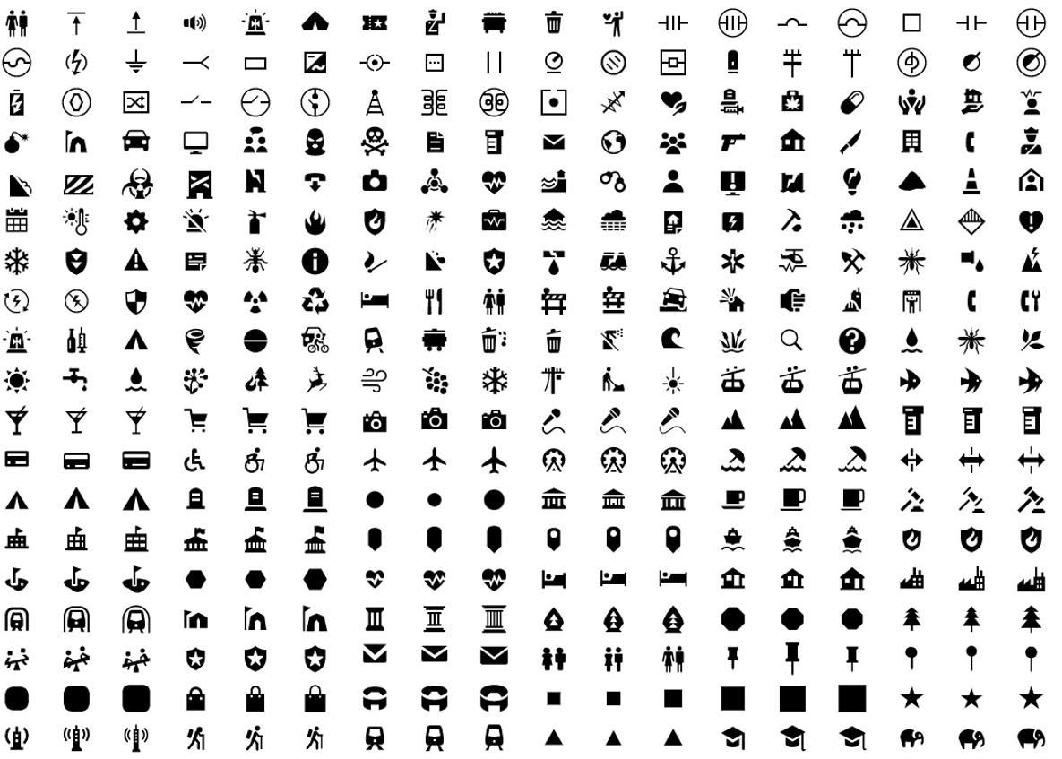
calcite-point-symbols
A collection of 700+ monochrome point symbol icons for usage on maps. Built at 13px, 17px, and 21px. Constructing these symbols on an odd-numbered pixel grid means that they can be centered both horizontally and vertically.
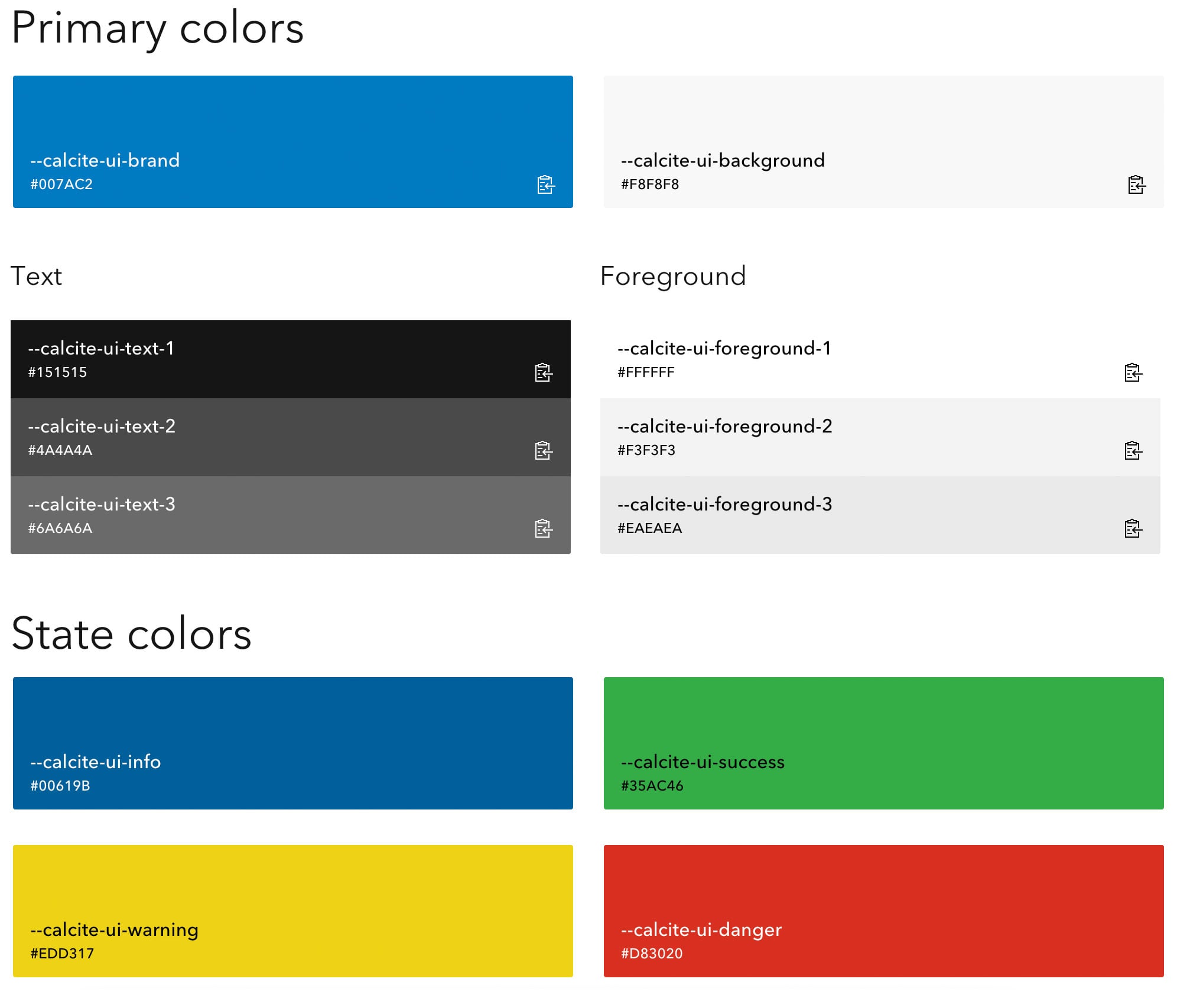
Colors
Esri’s colors have sparse use of strong and bold colors and leave the core focus on the primary blue brand color and UI states. Additionally, all the colors are designed with accessibility in mind when building the component library. Moreover, both light and dark themes pass the WCAG AA accessibility contrast ratio.
Get started
Everything you need to get started is available on the Developers website. You will find resources such as usage guidelines, best practices (do’s and don’ts), writing and copy guidelines, accessibility documentation, and a component API reference. Most notable, you will find knobs for the component configuration to visualize the flexibility of its properties, light/dark theme, and right-to-left layout for localization. As you adjust the component knobs and properties, you can copy the code from what you modified and paste it straight into your application.
A look into the future
Stay tuned for the production release. Calcite is currently in beta. While it is in beta, please feel free to try it out and share your feedback with us via the Calcite place on Esri Community!
An evolving design system. As with other state-of-the-art design systems, Esri’s design system is constantly evolving with the advancement of ArcGIS technology, the available tooling for web development, and the underlying technology. Since Esri heavily depends on the design system for creating the user experience for products, the component library will continue to grow and see on-going enhancements.
Beyond web. While the current UI components are limited to the web platform, we plan to expand the offering to support more platforms. In fact, apps built with technologies other than web can still benefit from many of the design system resources such as the design guidelines, icon library, and colors.
We can’t wait to see what you build!

hi Julie, I’m keen to get hands on Calcite. Is there a road map for the product and when the first official release will be? thanks.