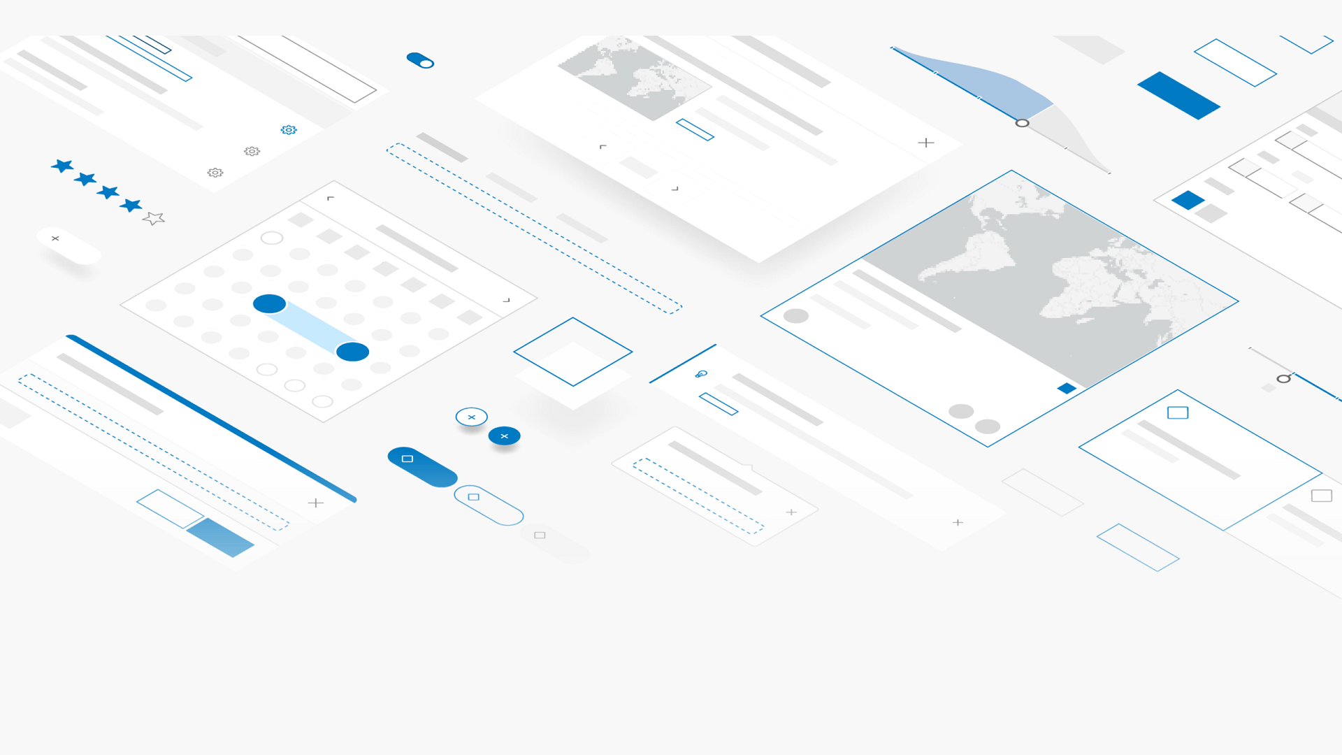
We are thrilled to announce that the production release (version 1.0) of Calcite Design System is now available! Using Calcite, developers can create beautiful, user-friendly, and consistent experiences across applications with minimal effort. It includes configurable web components along with iconography, a UI kit, and usage guidelines containing best practices. Let’s start with a quick overview of what Calcite is all about.
User-friendly apps integrated with ArcGIS
Calcite is used by Esri product teams to create consistent, on-brand Esri experiences across ArcGIS products. With its availability to the developer community, you can create a cohesive user experience across your applications by implementing the patterns and established best practices native to ArcGIS products. Your apps that integrate with the ArcGIS ecosystem will offer the familiar ArcGIS experience – and at the same time showcase your own brand and style.
Customize to match your own brand
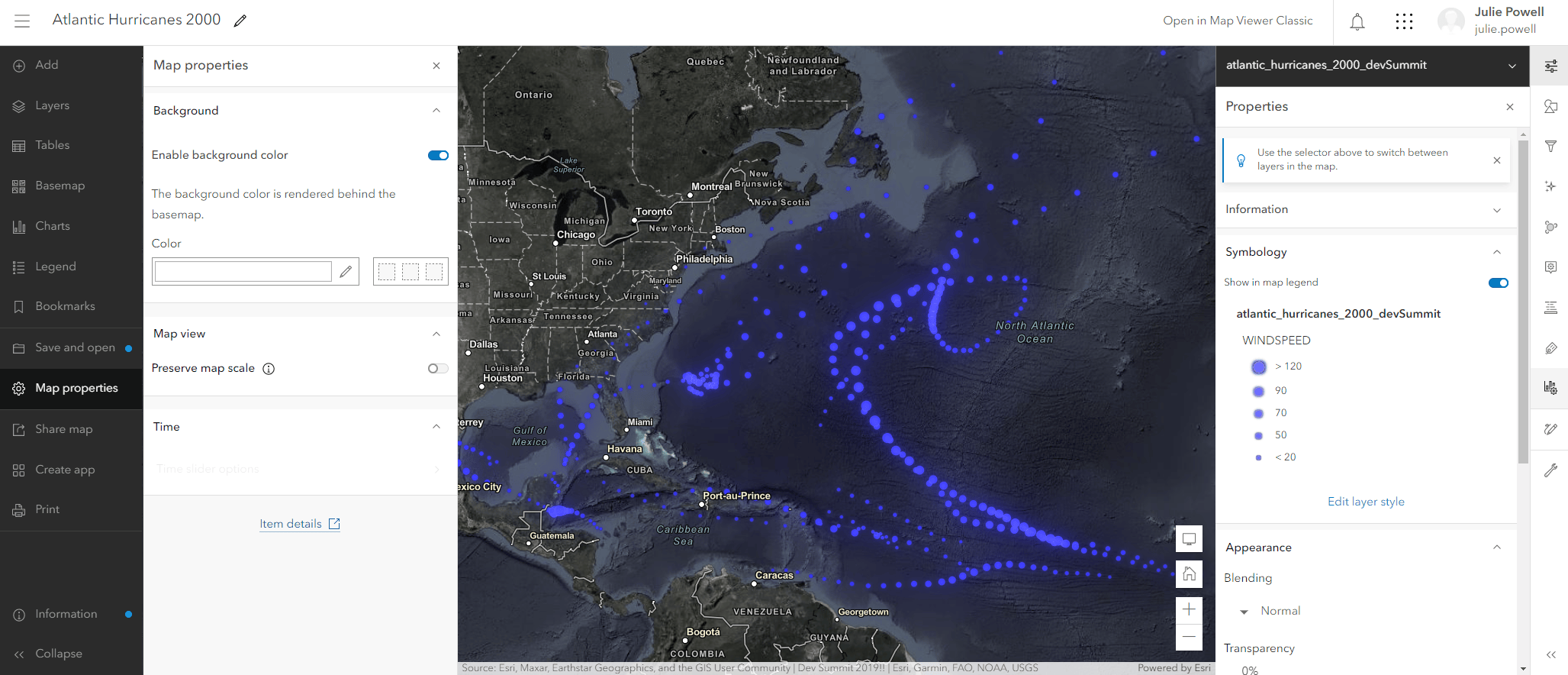
Theming allows you to integrate your own style or company branding in your app. By default, UI components use the ArcGIS color palette, font, and component shape. If you want to adapt the look to match your brand or style preference, you can easily customize the components’ color, font, and other styles where applicable.

What’s new in 1.0?
The Calcite team has been hard at work making many improvements to the design system, including ensuring consistent and predictable component API patterns, improvements to accessibility and localization, new bells and whistles in the component preview experience, in-depth guide topics covering best practices and how-to topics for building apps with Calcite, a brand new Figma UI kit, and much more. Keep reading for an overview of the key updates; or check out the release notes for more details.
Consistent Component API
Calcite is the result of a broad collaboration between Esri design and development teams, which naturally resulted in some differences in implementation between components. As we transitioned to the production release offered to the developer community we defined strict rules for component implementation and programming patterns. To provide a standard API across components for developer we made changes to some of the components’ APIs. As a result, developers who built apps with previous beta releases will likely have to update their code to match the API changes. Consistency updates span the following areas:
- Naming, events, and property patterns
- Focus and blur events
- Options and methods for floating elements
- Disabled and read-only properties
To see a full list of breaking changes between releases, check out the change log.
Accessibility
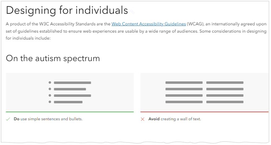
Delivering accessible software is a top priority to Esri. Calcite Components leverage W3C Accessibility Standards to ensure the applications and experiences you create are usable by a wide range of audiences. Calcite undergoes 3rd party accessibility audits to help identify key areas for improvement. In the last year, many updates have been made to Calcite around accessibility. Some of which include:
- Ability to automatically reduce motion based on user preference
- Improved keyboard interaction
- Enhanced assistive technology support (e.g., requiring labels, setting of roles, and aria-attributes)
- High contrast support
We also introduced a new guide covering accessibility guidelines, outlining additional steps you can take to ensure a diverse audience can navigate, understand, and use the solutions you build.
Accessibility is an on-going, incrementally improving project for Esri product teams. We will document all accessibility advancements with each release. Check out the release notes for more details about accessibility updates.
Localization
Calcite Components support localization, meaning the language used within the UI can be adapted to a specific language and culture. Support includes changing the display language, regional formatting, utilizing numbering systems, and right-to-left (RTL) bidirectional content. With this release, components now have built-in translations for all supported Esri locales among other localization-related enhancements. You can learn more about the Localization documentation standards.
Framework integration
Since Calcite Components are built on W3C web component standards they are framework agnostic, meaning you can use them with any framework. This release includes improvements to the components for when working with virtual DOM environments, and there are new resources to help with your implementation including new and updated framework example apps and also a new guide topic about Integrating Calcite with Web Frameworks. Developers can also use the provided Calcite Components React wrapper to easily use Calcite in apps built with React.
Calcite Resources in Figma Community
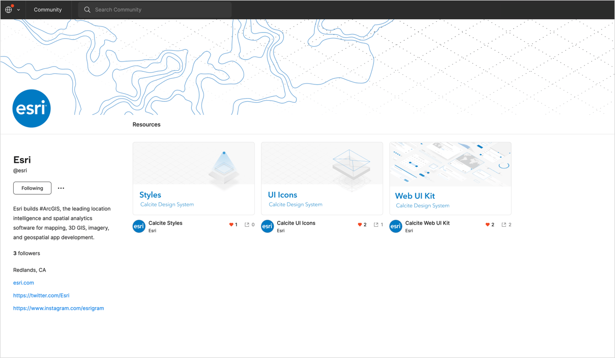
You can now access Figma Web UI Kit, Styles, and UI Icons on Esri Figma Community and stay up to date on the latest Calcite Figma resources that will be updated regularly with each major Calcite release. You can also use the Figma Community to ask questions and make suggestions related to the Calcite Figma resources.
Figma web UI kit
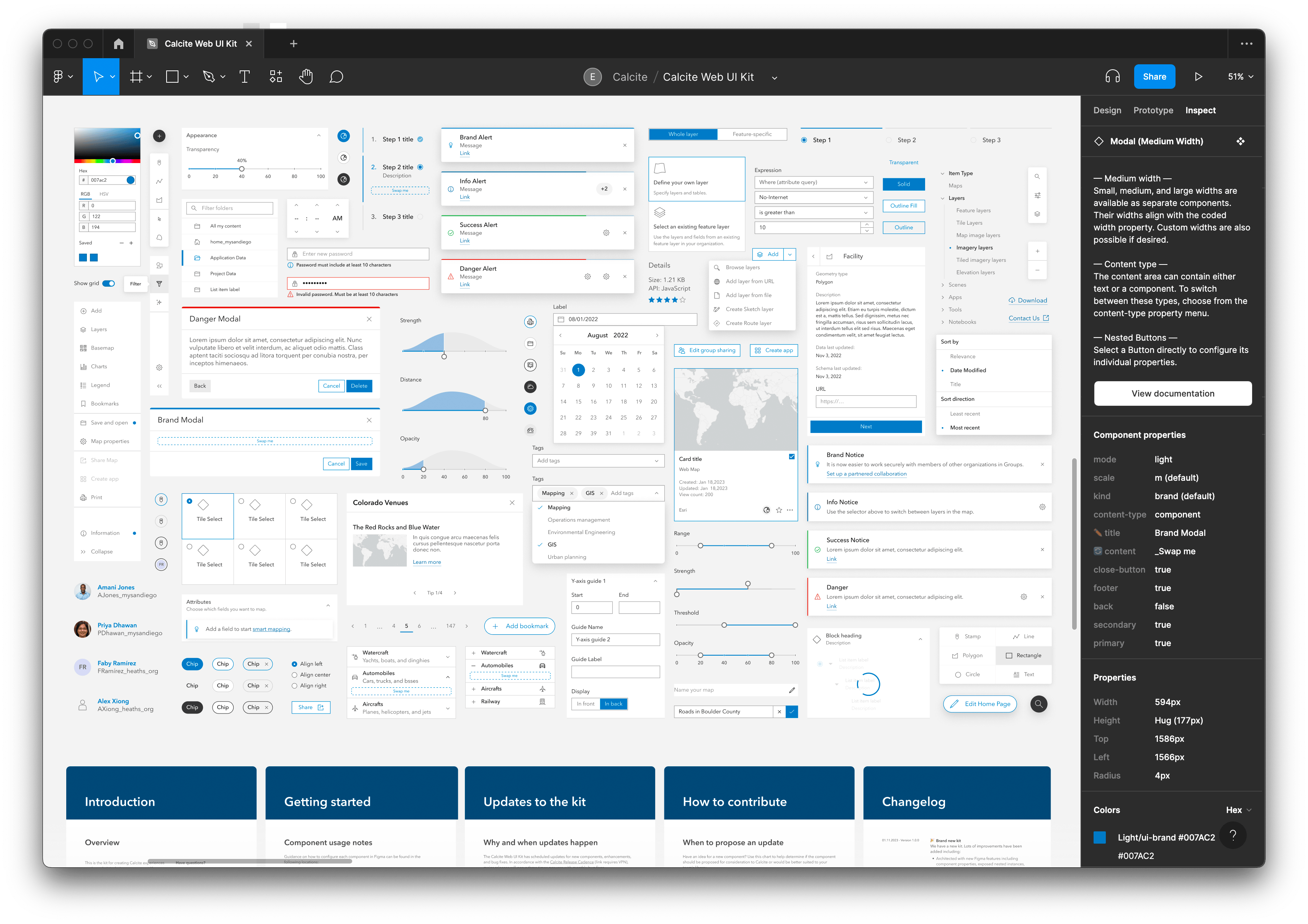
With 1.0, we are introducing a new Calcite Figma UI kit that designers and developers can use to design their apps inside the Figma environment using Calcite. You can design your app inside Figma and have confidence that your design will have an exact match with a web app built with Calcite components.
The new UI kit will sync to Calcite releases and offers the following improvements over the beta version:
- Includes sticker sheets and examples of common component configurations
- Provides component usage guidelines
- Architected with component properties, nested instances, and preferred instances
- Improved auto layout
- Comes with defined frame architecture & naming conventions
- Supports light and dark modes
Please note that Figma is a popular design tool and is not part of Esri’s product offering. Visit the Figma website to learn more.
Documentation site updates
Many updates have been made to the documentation site with more information on best practices, enhancements for exploring and configuring components, and updated resources for getting started quickly.
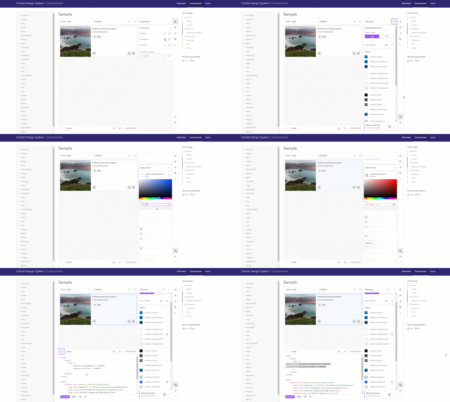
Improved component samples: Each component page has an interactive sample which allows you to explore the various ways in which a component can be configured. Many of the components were updated to expose new ways for interacting with the component, for example:
- Explore a variety of recommended patterns for a given component.
- Adjust the default Calcite theme variables to preview your brand or application colors within the component.
- Visually preview and toggle the visibility of slots within components
Getting started resources: We added a guide to help you determine which Calcite Component build format is best for your workflow. We also introduced new tutorials.
Learn the basics about web components: Web components are a native browser standard, and many of the technical concepts necessary to develop with Calcite Components are not specific to the library. However, to help developers quickly come up to speed on the key aspects of working with web components, we added a core concepts guide.
What to expect
Calcite releases will follow semantic versioning, which indicates the types of changes in a release: MAJOR.MINOR.PATCH, where:
- Major versions increment when there are breaking changes
- Minor versions increment for new capabilities and enhancements
- Patches increment for bug fixes
Much more is coming! Calcite will continue to evolve and expand with new components and resources for building great applications.
Calcite at the 2023 Esri Developer Summit
Join us at the 2023 Developer Summit in Palm Springs where you can attend technical presentations on Calcite, the ArcGIS Maps SDK for JavaScript, and many other ArcGIS topics. You can discuss your own project with Esri’s Development teams, network with the developer community, and (back by popular demand) play dodgeball! Learn more about Esri Developer Summit.


The command in the Python Command Prompt fails: RuntimeError: Cannot open <path\to\toolbox>
Where is this supposed to be ran from? My command prompt opens arcgispro_py3_clone