When visualizing continuous data such as temperature and salinity in ArcGIS Online, sometimes you may want to configure a few rendering templates with specific color ramps or breaks. While you can achieve the goal by way of the Stretch function, Remap function, Attribute Table function, Color map function, etc, you can also do it directly from the Symbology window in ArcMap.
Steps:
1. Add the mosaic dataset to ArcMap.
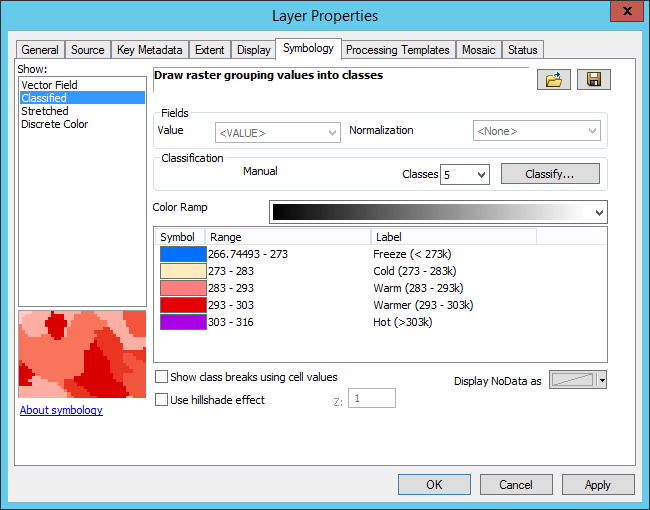
2. From the layer’s Symbology tab, set up how you want to display your data.
3. Use the Save button to export the classified renderer as a raster function template, give it a meaningful name.
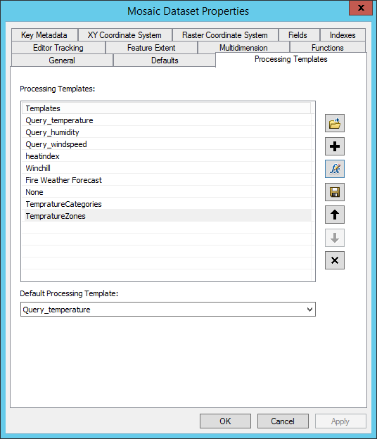
4. Add the template to the mosaic dataset through its property page (Processing Templates tab), use the fx button to bring up function editor and provide a user friendly name and description.
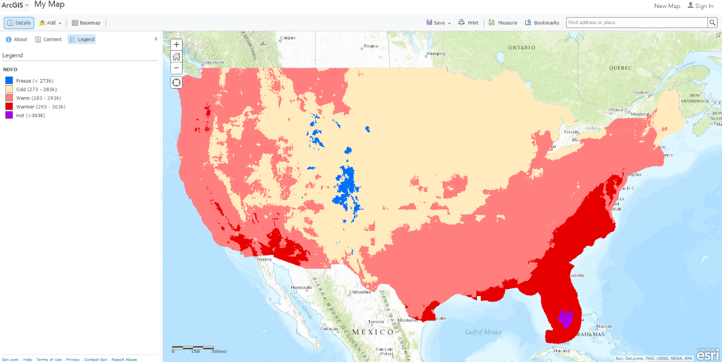
5. Add the image service to Map Viewer, pick the processing template to get a nice display and legend.


Article Discussion: