In this blog post we’ll get hands on with some practical tips and tricks. We’ll examine a workflow in Insights and highlight some steps you can take to author compelling visuals and communicate your analysis effectively.
Introduction
Find the data, prepare the data, and analyze the data. You’re likely no stranger to this workflow, but there’s another step that’s often overlooked, or worse, forgotten altogether. Sharing the results.
As you’ve performed the analysis you’ve become intimately familiar with the data, methodology, and results. It would be easy to assume that your audience will come to understand your work in much the same way. However, this depends on how well you communicate your results.
The effective communication of results is the key to achieving the return on investment for your work and ensures that the information extracted from your data becomes actionable next steps.
With the goal of effective communication in mind, lets breakdown some practical tips and tricks for sharing your work from Insights.
Pages – keep them separated
Creating content from your analysis within Insights is the easy part; the intuitive drag and drop interface allows you to churn out maps, charts, and tables with untold ease. As you work, you’ll no doubt stack up content and visuals. When you can chart and map no more, pause a moment and take in your workbook. No doubt it’s glorious and speaks volumes of your analytical prowess however, if you shared it right now would it make sense to your audience?
This is where you can take advantage of pages in your workbook. You may already use them for different stages of your work, but my tip is to use them for refining the content intended for sharing. As a reminder, it’s important to consider your audience and whether you really need the entire workbook to illustrate your findings. Sometimes simplicity is key, and a handful of carefully crafted cards can go a long way to telling the story of your data. For that reason, consider which elements are the keystones to your analysis and drag or copy these from your ‘working’ page to a ‘publishing’ page.

As you curate your cards in this new ‘publishing’ page, Insights retains the analysis model used to create these cards and carries it over behind the scenes. Since the model is retained automatically, you can focus on styling and formatting the selection of ‘keystone’ cards.
Be smart with style
Narrowing the workbook page down to a collection of cards means our data story will be concise and our styling focused and deliberate. Using colour, layout, and additional text can help explain your analysis and share your newfound results with the audience.
Aside from all the usual principles of good design, here are some Insights-specific steps that will help you author effective visuals.
Style configuration
Starting with styling, both card and data, it helps to be consistent. Using a consistent colour palette visually ties elements of your workbook together and helps the audience decipher the connections in your data. Any time spent configuring these options pays dividends for your audience, plus it will just look great!
Here are some places to dive into the style configuration:
If your data contains unique categories that are relevant to your analysis take the time to configure a colour palette. When you do, Insights will use those colours across other cards that utilize those same fields.

Card style options have parameters for the card background and borders. A couple configurations here can be used to either emphasize the content of a card or immerse it within its surroundings.

The workbook page itself also has some style options. Now I wouldn’t suggest painting your entire workbook in neon green but, the background colour can be used to help blur the line between your workbook and its surroundings when embedded.
These simple style configurations can greatly improve the visual presentation of your workbook and audience engagement.
Enhance with marginalia
Obviously, the maps, charts, and tables are the focus of your workbook. However, supporting them with additional elements can help explain their importance through context. Remember, not everyone who sees your work will have the same background or familiarity with the data and methodology. Therefore, describing the relevance of the charts and maps in-situ engages the audience and increases their understanding.
Textboxes and media are an excellent way to caption a card and describe important findings or the importance of that card within the broader analysis. Going a step further and formatting the text to match a colour palette or categories within the data ties the elements together in a snazzy visual bundle.
The humble legend, often forgotten and left off the maps and charts. Aside from illustrating categories and classes within your data, they’re interactive in Insights. When popped out from their card, legends can act as a handy ‘switchboard’ for viewers to interact with visuals. My tip is to use them when a visualized data category exists across several cards in your workbook. Even better, use some of the formatting tricks from earlier to ‘embed’ them within textbox captions.

Maximize real estate
This last housekeeping tip ensures that your charts and maps have the maximum real estate. If you’ve taken advantage of text and legends to support your cards, I’d suggest that you no longer need the card headers or layer lists (in terms of maps). Let the charts and maps take centre stage by collapsing those card headers and hiding the layer list.
Hiding or collapsing these elements means they’ll be tucked away when users load your workbook page, and everything will be nice and tidy.

Know your medium
Next step is publishing. There are several ways to share work from Insights; share/export data, print your workbook, share your workbook, or embed Insights in other apps. All these methods enable you to communicate results in some fashion but in this blog, I’ll be focusing on page sharing workflows that maintain a connection to the workbook.
I’ve conceptualized these workflows into some broad ‘styles’ of communicating content from Insights. I offer these purely as suggestions, and you’re not restricted to any specific path. Your use of each workflow will depend on your audience and your medium so adapt and modify them to suit your needs, or innovate something completely new, I’m just here to provide samples.
The figure caption
This workflow aims to author bite-sized portions of a workbook and embed them within another app or ArcGIS StoryMaps. These nuggets of analysis are great ways to support data storytelling with interactive visuals. Think of this style as a figure in your high school science textbook (but better).
While sharing Insights using this workflow, plan your content to fit within the space of 1-4 cards, at their default size. When embedded in a story, these card groupings will fit nicely within the centre block (check out this helpful iframe guide for all the details). You don’t necessarily need to use all cards either. Feel free to supplement cards with text captions and images, hence the figure-caption name.
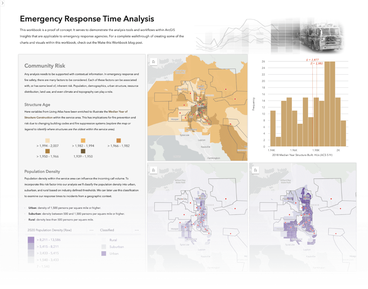
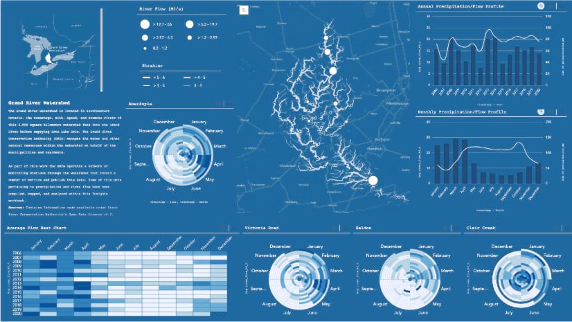
Here are just a few samples of various configurations.


The report dashboard
The tried-and-true report dashboard is a classic. With this style of communicating, pick Insights content that speaks to important aspects of your analysis. For instance, you could show how data is distributed (both spatially and temporally), indicate whether performance measures are being met, or summarize trends and relationships within the data.

Report-style workbooks are perfect for creating bespoke reports. Through a variety of visualizations and tools it’s possible to create a clever workbook page summarizing your analysis with key metrics.
Take full advantage of filter widgets when configuring your workbook. These tools enhance your report with additional interactive qualities; enabling the audience drilldown into the report and explore your analysis.
Another tip is to configure scheduled updates once you’ve shared your report workbook. This configuration will keep your workbook in sync with your data in the event the data behind your analysis is continually updated.
The deep dive
This last style of sharing work from Insights is for putting it all on display. Everything from the methodology to the results get shared straight from the workbook. It’s like a research poster culminating your analysis start to finish and presenting your results.
The deep dive workflow is best used when the audience is comfortable with the analytical details and happy to dig through your workbook on their own. However, that doesn’t mean we can simply drop them into our workbook and expect it to do the communicating for us. To be effective make use of additional marginalia and give your workbook some structure. Use these elements to describe some of the methodology, key discoveries, or when you had to pivot; there’s still a story to be told from your data, it’s just from a more analytical perspective.
As a reminder you’re not limited to just one workflow, providing links out from an embedded Insights figure within a story to the supporting workbook is a great way to provide the complete analysis and further extend the story.
Summary
That wraps it up! I’ve covered where to spend a little time configuring Insights content and dropped some tips and tricks for applying a bit of polish to your workbooks.
We also covered some very broad categories of communicating your analysis from Insights. These aren’t hard and fast rules but simply suggestions for content styles and things worth considering when preparing your workbook for sharing. Regardless of how you end up sharing your workbook, it’s always a good idea make sure it passes one last check; run it past a colleague, grab a coffee and review it with fresh eyes. Make sure your visuals are still sharp and the content still resonates, and others will be able to easily understand it. After that go ahead and share away!
If you have some examples of notable Insights workbooks let me know in the comments. Let’s see your work!


Article Discussion: