At the Esri Developer Summit plenary, I presented a dynamic web application that uses the powerful rendering and querying capabilities of the ArcGIS API for JavaScript to explore age and income data in the Los Angeles area.
This app allows you to see the relative proportion of various age groups around Los Angeles and the predominant income for each of these groups. You can view the six-minute demo of this app as it was presented at the Developer Summit in the following video. You can also view the source code here.
Today, I’m going to talk to you in a little more detail about how I created this app and some interesting areas of Los Angeles that I discovered when exploring this data.
Feel free to skip ahead using the links below. 😊
• Let’s talk about the data
• How the app was built
- Blend modes
- Visualizing age distribution
- Querying for statistics
- Visualizing income predominance
- Filter and effect
Let’s talk about the data
Before I get into how the app was created, let’s first talk about the data. The primary layer that is used in this application contains population data for California block groups, geoenriched with age and income data. It contains over 23,000 features and over 350 fields. The fields that we are going to focus on in our application include fields for the number of males and females for every year of age from 0 to 85, household income for members of various age ranges, median household income, and the total population of each block group.
How the app was built
Los Angeles is a pretty unique city – the population is widespread across the whole city in different neighborhoods, not just centered around the downtown area. Another thing that makes Los Angeles unique is its terrain. The city is pretty much surrounded either by hills on one side or the ocean on the other. The layout of Los Angeles – its neighborhoods and its terrain – plays a big role in its demographics.
Blend modes
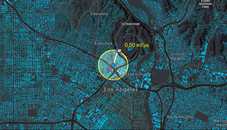
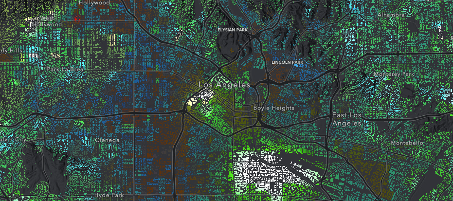
To help us understand the terrain’s role in the demographics of Los Angeles, I created a webmap in the new Map Viewer that blends together the classic dark basemap with a world hillshade basemap. This allows us to see both the neighborhoods, the city’s roads and freeways, and its terrain at once.

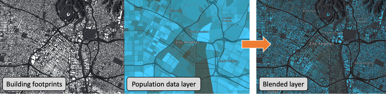
When I added the demographic data layer to the map, I didn’t want it to cover this beautiful, informative basemap that I had just created. So, I decided to use layer blending yet again. Instead of displaying the layer as polygons that would just show the block group boundaries, I blended this layer with a tile layer of LA building footprints. This allows you to see where people live and work in the city, and areas that are less populated (or have less buildings) than others.
To add layer blending, I created a groupLayer with my FeatureLayer of population data, and my TileLayer of building footprints. Then, I set the blendMode on my FeatureLayer to "source-in", which means that this layer would only be drawn where it overlapped with the background layer (the building footprints).
const groupLayer = new GroupLayer({
  layers: [buildingFootprints, featureLayer],
});
featureLayer.blendMode = "source-in";
The resulting effect can be seen in the image below.
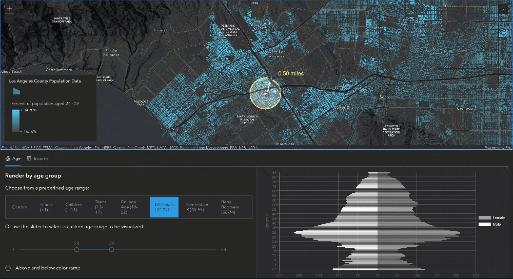
Visualizing age distribution
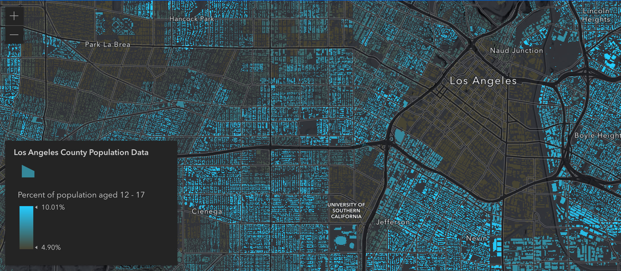
One of our goals with this app was to allow users to explore and understand the age distribution of residents across Los Angeles County. To do this, I created a simple Arcade expression that would take a given age range and calculate the percentage of the population they represented. The layer is rendered from the results of that Arcade expression, using color visual variables to show areas where high percentages of that population exist.
We added some radio buttons using Esri’s new design system (Calcite Components) to allow users to select from a predefined age range, and we also added a Slider, to allow users to enter a custom age range. The Arcade expression will work at any age range, it will just update the fields it calculates based on the age range provided.
function createAgeRange(low, high) {
   let str = "var TOT = Sum(";

   for (let age = low; age <= high; age++) {
      str += "Number($feature.MAGE" + age + "_CY), Number($feature.FAGE" + age + "_CY)";
      if (age != high) {
         str += ",";
      }
   }
   str += ")\n Round(((TOT/$feature.TOTPOP_CY)*100),2)";
   return str;
 }
To make sure the information displayed on the map was reliable at each age range provided, we calculated the average and standard deviation for the layer at that age range and use those statistics to populate our visual variables stops. We set the middle stop to the average, and the highest and lowest stops to one standard deviation above and below the average, respectively.
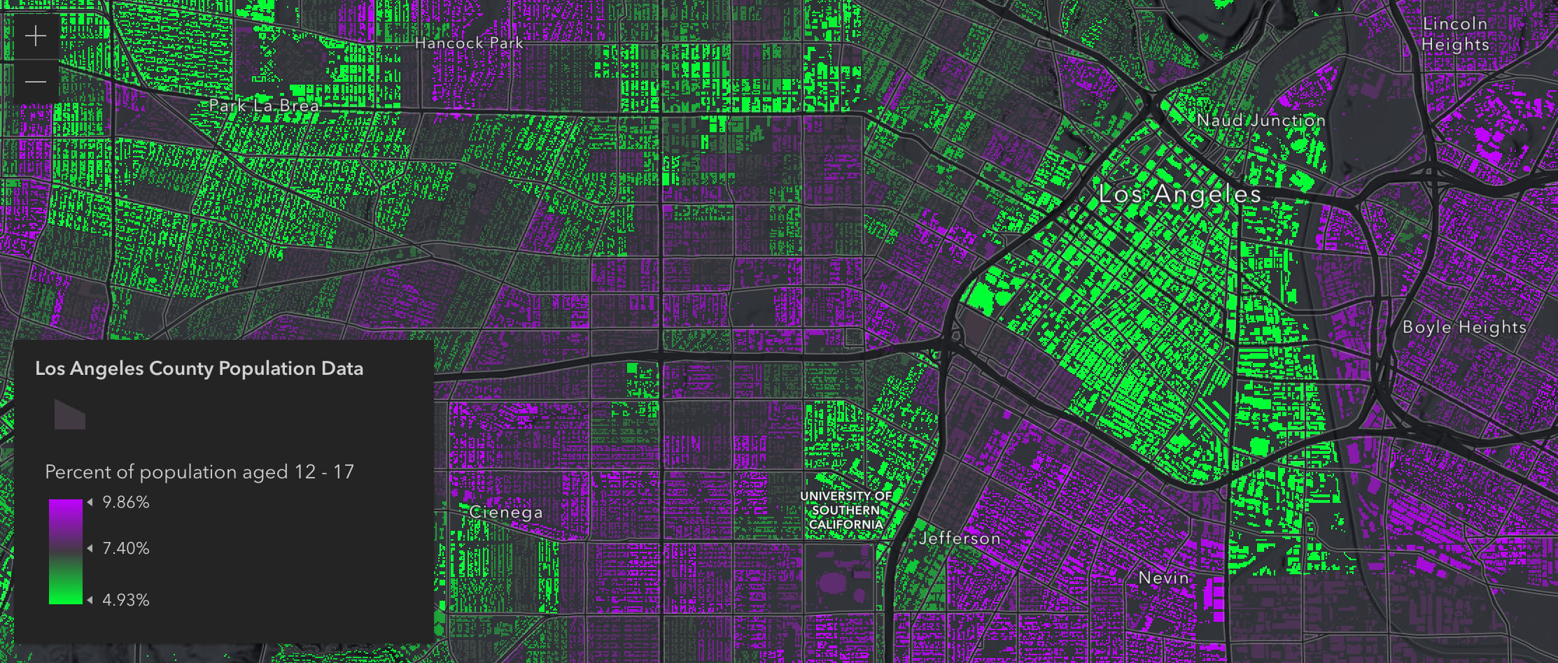
Above and below color ramp
The visualizations above show where high percentages of the given age range reside, but it can also be worthwhile to see areas where low percentages of that population exists. We can see this by switching to an above and below color ramp. This is easily done by updating the color value of the visual variable stops, but provides a unique map that allows you to see areas with both high and low percentages of a certain age group.
Querying for statistics
Since this layer contains so much data, we wanted to allow users to see more than just what is rendered in the layer. The age data fields that the layer contains (for men and women of all ages between 0 and 85) provide really nice information to set up an age pyramid. To do this, we created a moveable, resizable buffer using the SketchViewModel that would allow users to define the query geometry for the age pyramid. As soon as the buffer is updated, then a query is executed on the FeatureLayerView to get the statistics for each age field, and those results are plotted on a chart to create the age pyramid. Let’s dig a little deeper into this.
Creating the buffer using SketchViewModel
To create the buffer used to query for statistics, we start by creating two GraphicsLayers – these two layers are used together with the SketchViewModel to create the graphic drawn on the map. The bufferLayer has a "color-dodge" blendMode applied to create a lightening effect for the features included in the buffer.
// layers for the buffer graphic
const graphicsLayer = new GraphicsLayer();
const bufferLayer = new GraphicsLayer({
   legendEnabled: false,
   blendMode: "color-dodge"
});
When the app is initialized, we create the point and line graphics within the buffer based on a point relative to the center of the view.
const viewCenter = view.center.clone();
const centerScreenPoint = view.toScreen(viewCenter);
const centerPoint = view.toMap({
   x: centerScreenPoint.x,
   y: centerScreenPoint.y
});
const edgePoint = view.toMap({
   x: centerScreenPoint.x + 15,
   y: centerScreenPoint.y - 49
});
We use those two points and create a line connecting them to represent the radius of the buffer. Then, we can use the geometry engine to calculate the length of the line and create the buffer.
// get the length of the initial polyline and create a buffer
const length = geometryEngine.geodesicLength(polyline, unit);
const buffer = geometryEngine.geodesicBuffer(centerPoint, length, unit);
Then, we create graphics for each of the points, the line, and the buffer polygon that we created. We add the point, line and label graphics to the graphicsLayer, and add the buffer polygon graphic to the bufferLayer (which has the blendMode applied).
Once we have created all our graphics and added them to layers in the map, we can use the SketchViewModel to allow the point graphics to be updated in the map, and use their updated geometries to recalculate the line length and buffer whenever it is moved.
sketchViewModel.update([edgeGraphic, centerGraphic], {
   tool: "move"
});
Querying for statistics on the FeatureLayerView
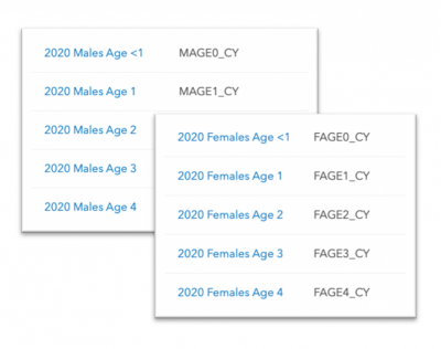
Next step, creating the query to get the statistics of fields within the buffer. Since we are creating an age pyramid, we need to include statistics for the sum of the values of each field of males and females at each age. To calculate these statistics, we will perform a query on the FeatureLayerView with the outStatistics property set to an array of StatisticDefinitions for each field of males age 0-85 (MAGE0_CY to MAGE85_CY) and females age 0-85 (FAGE0_CY to FAGE85_CY). For each of those field names, the following definition is set to get the sum:
{
  onStatisticField: fieldName,
  outStatisticFieldName: fieldName + "_TOTAL",
  statisticType: "sum"
}
Once we have the statistic definitions defined through the statDefinitions variable, we can create our query. We want to perform this query on the client-side to avoid making unnecessary calls to the server, so we’ll use the featureLayerView. We’ll set the query.outStatistics to the statDefinitions we just defined, and apply the buffer from the SketchViewModel as our query geometry. Then, we can execute the query and use the results to populate our age pyramid that is created with Chart.js.
const query = featureLayerView.createQuery();
query.outStatistics = statDefinitions;
query.geometry = buffer;

return featureLayerView.queryFeatures(query)
   .then((results) => {
       // parse the results and pass them into the chart
   });
I just want to point out – this query generates statistics for 170 different fields! 🤯 Yet it still executes and updates the chart very quickly, all on the client-side.
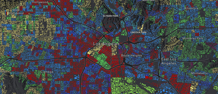
Visualizing income predominance

When you switch to the “Income” tab of the app, we update the renderer to calculate and display the predominant income for members of each block group. Again, this is done through an Arcade expression. The Arcade expression looks something like this, where the fields array correlates to the fields for median income.
var fields = [FIELD_NAME_1, FIELD_NAME_2,
   // ADD MORE FIELDS AS NECESSARY
];

var maxValue = -Infinity;
var maxValueField = null;
for(var k in fields){
  if($feature[fieldsArray[k]] > maxValue){
    maxValue = $feature[fieldsArray[k]];
    maxValueField = fieldsArray[k];
  }
}
return maxValueField;
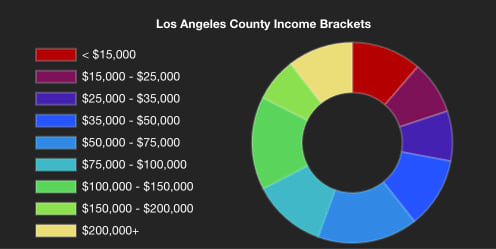
Once we’ve calculated the predominance, we use a UniqueValueRenderer to render the layer in different colors based on the different income ranges.
After creating the renderer, we create a donut chart using Chart.js that will serve as a legend for our map and provide some additional context. To create the chart, we query for statistics on the fields used to create our renderer to find the total number of people in each income bracket. Then, we perform a query on the FeatureLayerView, and use the results to populate our chart. We can set the colors of the chart to match the colors of the renderer so that it can also serve as a legend.
Whenever the layer view is updated, we can perform the query on the new layer view extent, and update the chart.
// when the view is updated, update the donut chart when on the income tab
featureLayerView.watch("updating", (value) => {
   if (!value) {
     if (activeTab == "income") {
       createDonutChart(incomeAge);
     }
   }
})
Similar to the age tab of the app, you can click through and see the predominant income for different age ranges. Clicking one of these radio buttons just updates the Arcade expression with the appropriate fields for that age range, and then the renderer updates. The donut chart is also repopulated with the new data.
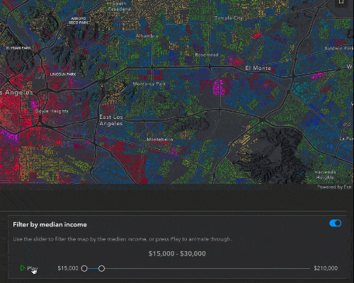
Filter and effect
While the predominant income tells us what the majority of people in that block group are making, the median income will give us a better understanding of the bigger financial picture for that block group.
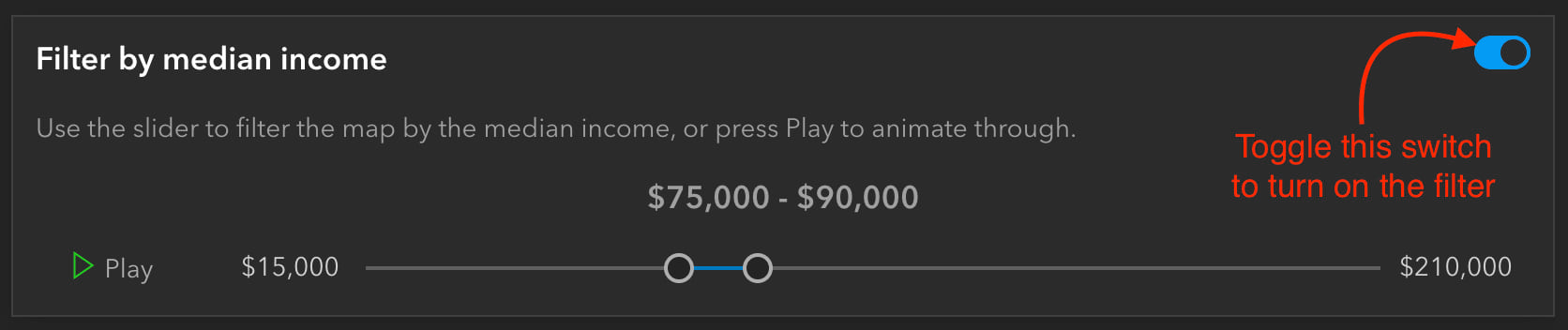
To filter by the median income, click the switch in the top right of the Income UI. A feature effect will immediately be applied to the layer, highlighting areas that fall within the filter range, and dimming features that fall outside of the filter. Let’s take a closer look at the code.
Here, we have the function to create the filter and effect. This is called whenever the filter is initially turned on, or when the slider values are updated. It takes the parameters of the minimum and maximum slider values and creates a filter where the median income is greater than the minimum slider value and less than the maximum. For features that are included in this filter, we apply a bloom and saturate effect, to highlight and add more color to these features. To the excluded features, we blur them and dim their brightness, to deemphasize them.
function createEffect(min, max) {
  featureLayerView.effect = {
     filter: {
        where: "MEDHINC_CY > " + min + " AND MEDHINC_CY < " + max
     },
     includedEffect: "bloom(150%, 1px, 0.2) saturate(200%)",
     excludedEffect: "blur(1px) brightness(65%)"
   }
}
As I mentioned, these effects are updated as soon as you move the slider. You can hit the Play button to quickly animate through the data.
Interesting observations
This app allowed me to really explore and understand the demographics of different neighborhoods in a new light. I’ll share some areas I found interesting, but encourage you to explore the map and play around with the data yourself!
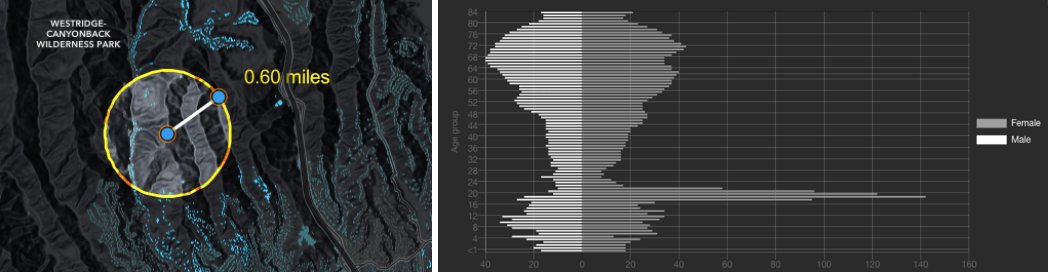
When looking at the age tab, I found some unique population pyramids around the “College” age range. For example, here’s the population pyramid for UCLA’s campus.
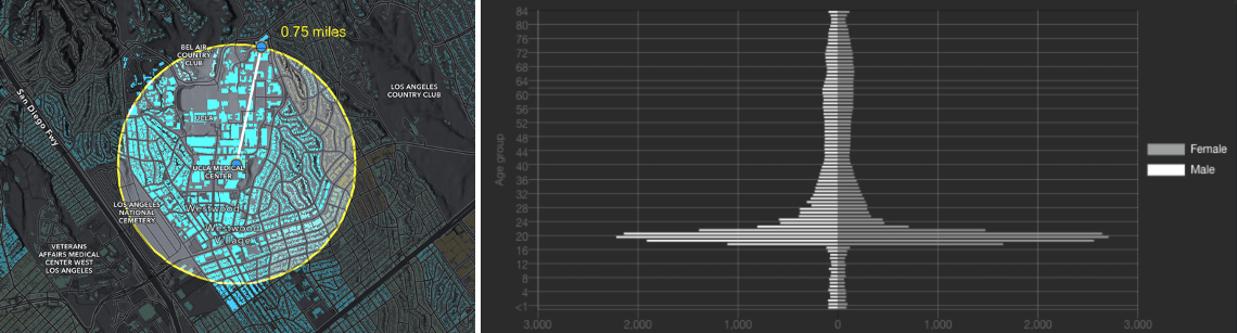
The population pyramid here shows that the primary people living in this area are 18-23, and few people of other ages live here.
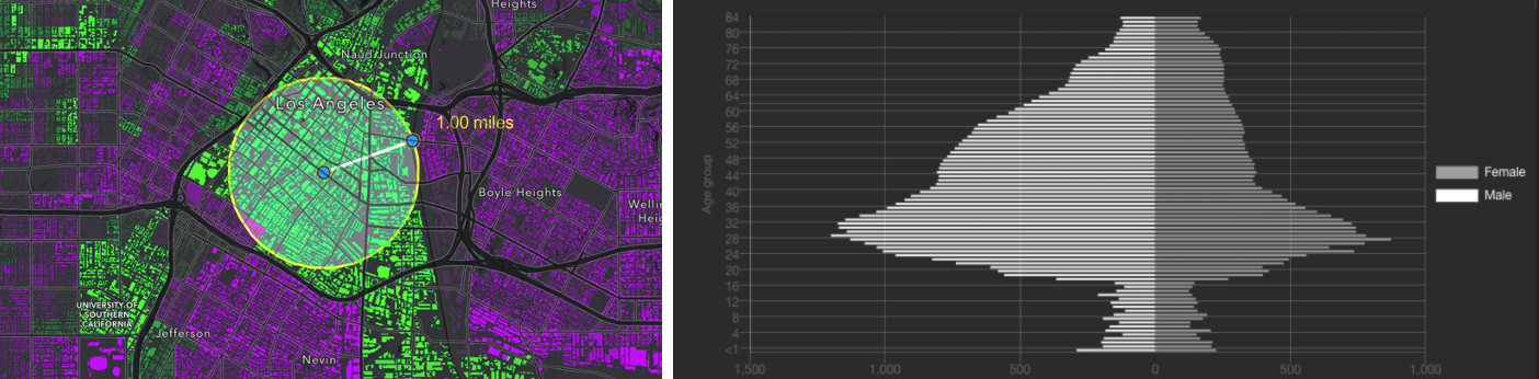
Another fascinating college age pyramid is this one, for Mount Saint Mary’s University, which is up in the hills just north of UCLA’s campus.
Mount St. Mary’s University is a small, Catholic all-girls school, so it makes sense why there is such a large spike for college-aged females in this area.
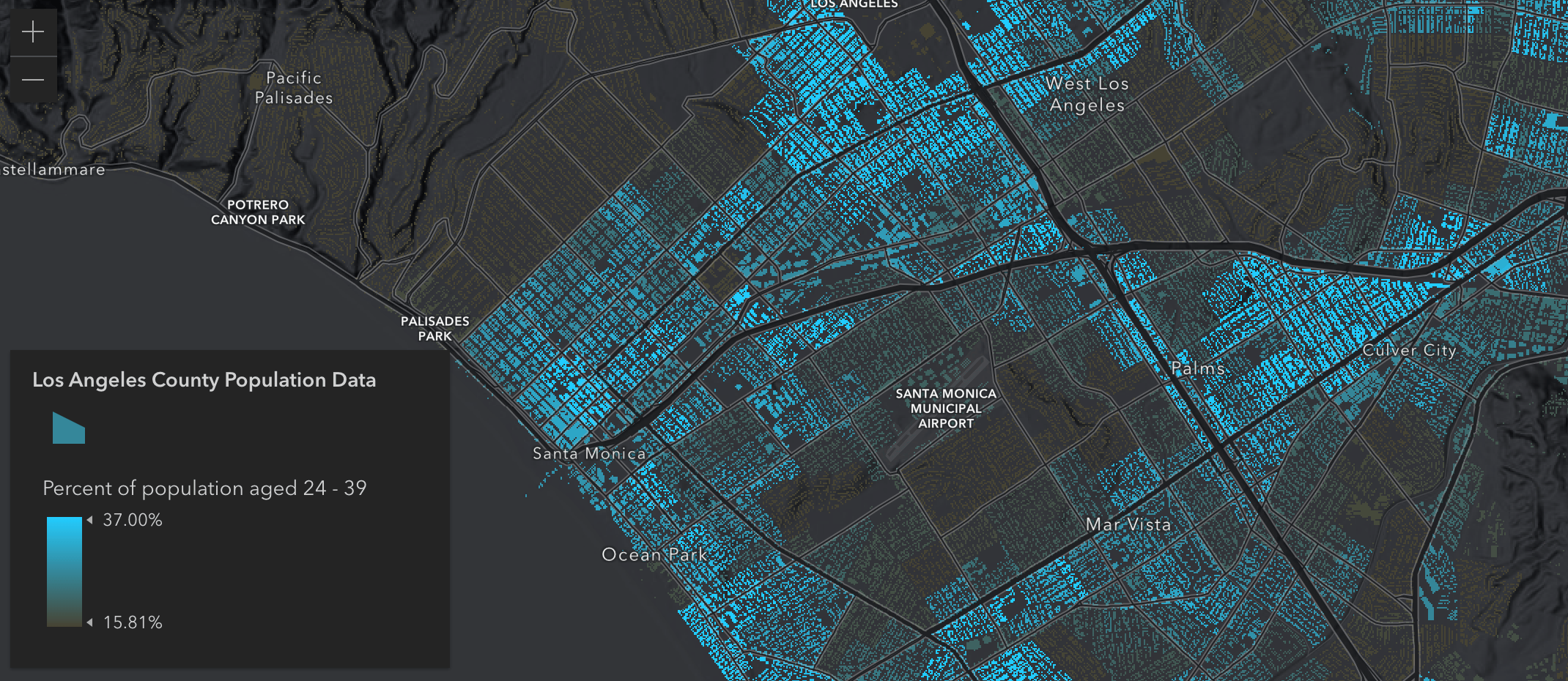
After looking at the percent of college aged students in each block group, I switched to “Millennials” and noticed a really unique pattern of millennials living primarily along the freeways in West Los Angeles. These areas have a higher amount of apartments and are generally cheaper places to live.
Switching to the above and below color ramp allows us to see even more patterns, and allows for easier comparison to nearby areas. For example, if we switch to the “Children” age range, we can see that Downtown Los Angeles has significantly less children than the surrounding neighborhoods.
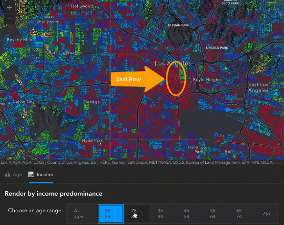
We can also see some interesting patterns in the map after switching over to the Income tab. For instance, when switching between radio buttons to view the predominant income for different age groups, we see a pretty predictable story. Younger people start out making less money, they make more as they get older, and then as people start to reach retirement age, then they bring in less income. There are some unique areas that don’t follow this pattern – like the block group containing Skid Row in Downtown Los Angeles, where the predominant income is consistently less than $15,000 at each age range.
These are just some of the areas I found interesting while exploring this map. I encourage you to play around with the app and explore the data for yourself, you may be surprised at what you find! Feel free to share any of your observations in the comments below 😊
A big thank you to Jeremy Bartley, Jim Herries, and Kristian Ekenes who provided lots of input and feedback in the making of this app.


Article Discussion: