Last year we started a small research project at Esri R&D Center Zurich where we investigated what non-photorealistic city depictions would look like, how they would be helpful to our users, and how we could implement them.
We discovered that rendering the edges of buildings improved perception of the actual building shape. From certain viewpoints and depending on the lighting model, the shape of a building can be hard to recognize by users. In this blog post I am going to show different use cases and discuss some ideas on how to use edge rendering.
As a technical side note before diving into the examples, in the ArcGIS API for JavaScript edges can be set as a property in the FillSymbolLayer of the MeshSymbol3D.
Ok, now let’s have a look at the use cases.
Data driven visualizations
When it comes to data-driven city visualizations, we are mostly interested in the attribute data of the displayed buildings. The edges should not stand out at all, they should be as subtle as possible, providing just a hint about the shape of the building. That is why for this kind of visualizations we recommend setting a high transparency and a small size for the edges.
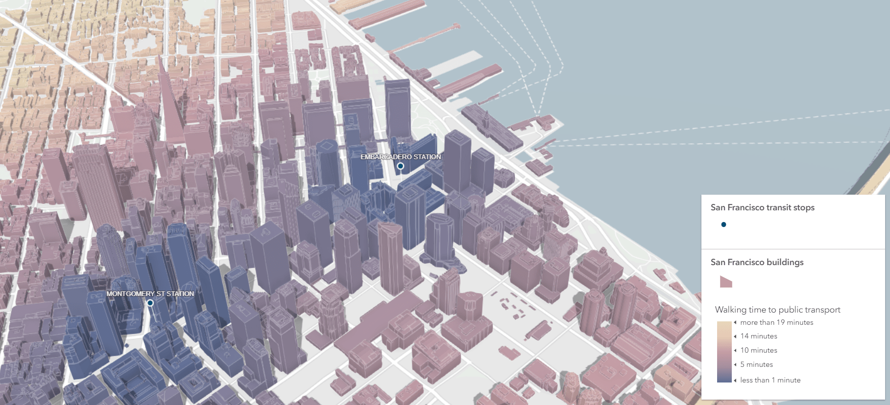
In the example above, we show how far buildings are from a subway station in San Francisco. Dark blue represents buildings within a 1 minute of walk and yellow buildings are more than 15 minutes away. The edges are very subtle and have the following configuration:
const edges = {
  type: "solid",
  color: [255, 255, 255, 0.4],
  size: "1pt"
}
Check out the live app here. The code for this app is here.
Urban planning
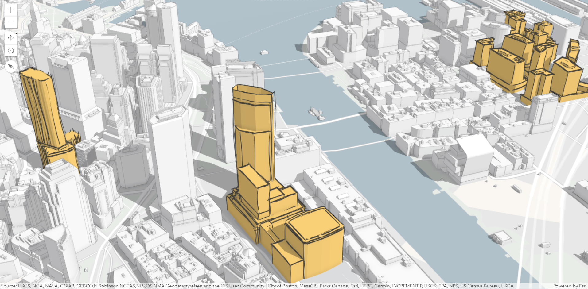
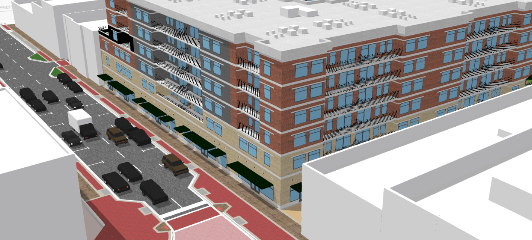
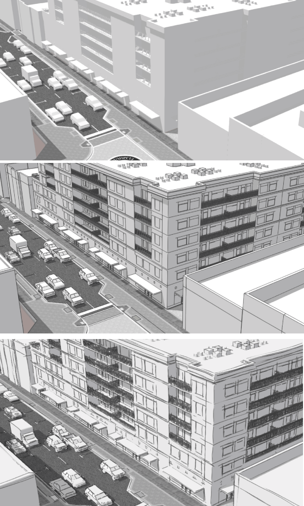
Another use case is urban planning, where the new project proposals are hand-drawn or sketched. The message is that the sketch buildings are just a proposal and they haven’t been built yet.
Take a look at the Boston redevelopment scene below: current buildings are displayed in white with thin dark edges. The proposed buildings are displayed in orange with sketch edges. In this case it is useful to make the sketch edges a bit thicker to make them stand out. This higher contrast between built buildings and proposed buildings helps users understand that these are proposed future buildings.
The edge style for the proposed buildings is:
const edges = {
  type: "sketch",
  size: "2pt",
  color: [50, 50, 50, 0.9],
  extensionLength: 10
}
The current buildings have very subtle solid edges:
const edges = {
  type: "solid",
  color: [0, 0, 0, 0.65],
  size: 0.3
}
The live app is here and the code for this app is here. Original data for this app can be found on the Boston Planning and Development Agency website.
Urban planning (again)
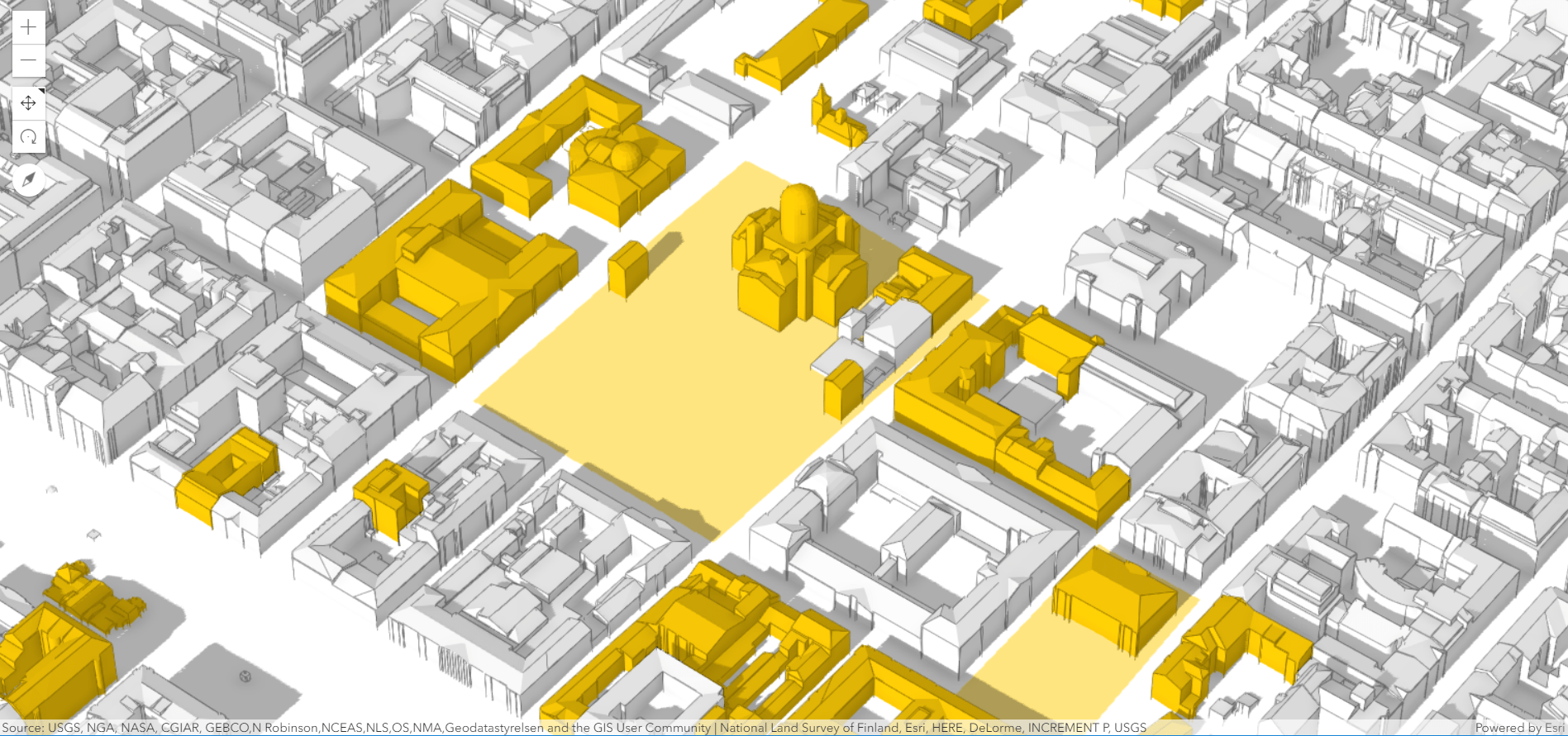
Many urban planning projects prefer a simple and clean visualization. Important parts of the city are emphasized with colors and the rest is left white. In the example below, historical buildings and areas are emphasized in yellow and the rest is white. That’s when edge rendering comes in handy. It helps to create simple, but stylish visualization where the main focus is on the buildings.
The style configuration for edges in this case is:
const edges = {
  type: "solid",
  color: [0, 0, 0, 0.9],
  size: "1pt"
}
The live app is here and the code for this web scene is here.
Urban sketch
Edges can also be used to give your scene a special style. Let’s take the following scene:
If we desaturate the textures (which we can do in the API on the client using colorMixMode: "tint") and add sketch edges to all the scene layers, it ends up looking like a hand-drawn sketch. The fun part comes when you start navigating around and discovering all the “hand-drawn” details. Try it out for yourself, navigate in the scene below:
Awesome, right?
The configuration for the edges in this above scene is:
const edges = {
  type: "sketch",
  color: [0, 0, 0, 0.65],
  extensionLength: 10,
  size: "1pt"
}
The entire code for this app can be found here.
As a comparison below are the images without edges, with solid edges and with sketch edges.
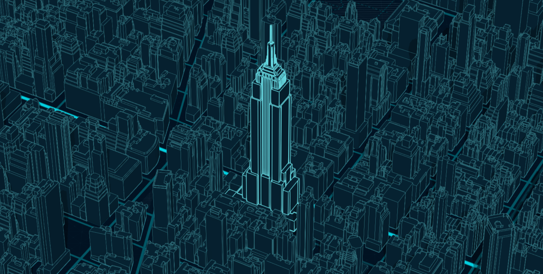
Manhattan by night
If we talk about mapping styles, then there’s always the dark sci-fi style…with glowing edges of course! My inspiration for this style came from the Nova vector tile layer style. The buildings have the same dark color fill as the basemap and the light cyan edges make the shape really stand out. Everyone recognizes the Empire State Building below:
The style configuration for the thick edge buildings is:
const edges = {
  type: "solid",
  size: "1pt",
  color: "#69dde5"
}
The live web scene can be found here and this is the code that generates it.
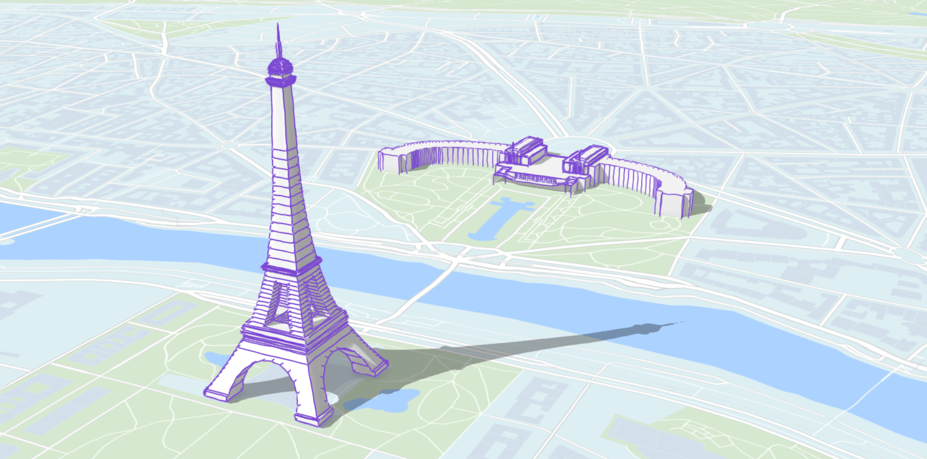
A touristic scene (view) of Paris
Another idea could be to use sketch edges to create a touristic map. To try out this idea I used the data for famous buildings in Paris, published by Esri France and I symbolized them with purple sketch edges.
The configuration for this style is:
const edges = {
  type: "sketch",
  color: [121, 69, 211, 1],
  size: "2pt",
  extensionLength: 3
}
The live web scene can be found here and the code for it is here.
The old map of Lyon
Historic 3D city depictions have a very unique style, they are usually manually drawn and have a pleasing design. Building outlines are displayed in most of these maps and predominant colors on buildings are ocher and brown or dark red. The building model for Lyon is a good dataset to imitate this style because the building textures use this color scheme and the buildings are very old. Adding edges to the buildings and displaying them on the Antique vector tile basemap strengthens the impression of an old map.
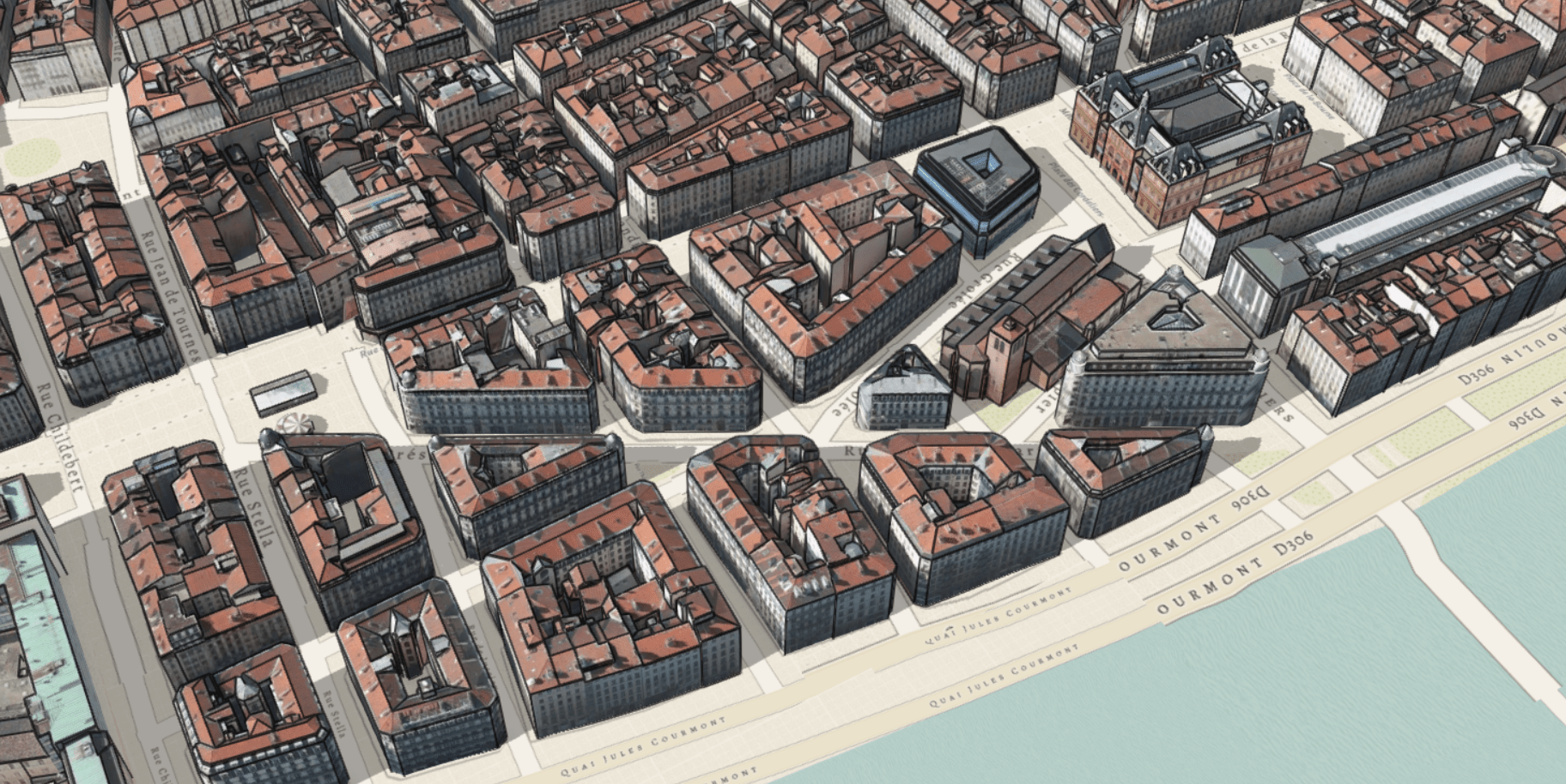
The configuration for this edge style is:
const edges = {
  type: "solid",
  color: [0, 0, 0, 0.7],
  size: "2pt"
}
The live app can be found here and this is the code for it.
I hope you enjoyed this blog post about enhancing your urban visualizations and now want to try it on your own. Feel free to play around with this feature in our sample sandbox. I’d love to know what you created with it!
Last but not least, I want to credit all the people that were involved in creating this cool feature: Adrian Blumer, Jesse van den Kieboom, Pascal Müller, Javier Gutierrez, Krystian Samp and Cheryl Lau.
Raluca

Commenting is not enabled for this article.