ArcGIS API for JavaScript turned one release older this month. In this release we have some features in 3D that I’m really excited about because they help create appealing cartographic globe visualizations, like these ones:

You know how cartographers like to abstract away the reality? These features bring us one step closer to that goal.
First of all, we can replace the realistic sky with a custom background color that best fits the data visualization in the web scene. We can also make the view background completely transparent so that you can integrate your scene within your website.
Then, most of the times for global visualizations we don’t need a detailed basemap. So now you can remove the basemap and replace it with a custom ground color and on top you can add thematic layers.
And very important, you can now make the ground partially transparent which will allow you to see underground data.
I want to go through some examples to show you how I used these features. I hope that they will serve as inspiration for other visualizations of data sets that you are interested in.
World’s biggest cities
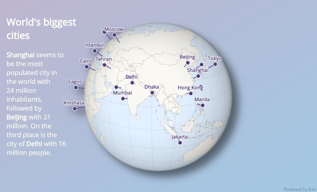
This is an example of how you can use a specific cartographic style to visualize locations around the world on a globe. Everything can be customized in this web scene: the view background is transparent so you can use the html element behind the globe as a background, the point symbols and the font-family of the labels can be configured, the ground color can be changed etc. You can make different versions of this globe with your own data and your own design. You can map all the places you went to in your holiday or the worldwide offices of your company or all the geo-events locations from 2018, etc.
I won’t go into details on how I created this visualization in this blog post, but I made a step by step tutorial here. The tutorial is JavaScript beginner friendly, so you can also use it to get started with web mapping. The code for the app is in the same folder as the tutorial. Here is a link to the live version.
World globe by Giovanni Cassini
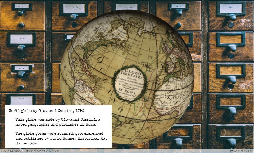
Everyone is fascinated by old globes and exploring them interactively in a web application is the next best thing to exploring them live in a museum.
The David Rumsey historical map collection brought many old maps to a digital form, including the World globe by Giovanni Cassini. You can read more about this process in their blog post.
For this app I reused the map service that they published to visualize it on a globe. Then I created a web page with a custom background that would simulate an antique atmosphere. Setting full transparency on the view background allows to see the web page background.
The code for this application can be found here. Click here to go to the live version.
World population
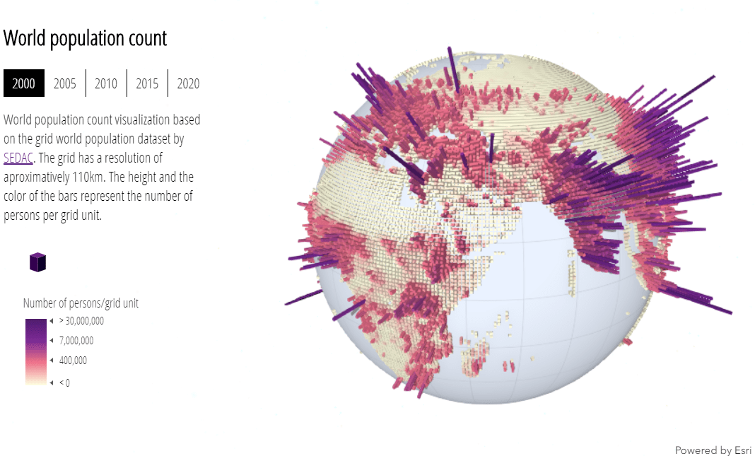
This globe displays the world population as a grid. The grid has a resolution of approximately 110km and each grid cell is visualized according to the number people living within it. I mapped the population count to two visual variables: size and color. Like this it becomes immediately obvious where the highly populated areas are.
For this globe I used a white background, so that the visualization really stands out. The globe doesn’t have any basemap as the continents can be recognized from the shape of the grid.
Go to the live sample here. The code for this visualization can be found here. The original data can be found on the SEDAC website.
World population in 2020
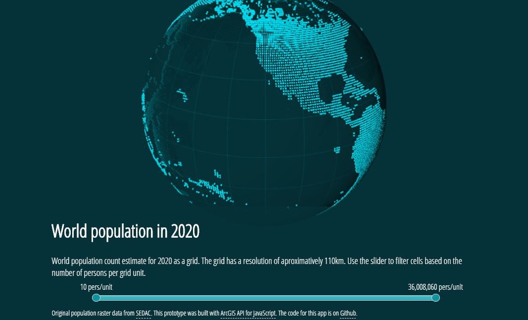
I finally watched Tron! Really cool movie, great inspiration for this globe ? I mapped the population estimates for 2020 as calculated by SEDAC. I wanted to have this grid effect, so I didn’t apply any size or color visual variable. I created a slider instead to allow you to select data values you are interested in.
For this globe I used the same color for the background and the ground. The ground is slightly transparent, so that the grid cells can be seen through the globe.
Again, the code for this application can be found here and the live app is here.
These are just a few examples, but there are tons of possibilities to create appealing globe visualizations. Let me know what you created!
Raluca

Commenting is not enabled for this article.