In collaboration with an internationally operating airline and to address the lack of a holistic and intuitive 3D visualization of aviation weather, ETH Zurich has developed a prototype to display weather forecast data in a 3D Web Application using the ArcGIS API for JavaScript. In this blogpost, learn about some of the implementation details and the way the ArcGIS API for JavaScript was used in the design process, as well as the user study which evaluated the prototype against the 2D maps that pilots are using today.
More and more industries have already realized and explored the benefits of 3D data for their day-to-day routines beyond just visualization purposes. The aviation industry is no exception to this. Technological advancements in the field of 3D graphics on the Web as well as streaming services have opened new possibilities for data visualizations of large amounts of weather-related aviation data. Commercial airline pilots are using a range of weather products for flight planning and to avoid severe turbulence areas whilst in the air. Most of those weather products are still displaying weather information in 2D to the pilots, including turbulence forecast data (e.g., 2D Significant Weather Charts, see figure 1). While severe aircraft accidents have reduced significantly in the last decades, the number of injuries and fatalities caused by turbulence is still rising.

The circumstance of turbulence still being a major threat in commercial aviation and the lack of 3D visualizations for turbulence forecast data has motivated researchers in the Institute for Cartography and Geoinformation at ETH Zurich to develop a 3D Web-Based Aviation Weather Visualizer. Over 4 months and in the scope of a master thesis, a prototype was designed, implemented and eventually evaluated in a user study in which 64 pilots participated.
Data Processing
The underlying turbulence forecast data used for the prototype are so-called Significant Weather Charts (SWC). These are issued four times a day by the World Area Forecast Center (WAFC) located in London and Washington. The 2D black-and white maps depict elements such as jet streams, areas of moderate or severe turbulence in cloud or clear-air, cumulonimbus clouds associated with thunderstorms and other weather phenomena related to aviation.
The 2D elements were first digitized using ArcGIS Pro (since the source data was not available) and annotated and joined with several attributes representing altitude and additional information (e.g., minimum and maximum height). Some of the layers needed further processing steps, such as a 3D intersection of the flight route with the turbulence areas or the determination of jet stream directions on equally distributed points along the stream. In a next step, all data layers were published to an ArcGIS Portal, to which the Web Application had access for the 3D visualization. This workflow, which is depicted in figure 3, was then used to come up with an initial proposal for the application which was subsequently reviewed in a pilot study.

Design
One of the major challenges concerning the visualization of aviation weather data is the fact that most weather products are maintained and created by meteorologists and are not designed for pilots. To implement a prototype with a high level of usability, it was crucial to do a pilot study where an optimal design was identified based on feedback from subject matter experts, namely experienced pilots. The motivation to do a pilot study originated from the requirement of implementing a 3D representation that aligns as much as possible with the pilots’ mental perception of weather objects.
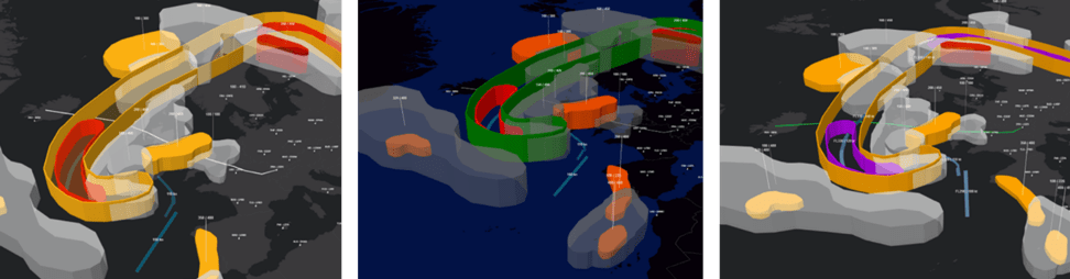
The pilot study was performed with three subject matter experts that were brought in for on-site interviews. They were able to choose several design parameters in a first draft of the application. The parameters included vertical exaggeration (thickness), offset from the ground, colors of elements and basemaps, as well as different types of renderers. For the night mode of the application, the subject matter experts came up with different 3D designs which can be reviewed in figure 4. They were also able to dynamically choose parameters for the day mode of the application which has brighter colors. The dual mode was implemented since most aviation displays have a day-night mode switch due to frequently changing lighting conditions in the cockpit.
The inputs from the pilot study as well as an additional review of all three designs by the subject matter experts were then used to implement the actual prototype.
Implementation
As already mentioned above, the application was implemented only using the ArcGIS API for JavaScript 4.x with its capabilities for 3D symbology. In the following paragraphs, two implementation details are highlighted: the jet stream visualization, which required a 3D directional line representation, and the manual transparency sorting which was needed due to a current limitation in WebGL.
The visualization of the jet streams can be seen in figure 5. It features both a 3D line and an overlaying 3D path visualization. As the 3D line does not scale, it is suitable for large scale, whereas the 3D path is more suitable when zoomed in closely. The 3D path symbol also aligns nicely with the pilot’s mental perception of a jet stream. Additionally, wind speed is visualized with different colors and the flight height is applied as a label with a callout. The tricky part of the jet streams, is the fact that the direction of the streams is crucial and needs to be visualized. The ArcGIS API for JavaScript does not yet have built in renderers for direction (like in ArcGIS Pro) which is why a workaround had to be applied.

The direction of the jet streams was visualized by using an ObjectSymbol3DLayer with a white cone symbol (width = 75 km, height = 150 km). The rotation of the cone was adapted for each point along the stream by using visual variables on the heading property of the object. Additionally, the cone had to be tilted by 270° to have it lying down as well as the correct initial position. The renderer for the cones was constructed as follows:
Transparency, like color and shape, has proven to be a useful visual variable in 3D visualizations, especially for data overlays. However, correct transparency sorting is still one of the challenges in displaying 3D graphics on the web and is not supported by WebGL. Since some weather objects were rendered in a transparent style e.g., to make objects that they enclose visible, an order-dependent transparency sorting was manually established in the prototype. The implementation was achieved by using a promise for each layer which waits until the LayerView of the previous FeatureLayer is loaded. Afterwards, the next layer or group of layers is loaded. The result of the transparency sorting can be seen in figure 6.
The following shows how this was implemented in the code assuming that layer 1 is enclosed by layer 2, as well as that layer 2 potentially represents the outline of layer 3 and therefore needs to be loaded first:
Another interesting detail about the implementation is that the target device for this application is a tablet that can be taken into the cockpit by the pilots. As support for mobile devices such as tablets has been available since the 4.6 release of the ArcGIS API for JavaScript, this requirement perfectly aligned with the development of the prototype. A version of the web application shown on a tablet as opposed to in the browser can be seen in figure 7.

Evaluation
Since the research questions for this project mainly evolved around the idea of whether a 3D representation of the data can enhance certain aspect of the human-computer interaction, an evaluation in the form of a user study was performed as a next step. The aspects that were evaluated and compared were the following: cognitive load, usability and spatial awareness. The participants of the user study were asked to fulfill a set of tasks related to flight planning with both visualizations, the current 2D black-and-white maps and the new 3D prototype. A total of 64 participants, all pilots of the same airline, completed the user study. The results were then evaluated between the two conditions finding that cognitive load could be reduced by 18.3%, usability was improved by 29.4% and spatial awareness by 24.4% when using the novel 3D web-based application. For cognitive load and usability a standardized questionnaire was used to measure the differences, whereas for spatial awareness the ArcGIS API for JavaScript was used again.
Spatial awareness was assessed by a drawing task for the participants in which they had to draw four categories of weather objects (jet streams, clouds, CBs, CAT areas) with the flight path and a basemap as reference. Sketch maps were used for the evaluation of cognitive maps and mental representation and have proven to be a reliable source of information to assess the internal representation of an environment which correlates to the sense of direction and therefore spatial awareness. Participants of the user study were asked to look at either a 2D or a 3D representation of the data and were then required to draw what they remembered in a second step. The drawing was implemented in the user study with a map and the drawing widgets. The features which participants drew were saved as new features in a result layer. A drawing from one of the participants can be seen in figure 8 in comparison with what the participant was presented in the 2D or 3D condition.

The research project showed great potential and promising results for the use of a 3D web-based visualization for aviation weather and will therefore be continued at ETH Zurich in collaboration with the international airline. Additionally, the project also contributes to the research community around user interfaces and has been published to an international conference. Further information can be found in the research paper about this project.


Commenting is not enabled for this article.