Smart Mapping was released last year in the ArcGIS API for JavaScript, ArcGIS Online, and Portal for ArcGIS, providing easy-to-use tools for generating attractive default visualizations of geographic data on the web.
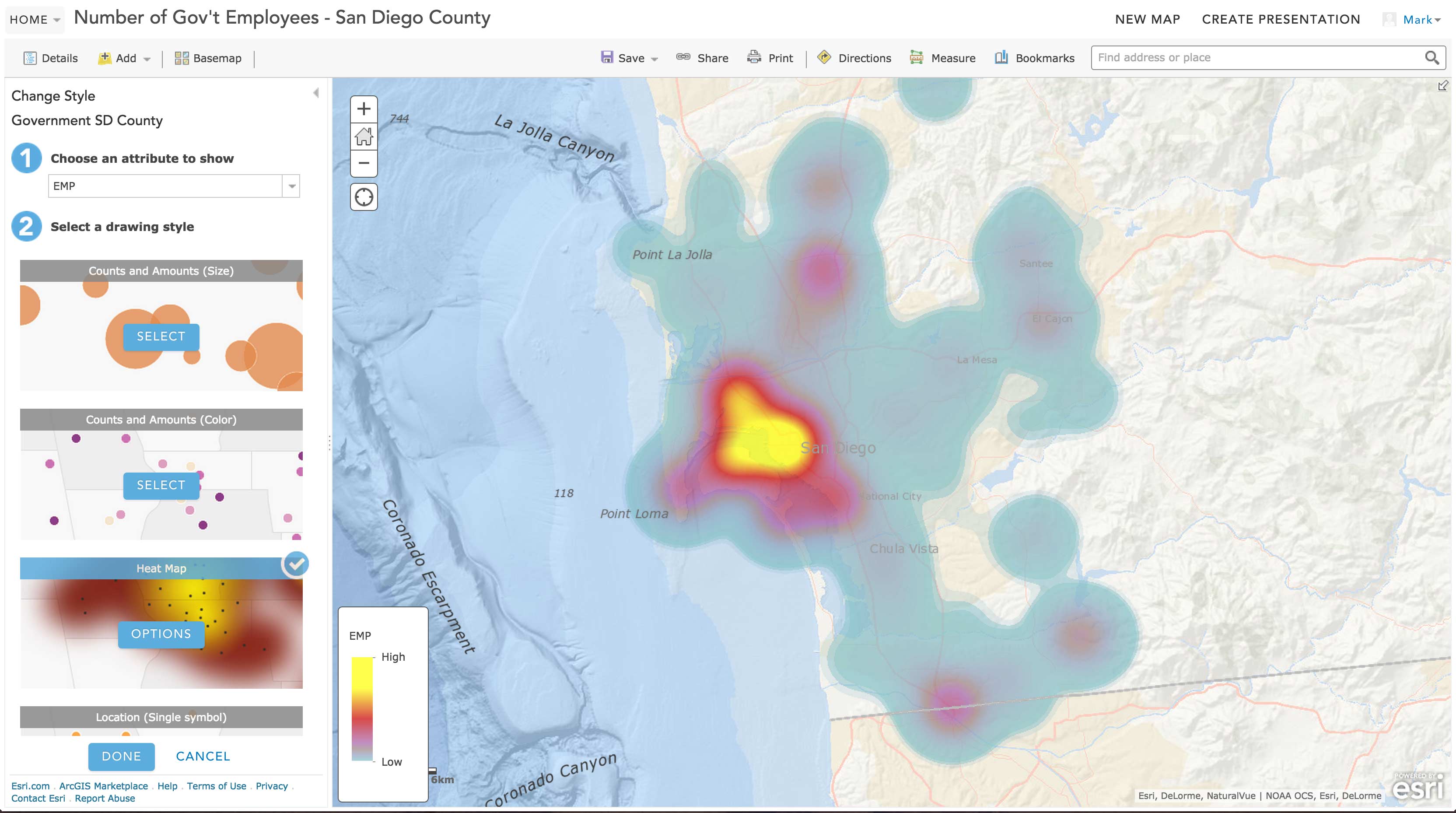
The ArcGIS Online Map Viewer fully equips users with out-of-the-box Smart Mapping tools and simple widgets that allow users to easily change sizes, colors, and opacity values for features in a layer. These tools are particularly useful when the user explores unfamiliar datasets. In a matter of minutes, users can use sliders to discover and explore the intricacies and distribution of their data and observe how changes to renderer values affect the visualization on the map.
How to use the Smart Mapping module
All of the tools for changing layer styles in the ArcGIS Online map viewer were built on top of the SmartMapping module in the ArcGIS API for JavaScript. This high level API is easy to use in building custom data exploration web applications.
For example, open the sample depicted in the image below, which uses Smart Mapping to generate a color renderer with good default inflection points for colors based on the statistics of the layer. Compare the visualization in the app to the default renderer of the same layer in the ArcGIS Online Map Viewer.
CLICK HERE TO VIEW THE LIVE SAMPLE
In this app I call the createColorRenderer() method on the smartMapping module to generate a visually pleasing renderer for the layer once it loads. All that’s needed is the layer, field name, normalization field (if desired), basemap, and theme. The method returns a promise that resolves to an object containing a renderer with a color scheme mapped to values specific to the data in the given field. See the code block below to observe the simplicity of this API; there’s no need to know the statistics, data values, or classification types. It’s all figured out for you.
Click here to view this code on GitHub
// Generate the color renderer based on the given field,
// normalization field, basemap and theme
smartMapping.createColorRenderer({
  layer: layer,  // only one layer used in this app
  field: fieldName,  // selected by user
  normalizationField: normFieldName,  // generated from getNormalizedField()
  basemap: basemap,  // current basemap
  theme: theme  // selected by user
}).then(function (colorRenderer){

  // Set the generated renderer on the layer
  layer.setRenderer(colorRenderer.renderer);
  layer.redraw();

  // Generate histogram and set values on slider below
});
Once the promise resolves, you can set the renderer object directly on the layer and redraw it.
Now play around with the color slider. Switch the selected attribute and the basemap and observe the behavior on the map and color slider. Using the renderer values and statistics returned from the createColorRenderer() method, you can update the color (or alternatively size) slider widget to be in sync with changes to the renderer and vice versa (see code below).
You can also optionally generate a histogram to visualize the data distribution of the field using the getHistogram() method on the FeatureLayerStatistics plugin.
Click here to view this code on GitHub
featureLayerStatistics.getHistogram({
  field: fieldName,
  normalizationField: normFieldName,
  numBins: 25
}).then(function (histogram){
  // --------------------------------------------------------------------
  // Apply the FeatureLayerStatistics histogram to the slider
  // --------------------------------------------------------------------
  colorInfoSlider.set("histogram", histogram);

  // --------------------------------------------------------------------
  // Set the color ramp and statistics on the slider from
  // --------------------------------------------------------------------
  colorInfoSlider.set("colorInfo", colorRenderer.renderer.visualVariables[0]);
  colorInfoSlider.set("minValue", colorRenderer.statistics.min);
  colorInfoSlider.set("maxValue", colorRenderer.statistics.max);
  colorInfoSlider.set("statistics", colorRenderer.statistics);

});
Why use Smart Mapping in custom apps?
While Smart Mapping may be simple to work with, some might reasonably ask:
If the ArcGIS Online map viewer already provides Smart Mapping tools out of the box, why would I want to build a custom web app only for data exploration purposes? Can’t I just use ArcGIS Online to explore my data?
This is a valid question and can be summed up in one word – simplicity. The ArcGIS Online map viewer is a generic application that works with any layer/dataset. Using the Smart Mapping tools in ArcGIS Online is ideal when you know absolutely nothing about the data you’re about to explore. But you may have your own datasets that contain a lot of known attributes that need to be visualized and queried in dozens of different ways. As an application developer you can focus the user experience of a data exploration app by using only the Smart Mapping tools applicable to the client, users, or project. The custom application can be simpler, more focused, and tailored specifically to the data; unlike ArcGIS Online, which is more generic and built to handle a variety of common GIS workflows and visualizations.
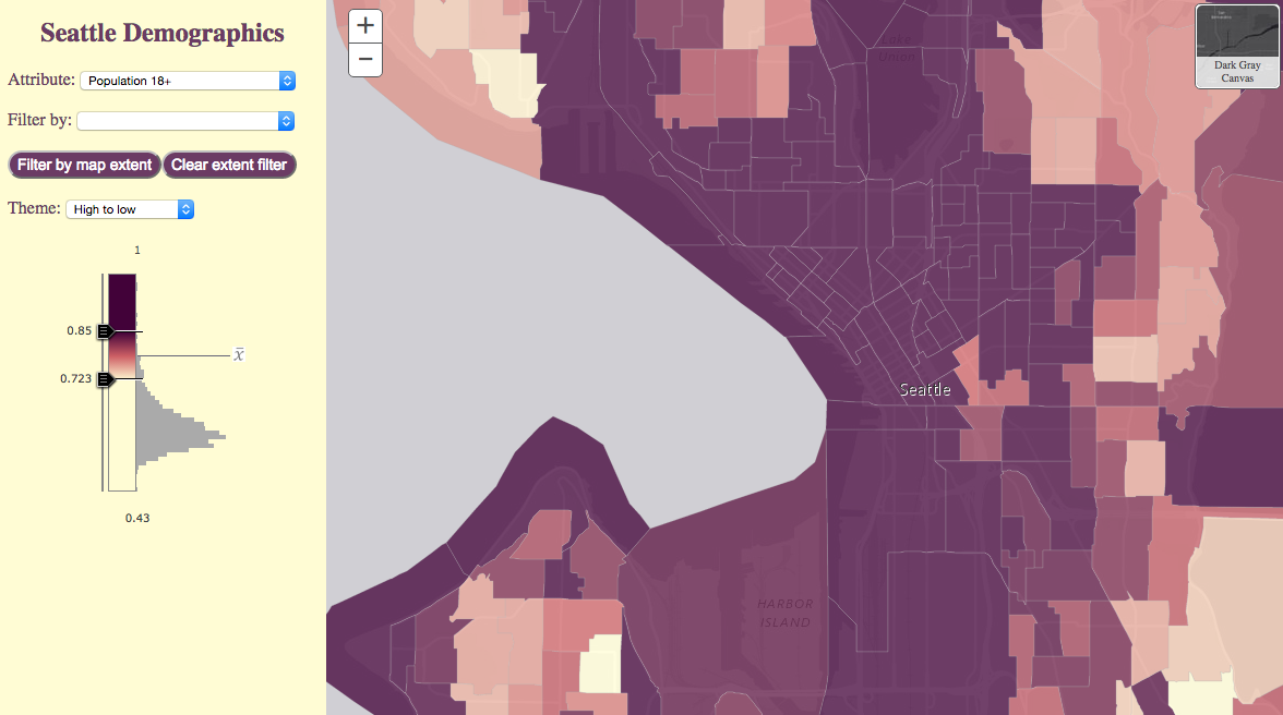
For example, suppose you need to explore and visualize demographic data similar to the Seattle dataset used in the app above. This layer has more than 60 demographic attributes including home values, household incomes, educational attainment, and population. Depending on the project or client, the demographic attribute and/or area of interest might change. In fact, it might change frequently. The underlying data you reference may even change, so it makes sense to use Smart Mapping to automatically determine the initial visualizations. The data might also have a lot of features and attributes which make it difficult to understand with a single visualization. Thus generating multiple renderers helps you and the user understand the data better.
Let’s dive into five ways a custom data exploration app using Smart Mapping can simplify data exploration workflows.
1. Focus on one visualization method
The Smart Mapping module has 10 methods for generating renderers and visual variables which select predefined color schemes and size ramps that work best for each named basemap in the API. The JavaScript API also provides color and size sliders whose event objects tie in easily to existing renderers. There are a lot of options, but not all of them are necessarily appropriate for a custom application.
The ArcGIS Online map viewer provides all visualization options Smart Mapping has to offer including using unique types, color, size, combinations of color and size, predominance, simple location, heatmaps, etc. Depending on the needs of the project or client, most of these options may not be applicable or useful to the user. In some cases, just one option is preferred. Color is the easiest way to interpret data for me, so I chose to include a colorInfo slider and only generate renderers using color in this application.
It’s simple, focused, and removes clutter from what would otherwise be a complicated app with multiple sliders and rendering options.
2. Focus on a subset of attributes
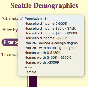
In the Seattle app, the service representing demographic data by block group contains more than 60 attributes. My users only care about a few of those attributes. So rather than providing an option to select any field, I chose to restrict the user to selecting one of 12 attributes. In this case, I only care about home value, household income, education attainment, and adult population. So I don’t bother providing the user with the 50 other attributes they would otherwise have to sift through when choosing a new attribute.
You could customize this component of the application further by displaying icons for each attribute (i.e. a gallery) instead of listing them in a dropdown box, making the app more visual.
3. Handle data normalization internally
Normalization is essential in cartography, particularly when dealing with demographics. Without normalization, features with high counts will always stand out and spatial trends will either be deceptive or won’t be immediately obvious to the audience. When working with demographic data and failing to normalize by area, total or some other attribute, maps will tend to look very similar no matter which attribute is selected because they often follow overall population trends.
Check out the Seattle app when normalization is removed from the equation. The visualization changes with each attribute change, but the spatial patterns are deceptive and in many cases follow population trends.
The ArcGIS Online map viewer provides an option for normalizing data based on a field. Again, with the Seattle dataset this is done with a very large dropdown menu giving the user the option to select any numeric field. With a custom app, however, you can forego the normalization dropdown altogether and make the app smart by setting the normalization field for the user based on their field selection.
The code snippet below demonstrates how I used a simple function in the Seattle app to determine the normalization field based on the user’s field selection. Notice that if the user selects a field related to household income, a field containing data for the total number of households is selected for normalization. Likewise for fields dealing with home value, a field representing the total number of owner-occupied homes is selected for normalization. Now the user doesn’t have to worry about normalization. It’s handled for them behind the scenes!
Click here to view this code on GitHub
// Determines which field to normalize by given the selected field name
function getNormalizedField(field){
  var normField;

  if (field.includes("HH_Income") || field.includes("HINC")) {
    normField = "HINCBASECY";  // Total number of households
  } else if (field.includes("HomeValue")) {
    normField = "VALBASE_CY";  // Total number of owner-occupied homes
  } else if(field.includes("COL_DEG")){
    normField = "EDUCBASECY";  // Total population 25 and older
  } else {
    normField = "TOTPOP_CY";  // Total population
  }

  return normField;
}
4. Provide a list of predefined filters
Smart Mapping takes into account definition expressions when generating renderers. Filtering features by definition expression can change the visualization since a sample of a subset of features can produce different statistics than sampling the entire dataset. Users can set definition expressions in the ArcGIS Online map viewer, but it takes a few extra clicks to get there.
You can simplify the user experience by providing a simple dropdown with commonly used expressions for filtering features. Maybe users want to only take into account features within the city limits of Seattle (or other city or district). Perhaps they only want to view the data distribution in features where most adults earned a bachelor’s degree. When one of the options is selected, the appropriate definition expression is created and set on the layer for the user. This eliminates extra clicks and the potential for user error if they had to build the SQL expressions themselves.
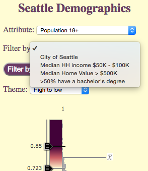
In the Seattle app, whenever the user decides to filter the features based on an attribute, the layer’s renderer is regenerated, exposing different spatial trends among the subset of selected features.
Click here to view this code on GitHub
// Get the definition expression selected by the user, set
// it on the layer and regenerate the layer and slider handles
if(evt.target){
  lyr.setDefinitionExpression(defExp);
  updateSmartMapping({
    layer: lyr
  });
}
5. Focus on a specific area
Suppose the user wants to explore the demographics of a subset of features, such as a neighborhood, but the features in the area of interest don’t have a common attribute for filtering. For example, when I select the attribute Population 25+ that earned a college degree, I notice that most of the adult population in the Sammamish, WA area seems to have a college degree.
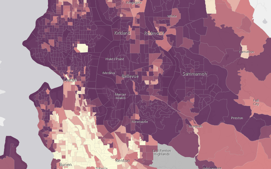
This intrigues me so I decide to explore that region further. When I zoom in, most of the features are shaded with the darkest color indicating that at least 69 percent of the adults have a degree.
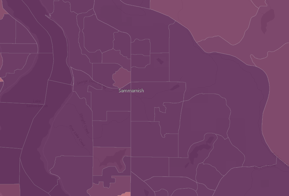
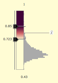
But this view isn’t useful to me; I want to see more details. I can do this by regenerating statistics and the renderer for only the features in the map extent. So I included an option to filter features by geometry.
![]()
Once this button is clicked, all features outside the extent of the map are excluded and the layer’s renderer is regenerated based on the statistics of the subset.
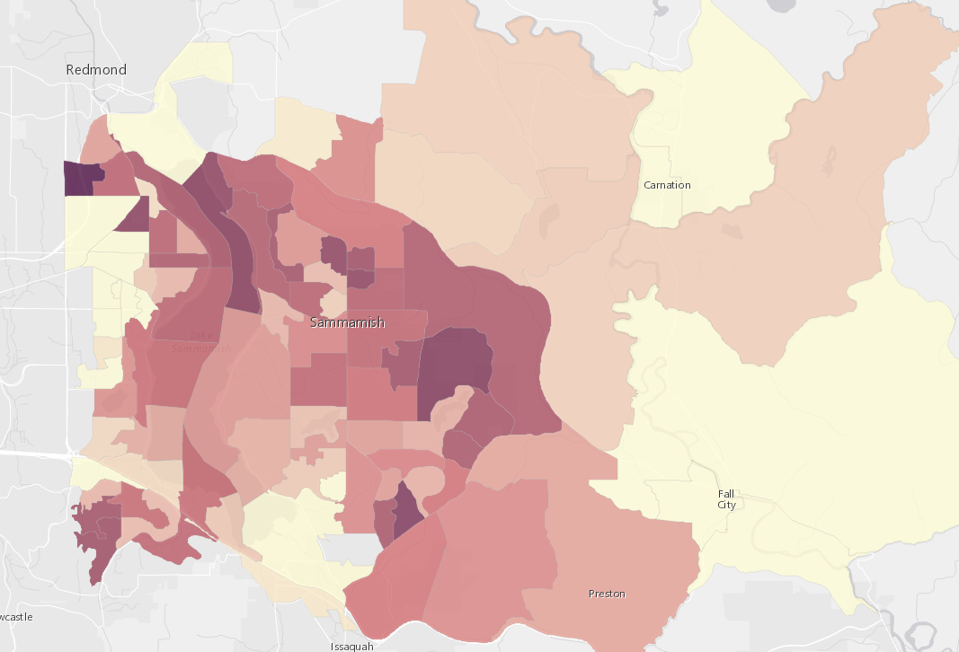
Now I can see more detail in this area relating to the percentage of adults that have college degrees. If I adjust the slider slightly, I can stretch the color ramp so the feature with the highest rate of college degrees (98 percent) and those on the low end (71 percent) are more obvious at first glance.
You could similarly add a Draw toolbar and allow the user to draw a geometry for filtering a subset of the layer’s features.
Conclusion
Just because the Smart Mapping tools are powerful and publicly available for use in any web application, it doesn’t mean that they should be used. In fact, in most applications it doesn’t make sense to use Smart Mapping because the symbol of each feature is already predetermined programmatically, saved directly to the layer, or the data values/ranges including sizes and color schemes are already well established to meet the standards of an organization or fit the theme of the application.
In addition, frequently using this module can cost you in terms of app performance. If only one visualization is needed, you could also simply use the tools already available in ArcGIS Online to generate a renderer and save it directly to the layer.
Remember, Smart Mapping tools are particularly powerful and useful when creating custom apps designed specifically for data exploration purposes.

Commenting is not enabled for this article.