This article was updated on October 26, 2021 with ArcGIS Pro 2.8.3.
The night sky mostly looks like a million tiny white pinpricks in the dark. But there is in fact a lot of variation there. Some stars are brighter than others. And if you look closer, you can see that the stars have different colors. You can use ArcGIS Pro to depict these subtle stellar differences.
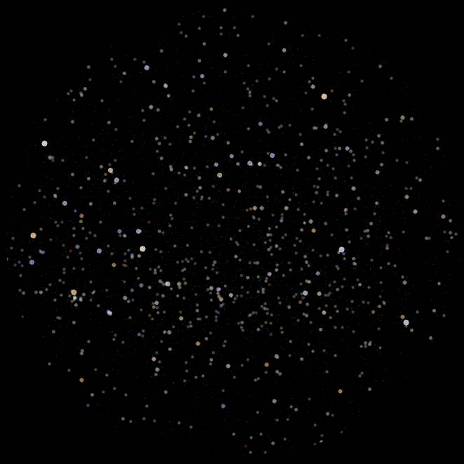
This tutorial delves into the Vary symbology by attribute controls in ArcGIS Pro, which allows you to code map symbols with multiple variables at once.
1. Download StarColor.ppkx and double-click the file to open it in ArcGIS Pro. Make sure the Starting point map tab is open.
You’re mapping the night sky, so you’ll begin by making the background black.
2. In the Contents pane, right-click Starting point and choose Properties.
3. In the Map Properties window, on the General tab, for Background color, choose Black.
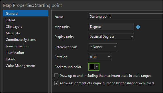
Another thing you can do in the Map Properties window is change the map’s projection.
4. Click the Coordinate Systems tab. If you live in the northern hemisphere, search for and click North Pole Stereographic.
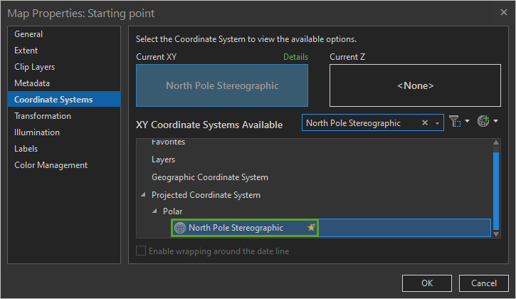
If you live south of the equator, choose South Pole Stereographic instead.
If you want to learn more about using earth’s coordinate systems to map the night sky, read this story about making a star chart in ArcGIS Pro.
5. Click OK.
The projections I recommended above are only really intended for showing half of the earth at once. Anything beyond the equator is simply too distorted:
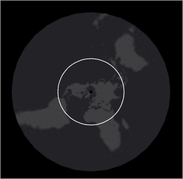
That’s why I’ve provided some masking layers in the project.
6. In the Contents pane, turn on either the SouthernHemisphere or NorthernHemisphere layer, whichever one covers the outer, distorted part of your map.
7. Open the Symbology pane for the hemisphere layer and change the Color to Black and the Outline width to 0 pt.
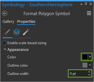
Now your map is masked so it only shows the reasonably undistorted half:
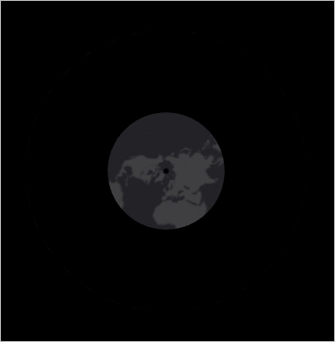
Of course, you are not mapping the earth! But the celestial sphere behaves similarly to the terrestrial one, and distorted constellations are just as problematic as grossly continents.
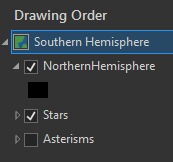
8. In the Contents pane, drag the mask layer above the other ones. Remove the basemap layer and the unused hemisphere layer. Turn on the Stars layer. You can ignore the Asterisms layer for now.
Symbolize by size
Stars are typically symbolized based on their magnitude value. This is a measure of how bright or faint they appear from earth. A low magnitude value means a brighter star.
1. Open the Symbology pane for the Stars layer. For Primary symbology, choose Graduated Symbols. For Field, choose Visual Magnitude.
2. Click the yellow Template symbol. Change its color to White and its Outline width to 0 pt.
A larger star magnitude means a fainter star, so you need to flip the min and max symbol sizes.
3. Change Minimum size to 6 pt and Maximum size to 1 pt.
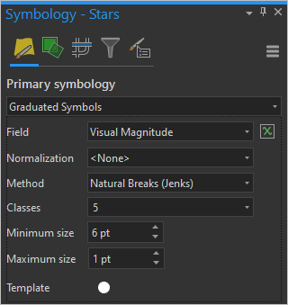
4. Optionally, change Classes to 6 and in the Classes table, edit the Upper value column to round numbers.

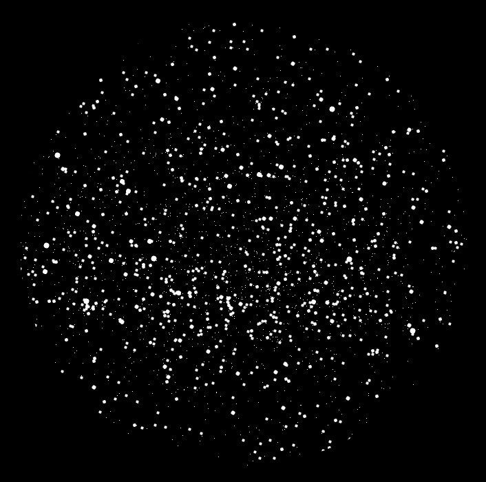
Your map now looks like a map of the night sky.
Symbolize by transparency
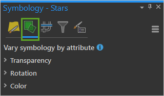
1. At the top of the Symbology pane, click the green Vary symbology by attribute tab:
Whenever you symbolize your data with anything more than a single symbol, you are using what cartographers call Visual Variables. Check out this chart that explains them all.
On the Vary symbology by attribute page you can add more visual variables to your layer. Usually you would do this because your data contains two different attributes and you want to represent both of them at once. But in this situation, you’re going to do something a little different, and use the same attribute (magnitude) with two visual variables in order to emphasize it.
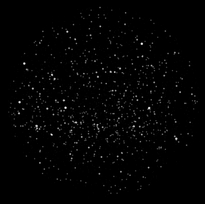
You’re already using the size visual variable (applied using graduated colors). Now you’ll add transparency. This will create a more naturalistic image of the night sky. It’s a visual trick to add some depth, so that the faint stars recede even more into the background.
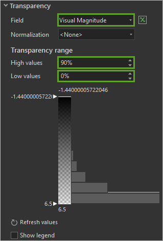
2. In the Symbology pane, expand Transparency. For Field, choose Visual Magnitude. For High values, type 90 percent. For Low values, type 0 percent.
The result appears even more like the real night sky.
But you can go even farther than this.
Symbolize by color
Normally I do not recommend using more than two visual variables at a time. It can make for some very confusing maps! But since you are using size and transparency to depict the same attribute, I think that you are ok to add color to the mix.
1. In the Symbology pane, collapse the Transparency section and expand Color. For Field, choose Color Index.
In astonomy, the color index defines the color of stars and other celestial objects. Hotter stars appear more blue in the sky and have a smaller value in the color index. Cooler stars appear more orange and have a higher value.
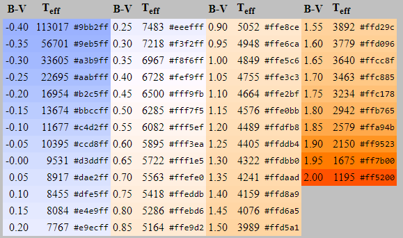
The table above was created by Mitchell Charity. The B-V column lists the range of color index values in intervals of 0.05 and maps each one to a hexadecimal color code. I converted this table into a color scheme in ArcGIS Pro:
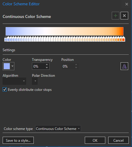
Don’t worry: you don’t have to make this color scheme yourself. It’s included in the project package that you downloaded.
But if you ever do find yourself making a color scheme with 49 color stops, I recommend checking the Evenly distribute color stops box. If you look at the table above, you can see that the color stops are all evenly distributed, with a change of 0.05 between each row. Their corresponding color stops need to be just as evenly distributed if they are to match properly.
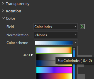
2. In the Symbology pane, open the Color scheme menu and choose StarColorIndex(-0.4-2) (point to color schemes to read their names).
The numbers shown on the histogram are based on the min and max Color Index values found in the data. But the stops in the color scheme are meant to be associated with very specific B-V values, and they won’t line up if the min and max are off. You need to edit the min and max values on the histogram before the color ramp will align correctly with the data. These histogram values aren’t allowed to overlap one another, so they are picky about which order you edit them in.
3. Double-click the number above the histogram and edit it to -0.4.
4. Edit the upper handle on the side of the histogram to -0.4.
5. Edit the lower handle to 2. Edit the number below the histogram to 2.
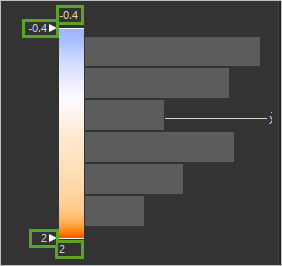
Any stars that fall outside of the -0.4 to 2 range will either draw with the first blue color or the last orange one.
There’s also a few Null values in the data. Three stars have no color index value at all, so they will be ignored by the color scheme, and draw with the fallback color. This is the white color defined in Graduated Symbols. You might be fine with this, but if you’re not, you can exclude them from the map.
6. A the top of the Symbology pane, click the Advanced symbology options tab and expand Data exclusion.
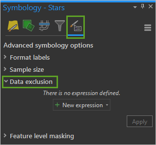
7. Click New expression and build the expression Where Color Index is null. Click Apply.
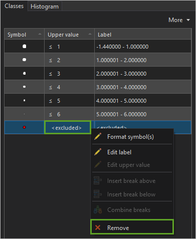
Any stars that satisfy the above expression will draw with a special symbol. By default, that symbol is red. You’ll change it so these stars don’t draw at all.
8. Click the Primary Symbology tab.

9. In the Classes table, right-click <excluded> and click Remove.
Let’s take a look at the final result:

To finish your map, you’ll add some constellation lines, also known as asterisms.
10. In the Contents pane, turn on the Asterisms layer. Open its Symbology pane.
11. Click the Gallery tab and under StarColor, choose the pre-made Asterisms symbol.
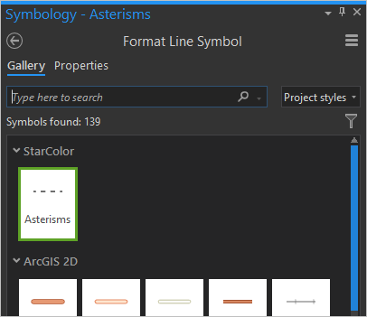
This dashed-line symbol should be faint enough to provide context without overpowering the stars.
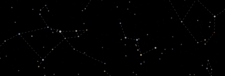
In this map, you used three visual variables to map the stars with size, color, and transparency. Your goal was to create an appearance closer to how stars appear in nature. The changes are relatively subtle and the result is a map that is easier to read – the brighter stars stand out more distinctly than before, helping you to find your bearings in the sky more quickly.
More often, visual variables are combined to present complex data stories that are not inherently visual. If you combine visual variables carefully you can add more information to your map, but if you are not careful, you can create a map that is difficult to decode. Learn more techniques for combining visual variables in this video series by John Nelson.

Commenting is not enabled for this article.