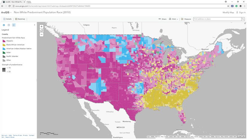
There are sometimes when you want to have a multi-level-geography map, as seen above, where you want to visualize an attribute at national level as well as at regional or even at neighborhood level as you zoom to larger scales in order to reveal the same information in finer details. For example, the map above shows ‘vacant housing unit rate comparing to national average’ at state level and then as you zoom in you can see the same information at county level followed by at census tracts and all the way to block-group level.
Traditional solution:
This might be something you have done many times before – the traditional approach to solve this problem is to use multiple layers, with mutually exclusive scale visibility range, where each layer represents one geographic/political unit such as states, provinces, divisions, counties, districts, tracts, blocks etc. And symbolize all layers using the same symbology. If you want, you can give it a try with this webmap – when you open it, it shows 2010 population density at US state level, as you zoom in, you will see that it shows the same information at greater details – from states to counties to census tracts to block groups. Now, if you want to change symbology e.g. to symbolize them with a different color scheme, you will run into the problem that is described below.
Problem:
The issue that we often run into with this approach is that it requires symbology set separately for each layer to begin with. And if you need to make any change to a symbol or change break values for a class breaks symbology, you need to keep repeating the same thing for all layers. It gets even harder when you want to share as a web layer and you want your end users to modify its symbology based on their needs.
Solution:
ArcGIS Pro 2.2 introduces view_scale parameter in a query layer that allows you to vary where clause or selected fields or even table name in a SQL statement based on the current map scale. We will use that to read features from different tables based on map scale. Please note, in this case schemes for all these tables must be identical as it is the case in the webmap specified earlier.
Steps:
- Download USDemograhic.gdb containing data only for states and county levels to keep it simple for this exercise.
- Open ArcGIS Pro (version 2.2 or above)
- Import states and counties FeatureClasses from this File Geodatabase to an enterprise database
in this example, I imported them to a SQL Server database - Insert a new map
- Choose Query Layer from Add Data drop down menu on the Map tab
- Choose a database connection
- Provide a Name
- Copy/paste following sql in the Query text box
SELECT * FROM (
SELECT 1 AS t_id, * FROM states
UNION ALL
SELECT 2 AS t_id, * FROM counties
) x
WHERE x.t_id =
CASE
WHEN ::view_scale > 25000000 or ::view_scale = 0 THEN 1
ELSE 2
END - Click on the Validate button
- Click on the Next button
- Check next to OBJECTID field from Unique Identifier Field(s) list
- Make sure Geometry Type and Spatial Reference are auto populated.
- Click on Finish button
- A query layer get added
- It should draw state boundaries on the map view

- Zoom in beyond 1:25,000,000 scale and you will see the layer switches to county boundaries

- To visualize them using different color based on whether the vacant housing unit rate is above, around or below the national average, open the layer’s Symbology pane
- Select Unique Values from Primary Symbology drop down box
- Click on Set an expression button next to the Field 1 drop down box
- Copy/paste the following arcade expression
var v = ($feature.VACSALE10 / $feature.OWNER10) * 100
return iif(v < 2.3, -1, iif(v > 2.5, 1, 0)) - Change the color scheme
- Add ‘Below Nat’l Avg.‘, ‘Close to Nat’l Avg.‘ and ‘Above Nat’l Avg‘ respectively next to -1, 0 and 1 values in the table below

- If you want to share this to others, you can connect to a portal and share this map as a Map Image web layer
Notes:
- This approach only works when tables are in an enterprise database since query layer does not support data sources such as File Geodatabase or Shapefiles etc.
- If your data is in an unsupported data source and you still want to share a map like this to a larger audience, you can take advantage of ArcGIS Server SOI (server objects interceptor). Here is a sample SOI that will help to achieve it.
- It does not work in ArcGIS Pro as SOI, as the name suggests, is only works on server.
- If your data is in an unsupported data source and you still want to share a map like this to a larger audience, you can take advantage of ArcGIS Server SOI (server objects interceptor). Here is a sample SOI that will help to achieve it.
- When data ranges between geography levels do not match, you should normalize your data e.g. divide them by another attribute or use arcade expression.
- You may want to read about Display Filter if you want dynamically filtering out features off display based on map scale (just as a related topic).

Article Discussion: