Throughout last year, we have been busy revamping the internals of the ArcGIS API for JavaScript to support larger feature data sets in 3D. In version 4.9 we have added support for displaying large point datasets, and in version 4.10 we extended this to large line and polygon datasets. As a result, we removed the 2,000 feature limit when adding a feature layer to your scene.
In this blog post you will learn about the technical details behind loading and displaying large datasets. We have included examples of 3D city visualizations to help further understand these topics. Following our approach you can create a 3D view of your city using only 2D data. Hundreds of thousands of buildings generated live from 2D polygons!
How does it work?
For feature services that have less than 2000 features (let’s call them small services) we can load all the data at once in the client. Internally, we call this snapshot mode, and we continue to use it for small services. This mode has the advantage of instantly showing all the features while navigating, since all the data is on the client and rendered directly.
Whenever a service exceeds the amount of data that can be handled in snapshot mode, we switch automatically to a tiled on-demand mode. This tiled mode behaves similar to SceneLayers, but without a cache. The tiled mode loads large services and organizes them in tiles. This mode can display up to 50.000 features in a single layer.


We also use quantization, a technique that reduces the resolution of line and polygon features based on their size on screen. Quantization reduces the amount of data we need to handle, but may cause very small features to not be loaded since they get “quantized away”. You can also see quantization temporarily when zooming into a large feature layer, until we have updated the data with the finer quantization.
When we cannot load all the data in a tile, we now try to load a meaningful subset of the data:
First, we query how many features are in this tile, and then load the same percentage of all features on all tiles. This creates a fair subsampling of features across all tiles, which gives a good visual indication how the data is distributed spatially. It also makes tile border less visible.
Secondly, we use distance-based thinning for tilted views. This results in denser tiles closer to the viewer, and sparser tiles towards the horizon.
This new feature selection algorithm also results in faster load times. By using a precise count, we can better estimate how many features we need for each tile, and request more efficiently from the server. Additionally, when supported by the server, we request the features in a binary format (pbf) instead of JSON, which reduces the response size.
Large datasets in action: 3D city visualizations with 2D features
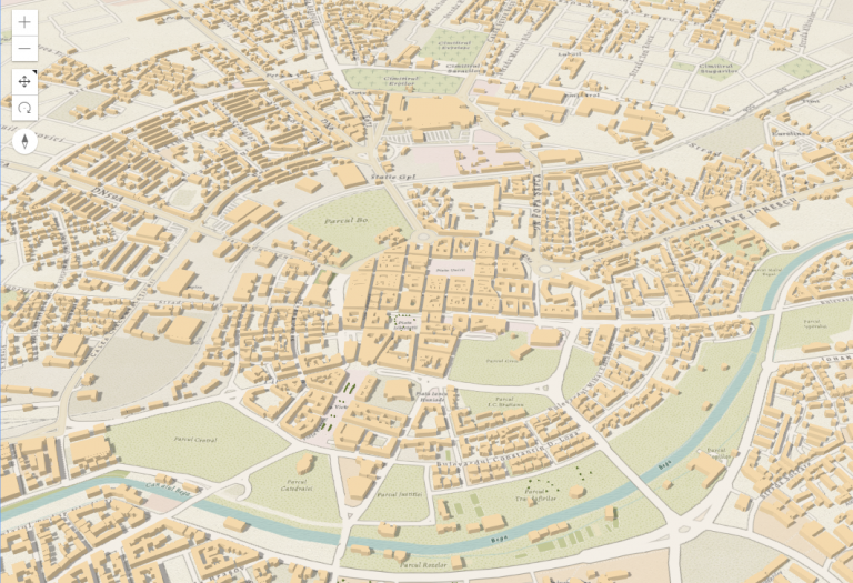
Most cities don’t have detailed 3D models of their buildings. This is also the case for the cities in Romania, so we decided to download all the building footprints available on OpenStreetMap and to visualize them in 3D. There are around 1 million mapped buildings for the whole country. To add a bit of freshness to the map we also downloaded all the trees. Before we dive into the workflow, here is what Bucharest looks like in the final map:
Download and publish data
There are several ways to download data from OSM, you can read more about it on the OSM Wiki. When downloading data for a whole country, the easiest is to download it from Geofabrik. Some things to be aware of when using OSM data: you should credit OpenStreetMap and the end result should be redistributed under the same license (read more about it here).
Performance tips
Most of the OSM data comes in WGS84 and my web scene is in Web Mercator. When publishing large data sets, it’s important to have all the data in the same projection. Otherwise it will be reprojected on the server for each request, which in the case of large datasets is time demanding.
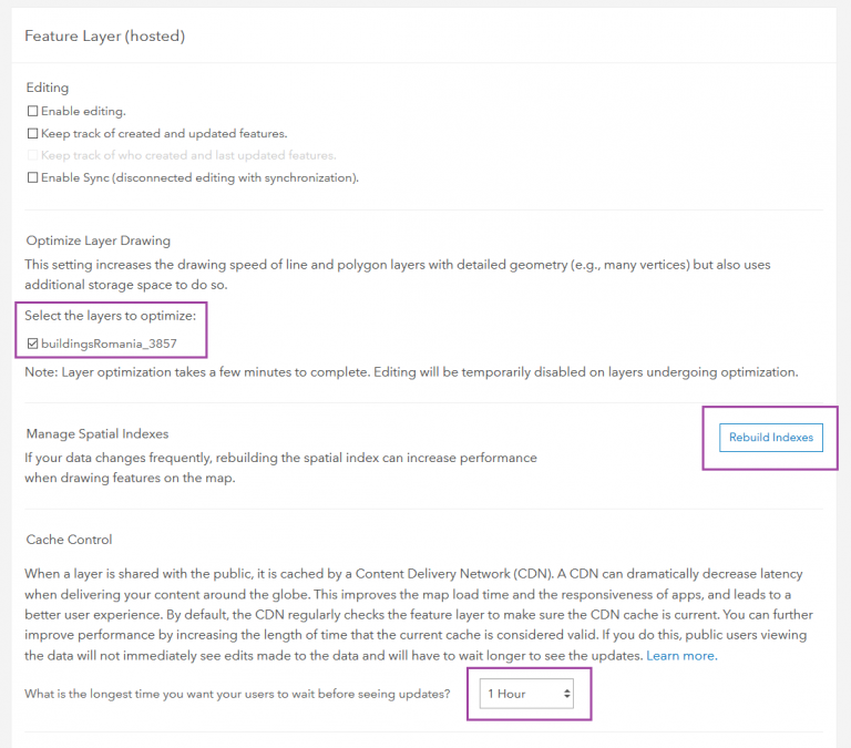
After the data is ready (don’t forget to add the attributions!), we can publish it to ArcGIS Online. Here are a few optimizations that we made in the item settings to make our layers perform better:
- Tick the checkbox for Optimize Layer Drawings.
- Rebuild Spatial Index.
- Set the Cache Control to 1 hour.
Create visualization
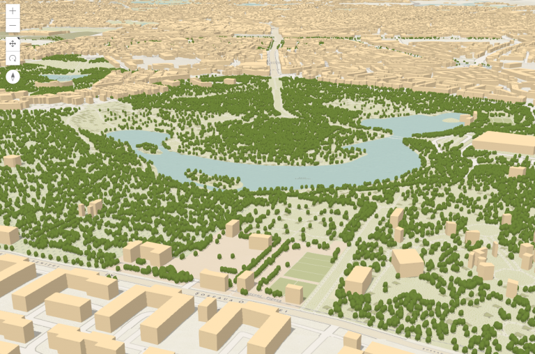
Now it’s time to visualize the buildings. To write less code, we created the WebScene in the SceneViewer where we extruded the building footprints by 10 meters and we symbolized the trees with realistic 3D models. We saved the scene and loaded it in a custom application using the portalItem id. Then we added a menu at the bottom that zooms to the major cities based on the slides defined in the webscene. This is what the cities look like:

You can view the live app here.
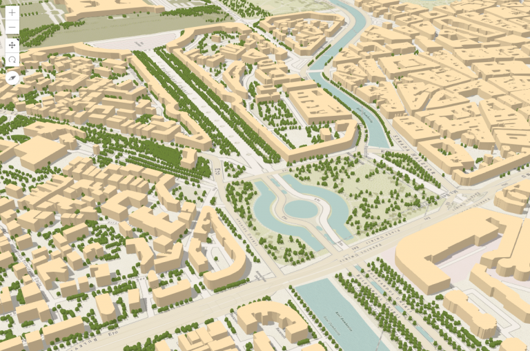
This is basically how you can create a 3D view of your city using only 2D data. I used the data from OpenStreetMap, but some cities have Open Data Portals where you can find the building footprints (even with height information). This is the case for Paris, which published all the building footprints on the Paris Open Data portal. The footprints have height and construction period information so I used those attributes to represent the extrusion height and color. The extrusion height is set as a size visual variable, and construction periods are used as categories in an unique value renderer.
const renderer = {
  type: "unique-value",
  valueExpression: periodExpression,
  uniqueValueInfos: [{
      value: "Before 1850",
      symbol: {
        type: "polygon-3d",
        symbolLayers: [{
          type: "extrude",
          material: {
            color: "#6F2806"
          },
          edges: {
            type: "solid",
            color: [50, 50, 50, 0.5],
            size: 1
          }
        }]
      },
      label: "Before 1850"
    },
    ... // some more categories here
  ],
  visualVariables: [{
    type: "size",
    field: "H_MED",
    valueUnit: "meters"
  }]
}
Here’s what the visualization looks like:

Explore the buildings of Paris live! And you can view the code of the application here.
And if you’ve mapped your city in 3D let us know, we’d love to see it!


Commenting is not enabled for this article.