Regions are defined by many things. Among these are physical aspects (landforms, plants and animal habitat, precipitation), administrative aspects (state and county boundaries, school district boundaries), as well as cultural aspects (language and dialect, food, clothing and housing styles, and more.) Some of these cultural aspects are qualitative, and therefore not easy to measure with a ruler, thermometer, or protractor.
There is a rising number of GIS tools and workflows for qualitative social science. Part of social science research is in the area of perception of place. There is great value in gathering mental maps from community members and individuals. What is their definition of their community or region?
A longstanding and favorite subject for regional geographers to study is “The American Midwest.” As a combination of a physical and cultural area, it means different things to different people, depending in part on where those people live or have migrated to or from. As early as the 1930s, geographers were asking students and the general public, “Where is the Midwest?” as shown in these early hand-drawn maps. James (Pete) Shortridge from the University of Kansas is probably the geographer who spent the most time studying it, through writing his articles (such as his article in the 1985 Annals of the American Association of Geographers, summarized here) and his book The Middle West—Its Meaning in American Culture (reviewed here.)
Inspired by his work, we thought the Midwest would be the perfect topic for illustrating participatory mapping. We collected perceptions of the Midwest with ArcGIS Survey123. We then visualized and analyzed the results with ArcGIS Online and ArcGIS Pro.
Collect Polygons as Survey Responses
ArcGIS Survey123 can be configured to allow your respondents to capture a polygon that they draw. When designing a survey, add a Map survey item. The label and hint allow you to add text that will be displayed to your respondents as they take the survey. Next, choose the appropriate Drawing Tools: point, line, or area. In our case, we chose area since we wanted to gather polygons. Choose an appropriate basemap for your map. The Human Geography works well since it is a neutral-colored, distraction-free basemap subtle with state lines and rivers, that can help orient your respondents so they can provide more precise locations when completing the survey.
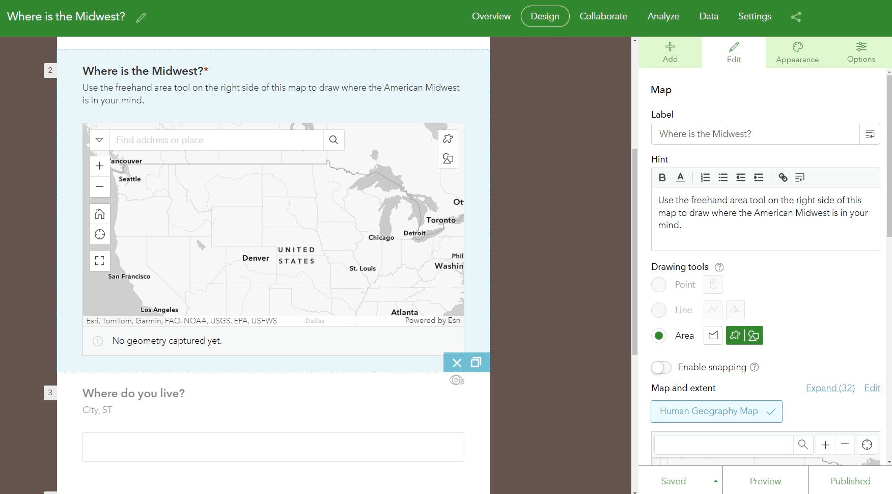
We received as many different polygons as there were respondents: 369.
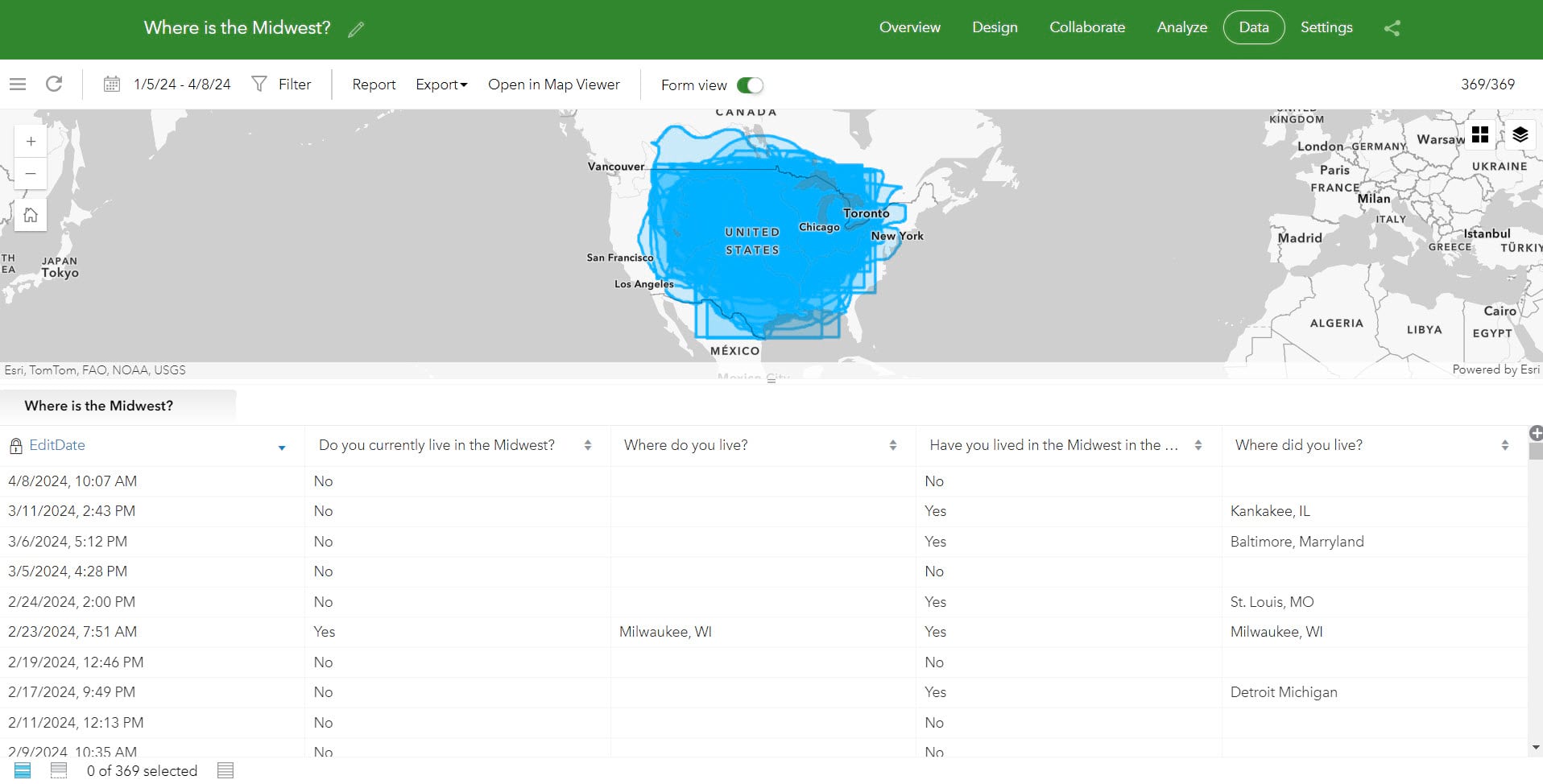
That’s okay, GIS is great at symbolizing, combining, and quantifying all these different polygons.
Visualize
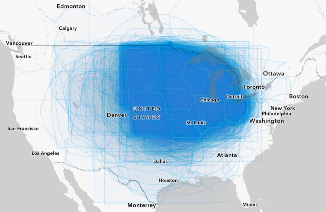
Visualization is often the very first step in analysis. You easily can symbolize your feature layer of responses in ArcGIS Online. The default symbology had thick outlines that were obstructing the patterns in the map. With just a few simple changes – increasing the transparency of the polygons to 99, increasing the transparency of the outlines to 75 – we can make a much more revealing map:
Filter for Further Insights
Up until now, we have only been mapping using the Location (single symbol) drawing style. We can also use attributes gathered from other questions in our survey. For example, we asked, “Do you currently live in the Midwest?” The answers available were: Yes, No, and Unsure. By applying a filter, the map will only display a subset of responses. We can depict different mental maps of the Midwest, depending on whether or not people self-identify as living there.
Combine, Analyze, and Quantify
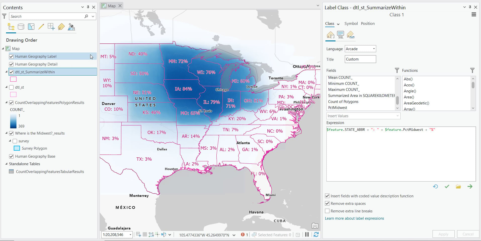
84% of our respondents agree that Iowa is in the Midwest, but only 51% agree that Ohio is. We were able to quantify our data by running geoprocessing tools in ArcGIS Pro.
The first we ran is called Count Overlapping Features. This tool generates a new layer with many many tiny polygons along with the count of the overlapping polygons.
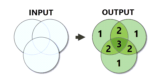
In our case, we had 300,226 individual polygons. The Count_ field on the resulting layer ranges from 1 to 369. We were then able to symbolize the resulting layer on that Count_ attribute, with an unclassed, continuous color ramp ranging from 1 to 369.
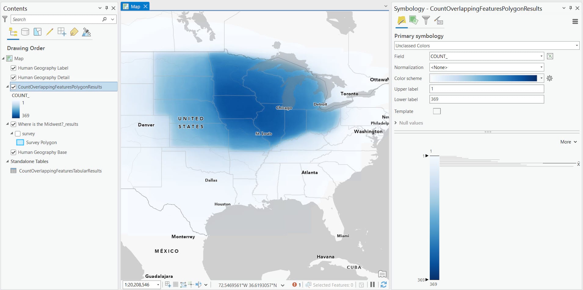
This reveals a clear vertical dividing line between North Dakota, South Dakota, & Nebraska; and Minnesota & Iowa. Iowa is in a very dark blue compared to other states, meaning more people identified Iowa as being in the Midwest relative to others. But how much more, exactly?
In order to get percentages for each state about perceptions of whether or not they are in the Midwest, we added states as layer from ArcGIS Living Atlas. From there, we ran the Summarize Within geoprocessing tool. This generates a new states layer with additional fields containing summary statistics of the Count Overlapping Features results. We chose to run the mean, min, and max, which yielded three additional fields.
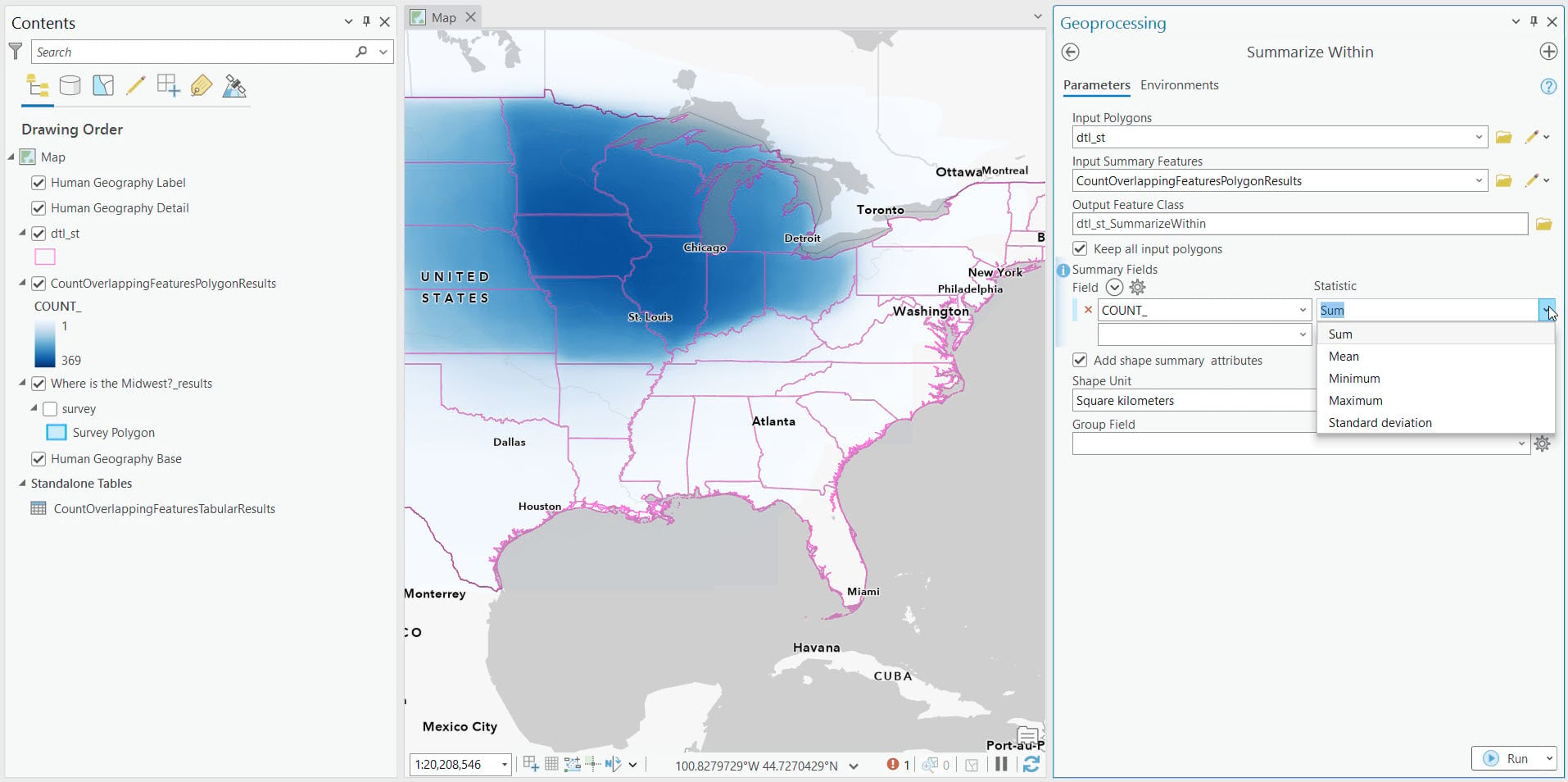
On the newly generated states layer, we added a new field to divide our mean summary statistic by our total (369) and multiply by 100 to make it a percentage. We had the answers to our question for each state. From there, it was easy to configure label properties so that these values would show in the map.
Compare to Other Sources
Is there an official or authoritative source that you want to compare your results to? In our example, we can compare our the aggregate of our respondents’ mental maps of the Midwest to the U.S. Census Bureau’s 4 major regions: West, South, Northeast, and – you guessed it – Midwest. Turns out that Census does consider both Iowa and Ohio to be in the Midwest. Keep in mind that official subdivisions and regions that are set up for administrative purposes, and can vary from popular perceptions. Are people who responded to our survey wrong? Is Census wrong? Not necessarily.
Take this Further
You can imagine doing this for other topics including environmental, economic, housing, linguistic, and more. A hyper-local level example could be a high school: Where do the band students eat lunch? How about the lacrosse team? The theatre kids? Etc. A community level example could be: Where is an intersection in your community where the bicycle-vehicle safety, or the pedestrian-vehicle safety, could be improved? A linguistic example could be: Where are the North Rhine-Westphalia accent and the Bavarian accents regions in Germany?
You can also repeat these steps for multiple regions, and then see how much of an overlapping Venn Diagram there is. For this, we recommend setting up multiple surveys. At the national level, Mississippi might be unambigously in the South, whereas Missouri straddles South and Midwest. Maybe only some parts of states are “in” a region. We’re looking at you, Florida!
Have you done a project like this? Do you plan on doing one soon? Let us know in the comments below. If you are an educator and do something similar with your class, let us know in Esri Community for Educators.



Article Discussion: