Since this post was written, many of the tools mentioned below have been added to the core functionality of ArcGIS Pro. To see an updated list of GTFS-related tools, visit this site.
Public transit (like buses and subways) is a vital service that connects people with their jobs, schools, healthcare, recreation, and more. Consequently, if you’re studying access to healthcare, assessing an economic development project, trying to choose a new site for your business, or performing any other GIS analysis in an urban environment, you can take your analysis a step further by incorporating public transit data.
In a previous post, we introduced the General Transit Feed Specification (GTFS) for public transit data and a set of tools for working with this data in ArcGIS. In this post, we’ll talk about each tool individually and give some examples of analyses you can do.
Visualize your transit data in a map
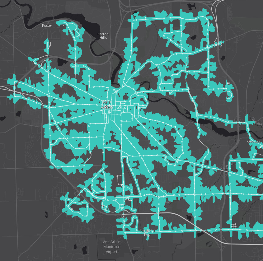
The Display GTFS in ArcGIS toolbox is the first step to working with your GTFS data in ArcGIS. The tool creates feature classes of your transit stops and routes which you can use in your map or as inputs for other tools. For example, you can take your stops and calculate quarter-mile walk distance polygons around them using the Network Analyst Service Area tool. This type of proximity analysis can help you determine the overall coverage of your transit system, and you could even add demographic data to this coverage area using the Enrich Layer tool.
Calculate level of service
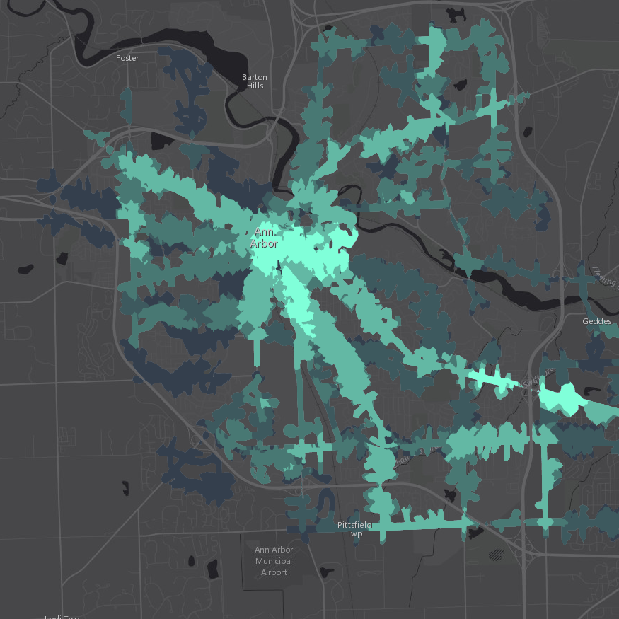
Not everyone with access to a transit stop enjoys the same level of service, so it’s important to know not only how close the bus stop or train station is but also how often a bus or train stops there. Someone who lives next to a stop where the bus comes once an hour probably isn’t as well served by transit as someone who lives next to a stop where the bus comes every 10 minutes.
Calculate the frequency of transit service available to each stop, area of town, or specific point of interest using the BetterBusBuffers toolbox. You can combine the calculated average headway or number of trips available per hour with demographic data to understand who is served by public transit, who is well served, and who is not served by transit at all. In the map below, the well-served areas of Ann Arbor light up in pale green based on frequency of service.
Learn how well your transit system serves its community
Want to identify the role of public transit in food accessibility, or calculate job accessibility in different neighborhoods? Want to figure out which of your employees to target for ridesharing incentives? Want to find the best location to open a new public health clinic so your target population can easily reach it?
Unleash the full power of ArcGIS Network Analyst to answer these questions and more with the help of the Add GTFS to a Network Dataset toolbox. This toolbox allows you to build a network dataset combining your street data and your GTFS public transit data.
Edit or update the geographic portion of your GTFS data
If you want to improve your GTFS dataset, we have some tools to help you with that, too. Update the latitude and longitude of your stops.txt file with Edit GTFS Stop Locations, or create a shapes.txt file with Generate GTFS Shapes. Use Interpolate Blank Stop Times to estimate missing arrival_time and departure_time values in your stop_times.txt file.
In future blog posts, we’ll go more in depth with each of these tools to talk about tips, tricks, and best practices. For now, happy mapping!

Article Discussion: