We are happy to announce the all new ArcGIS Maps for Office 4.0. With this release we’re making it even easier to see patterns in your Excel spreadsheet data, understand what they mean, and make better decisions as a result. Head over to our shiny new website to download it.
We’ve got lots of great updates and enhancements for you, including support for Office 2016 and all of this:
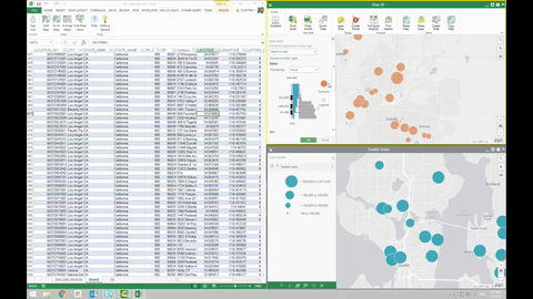
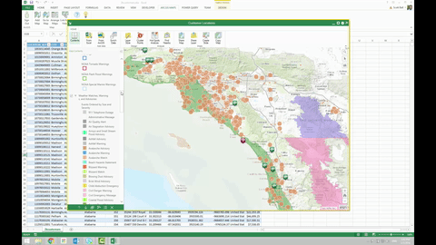
Use Smart Mapping to quickly create beautiful maps
Whether you’re an expert at working with maps or just getting started, it’s never been easier to create visually stunning maps that tell the stories you want to tell. ArcGIS Maps for Office analyzes the data in your spreadsheet and suggests the best ways to show it on a map. Choose a style and instantly create a map, or customize the styling options to suit your story. Smart mapping also provides the much-requested ability to manually set class breaks for your layers.
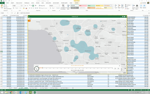
Find patterns in your locations over time with time-based animations
If your data contains temporal values, you can add time-aware layers to a map in Excel and run an animation that shows how patterns in the data change over time. This feature also supports time-enabled layers on the ArcGIS platform, allowing you to compare time-based patterns in your data with similar patterns from within your organization or from authoritative sources such as the US National Oceanic and Atmospheric Administration (NOAA).
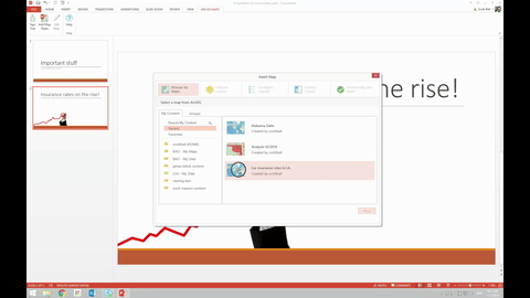
Communicate your work more effectively with an all-new experience in PowerPoint
ArcGIS Maps for Office provides a fully updated experience for enhancing your PowerPoint presentations with interactive, dynamic maps by making it simpler and quicker to search for content. Add maps directly to PowerPoint using content from your ArcGIS organization, or edit existing map slides. Insert the map into a slide and position it as desired—on its own or combined with other standard PowerPoint features such as charts, images, and text. In Slide Show mode, you can zoom and pan across the map and select features to display detailed information, allowing you to quickly answer questions that come up during your presentation.
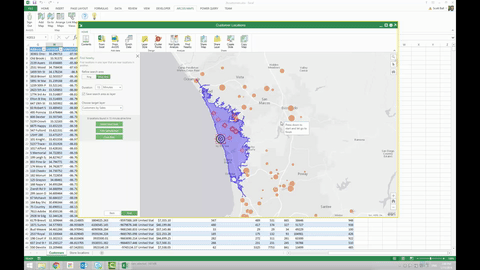
Focus on the rows that are important by using map-based filtering
You’ve been able to filter spreadsheets by cell value for a long time. Now, ArcGIS Maps for Office lets you filter your spreadsheet by selecting items on the map, allowing you to focus directly on the features you’re working with right now. Filter the spreadsheet to display only selected features, then use standard Excel functions to work with the data that you need.
Keep your map up-to-date with refresh intervals
Static layers added from ArcGIS help you visualize immobile objects such as buildings, roads, or boundaries. Now, ArcGIS Maps for Office lets you keep track of things that move, change, or evolve—like storms, vehicles, or field work status. The Refresh Interval feature lets you specify how often a layer added from ArcGIS Online or Portal is polled for updates. When conditions change in the field, you’ll see it in your maps.
We want to hear from you!
Your feedback is what helps us take Maps for Office to the next level. Many of the new features you see in 4.0 are direct results of getting input from the awesome people that use our add-in. There are lots of ways to get in touch and stay up to date with Maps for Office:
- Visit our new GeoNet group to keep up to date with Maps for Office. It’s where we’ll post early access and beta program opportunities, among other things.
- Follow us on Twitter (@mapsforoffice) where we plan to share sneak peeks of new features we’re working on, interesting use cases, and stuff we find relevant to our community of spreadsheet junkies.
- Share your ideas for new features (and vote for existing ideas) you want to see in Maps for Office at the Ideas site.
- Learn what you can do with Maps for Office at the Help site.

Article Discussion: