GIS for Science volume 2 is a wonderful collection of examples of geospatial technology being used by scientists, historians, and engineers, to reveal structure in their data and help them ask better, more specific, questions in their pursuit of understanding.
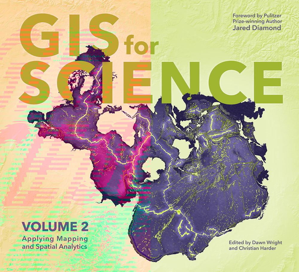
In planning a cover design for this book we wondered what…on earth…sort of graphic do we choose to wrap a collection of beautiful narratives showcasing the wonders of understanding our world? Sort of a tall order.
Additionally, we wanted it to fit within the thematic, and design, family of the GIS for Science series and appear neighborly beside the volume 1 cover (which featured the beautiful glacier cartography of Daniel Coe).
Assembling the Data
So what should be the subject and how should it look? We tried out a truckload of different marine layers (a target-rich adventure, given the depths of Living Atlas oceanic content) and settled on seafloor geomorphology.
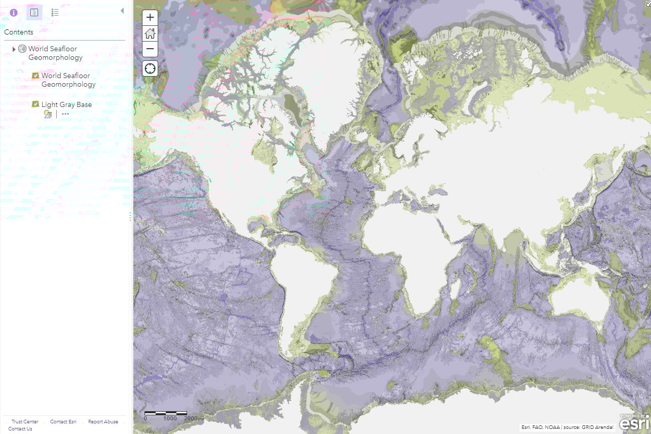
You can download a version of undersea geomorphology similar to what we’ve used, in a great big delicious 400MB chomp here, from the wonderful folks at Blue Habitats. By the way, if you are curious about this data for your own maps, you can quickly explore an image service available in Living Atlas. Geology maps are their own form of art; if you are a rock hound then you probably already know about the fascinating life and work of William Smith, and if not get ready to live (thirsty for more? Check out the first ever geology map here).
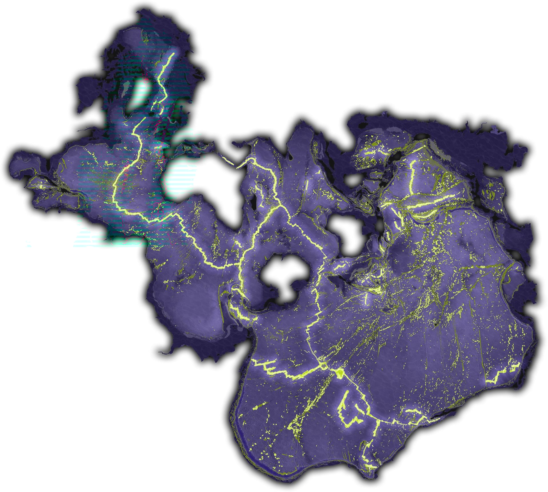
To provide full coverage of the seafloor, we added the achingly beautiful GEBCO bathymetry (which is constantly improving in coverage and precision).
These geologic and bathymetric layers were given a cool dark color scheme, inspired by those stunning rolling globe animations (by Greyson Harris) that bowled over us in the 2018 Esri User Conference plenary.
Spilhaus
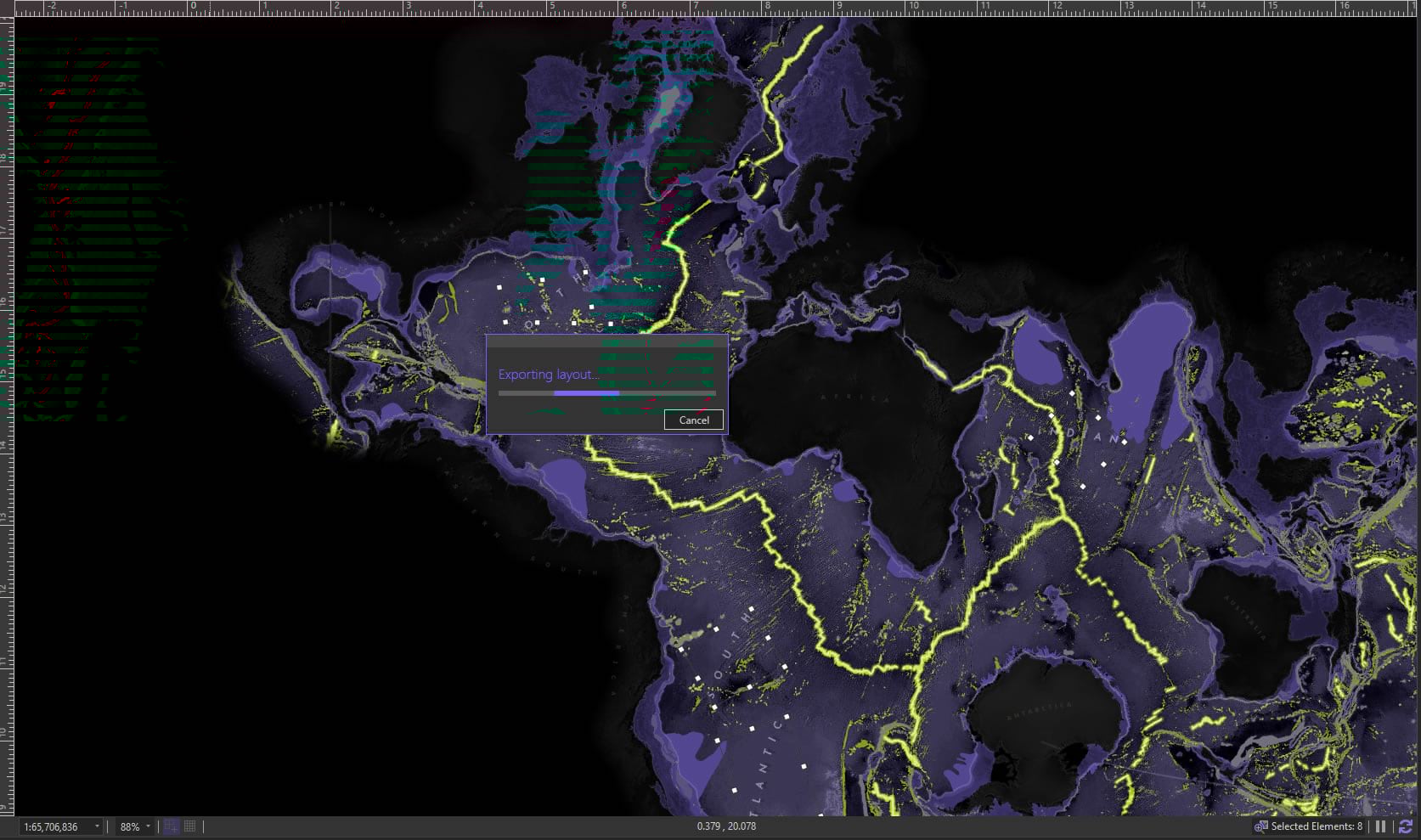
We determined early on that it would be interesting to include the Spilhaus map, which shows the planet’s oceans as a single body of water. The story of the Spilhaus map is also a section within the volume, so it had a content-tie as did the glacial lidar theme of volume 1’s cover.
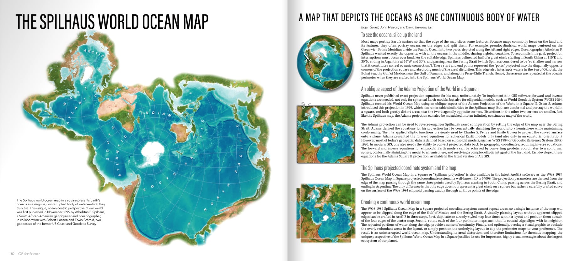
Over the past year or so the Spilhaus world ocean map has been made available to map makers to showcase the unified an continuous nature of our world’s oceans. Scientists are using it to communicate small-scale (which is big!) oceanic phenomena in a manner that attracts attention and challenges our notions of a isolated aquatic systems. Which is to say Spilhaus maps are cool and destined for book covers!
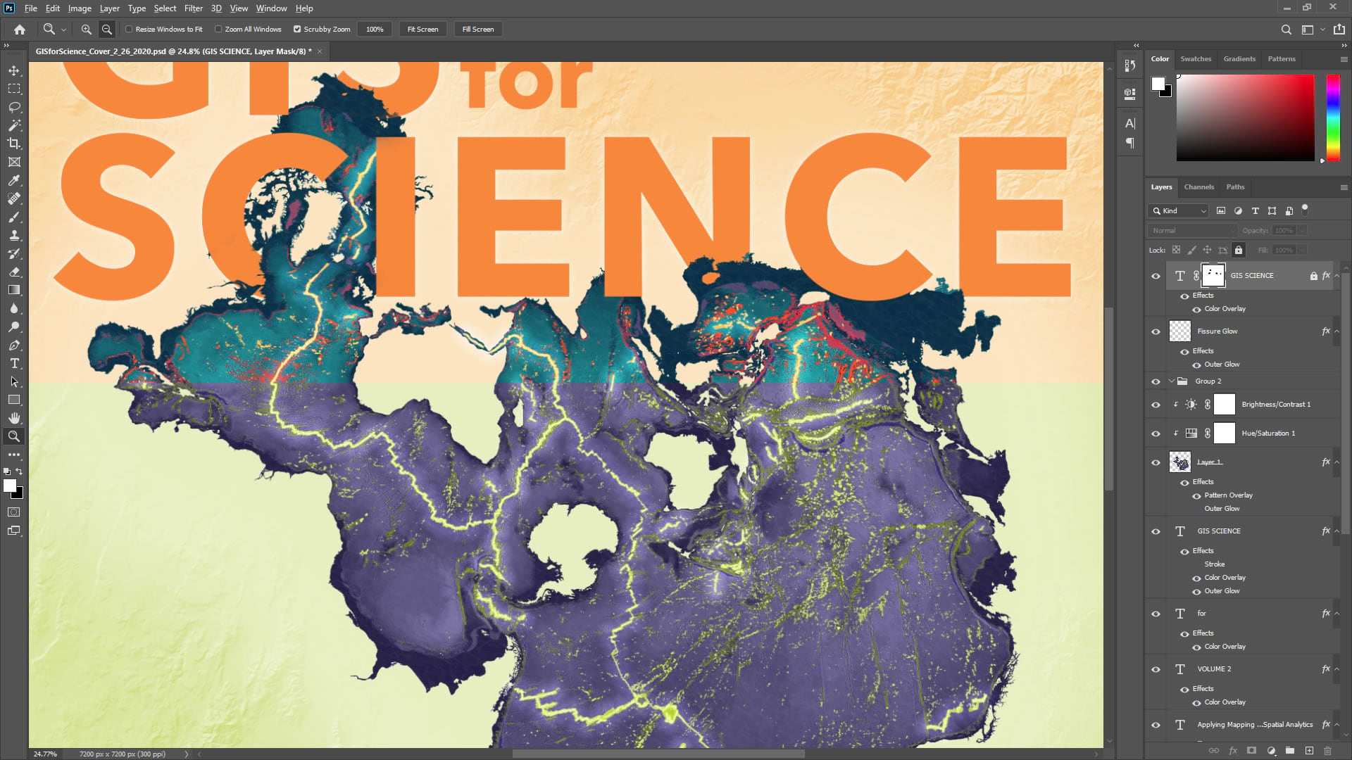
Using the ArcGIS Pro Spilhaus project package, these layers were added to the pre-configured layout and exported as an Adobe Illustrator-compatible file using the ArcGIS Maps for Adobe Creative Cloud (deep breath) plugin. The result is a file that can be opened in Illustrator and retains layer names and configuration. A glorious bridging of the GIS and Illustration workflows. If you’ve ever opened an SVG or PDF export in Illustrator you’ll appreciate this level of fidelity that the Maps for Adobe format affords. From there it can be sent into a cover template in PhotoShop as an embedded smart object, if that’s your thing.
This way the team could iterate on both the map and the layout elements without lots of re-assembly. Speaking of iterating…
Iterative Collaboration
I got the opportunity to collaborate closely with bookmaking aficionado Christian Harder and science-slinging Dawn Wright on this cover. It’s always a joy. If I may, one of my very favorite parts of working here at Esri is the just outright bonkers-cool collaboration that happens almost daily. It’s such a wonderful group of folks doing cool things and kicking around fun ideas. Anyway we tossed around a bunch of ideas early on but settled on the Spilhaus theme pretty quickly. We iterated frequently and rapidly and the look of the map, and the context of the overall cover, take shape rather quickly.
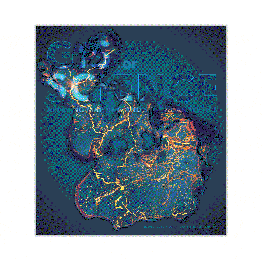
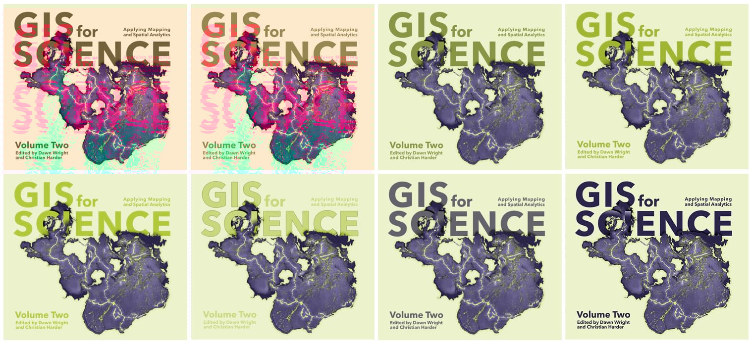
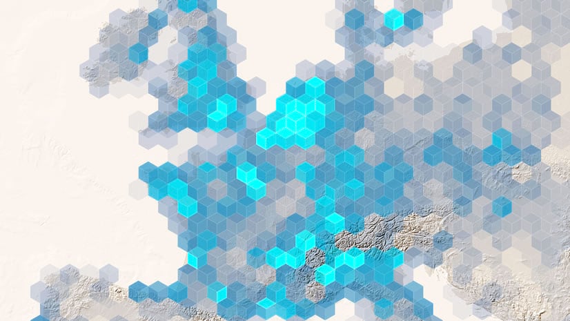
Once we had the big pieces in place, we created a set of color themes plucked from the map and floated them to stakeholders. Here’s an example of a raft of options floated in one of those feedback loops.
One point of feedback was that it would be nice to have some texture in the non-map portions of the map. We played with some ideas for a terrestrially-themed texture for the cover and settled on a subtle hillshade. This hillshade was created in ArcGIS Pro based on a NASA SRTM elevation model of the Prescott Arizona area. Here’s a one-minute video showing you how to style up a hillshade like that.
If you’ve read GIS for Science vol 1 and enjoyed it, then I think you’ll really find some inspiration and joy in volume 2. If you haven’t seen either then what’s stopping you! There’s also a website jam packed with resources to totally engage in the map adventure. It’s amazing the sorts of stories that maps can tell and the thoughtful and hard work being done by their makers.
Love, John

Article Discussion: