Charts (beta) have been added to Map Viewer!
Visualizations are how we interact with and make sense of our data. We all understand the importance of visualizing our data in geographic space, but there is great value in visualizing our data in ‘data space’ as well.
Charts in Map Viewer provide extra insights into our data, allowing us to quickly make comparisons, visualize distributions, and uncover relationships.
The Map Viewer Charts beta release includes three chart types to get us started exploring our data: bar charts, histograms, and scatter plots.
The versatile bar chart allows us to measure the frequency of categories in our dataset, aggregate and compare numeric values by category, and even display part-to-whole relationships.

Histograms are an invaluable tool for data exploration. They display the distribution of a numeric variable, showing us the shape and frequency of values in our data. Histograms also include a table of descriptive statistics summarizing the numeric variable.


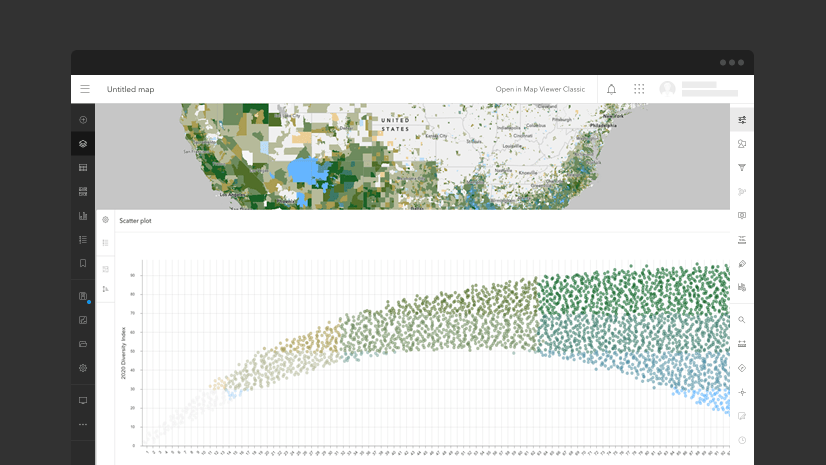
Scatter plots are a great way to visualize bivariate relationships. Relationships between numeric variables can be revealed by plotting two numeric variables in the same plot. Linear relationships can be quantified by adding a trendline that calculates the R-squared, measuring the strength of the relationship. Since each point in a scatter plot corresponds to one feature on the map, the scatter plot will match the map colors by default, allowing a third dimension to be added to the chart.

Charts are created from feature layers or tables, and are linked to their parent layer, allowing for interactive exploration. Selecting features in a chart will highlight the corresponding features in the map and in other charts created from the same layer.
Additionally, our visualizations should be as beautiful as they are informative, so we can format the look of our charts, customizing fonts, line types, and colors.
Charts authored in Map Viewer can be saved and shared with the web map, and discovered through the chart list. Layers published from ArcGIS Pro with any of the three supported chart types will be available in Map Viewer with the published layer.
We’re excited to release this beta functionality and have big plans for enhancing charts in Map Viewer in future releases, including new chart types and the ability to embed charts in web applications. Stay tuned!


Article Discussion: