Mapping mangrove dynamics is critical for understanding the health and resilience of these unique ecosystems. Mangroves provide invaluable ecosystem services such as carbon sequestration, coastal protection from storm surges, and habitat for diverse species. Monitoring changes in mangrove extent whether it’s loss, gain, or no change supports effective conservation planning, assess the impact of human activities and climate change, and prioritize restoration efforts.
This blog will guide you through the process of using Image collection explorer in combination with a Raster function template to analyze mangrove dynamics available in Living Atlas. The detailed workflow for selecting imagery through the Image collection explorer is covered in another blog here.
Requirements
To complete this tutorial, you will need to have an ArcGIS Online account to add the imagery layer to a web map and you will need to have a Professional, or Professional Plus user type, which you will need to perform raster analysis.
Study area
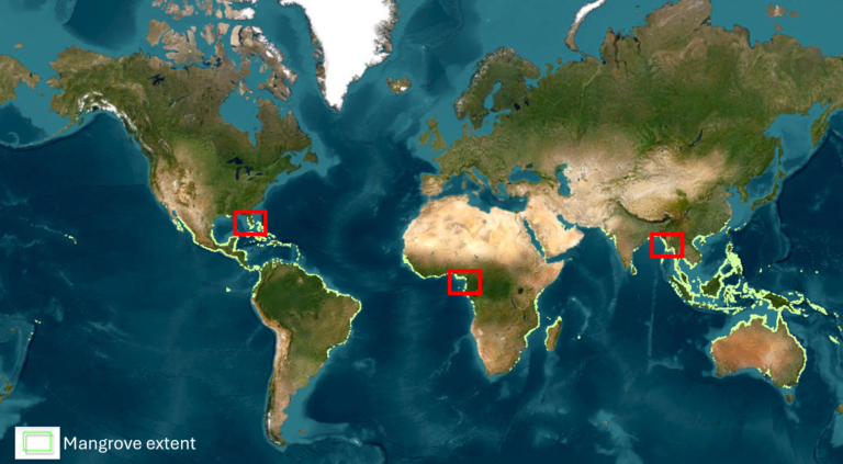
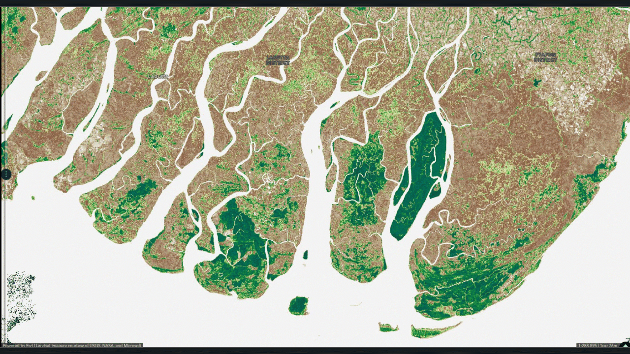
Mangroves can be found along tropical and subtropical coastlines, are rapidly declining due to agriculture, urbanization, and aquaculture. This study maps mangrove dynamics from 2014 to 2024 across key regions, including Myanmar’s Ayeyarwady Delta also called the Irrawaddy Delta, some parts of the West African coastline, and Florida’s coastal areas. While significant losses have been recorded, several regions show natural regeneration and successful community led restoration. These patterns reveal both the persistent threats and the promising potential for recovery through sustained conservation efforts.
Is a decade long enough to detect meaningful changes?
A decade may seem brief, but mangroves are highly dynamic ecosystems. Over 10 years, significant changes can occur, especially in areas under pressure from deforestation, aquaculture, and sea-level rise. Advances in remote sensing and high-resolution satellite imagery allow even subtle changes to be detected over such a period. Therefore, while it might be a relatively short span, it is sufficient to observe meaningful patterns of loss and gain in mangrove extents.
Which satellite sensors are compatible
This RFT is compatible with various satellite sensors that capture key spectral bands for analysis. Commonly used imagery layers include Sentinel-2 Level-2A and Landsat Level-2 which is accessible through the Living Atlas. This sensors provide red and near-infrared bands for medium resolution analysis.
A group of Living Atlas imagery layers allow processing at large scale, it requires ArcGIS Online organization administrators to enable this capability. For more details please refer to this help documentation: Raster analysis with ArcGIS Living Atlas imagery.
Mapping mangrove dynamics using raster function template
The process of preparing the layer from the Living Atlas and working with the Raster Function Template has been thoroughly explained in the RFT description and is covered in detail in a separate blog.
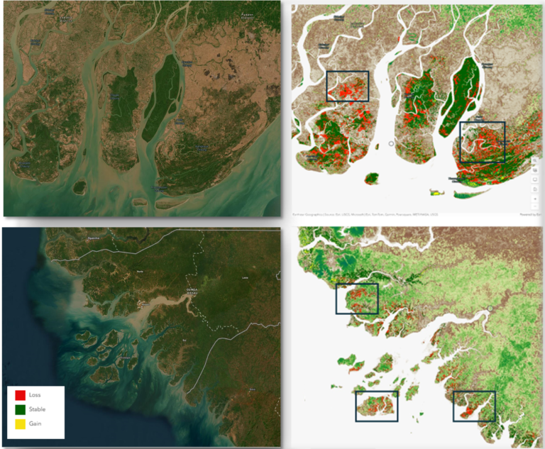
Once you open the raster function template you can see various raster functions has been used to map the mangrove areas. Here, we have used two time period images from 2014 (T1) and 2024 (T2). First, we have rasterized the mangrove extent using Rasterize features function and then applied the Clip function to isolate only the mangrove regions, which effectively excludes other vegetation types including small shrubs and other trees.
Next, we have calculated Normalized Difference Vegetation Index (NDVI) for both images using Band Arithmetic function. A threshold is then applied to each NDVI output to create a binary image which filters out low density vegetation. This helps minimize background noise and allows us to focus on the denser mangrove areas.
With binary layers prepared for both T1 and T2, Compute Change function is used to perform change detection which generates a difference layer that highlights the variations between the two time periods. Finally, the Attribute Table function was used to highlight the classes generating clear, interpretable maps of mangrove change over time.
Conclusion
This blog demonstrates how mangrove dynamics can be effectively mapped over time using readily available satellite data and raster functions. We hope this blog has helped you better understand the raster analysis workflow and shown how accessible and straightforward it can be to use readily available data for meaningful analysis.
The Product Team is interested in your thoughts and ideas. Influence the direction of future releases when you visit us and leave a comment via the Imagery in ArcGIS Online community on Esri Community.


Article Discussion: