In the November 2022 release of ArcGIS Online, a new Arcade editor was introduced to the platform. This editor provided a variety of improvements to help users author their expressions quickly and efficiently. For an overview of all these changes, check out our previous blogs here and here.
Since then, we’ve been busy exploring ways we can continue to enhance the experience of users leveraging Arcade in their work.
We’re excited to announce that with the June 2023 release of ArcGIS Online, a new accessible color palette for syntax highlighting will be coming to the editor in MapViewer!
Color in code
Using color to provide context is a common practice in design, and syntax highlighting is no exception. Syntax highlighting, otherwise known as code colorization, is a method used to help quickly differentiate elements within a script. It can help authors troubleshoot issues in their script while simultaneously improving code readability.
Color vision deficiencies
A color vision deficiency – colloquially referred to as colorblindness – is an inability for an individual to distinguish certain shades or colors. The type and severity of color vision deficiency can vary greatly between individuals. For a brief overview of the various types of color vision deficiencies, you can refer to the table below.
| Color vision deficiency | Description | Example |
| None | N/A |  |
| Deuteranomaly | Difficulty seeing green |  |
| Deuteranopia | Unable to perceive green |  |
| Protanomaly | Difficulty seeing red |  |
| Protanopia | Unable to perceive red |  |
| Tritanomaly | Difficulty seeing blue and yellow |  |
| Tritanopia | Unable to perceive blue and yellow |  |
Accessibility in ArcGIS Online
Accessibility is the practice of developing and producing content that is useable for all individuals, regardless of their physical or cognitive capabilities. Esri is committed to ensuring our products are accessible, and ArcGIS Online is no exception.
To achieve this objective, we leverage the Web Content Accessibility Guidelines (WCAG 2.0), an internationally recognized set of standards used for developing accessible web content and software.
The new color palette used to highlight syntax in the Arcade editor was designed to be compliant with WCAG 2.0 special criterion 1.4.3.
Special criterion 1.4.3 specifies that the contrast between foreground and background elements must be at least 4.5:1. This ensures that text is still legible for individuals with moderately low vision or other color vision deficiencies.
A brief history of color and Arcade
If you’ve used the Arcade editor before, you’ll know that syntax highlighting isn’t new. All versions of the editor have leveraged color to varying degrees to differentiate syntax elements. In the initial release of the editor, minimal highlighting was used to signify text and numbers.

Within the new editor, these colors were expanded to include other syntax elements like keywords and comments.
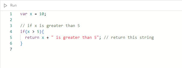
While this was a huge enhancement from before, there was some overlap in the colors used for different elements, and therefore, room for improvement. The editor’s new color palette has been designed to fulfill two objectives:
- Better differentiate syntax elements within the arcade expression
- Ensure contrast is compliant with WCAG 2.0 1.4.3 standards, both for individuals with typical color vision and with other color vision deficiencies
Out with the old, in with the new (colors)!
If you’ve already seen the new syntax colors, you might have noticed there are some similarities between the old and new color palettes. While the hue and saturation of many of the element colors has changed, we’ve tried to maintain consistency where possible. For example, text is still red, and numbers are still green.
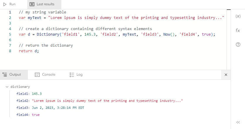
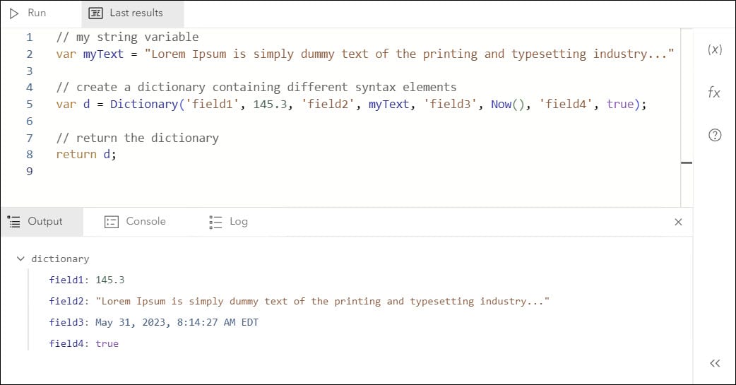
The new colors and the respective elements they’re assigned to in the editor are listed below:
- Comments are grey
- Boolean literals and nulls are purple
- Text is red
- Numbers are green
- Dates are light blue
- Functions, constants, and variables are dark blue
- Keywords are orange
Right now, you’ll be able to see these new colors in use anywhere in MapViewer that leverages the Arcade editor (Styles, Labels, Pop-ups, and Forms).
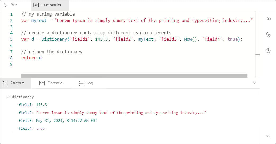
Ensuring that color isn’t the only way information is conveyed is an important tenet of accessible web design. The color palette we’ve implemented for highlighting syntax in the editor has been tested to ensure it meets WCAG 2.0 contrast standards for all types of color vision deficiencies, both more and less common.
While syntax color certainly isn’t the sole method of conveying context in the editor, we want to ensure that the contrast of text is sufficient for all individuals working with arcade expressions in ArcGIS Online.
Conclusion
If you haven’t already had the chance, try out our new syntax colors! Aside from MapViewer, they’re also available in the ArcGIS Arcade playground here.
In the future, we’re also hoping to leverage these syntax colors in other areas where Arcade is used in ArcGIS Online so check back for future announcements.
Finally, keep your eyes peeled for a WCAG 2.0 compliant color palette for a dark version of the editor coming soon.


Commenting is not enabled for this article.