We want to introduce you to Smart Mapping, an exciting new capability built into the March 2015 update to ArcGIS Online and to the ArcGIS 10.3.1 release of Portal for ArcGIS (included with ArcGIS for Server). Smart mapping is designed to give people confidence and power to quickly make maps that are visually stunning and useful. This makes it easier than ever for you to create attractive maps, maps that tell important stories. Here’s more about what we added and what you can expect when you try smart mapping.
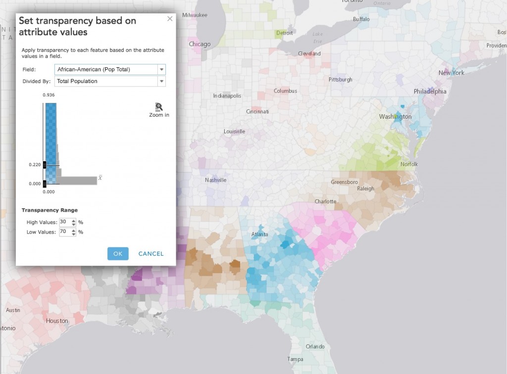
We added new ways to symbolize your data, ‘smart’ defaults, and data-driven workflows to the ArcGIS Online and the Portal for ArcGIS map viewer. Continuous color ramps and proportional symbols, improved categorical mapping, heat maps, and new ways to use transparency effects to show additional details about your data are all now delivered via a streamlined and updated user interface.
But smart mapping is more than just new kinds of maps (as exciting as those are!). To power this experience, we’ve articulated and then programmed in deep cartographic first principles that become a set of interconnected ‘smart’ defaults that create data-driven workflows.
Unlike ‘dumb’ software defaults that are the same every time, with smart defaults we now offer the right choices at the right time. When we see your data in the map viewer, we analyze it very quickly in a variety of ways so that the choices you see in front of you are driven by the nature of your data, the kind of map you want to create, and the kind of story you want to tell (e.g., I want to show places that are above and below the national average).

Our goal is to take the guesswork out of the hundreds of settings and choices so your maps are both cartographically appropriate and look wonderful. Even if you don’t have a degree in cartography or GIS, you’ll still succeed. That means you can work much faster because you spend less time iterating and wrangling your maps into something great.

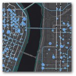
Critically, we’re not taking control away from map authors or dumbing down the map authoring experience, we’re just being smarter about how we set all of the initial parameters of the map (color, scale, styling, etc.). For example, for each of the Esri basemaps (e.g., Streets, Dark Grey Canvas, Topographic) we have created professional, multi-hue color schemes that can be used as the defaults so that you know your map will look great right out of the box without needing any adjustments. Mapping pros still have full control, we’re simply moving beyond defaults that provide the wrong choices for your data and story.

Where do I find Smart Mapping?
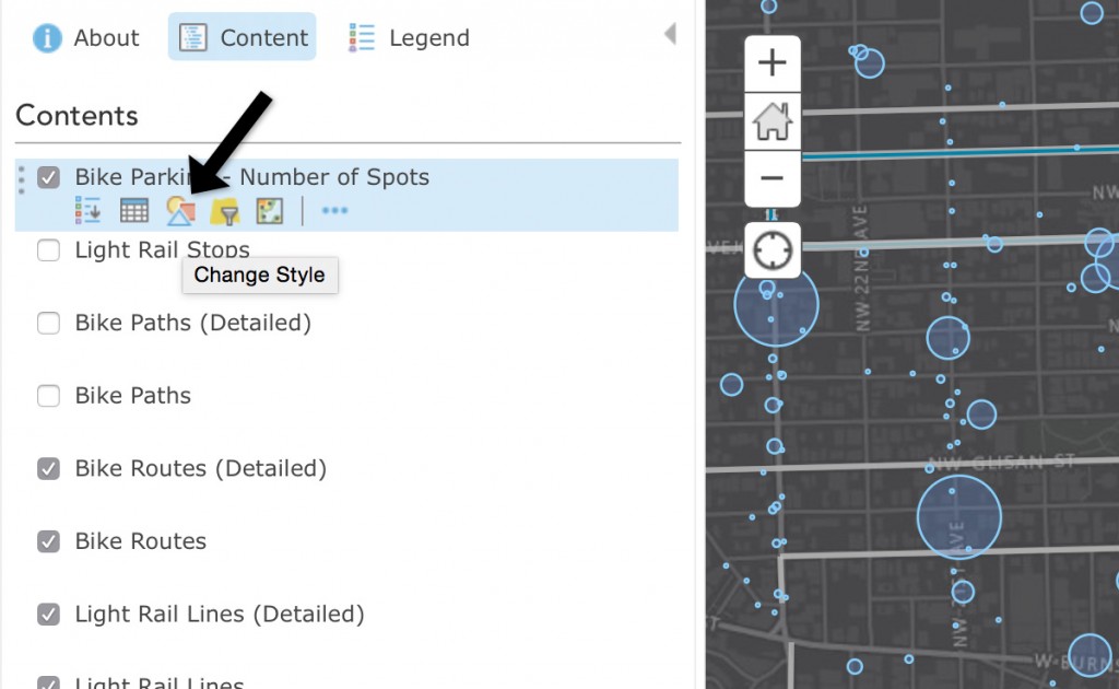
Within the map viewer, you can use smart mapping two ways: (1) if making a new map from a CSV, TXT, of GPX file just drag it into the viewer, or (2) find Change Style in the layer context menu.
- When you add feature layers that don’t have any styling, such as CSV or SHP files, the map viewer analyzes your data and presents layer styling options in a new Change Style pane.
- When you add features layers you’ve already styled, the map viewer respects the styling, though you can change this map styling at any time and tap into the new smart mapping workflow. Look for Change Style in the layer menu icons.
- You can create heat maps now when mapping the location of point features! Heat maps use colored areas to represent the density of point features. The colors are most intense where the most points are concentrated together.
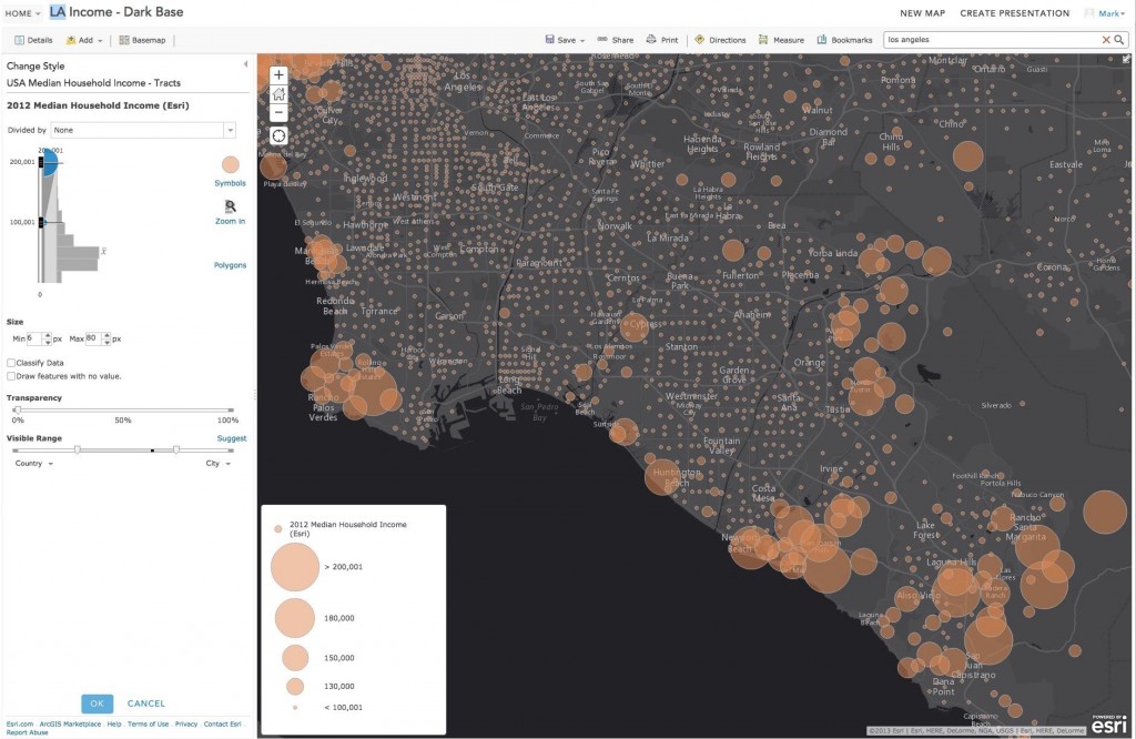
- You can use continuous colors and continuous size, bypassing the complicated step of having to group or classify your data.
- You can now set the visible range with intuitive sliders when styling your layer. You can also have the map viewer calculate and set the optimal visible range.
We have a series of blog posts planned that will dive deeper into each of the exciting new enhancements around smart mapping. Although it has made its first appearance in the March release, smart mapping isn’t a one-shot effort; it’s a new philosophy and approach that will infuse our work. Stay tuned for more. We’ve just begun.

Commenting is not enabled for this article.