Symbology by size is a common way to show quantitative data.
What is meant by symbolizing by size?
Simply that the symbols on the map are sized according to an attribute’s values.
When is it appropriate to symbolize by size?
When displaying a count or amount, using size is actually a more appropriate symbology choice than using color to fill polygons.
How to symbolize by size?
This blog article will walk you through an example that offers some guidance, and explores some different options when symbolizing by size. Next time you need to make a map of a count or amount, you’ll be well-equipped to make that map!
Step 1. Go to this Vacant Housing Units web map.
Step 2. Sign in to your ArcGIS Online account (or sign up for a trial).
Step 3. If you are presented with a splash screen about Map Viewer, click OK.
Step 4. If the Layers pane is not expanded, click the Layers button in the left side panel.
This opens a multi-scale web map that contains states, counties, and census tracts. This map uses the American Community Survey (ACS) Housing Units Occupancy Variables layer from ArcGIS Living Atlas. Zoom in and out to see how each geography level turns on or off, depending on the map’s extent. Notice the attribute being mapped – vacant housing units – is a count (integer), making size an appropriate symbology choice. Each layer (state, county, and tract) is currently using the default sizes suggested for this data. The next sections will go over different ways to fine-tune this symbology.

First we’ll start with counties. If necessary, zoom in or out so that the counties layer is the only one turned on.
Let the histogram help you make cutoff choices
Step 1: Open the Layers pane. Click on the County layer in the left side panel to activate the Properties panel on the right side.
Step 2: Close the Layers pane on the left side.
Step 3: Click on the Styles button -> Counts and Amounts (Size) to open the Style options.
, which shows a histogram of values.")
ArcGIS Online starts you off with displaying the full range of your data. In this case, the minimum count of vacant housing units was 37, and the maximum was 225,324. This means that one county has only 37 vacant housing units, whereas another has 225,324, and all other counties fall in between this range. We can also see that the average count of vacant housing units at the county level is 4,826, denoted by the x-bar in the histogram. Counties vary in size quite significantly, so this average is not very informative without a denominator, such as total housing units.
Note: This layer is updated every year with the latest data, so exact values may vary.
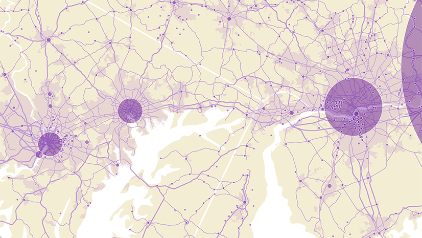
The histogram shows gray bars, which represent the spread of the data. They are all near the minimum value and the average value, but no gray bars near the maximum value. This tells us that the county with the maximum value is a far higher value than those of the rest of the counties. When this happens, that symbol on the map that is much bigger than the others, making the others very small in comparison.
The variation in size in the map is continuous, meaning that the symbols for some counties are ever so slightly bigger than symbols for others based on the value of vacant housing units. For example, look at the counties along the coastlines of Alabama, Florida, and Georgia. We will allow more of the differences near the average to come to life on our map by allowing more counties to get the maximum-sized symbol. We’ll drag the handle that controls the top value down to a lower number.
Step 4. Slide the top handle down to near 100,000. Watch the map instantly respond.
Step 5. Click on the value next to the top handle (e.g., 96,629) and type in 100,000 explicitly.

We have now allowed any county in our data that has 100,000 or more vacant housing units to get the largest sized symbol. Any counties in between the range of 37 to 100,000 will be sized appropriately within that range. Notice the change in size of symbols depicting cities such as Indianapolis, Cincinnati, Louisville, Columbus, Cleveland, and Pittsburgh. The effect here is more variation in the symbols, since the maximum value is no longer dominating the size ramp. This is often an iterative process, where trying a few different values can help you choose the most effective one for your map.
We can also use this same technique if the minimum were far and away lower than the bulk of the values. Simply move up the lower handle, and see the symbols respond accordingly.
Smooth out the legend based on the histogram
Our top value on our legend is 100,000, but our bottom one is still 37. Let’s make our legend look slightly nicer by choosing a rounder number for the smallest size. We want to choose a number that is close to the minimum value so that we still get the full variation in our data (especially if there are multiple features with counts close to this value), but makes our legend look a little cleaner. Appropriate choices here could be 40, 50, or even 100.
Step 1. Click on the lower handle, and type in 50.

Step 2. Click Done, Done.
Step 3. Save the map as Vacant Housing Units – (Your Initials).
Step 4. Your turn! Use this same process for the state and tract layers. Decide if you should adjust the maximum value, the minimum value, or both.
To classify or not to classify
By default, ArcGIS Online will suggest a continuous (unclassed) size ramp. In the map you just made, the circles change size gradually from smallest to largest. The data is allowed to “breathe.”
You can instead classify your data. This means dividing the distribution of values into a small amount of bins, so that there are only a few sizes of symbols that are easy to tell apart on the map – think small, medium, large, and very large. Variation within classes is not displayed. Sometimes your map’s message and audience demand a more simplistic map.
Step 1. Open the Style options pane for the County layer.
Step 2. Scroll down, and enable the Classify data option.

You will then have a series of choices to make to define your classes: the size range (which starts at 4 to 40, but may vary), the classification method (which starts at equal interval), the number of classes (which starts at 4), and the amount of precision you want in rounding (which prompts you to select an option).
If you choose to classify your data, ask yourself, “What benefit does this give me?” and “Does this help someone interpreting this map?” Is it because there is some hard cutoff for funding or for policies that makes sense for your topic? For instance, if you are mapping employers, and there is a policy in your state such that employers with 50 or more employees are required to adhere to a particular rule, and then employers with 500 or more employees are required to adhere to another rule. This would be a case where one size for all values from 1 to 49, a larger size for values 50 to 499, and larger size yet again for values 500+ might make sense.
Let’s try classifying our data on vacant housing units and see how it goes.
Step 3. Change the number of classes to 3.
Step 4. Change the size range to min: 6, max: 40.
Step 5. Change the rounding option to 10,000

You may have noticed that this changed the classification method to manual breaks. For more information on classification methods (natural breaks, equal interval, standard deviation, quantile, and manual breaks), see the official help doc.
Most of the counties fall in the first class, depicted by the small symbol. Similar to the method we did previously, we will use the histogram to change the break points.
Step 6. Change the lower handle to 10,000. See some of the less populous counties have moved up a size in the map.

It’s important to experiment with different options and methods. From this experimentation, we learned that an unclassed size ramp better communicates the data for this particular map.
Step 7. Click Cancel at the bottom of this pane to return to your saved (unclassed) map.
Change the symbol itself
An orange circle is the default symbol, but there are so many more options to help you make the best map possible for your purposes. Next, we will change the orange circle to some other types of symbols.
Step 1. If necessary, zoom to an extent that makes the county layer visible. Click on the County layer in the left panel, and then on the Styles button -> Counts and Amounts (size) button on the right panel.
Step 2. Click the edit option below Symbol style to see more symbol options appear.

Step 3. Select the diamond shape in the Basic Point options. Select a dark green color in the Fill Color options, or type in a hex code (#2D9A8C works).

Step 4. (Optional) Change the Hex or RGB value for your school’s color, or your organization’s branding color.
Finishing touches: adjusting the outlines and transparency
You may notice areas where the symbols are overlapping others. You also may notice the county boundaries are visible. Adjusting the outline and transparency settings are little touches that can make a big difference in your map.
Step 1. With the Symbol style pane open, adjust the Fill transparency slider. Slide the slider, or type in 30 to increase the fill transparency from 0 to 30.
Step 2. Now adjust the Outline transparency slider. Slide the slider, use the arrows, or type in to decrease the outline transparency from 75 to 50.

Notice the areas with overlapping symbols are now a bit more clear.
Lastly, we will make the county outlines a bit more subtle.
Note: We are working with a polygon layer, so the boundaries still display even when symbolizing by size. If you are working with points layers, you will not see this.
Step 6. Click the edit button under Background symbol style below the histogram to change the polygons’ style.
Step 7. With the Background symbol style pane open, Adjust the Outline color and select the same green as was used above.
Step 8. Increase the Outline transparency to 85. Notice the county outlines are now much more subtle.
 outlines.")
Step 10. Click Done in the symbology panel, and Save in the left panel.
Step 11. Repeat for states and tracts.
Use size with other map styles for a more intermediate map
Take your maps one step further by combining size with other mapping styles: Color and Size, Types, Predominance, Relationship, and more.
If you run into any questions when symbolizing by size when working on your next map, head over to Esri Community’s Cartography and Maps space where you’ll find a community of mappers and cartographers exchanging ideas.
This blog post was updated on 12/19/23 to change Map Viewer Beta to Map Viewer and GeoNet to Esri Community, as well as to add more recent related articles and links.
This blog post was updated on 12/27/23 to change screenshots and related text.

Article Discussion: