Sometimes it’s enough to simply see locations on a map, but other times you want to see locations by their category or type. If your data has an attribute field that captures a category, it’s easy to map that field with a smart mapping drawing style called Types.
Smart mapping helps you create beautiful and informative maps quickly. It suggests appropriate styles according to your attribute’s field type. If you choose to map a string attribute, Types (unique symbols) will be a suggested style. The Types drawing style simply displays each category in a different color or symbol. It works for points, lines, and polygons.
 option looks in ArcGIS Online for points, lines, and polygons.")
Examples of maps using the Types style
Points
For example, this map of public universities in California shows campuses as points, and the points are symbolized by system: the University of California system in blue vs. the California State University system in red.
Lines
Similarly, the dark map in the middle in the image below shows Florida streets as lines symbolized by which Florida Department of Transportation (FDOT) District in which it falls. Each district is a distinct category, and therefore has a distinct color: District 1, District 2, District 3, District 4, District 5, District 6, and District 7.
Polygons
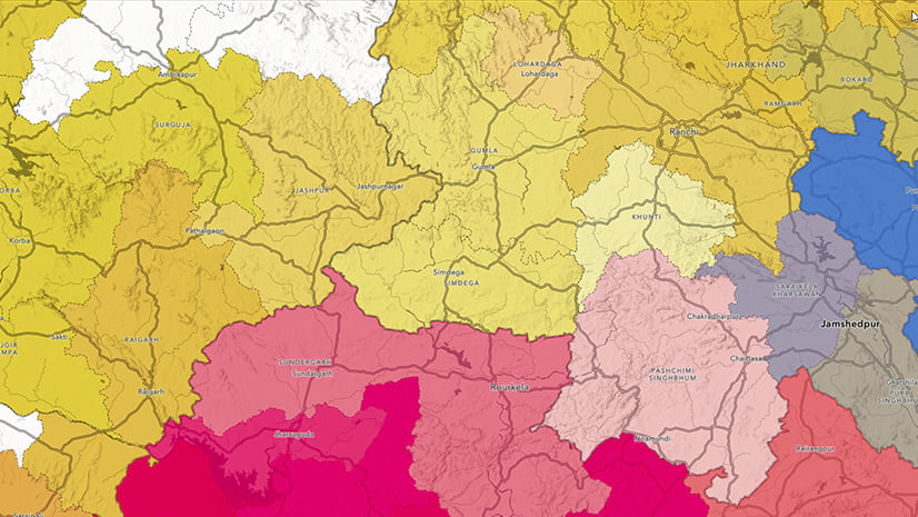
An example of a categorical map containing polygons is this map of Historical Neighborhood Redlining Grades, a neighborhood ranking system created in the 1930s now infamously known as redlining. The grades ranged from A to D. A (Best) was traditionally colored in green, B (Still Desirable) was traditionally colored in blue, C (Declining) was traditionally colored in yellow, and D (Hazardous) was traditionally colored in red.

As always, apply your knowledge
Use your subject-matter expertise to make smart symbology choices. This can come through in your map’s colors and symbols. For example, in this map of payday lending policies by state, notice the two legal categories (legal with limits on finance charges and legal with no limit on finance charges) are in different shades of teal, and the illegal category is in a completely different color: yellow. The two legal categories are qualitatively closer together than the illegal category, hence the symbology choice here.

Consider adding size
Size can be a great way to enhance a map using the Types style. There are two ways to include size into your map:
- Edit each category’s symbol by hand, applying a different size to each category.
- Choose a second numeric attribute to drive each feature’s size across all categories.
This map of hospitals by Medicare quality score is an example of the first way to incorporate size. We emphasized the hospitals with a 5-star quality rating with an outline and a bigger size. Also, these categories have a natural order to the categories here: 1 star to 5 stars. Therefore, the colors and sizes also have a natural order to them. As a result, the map emphasizes the 5-star hospitals, but the 1-star hospitals are visible among all the others.
 symbolized by their Medicare Quality score, with hospitals with 5 stars displayed by the biggest sized points.")
Alternatively, you could map two attributes at once: one using Types and one using Size. This map of Florida traffic by FDOT District uses size to show annual average daily traffic (depicted by the width of the line), as well as color to show the district. As a result, the highways pop and the minor streets are more subtle.
.")
Try it today
Experiment with different shapes, symbols, outlines, and sizes to enhance your map of categorical data. If you’re limited with colors due to printing or branding requirements, try using shape (e.g., squares vs. circles vs. triangles) to denote different categories. These little things can go a long way in bringing clarity to the data you are presenting through your map. Try it out today, and when ready share your maps with the hashtag #smartmapping and #ArcGISOnline.
For an interactive tutorial on the Types (unique symbol) smart mapping drawing style, see this story map, which is part of a collection of story map tutorials on all drawing styles. See the official help documentation for more information.


Article Discussion: