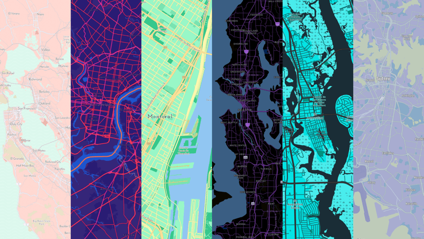
One of the coolest things about vector basemaps is that you can just tweak the styling rules and SNAP you have a new basemap. No re-cooking tiles, you just whisper to the robot some new rules about how to show the data.
And whispering those instructions to the robot is actually super easy and pretty fun.

But this blog post isn’t about the glories of the Vector Tile Editor, necessarily. It’s about a helpful little sneaky resource you can use to get the chroma flowing from your mind into a map!
Choosing and changing colors in the Vector Tile Editor is so fast and easy. But getting rolling with some colors at all can be a bit of a challenging start. I mean, what hex value is a forest or a desert or a prairie or a sea? Ah-ha…I have something that may help you! PhotoChrome.io is a web app I collaborated on with Jinnan Zhang (I told you we make lots of fun unofficial map nerd stuff).
Just type a word, and get a color palette. Cool, right? Here are all the nerdy bits without taking a breath: we are hitting a library of thousands of tagged photos, returning those that match your term, smashing them into a single impressionistic blended image (which is often quite handsome), extracting the dominant colors, then smoothing them into a perceptively linear brightness gradient; just copy the color value that looks good to you and paste it where you want in the Vector Tile Editor. GASP.

Grab colors for any manner of words, and try those word-colors in your basemap!

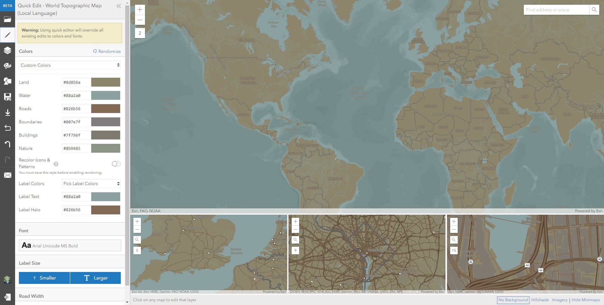
Here are three different vector basemaps I made using these palettes, in about five minutes total, by searching words like sea, clay, forest, emerald, moss.


Here’s a PhotoChrome palette from the word, “coast“…
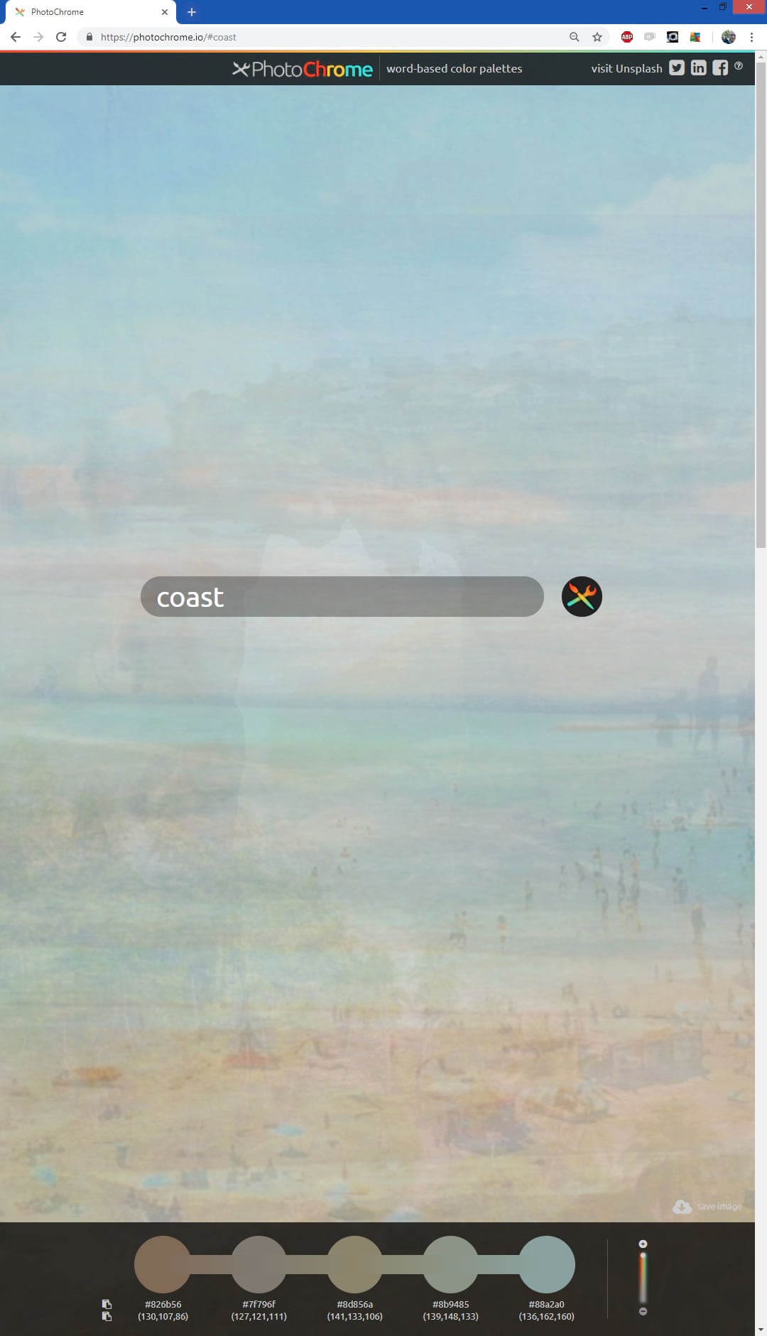
Which looks pretty decent as a nice little muted low-contrast vector basemap for who-knows-what.
Have fun!
Happy textual color palette adventures! John

Commenting is not enabled for this article.