Data analysis can help address some of today’s most pressing challenges. However, before data can be leveraged to tell powerful stories, it needs to be thoroughly explored, cleaned, and transformed. These data engineering processes are often labor-intensive; therefore, there is an enormous need for tools to facilitate them.
At the Developer Summit 2021 plenary, Lakeisha Coleman demonstrated how you can use ArcGIS Pro’s new Data Engineering experience to effortlessly turn messy data into analysis-ready data to address hunger and food insecurity issues in the United States.
Watch the plenary video below, and then read the rest of the blog for a summary of the processes that Lakeisha explored in her demo.
First, Lakeisha opened the Data Engineering view for the SNAP Participation layer, which contained data about the Supplemental Nutrition Assistance Program (SNAP) benefit, by right-clicking the layer and clicking the Data Engineering button. The resizable Data Engineering view automatically snaps to the lower half of the map view and contains two panels: the fields panel that lists the fields in the layer and the statistics panel that displays a statistics table for the fields.
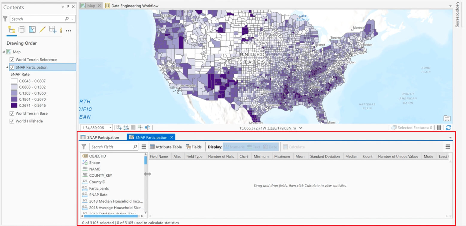
She then seamlessly explored the fields in the layer from the fields panel and clicked the Update Symbology button for the Median Household Income and the Average Household Size fields to quickly change the symbology of the layer to symbolize by those fields, respectively.

After visualizing the fields in the layer, Lakeisha selected all the fields from the fields panel and calculated statistics by right-clicking the selected fields and clicking the Add to Statistics and Calculate button. This immediately populated the statistics panel with each field’s descriptive statistics and metrics in a table format.

Using the generated statistics, she easily identified the number of null values in each field. She then right-clicked the Number of Nulls cell for the Participants field and clicked Select Null Values to visualize its missing values on the map.
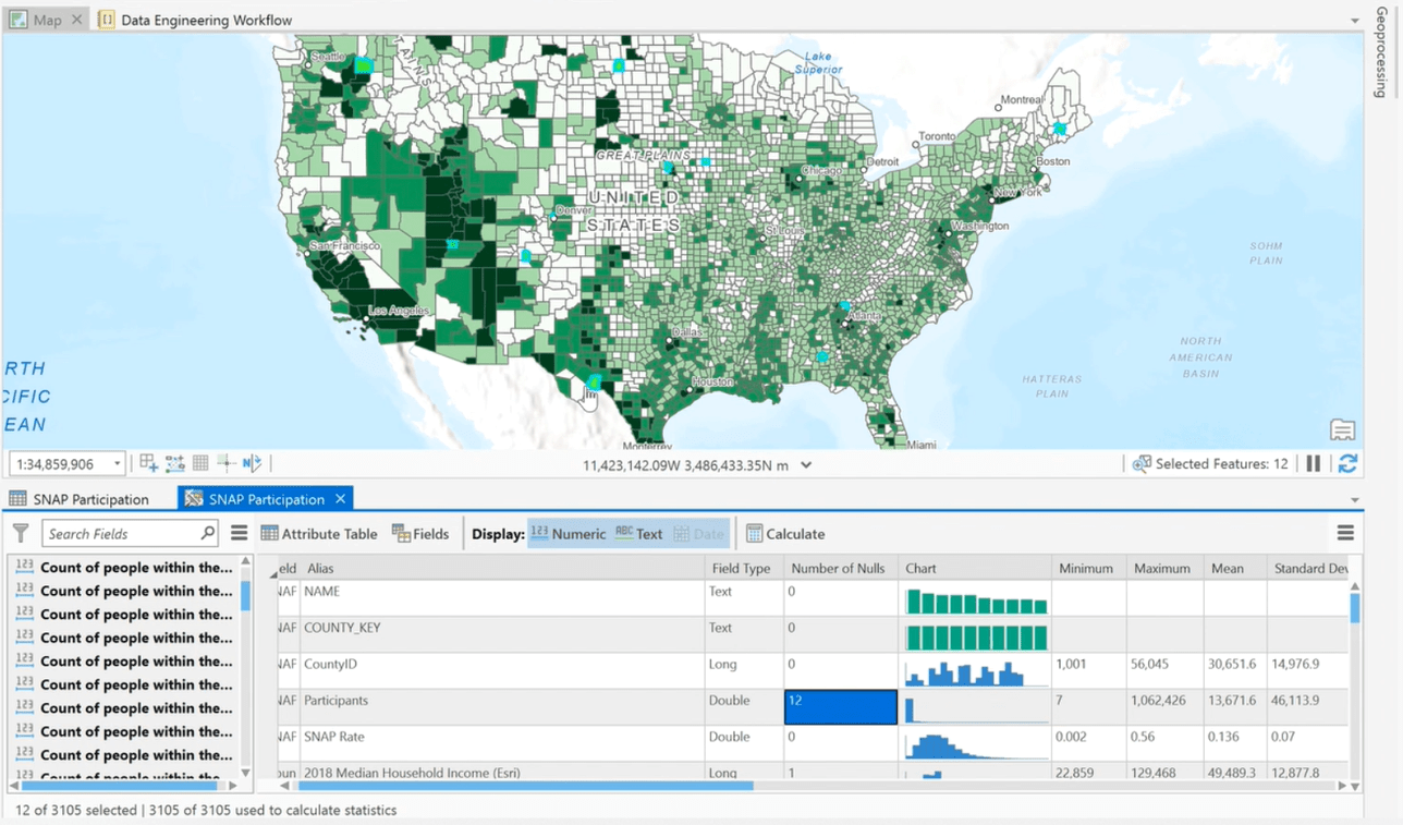
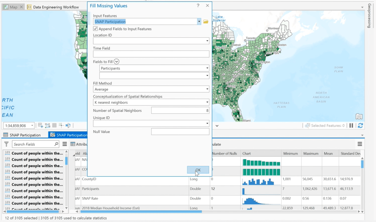
After confirming that the locations of the missing values don’t exhibit any obvious patterns, Lakeisha used the Fill Missing Values tool to replace the missing values in the field with estimated values based on spatial neighbors.
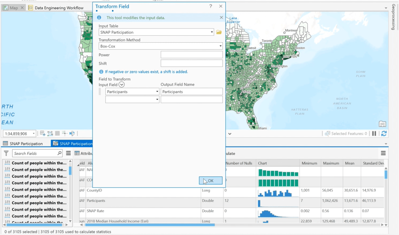
Next, she opted to change the skewed distribution for the Participants field to aid in the analysis of the data. The skewed distribution was transformed into a normal distribution using the Transform Field tool and recalculating the statistics.
Then, Lakeisha ran the Dimension Reduction tool from the Construct tools in the Data Engineering ribbon to reduce the number of population variables by aggregating the highest possible amount of variance into fewer components. Note that she selected Principal Component Analysis (PCA) as the dimension reduction method.
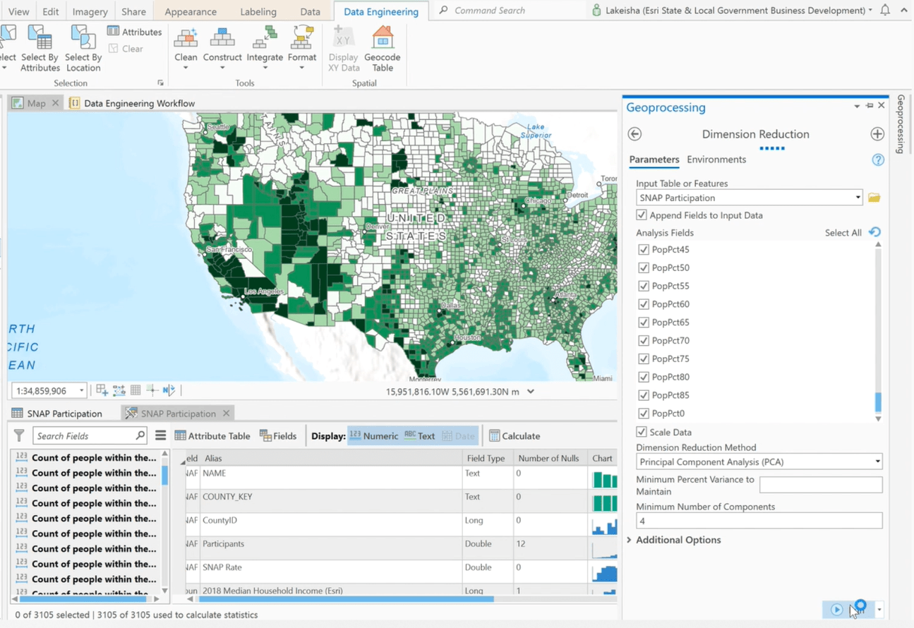
The resulting components were added to the data, listed in the fields panel of the Data Engineering view, and made available for analysis to study hunger and food insecurity issues in the United States.
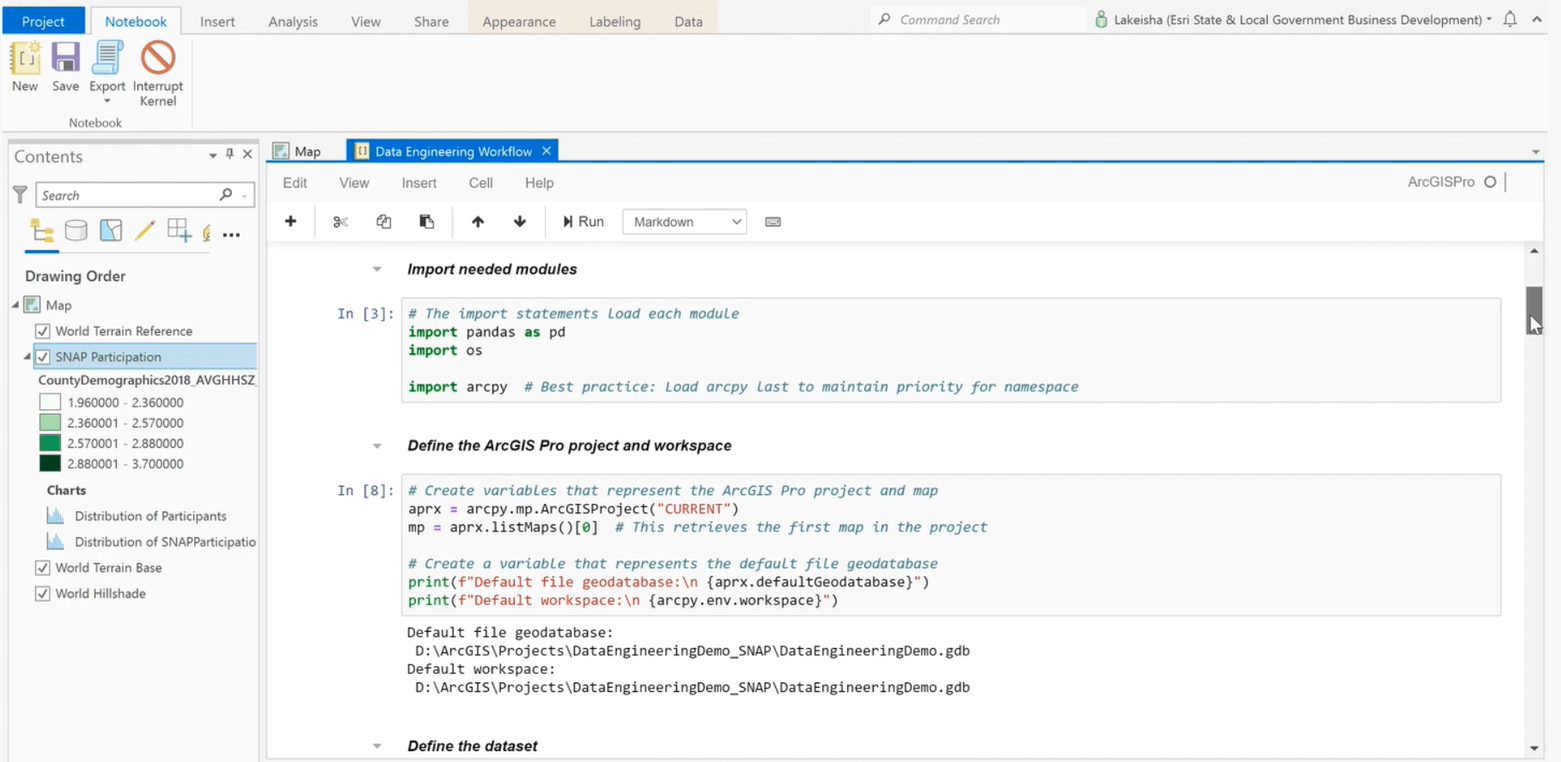
Finally, Lakeisha showed an ArcGIS Notebook in which she had recorded the details of the aforementioned processes. The Notebook simplifies sharing of code and allows for automation of the data preparation process.
Learn more
Lakeisha’s demo showed how the new Data Engineering experience in ArcGIS Pro can simplify the otherwise tedious task of preparing messy data for processing and analysis. Visit the ArcGIS Pro documentation to learn more about how you can use the Data Engineering experience to help you better understand your data and prepare it for GIS workflows.


Commenting is not enabled for this article.