With ArcGIS Pro you can easily craft effective data visualizations through the user interface and the arcpy.charts module. However, there may be scenarios where it would be handy to create charts through a geoprocessing tool—for instance, to simplify automation tasks or to include in a ModelBuilder workflow. In this post I’ll show how you can incorporate charts into geoprocessing tools to create, configure, and output data visualizations. I’ll briefly go over the process of creating chart tools, and then we’ll explore how these tools might be used.
Creating Chart Tools
To help illustrate the process of creating a chart tool, I’ve created basic sample tools that you can download here. These sample tools implement a geoprocessing tool interface for creating and configuring charts, but you can imagine following a similar procedure for outputting charts in a variety of other contexts. As the examples show, building tools that output charts is a straightforward process if you have experience with ArcPy and creating script tools in Pro. The main task involves creating geoprocessing tool parameters that allow you to set properties of a chart class within the arcpy.charts module. For instance, here is the code that creates the x and bin_count parameters for a histogram:
x = arcpy.Parameter(
    displayName="Number",
    name="x",
    datatype="Field"
    parameterType="Required",
    direction="Input"
)
x.filter.list = ["Short", "Long", "Double"]
x.parameterDependencies = ["in_layer_or_table"]

bin_count = arcpy.Parameter(
    displayName="Bin Count",
    name="bin_count",
    datatype="GPLong",
    parameterType="Optional",
    direction="Input",
)
bin_count.value = 32
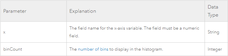
The parameters above correspond to arguments for the arcpy.charts.Histogram class:
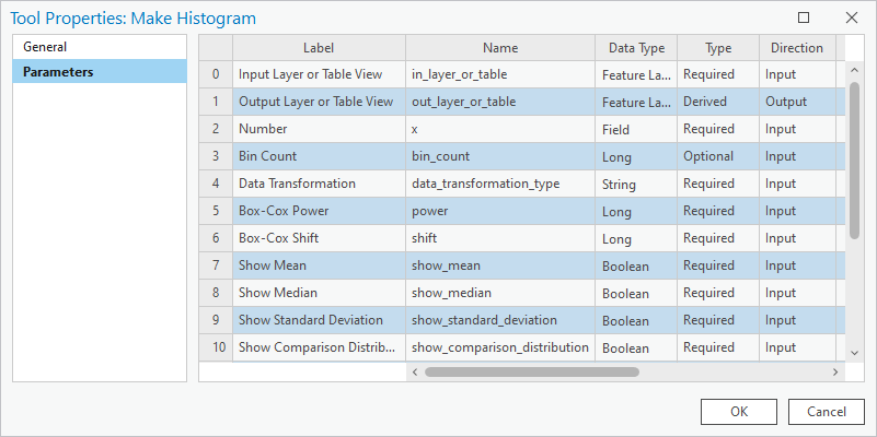
This is just a snippet; the full code includes additional parameters as well as some validation logic. Here’s a peak at the Parameter list:
Once the parameters are configured and the script is executed, you create the chart by instantiating the Histogram class inside the arcpy.charts module. The argument values are determined by the parameters we defined above:
# use valueAsText to get field name as string
chart = arcpy.charts.Histogram(x=x.valueAsText)

if bin_count.value != None:
    chart.binCount = bin_count.value
Finally, now that we’ve created our chart object we can add it to the output parameter by setting the charts property (read more about configuring output parameters here):
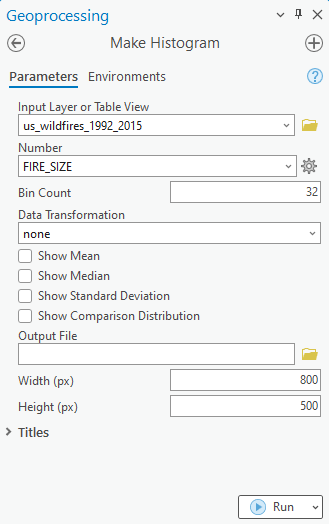
out_layer_or_table.charts = [chart]And that’s essentially all there is to it! Here’s what the tool looks like when opened in the Geoprocessing pane:
When you run this tool, a chart is added to the layer in the table of contents:
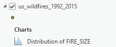
Now you can open this chart in Pro to view, interact with, export, or further configure.
Using Chart Tools
You can run these tools through the Geoprocessing pane, but Pro already has a UI for creating charts. So what’s the benefit of a geoprocessing tool that makes charts? Well, the tools become more useful in cases where you need to create and configure charts as part of an automation script. Though the arcpy.charts module provides similar functionality, this tool-based approach may be a simpler and more intuitive pattern for some users. Moreover, this streamlined, one-step process may allow for cleaner and more efficient code. In the case of the MakeHistogram tool, you can simply specify all relevant parameters as arguments to the tool and the chart is created and added to the output layer or table:
arcpy.ChartTools.MakeHistogram(in_layer_or_table="us_rents", x="price", bin_count=20)Contrast this single line of code with a snippet showing how you would do the same steps using the arcpy.charts.Histogram class directly:
lyr = arcpy.mp.ArcGISProject("current").activeMap.listLayers("us_rents")[0]
chart = arcpy.charts.Histogram(x="price", binCount=20)
chart.addToLayer(lyr)
You can also use chart tools in ModelBuilder workflows. To demonstrate, I’ve created a simple model (which can be downloaded here) that takes an input dataset, iterates over each numeric field, and creates a histogram to visualize the distribution for each of these fields. Each histogram created by this model is output to the dataset and optionally exported as a standalone SVG file:
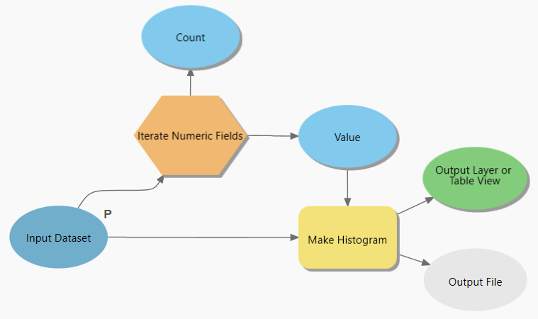
You can imagine this model being useful in cases where there’s a need to explore distributions for layers that include many numerical fields. By creating this model, we now have a repeatable visualization workflow that saves us from a task that would be tedious and inefficient if done manually for a large number of variables.
The examples in this post demonstrate how you can use the arcpy.charts module along with the geoprocessing framework to create, configure, and output charts as part of a script tool. Such tools can be used in ModelBuilder models or Python scripts to automate workflows that involve data visualization. We hope these samples will spark your imagination and inspire you to build your own visualization tools!

Article Discussion: