Introduction
After all the data integration and wrangling steps in the previous blog, it’s time to have a good hard look at the data and determine whether it is going to serve the purpose I need it for. I want to find out:
- Are all of my columns of the expected data type?
- Do any of my columns contain missing values?
- Are the columns named consistently?
- Are the columns named in a way that makes sense to me or others who will use the dataset?
- Are there any unnecessary or non-useful columns?
- Do any of the columns appear to have unusually high or low values for basic descriptive statistics such as minimum, average, or maximum?
- Do similar-themed columns from two different datasets have identical or very similar values (e.g. population for a given year from the US census vs. from the American Community Survey)?
Data validation and data engineering steps
Data validation
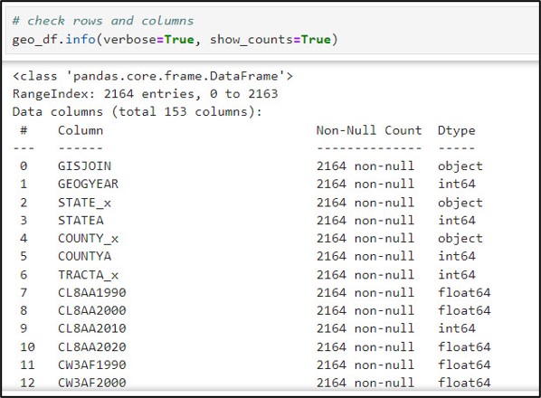
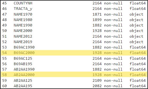
Many of these types of questions can be answered using just a few simple Pandas functions. For example, the .info method prints out every column in a DataFrame, along with a count of the column’s non-null values and data type. This is incredibly useful for determining which columns contain missing values.
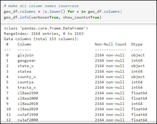
Another small, yet important data cleaning task was converting all column names from capital letters to lowercase. Here, I used the str.lower function within a list comprehension to convert all column names in the DataFrame from uppercase to lowercase.
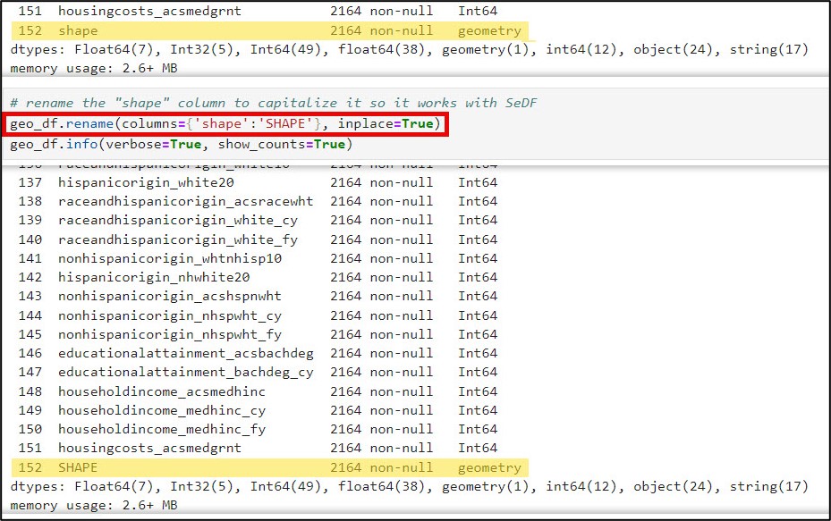
There was one column, however, that did need to be converted back to all capital letters. The “shape” column is actually a geometry type, meaning that it contains a spatial geometry. For it to be understood as such by the SeDF, it needs to be named “SHAPE”. Here, we use the .rename function to convert this column to all uppercase.
Next, I wanted to learn a bit more about the distribution of values with each column. The .describe method tells you which columns are missing values, and includes summary statistics for each column representing measures of centrality and dispersion. When I have many columns to look at, I often add the .transpose method to flip the summary statistics such that the columns are listed as rows. Here is an example of the descriptive summary statistics for several of the education-related variables.
After a bit of manual inspection, I determined that these missing values occurred for two main reasons:
- Some large census tracts in 2000 were subdivided into new, smaller census tracts in 2010
- Some small census tracts in 2000 were aggregated into new, larger census tracts in 2010
Bottom line: not all census tracts persist between two decennial censuses, and boundaries change over time. Fortunately, the NHGIS has developed a methodology to crosswalk census data over time (e.g. 2000 to 2020) by standardizing data to the 2010 census boundaries. This allows for comparison of one year’s census data for a different year’s geographic boundaries, enabling time series or “longitudinal” analysis. More information about the methodology for standardizing the geographic boundaries can be found here.
Dealing with missing values (Imputation)
Truth be told, there are many strategies available for dealing with missing values in data. Depending on how many missing values are in a column, you might decide to drop the entire column or delete only the rows missing the values from the dataset. By choosing either of these options, however, you run the risk of removing valuable information from your analysis.
If you choose not to remove data and want to replace it instead, you can fill missing values with global statistics of the column of interest, such as the mean/median for numeric columns and mode for categorical columns. If you have time series data, you have an entirely different set of options for replacing missing values along the timeline, which relies on recent/future values or even temporal trends to fill in the gaps.
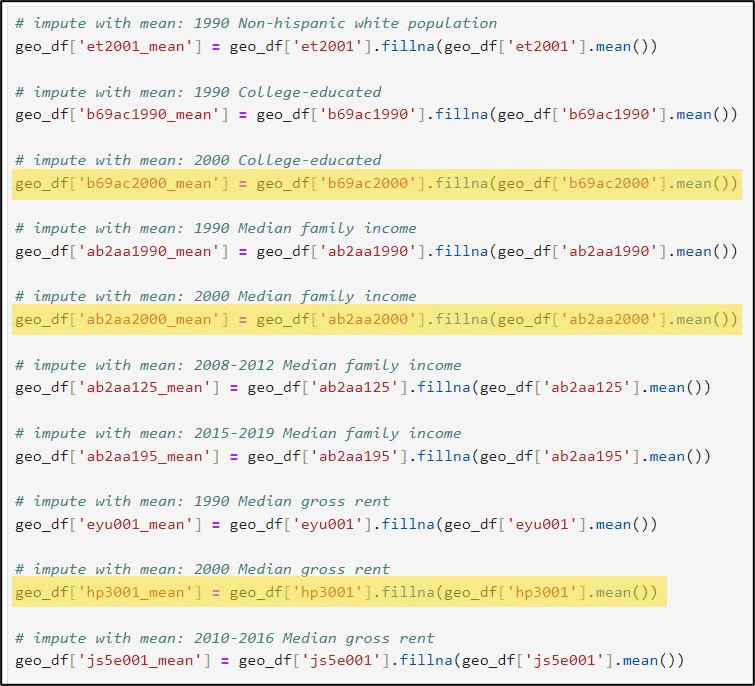
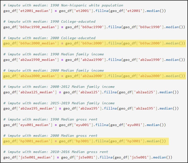
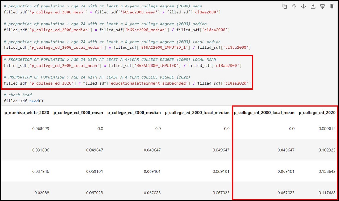
Because my three columns of interest that are missing data are numeric, I will first use each column’s global statistics (mean and median) to replace its missing values. This is achieved using the pandas .fillna, .mean, and .median methods, respectively.
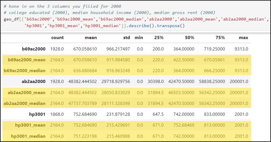
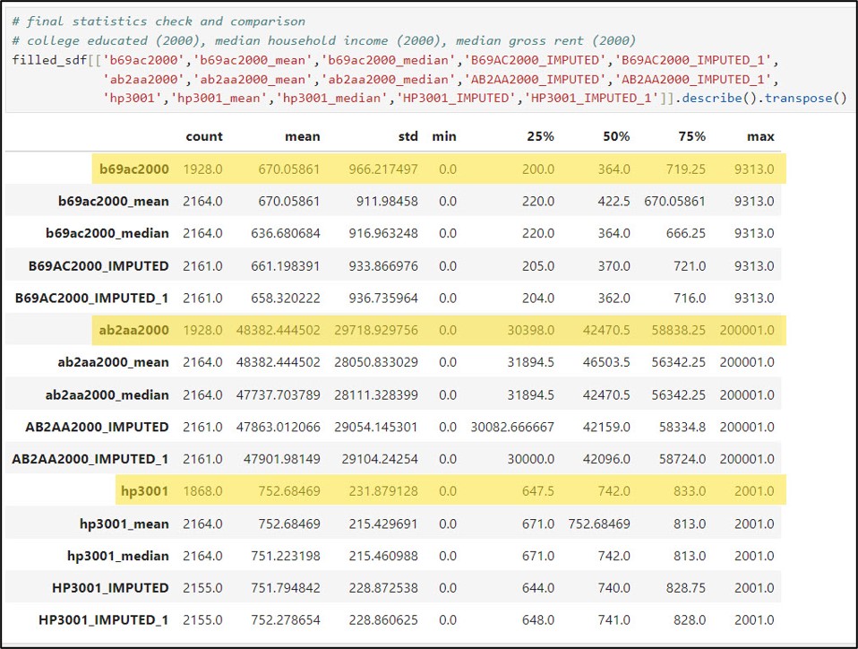
We can also have a look at the summary statistics for the three columns of interest and compare them to the summary statistics for their imputed versions (mean and median).
In the example above, we filled missing values in three of our data columns with global statistics, e.g. the mean and median of all the values in each column. Let’s not forget that we are working with spatial data, however, so it may also be worth looking into filling our data columns with local statistics, e.g. the mean and median of only the features that are spatial neighbors of the missing values. To do this, we’ll use the Fill Missing Values tool from the Space Time Pattern Mining toolbox.
It is important to remember that when imputing or filling missing values in data, you are essentially estimating data that you don’t actually have. As such, it is vitally important to think carefully about how many values you are filling, what imputation method you choose, how the filled results will be used in further analysis, and how you will communicate the fact that you chose to impute data in the first place. There are a number of best practices and things to consider when filling missing values, which you can read more about here.
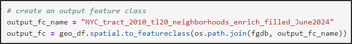
To use the Fill Missing Values geoprocessing tool, we need to convert our Spatially Enabled DataFrame to a feature class within the geodatabase using the ArcGIS API for Python’s .to_featureclass method.
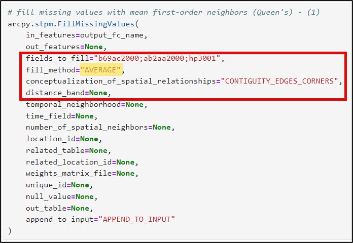
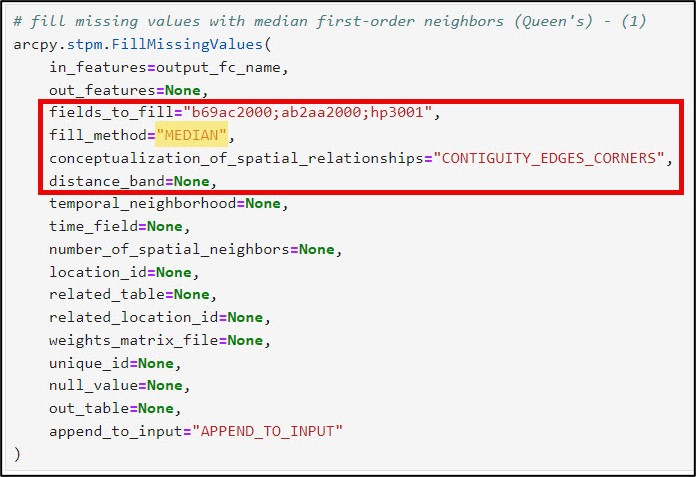
We’ll then run the Fill Missing Values tool twice—once to impute the local mean and once to impute the local median. Here is a bit more information on some of the important tool parameters:
- fields_to_fill – the columns in your dataset containing missing values. In my case, it is three columns: “b69ac2000” (year 2000, age > 24, college educated), “ab2aa2000” (year 2000, median family income), “hp3001” (year 2000, median gross rent).
- fill_method – statistic that is applied to missing values. For spatial data, you can impute missing values based on spatial neighbors, time series values, or space-time neighbors (e.g. local statistics). For standalone tables, you can impute with global statistics, as I did in the previous section. In this workflow, I’ve chosen to fill missing values with the local mean and local median, for comparison purposes.
- conceptualization_of_spatial_relationships – how you define which features become the spatial neighbors (e.g. the local neighborhood). These can be based on distance, contiguity/adjacency, or manually defined via a spatial weights matrix. You can read more details about each of these different conceptualizations along with best practices here. In this example, I am using Contiguity edges corners (e.g. Queen’s case), which means that each missing polygon value will be filled with the mean or median of the neighboring polygons that it shares an edge or corner with.
- distance_band – the cutoff distance for the Conceptualization of Spatial Relationships parameter’s Fixed distance. Not applicable in my case because I am using Contiguity edges corners.
- number_of_spatial_neighbors – the number of nearest neighbors included in the local calculations. For Fixed distance, Contiguity edges only, or Contiguity edges corners, this number is the minimum number of neighbors.
Now that we have filled missing values in three variables with both their global and local mean and median, we will do a quick assessment of the results.
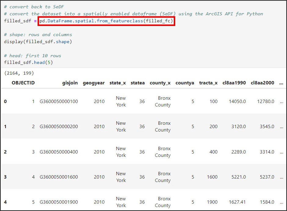
First, I’ll convert my feature class back to a Spatially Enabled DataFrame using the ArcGIS API for Python’s .from_featureclass method. This allows me to take advantage of all the data manipulation functionality of Pandas.
Next, a best practice is to examine and compare the data distribution and summary statistics of the variables before and after filling the missing values. I’ll use the .describe method to generate summary statistics of the three variables before and after imputation. Here, I’ve also added the .transpose method to flip the summary statistics such that the columns are listed as rows.
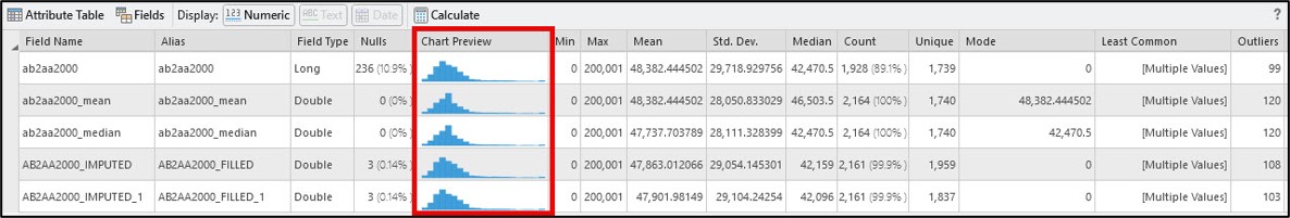
I can get this same information directly within ArcGIS Pro via the Data Engineering view, as well as in the tool messages of the Fill Missing Values tool. The other great thing about the Data Engineering view is that it gives you a chart preview based on the field data type. The example below shows the summary statistics and histograms for the median family income variable (ab2aa2000) before and after imputation.
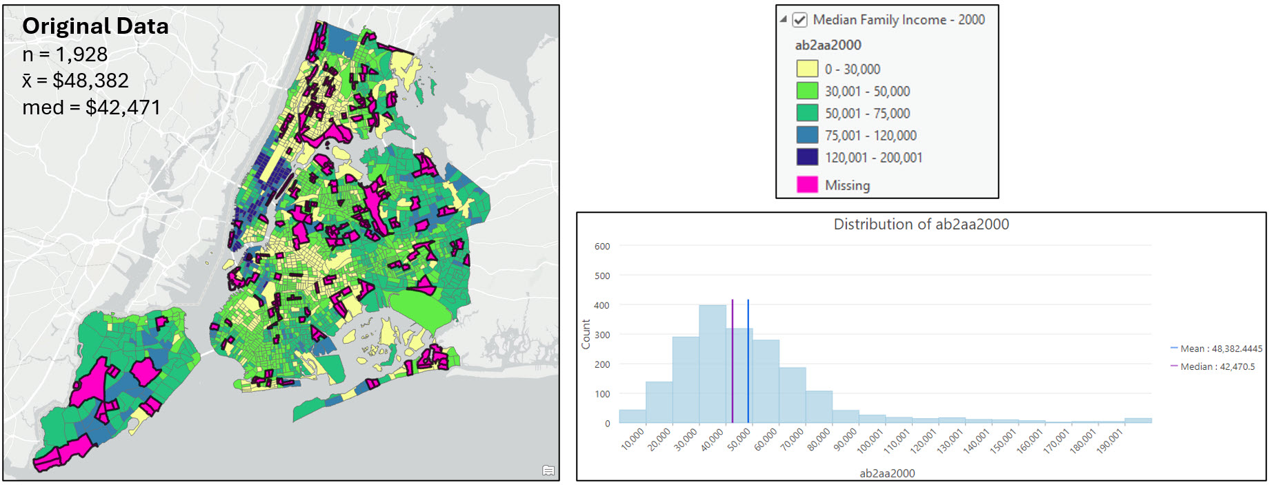
In addition to exploring the summary statistics prior to and after imputation, I also wanted to explore the data visually on the map.
The first graphic below shows the median family income variable for 2000 (ab2aa2000) displayed on the map and visualized as a histogram. The pink census tracts contain missing values for this variable.
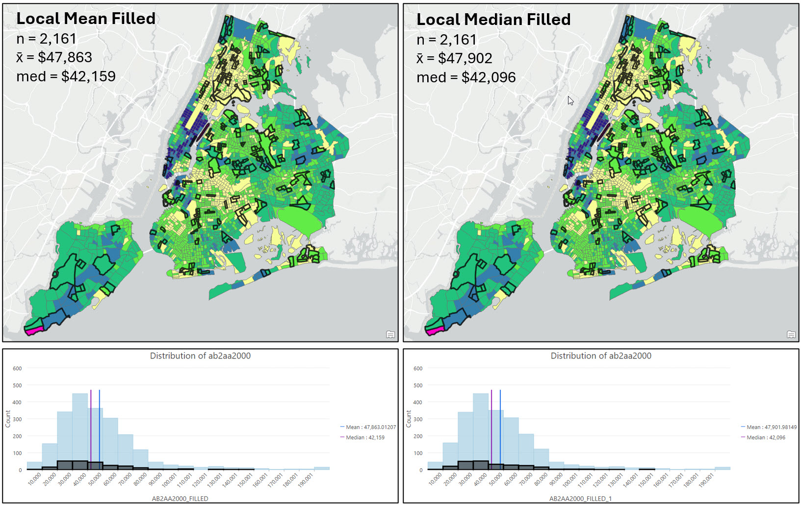
The following two graphics show the same variable under the four different imputation scenarios: Imputation with the global mean, global median, local mean, and local median. The dark black outlined census tracts contained missing values and have now been filled. The histograms show the distribution of the now-filled dataset, with the black highlighted bars corresponding to the black outlined polygons on the map.
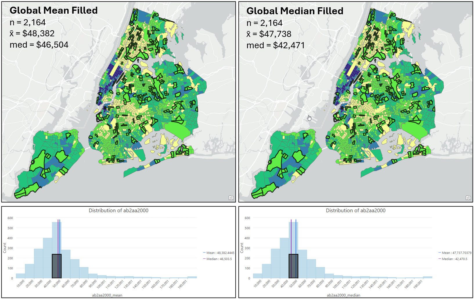
As mentioned earlier, there is no hard and fast rule for which method to choose when filling missing values, but there are a number of best practices to consider. After mapping my variable of interest before and after imputation, I’m confident that there is no distinct spatial pattern in the location of the census tracts with missing values, or in the median family income at those locations (e.g. both are relatively random).
Looking at the maps, summary statistics, and the histograms, it appears that the local imputation strategies produced the most similar descriptive statistics and data distributions to the original dataset. For example, filling missing values with the global mean or median noticeably pulls many census tracts into the $40,000-$50,000 median income range, while the local imputation methods have a much more similar distribution in each histogram bin to the original data.
Based on all the above reasons, and my knowledge of the dataset and problem, I decided to proceed with using the local mean imputation strategy.
Calculate the five gentrification indicators for the years 2000 and 2020
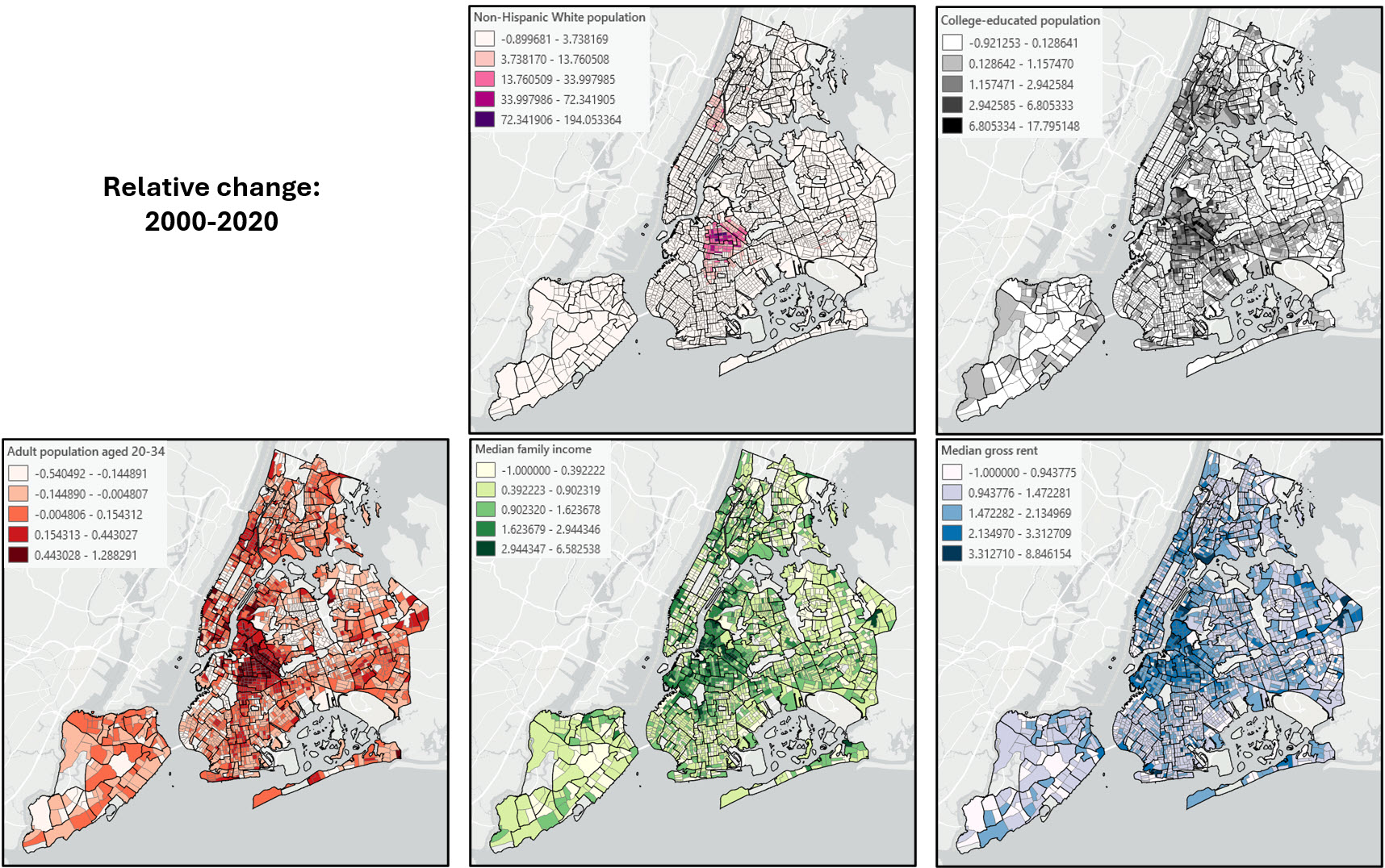
The next step in the data engineering process is to create the five gentrification indicators for the years 2000 and 2020. The socio-demographic composition, education level, and age indicators were created by normalizing the raw count of each individual variable by the total count of that variable for each year. The median family income and median gross rent variables were used as is.
Calculate relative change in the five gentrification indicators between 2000 and 2020
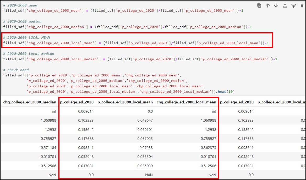
Gentrification is a process that causes change in a location over time, so the final data engineering step using Pandas in the ArcGIS Notebook was to calculate relative change between each of the five gentrification indicators between 2000 and 2020. For this, we used the simple percent change calculation of:
(Value at time 2 / Value at time 1) – 1
Data validation checks
You may have noticed that there are “NaN” and “inf” values in several of the new columns that represent the relative change in the gentrification indicators between 2000 and 2020. “NaN” values stand for “Not a Number”, and often represent undefined or missing values. In our case, NaN values for the gentrification change columns result from the presence of NaN (missing) values in either or both of the 2000 or 2020 columns for the given gentrification indicator.
“Inf” values stand for “positive infinity”. In our dataset, we get inf values in the gentrification change columns when we have data in a census tract in the year 2020, but a value of zero in that census tract in 2000. In other words, the “inf” values are the result of a “divide by zero” error.
We can use the Pandas .isnull function to identify the missing values in each gentrification change column, and then use the .isin function to find every row in a column that contains a certain value. In our case, we’ll pass in the np.inf and -np.inf constants to find positive and negative infinity values, respectively.
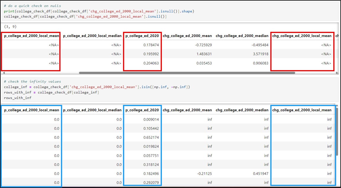
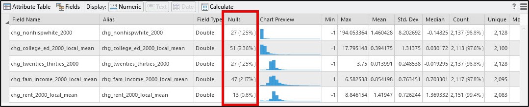
Below is a table showing the number of “NaN” and “inf” values for each of the five gentrification change indicators. Don’t worry too much about these right now. There will be several steps later in the workflow to remove these from the analysis, but for now, the most important thing is that we have a good understanding of why these values are occurring.
| Gentrification indicator | NaN / NA (missing values) | inf (infinity values) | Total |
| Socio-demographic composition, e.g. Non-Hispanic White population (chg_nonhispwhite_2000) | 25 | 2 | 27 |
| College-education population
(chg_college_ed_2000_local_mean) |
36 | 15 | 51 |
| Population aged 20-34
(chg_twenties_thirties_2000) |
24 | 3 | 27 |
| Median family income
(chg_fam_income_2000_local_mean) |
37 | 10 | 47 |
| Median gross rent
(chg_rent_2000_local_mean) |
13 | 0 | 13 |
Write out cleaned feature class to use in ArcGIS Pro
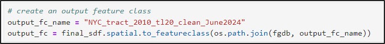
Now that we’ve finished exploring, cleaning, and engineering new variables in our data using Pandas, we’ll use the ArcGIS API for Python to convert our Spatially Enabled DataFrame to a feature class within the geodatabase.
We first use the .from_df method on the ArcGIS API for Python’s GeoAccessor class, passing the “SHAPE” field into the geometry_column parameter. This ensures that we are working with a true Spatially Enabled DataFrame, not a regular Pandas DataFrame.

We then use the .to_featureclass method to export the final, cleaned SeDF as a feature class in a geodatabase so we can use it in further analysis in ArcGIS Pro.
This feature class contains the columns representing the five gentrification change indicators:
- chg_nonhispwhite_2000: Change in socio-demographic composition (non-Hispanic white population) between 2000 and 2020
- chg_college_ed_2000_local_mean: Change in college-educated population between 2000 and 2020
- chg_twenties_thirties_2000: Change in population aged 20-34 between 2000 and 2020
- chg_fam_income_2000_local_mean: Change in median family income between 2000 and 2020
- chg_rent_2000_local_mean: Change in median gross rent 2000 and 2020
Final data cleaning steps
Recall from the previous section that several of the gentrification indicator columns contain “null” or “inf” values. In ArcGIS Pro, these are combined and treated as <Null> values.
To explore these values further, I used the Select Layer By Attribute tool to run a simple query that selected all census tracts from any of the five gentrification indicators that contained a null value. In my case, I was able to perform this multiple-value selection using the OR query operator. This initial query returned 62/2,164 census tracts with null values in at least one of the five indicators. Generally speaking, we can interpret these null values as resulting from the presence of missing values in either or both of the 2000 or 2020 columns for the given gentrification indicator.
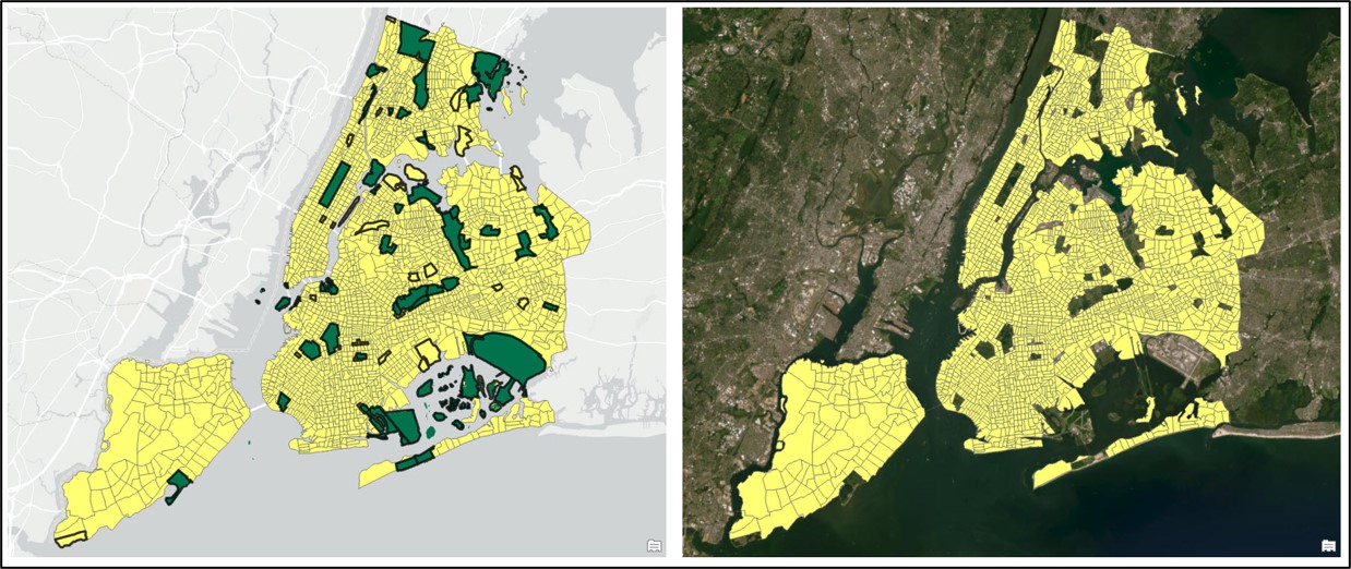
In the original paper, the authors also removed any census tract labeled as “park-cemetery”, which was easy for us to replicate because we spatially joined the New York City neighborhood boundaries to our census tracts in one of the early steps in this analysis.
The graphic below shows the full attribute query (via the tool interface and SQL) selecting any null value for a gentrification indicator, plus any census tract that is considered a park or cemetery.
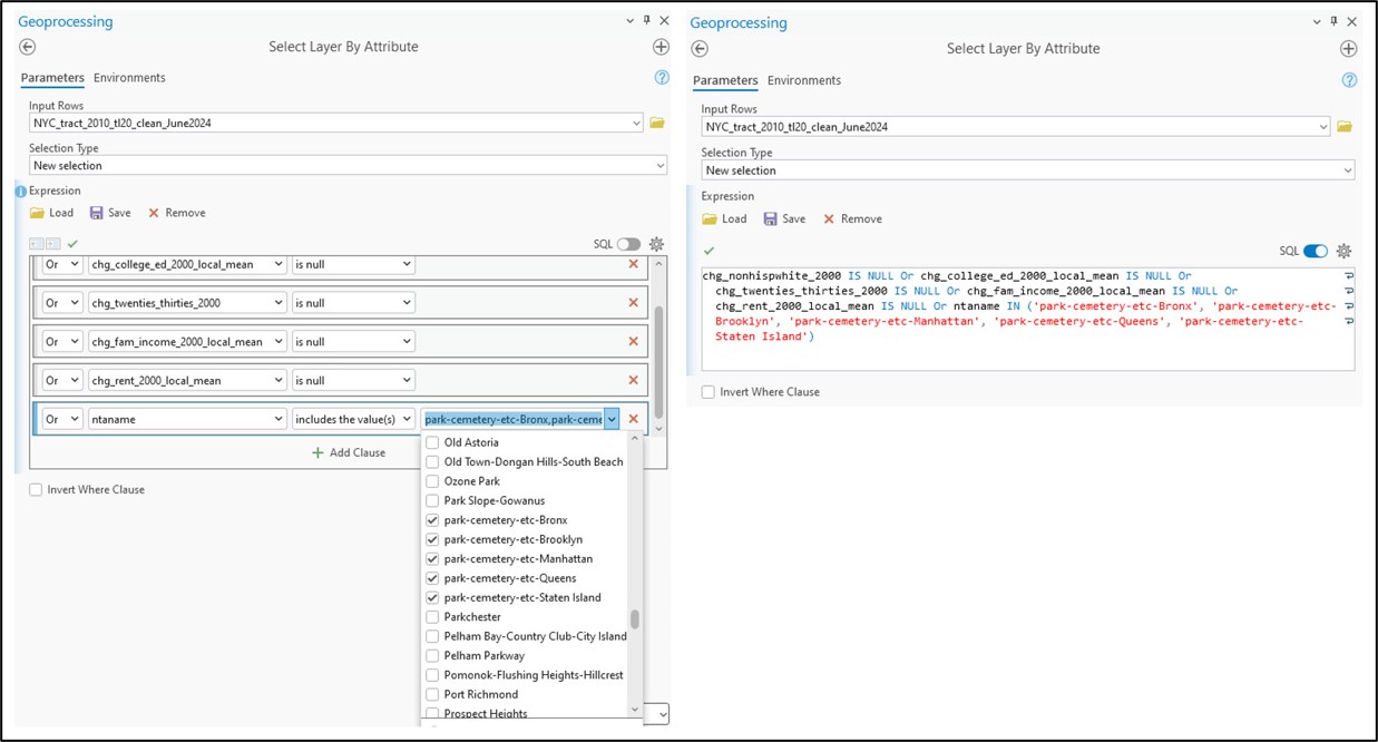
Switching the selection and exporting the feature class resulted in a dataset of 2,093 census tracts.
Data exploration
Before we complete the final analysis, there are a few more data preparation/engineering steps to do. When we open the Data Engineering view of our cleaned census tract feature class, we see that all five of the gentrification change indicators are right-skewed (positively skewed) to some degree. Positive skew occurs when there is a relatively small number of large values in a data distribution and is characterized by a longer tail to the right of the histogram.
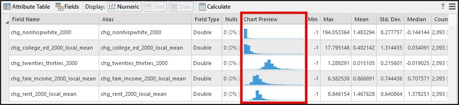
Scrolling to the right of the Data Engineering view also gives us additional statistics that help us quantify the shape in a data distribution. Skewness determines if the data distribution is symmetrical (e.g. “normal”), and kurtosis measures the heaviness of the distribution’s tails.
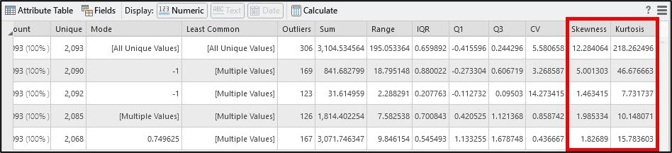
Skewness values close to zero suggest that a data distribution is symmetrical or normal, and values outside of the range of -1 to +1 indicate negative (left) or positive (right) skew, respectively. Kurtosis values less than 3 describe a data distribution with a flat peak and lighter tails with few extreme values, while a kurtosis of greater than 3 suggests heavier tails with more extreme values than a normal distribution.
The shape of the histograms combined with the skewness and kurtosis values for each of the five gentrification change indicators confirm that they are each positively skewed. This aligns with what the authors reported in the original paper, so our next step in replicating their analysis is data transformation.
To accomplish this, we’ll use the Transform Field tool. In the tool syntax, we pass in the input feature class and specify the attribute fields that represent the five skewed gentrification change indicators. The method parameter allows you to choose from several different transformation methods (e.g. Square root, Log, Box-Cox, etc.). The shift parameter allows you to input a constant value that is used to adjust the entire data distribution to the right (positive) or left (negative) and is often used when a data variable contains either zero or negative values.
Following the steps in the paper, we chose a log transformation with a shift of 1.01 to account for any zero or negative rate changes in each of the five gentrification change indicators.
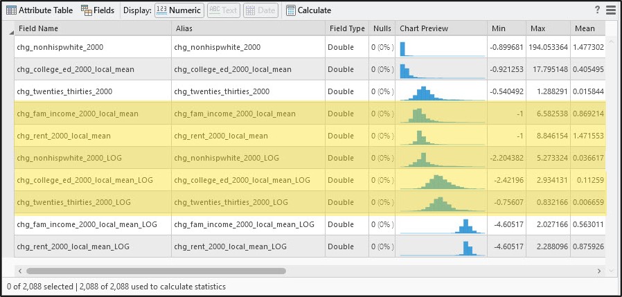
The resulting changes are shown in the Data Engineering view below.
Here, we can see that applying the log transformation improved the shape of two of the variables (chg_nonhispwhite_2000, chg_college_ed_2000_local_mean) but actually caused the other three to become negatively (left) skewed.
We can dig into this a little more by creating a scatter plot matrix containing the five gentrification indicator variables. This allows us to not only visualize the strength and direction of the relationships between and among the indicators, but is also a useful way to identify outliers.
In the graphic below, the left scatter plot matrix shows the cleaned feature class containing 2,093 census tracts. Note the red box, which shows the presence of outliers in the scatter plot. The right scatter plot matrix shows the scatter plots and associated Pearson’s correlation coefficients (r) after removing these five selected outliers. The scatter plot also shows that nearly all of the correlation coefficients between any two variables are around 0.5 or lower, which means that we don’t have high redundancy in our gentrification indicators.
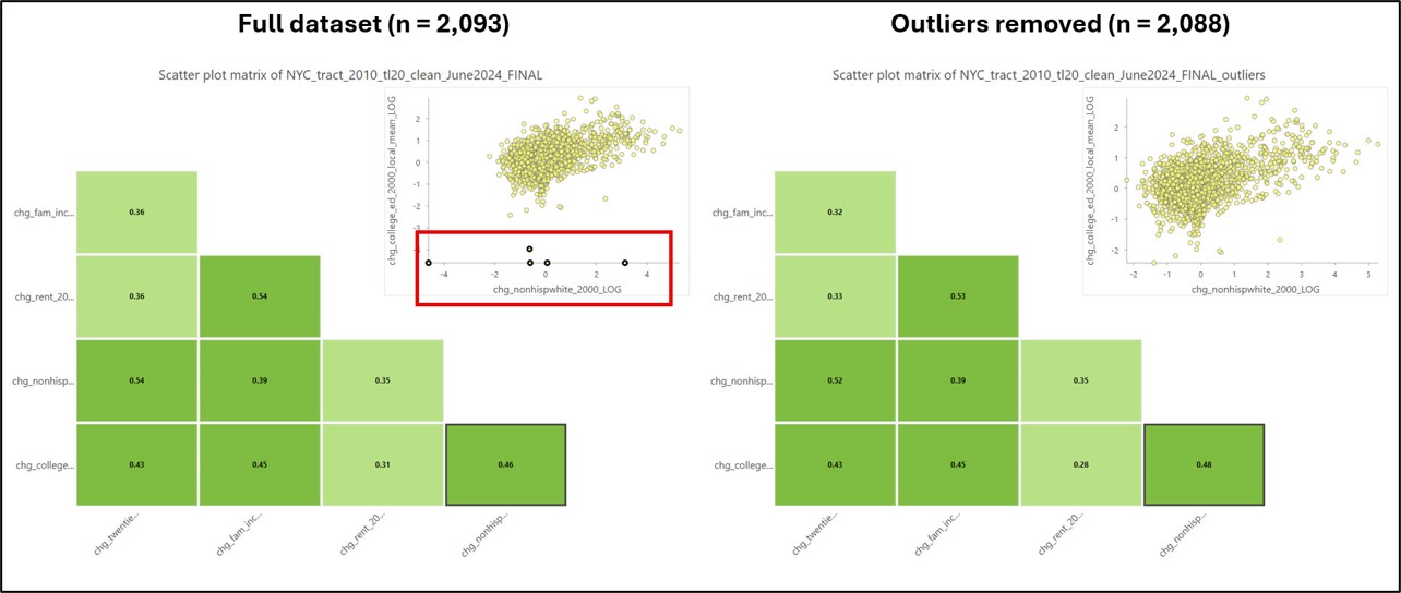
After a bit more experimentation and exploration, I made the decision to remove these five additional outliers, which gave me a final dataset of 2,088 census tracts. Based on the distribution of each of the variables, the final five chosen for the analysis are the logarithms of chg_nonhispwhite_2000, chg_college_ed_2000_local_mean, and chg_twenties_thirties_2000, and the non-transformed versions of chg_fam_income_2000_local_mean and chg_rent_2000_local_mean.
To close out this blog, I do want to reiterate that more often than not, there is no concrete set of steps for doing these data exploration and engineering steps. There are certainly some best practices and rules-of-thumb for filling missing values, doing data transformations, detecting/removing outliers, etc. but these decisions will almost always depend on your analysis goal, your chosen methods, and the characteristics of your data. In this sense, much of this process is equally as much art as it is science!
In the next blog, we’ll finally be able to use all of this good data to actually map gentrification across New York City!


Article Discussion: