Here is a map of over one hundred years of 6+ mag earthquakes. Together they trace out the Pacific Ring of Fire. With a name that cool, we need a map style to keep pace.
This style is used to make the maps in this story map about earthquakes and emergence.
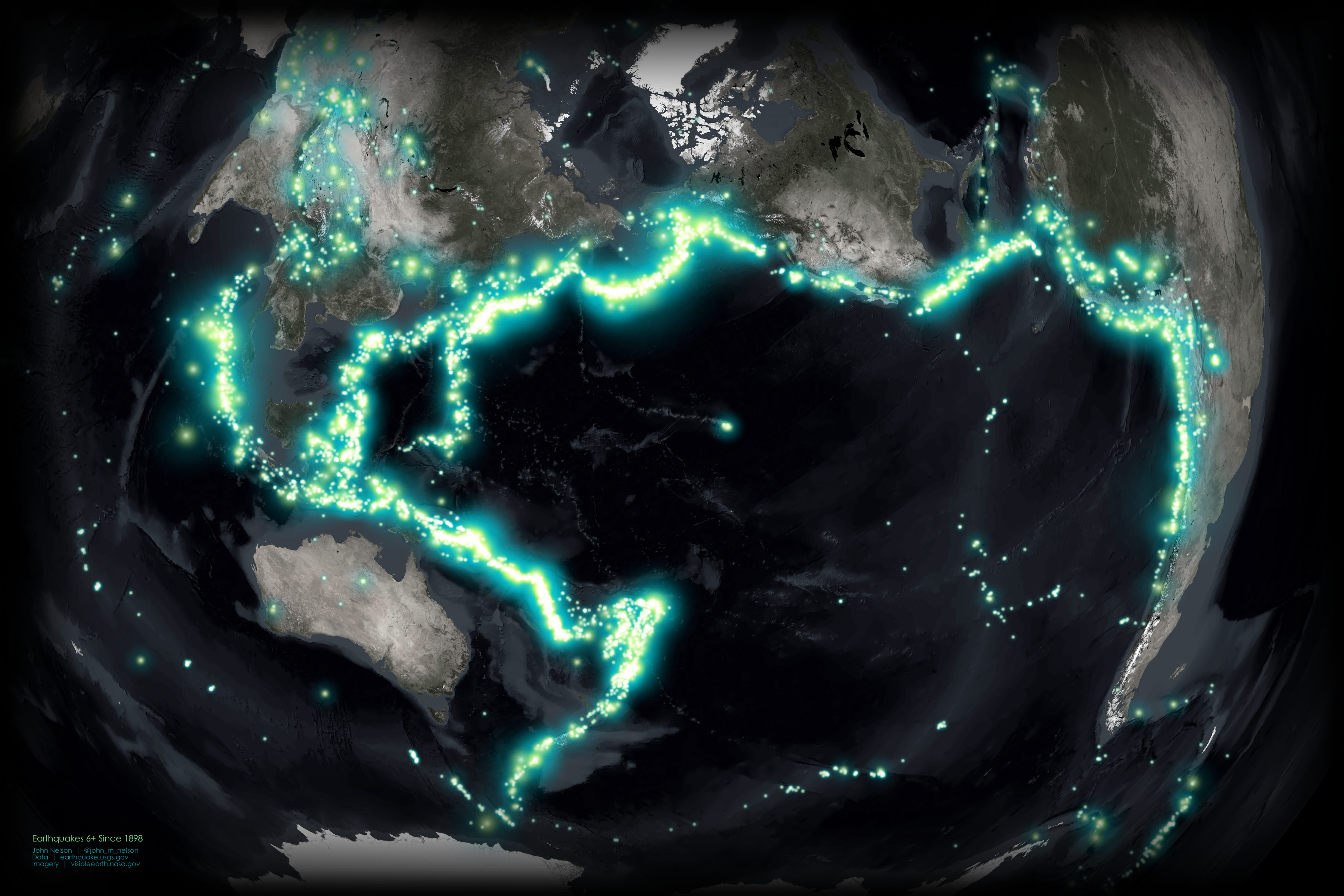
This map is an update to one I made long ago using a very different method (with similar visual results).
Here’s how to make it. Super easy. Super glowy. Like the luminescent magma that this phenomenon betrays, churning below the surface as our tenuously thin raft of cool rock folds against and under its neighbor, releasing bursts of punctuated energy from an unknowable well.
The quake data comes from our friends at the USGS. Great resource!
This map uses one symbol, and one symbol only. A faint white radial gradient image. This symbol, while small and faint, when assigned varying scales and tints, and clustered in enough numbers, creates a a luminescence that surrounds maps and binds maps.

If you right-click these words and choose “save image as” you can have it all for yourself.
This map makes use of three techniques…
- Picture markers
- Tint
- Layer stacking
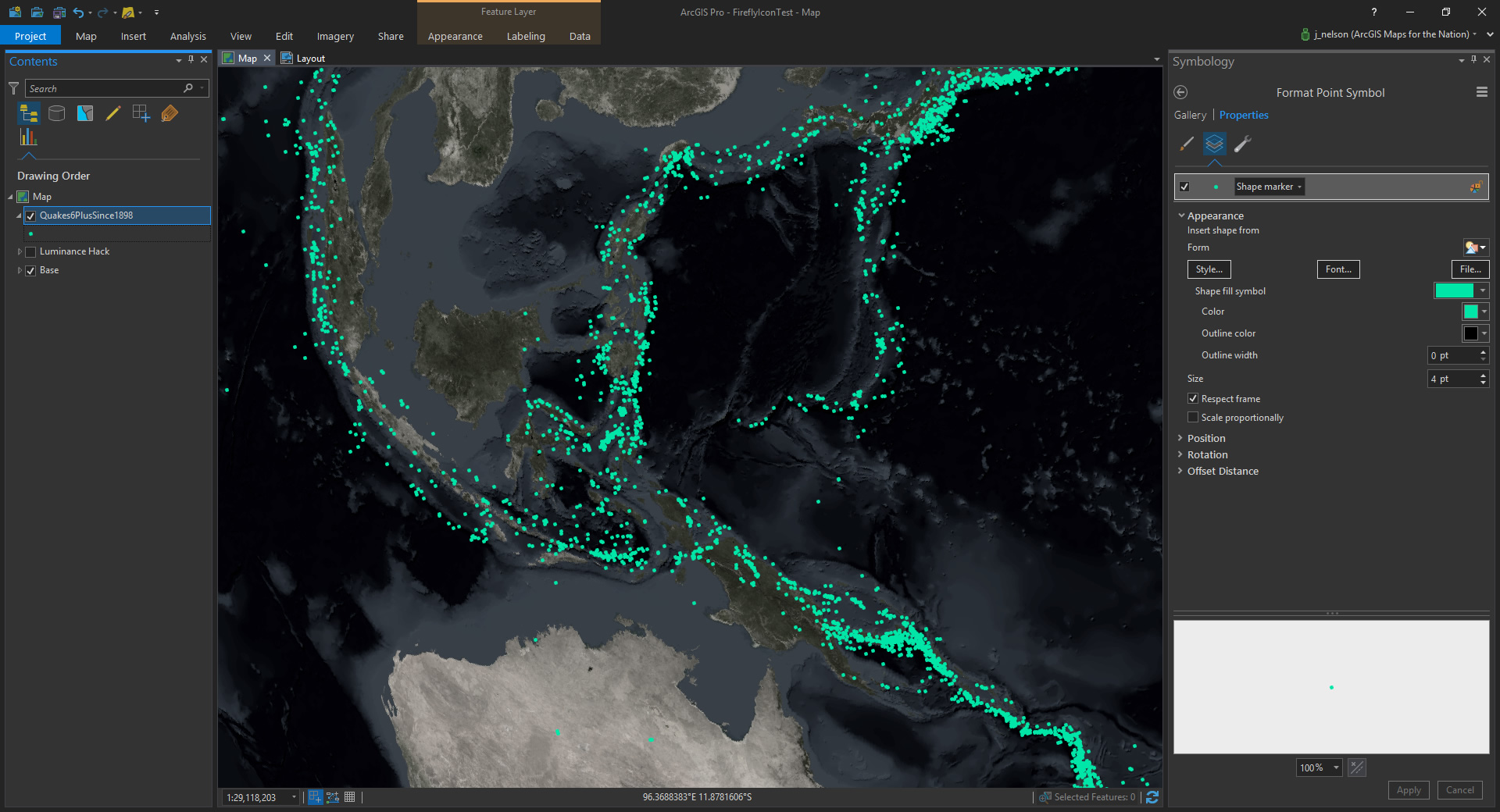
Here is a look at earthquakes, with a standard symbol marker. Lots of quakes. But the thing about quakes, and just about everything else, is that they aren’t so discrete and tidy as these symbols make them appear. They radiate energy outward and make their presence known to their surroundings.
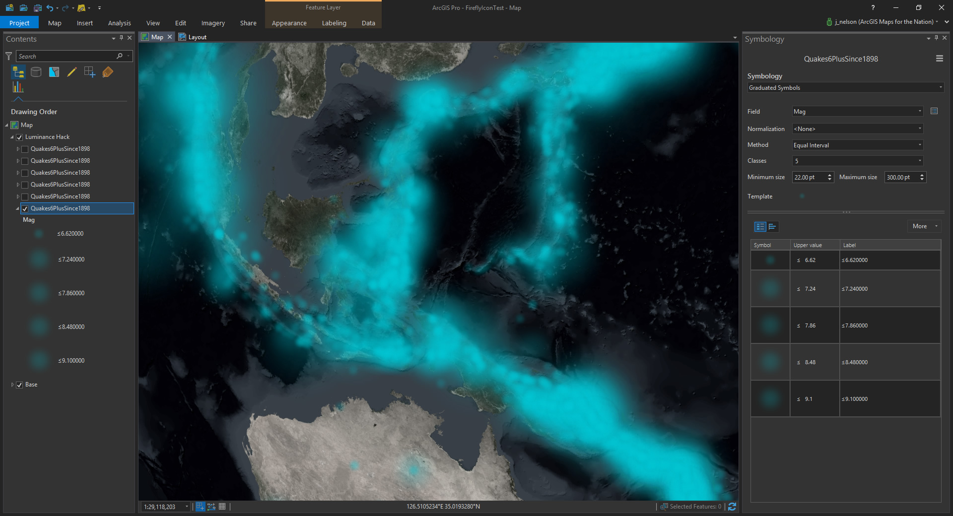
An earthquake ought to have a radial glow. And when that earthquake layer is duplicated several times, with the lower layers given a larger scale, that glowing amorphous effect is accentuated.
And if each of those layers has a slightly different hue, they merge to have a potentially beautiful chromatic radial decay…
Let’s see how this looks in ArcGIS Pro. I’m using the glow image (provided above) as a picture marker. And I’ve applied a tint to dye them a blueish color.
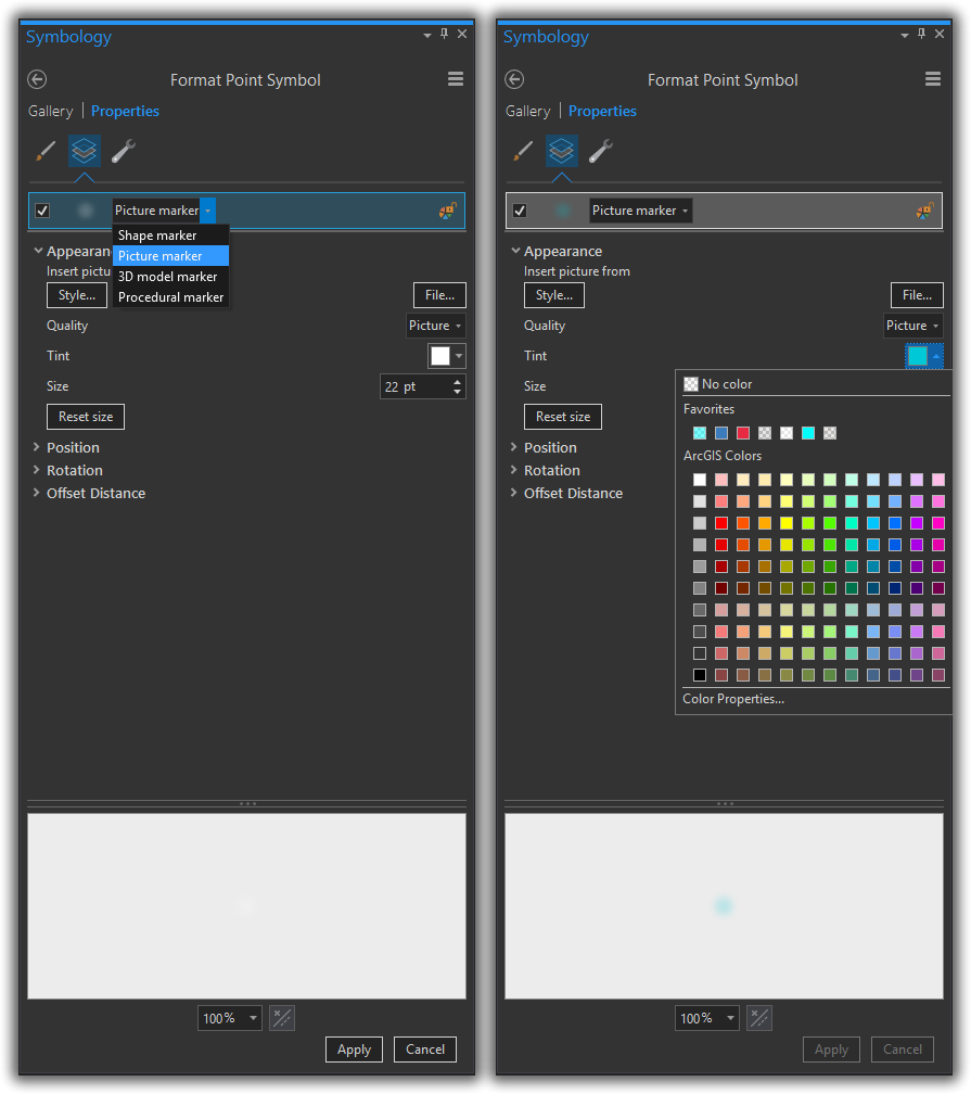
If you’ve never used the “tint” property on a picture marker, it hijacks the relative whiteness of pixels (this took me a bit to wrap my head around) and paints it the color of your choice.
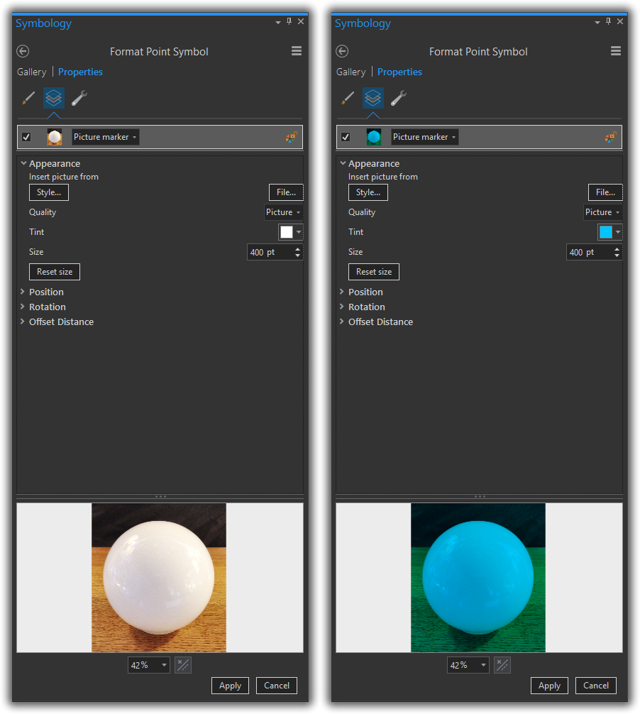
For example, here is an image of a pool cue ball. Then with a blue tint applied…
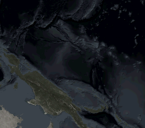
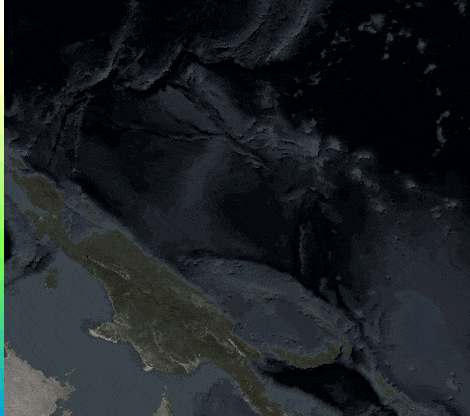
Here, I have a version of the layer scaled by earthquake magnitude. Really small earthquakes have really small blue fuzzies and really big earthquakes have really big blue fuzzies. I’m using a tint of #00C8D6. Areas of high concentration coalesce to form what pretty much looks like a kernel density map.
Like someone took and airbrush to the map and stood too far back. Let’s make a copy of this layer, reduce the size of the graduated symbols, and tint them #D1FF73. Now it looks like the airbrusher took a step closer.
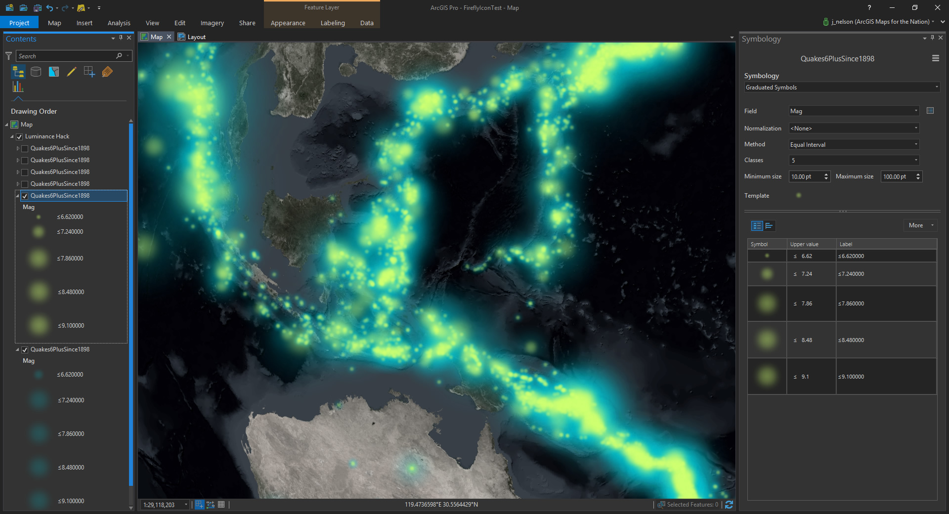
Already we’re getting an intriguing effect. It sort of reminds me of the lens flare background of the Focus Features vanity card. Anyway, this train is rolling and I don’t want to stop it. Here, I’ve added a third layer, smaller yet, and given a pale yellow color of #FFFFBE.
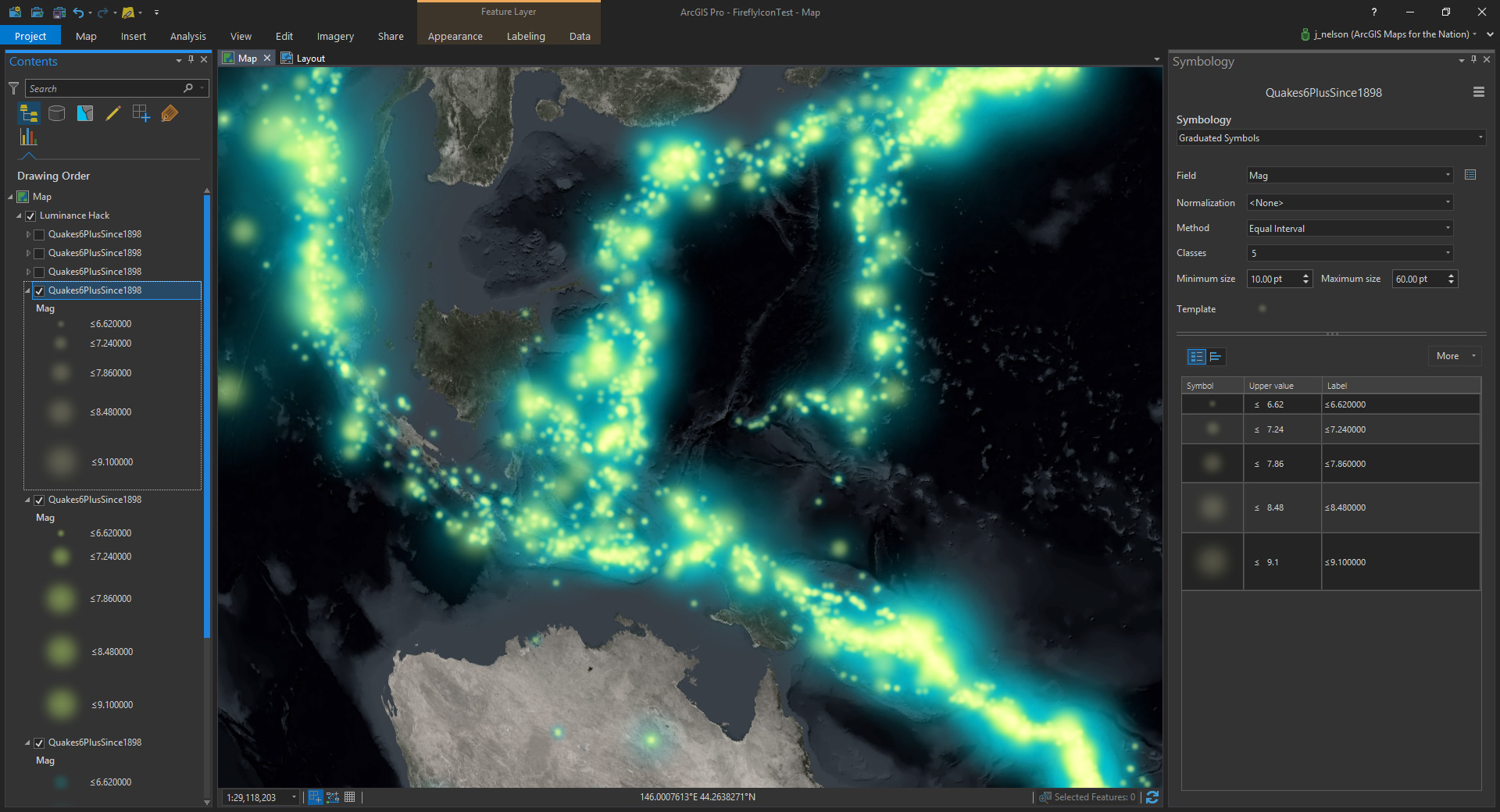
This white hot center really communicates an energetic confluence. Let’s turn it up to eleven by now adding a set of small, un-tinted, copies of the layer…

Firefly cartography does a pretty decent job of conveying blips of events and their diminishing impact on their surroundings at greater distance. The effect of a combined luminescence, particularly when coupled with a color scheme, can create the effect of regional intensity that spills over into neighboring areas. Just like in real life!
You could use a kernel density renderer of dense point layers, like this, and that would look cool, too. But there is an interesting amount of fluidity and control that this method allows. I hope you’ll give it a go (here’s a link to the image used as the picture marker), and make maps that are full of stars and share the results here in the comments!
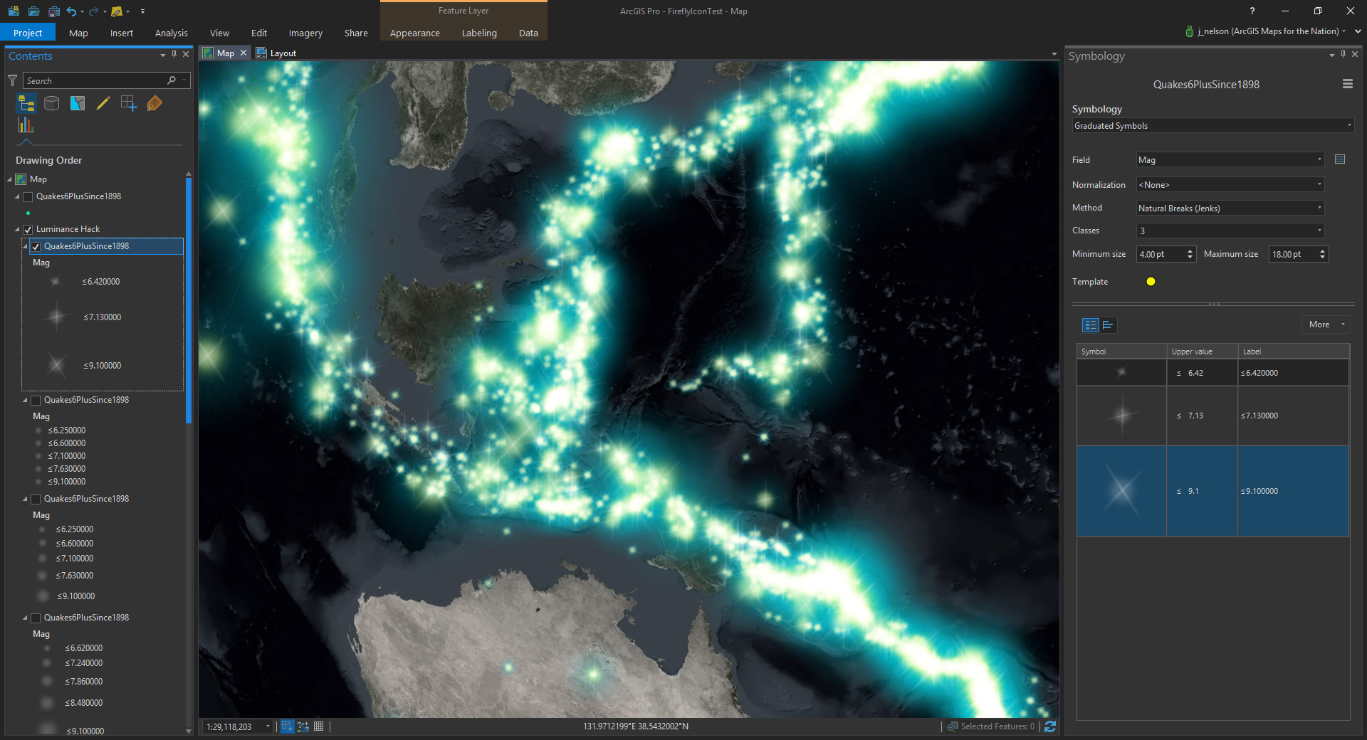
Speaking of stars, here’s a fun alternative to the top-most white symbols. This topmost layer uses a glowing image with a bit of a lens flare shimmer. Why not?
If you’d like to see the full-version in this style, as well as a map of the Mid-Atlantic Ridge, they are posted here.
If you like the basemap, you can have at it, in the form of a Pro project, here. There is also a Firefly imagery basemap tile set in the same aesthetic.
This map has a black vignette, to help frame the content and because vignettes are awesome. Here’s where you can download it and peruse a quick how-to.
Happy Mapping! John

Commenting is not enabled for this article.