What is a shapefile? A geodatabase? A raster? A hosted web layer? The GIS world can seem a bit overwhelming with so many different data types, but it doesn’t have to be. In this article I’ll walk you through using a few of the most common data types that you’ll encounter in GIS, so when someone throws data your way, you’ll know what to do with it.
This lesson was last tested on December 16, 2024, using ArcGIS Pro 3.4. If you’re using a different version of ArcGIS Pro, you may encounter different functionality and results.
Shapefiles
Shapefiles are an Esri-developed file format for storing geographic (shape) and attribute (table) information.
1. Go to HongKong_Transportation and click the Download button.
2. Locate and unzip the downloaded .zip file.
3. If necessary, open the HongKong_Transportation folder.
Inside there are eight files, all with the same name, but different file extensions.

A shapefile is actually a collection of files. The three required pieces are the .shp, .shx, and .dbf files. If one of these is missing, the data won’t work. But shapefiles also often come with extra parts, such as a .prj (projection) file—which defines the coordinate system for the data. If you delete that file, the data will draw, but maybe not in the right place.
To open a shapefile, you’ll need GIS software like ArcGIS Pro.
4. Open ArcGIS Pro. If you don’t have ArcGIS Pro, you can sign up for an ArcGIS free trial.
5. On the ArcGIS Pro startup page, under New Project, click Start without a template.
6. On the ribbon at the top, on the Insert tab, click New Map.
7. On the Map tab, click Add Data.

8. Browse to the shapefile, in the HongKong_Transportation folder. Here it only appears as one file, instead of eight.

9. Choose HongKong_Transportation.shp and click OK.
The data now appears on your map as a set of points.
10. On the ribbon, click the View tab. Click the Reset Panes button and click Reset Panes for Mapping (Default).
The Contents pane is now open on one side of the map, and the Catalog pane is open on the other.
11. In the Contents pane, right-click the HongKong_Transportation layer and choose Attribute Table.

A table appears showing the attributes for the points. The fclass column looks like the most useful one; it contains the transportation feature types, including tram stops, bus stops, and railway stations. The name fclass may not seem intuitive, but shapefiles cannot have field names longer than ten characters, so you’ll often run into cryptic headings like this.
12. Close the attribute table.
It is easy to save a shapefile and email it to a colleague, so you will come across many shapefiles if you’re searching for data on the internet. But this data type is older, so it has a number of limitations. For example, shapefiles cannot support time, null values, or the full range of Unicode characters.
Geodatabases
Esri has since created a new format for storing data—the geodatabase. If you’re creating or saving data, I recommend using this format instead of shapefiles. Data stored in a geodatabase will take up less space and perform faster than shapefiles.
1. Go to Hong_Kong GDB and click Download.
2. Locate and unzip Hong_Kong_gdb.zip.
Inside is a file geodatabase: HongKong.gdb. Inside the geodatabase are a lot of files with mysterious names. Leave them alone.
3. Return to your map in ArcGIS Pro.
You can add the gdb data the same way you added the shapefile (with the Add Data button), but I’m going to show you another way.
4. In the Catalog pane, on the Project tab, right-click Databases and choose Add Database.

5. Browse to and select HongKong.gdb. Click OK.
Tip: You may need to click the Refresh button next to the search bar.
In the Catalog pane, under Databases, there are two geodatabases listed. Default.gdb was created automatically when you created the project. It is empty now, but the house icon attached to it means that it is the default geodatabase for the project, so any new data that you create in this project will be placed here by default.
6. Expand HongKong.gdb. This is the geodatabase that you just downloaded.

While a shapefile can only hold one layer of geographic information, a geodatabase is a container that can hold many layers. HongKong.gdb has two: a polygon layer and a line layer. The layers inside a geodatabase are called feature classes.
7. Click the HongKong_ProjectedPopulation feature class and drag it onto the map.
8. Right-click HongKong_Roads and choose Add To Current Map.
9. In the Contents pane, right-click the HongKong_ProjectedPopulation layer and choose Symbology.
10. The Symbology pane appears. Under Primary symbology, choose Unique Values.
11. Change Field 1 to Population Trend.

Now the map is symbolized to show where population was projected to grow or shrink in Hong Kong between 2014 and 2024.

It looks as though some of the densest concentrations of bus and train stations are in areas experiencing a decline in population. Later, you’ll add more data to explore why.
12. Close the Symbology pane.
Exporting data
One of the advantages of the geodatabase is storing all your related data in one place. It would be nice if the transportation point layer could be stored with the other Hong Kong data.
1. In the Contents pane, right-click HongKong_Transportation, point to Data, and choose Export Features.
The Export Features window appears. This tool will copy the shapefile into a feature class within the geodatabase.
2. Click the Output Feature Class box.

The full path appears. By default, the data will be copied into the project geodatabase—Default.gdb. You want it to be placed in HongKong.gdb instead, so you’ll change the path.
3. Next to Output Feature Class, click the Browse button.
4. In the Output Feature Class window, in the navigation pane, expand Databases and click HongKong.gdb.
5. For Name, type HongKong_Transportation. Click OK.

6. In the Export Features window, the Output Feature Class field updates. Click OK.
In the Contents pane, you now have two layers named HongKong_Transportation. One is the original shapefile, and the other one is the new feature class.
7. Double-click the bottom HongKong_Transportation layer to open its Layer Properties window. On the side, click the Source tab.
The Data Type is listed as Shapefile Feature Class. This is the original layer that you want to remove.

8. Close the Layer Properties window. In the Contents pane, right-click the bottom HongKong_Transportation layer and click Remove.

9. In the Catalog pane, under Databases, right-click HongKong.gdb and click Refresh. Expand HongKong.gdb.
The point layer is now stored inside the geodatabase alongside the line and polygon layers.

Web layers and services
The layers you’ve used so far are stored on your computer. You can also add online layers to your map without downloading them. These are sometimes called services, service layers, or web layers.
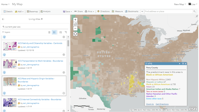
1. In the Catalog pane, click the Portal and Living Atlas tabs.

The Portal tab provides access to online layers owned by yourself or others. The Living Atlas tab only shows the curated content available from ArcGIS Living Atlas of the World.
2. In the search bar, type World population density and press Enter.

The icons shown in the search results tell you what kind of service each item is. In the screenshot above for example, the icons represent a tile layer, an imagery layer, a feature layer, and a web map. Feature layers are the online equivalents of the feature classes you worked with already.
3. From the search results, add the WorldPop Population Density 2000-2020 1km imagery layer to the current map.
4. In the Contents pane, uncheck the box next to HongKong_ProjectedPopulation to turn this layer off. The new layer is revealed on the map.

WorldPop Population Density 2000-2020 1km is service layer, because it is served from the internat, rather than being stored on your computer. It is also is an imagery layer, which means that it is raster data.
The other layers that you added to the map were vector data, which is made up of points, lines, and polygons. Raster data is instead composed of a grid of cells. A digital photo is a kind of raster, made of a grid of differently colored pixels.

The cells of the WorldPop layer are color-coded to represent the population density of each area.
5. On the ribbon, click the Map tab. Click Basemap and choose Imagery.

The basemap updates to show imagery of the earth that was collected by satellites and aircraft. Like the WorldPop layer, this too is a raster. It is also a service layer, because it is hosted online.
6. Explore the map by zooming, panning, and turning layers on and off.
Before, it seemed as though a lot of bus stops and train stations were located in areas of declining population, but now you can see that those areas are also very densely populated. When viewed together, the ProjectedPopulation and WorldPop layers suggests that surrounding urban areas are taking some of the burden of urbanization away from extremely dense Hong Kong Island, Kowloon, and Tsuen Wan. The imagery basemap can also help to explain why extremely dense areas exist right next to unpopulated green space: these places are mountainous, making them difficult to build on.
Real-time data
One of the advantages of services is that someone else updates them for you, so you don’t have to worry about downloading the latest version to keep your map up to date. Some layers even update in real time.
1. Copy this link: https://www.arcgis.com/home/item.html?id=bdfd0ca3f731412d81391d00b721bd08
You can also visit the link to read about the layer.
2. On the ribbon, on the Map tab, click the bottom part of the Add Data button and choose From Path.

3. Paste the URL and click Add.
A new layer, called TDCCTV, is added to your map.
4. Click one of the new points on the map.
A pop-up appears. It contains a traffic photo from a CCTV camera. Depending on where you are in the world, you might be looking at an image that was taken in the middle of the night.

If you reopen the same pop-up after a few minutes the photo and its time stamp will have changed.
Your map now has six layers (including the basemap) that you can use to explore population density in Hong Kong. Some layers are vector; some are raster. Some are stored in a geodatabase on your computer, and some are services that you are accessing from online. There are many more data types that you can use in ArcGIS Pro, with different purposes and functionality.
——————————
Photo by Ryan McManimie on Unsplash


Commenting is not enabled for this article.