Light is an amazing thing. Is it a particle? Is it a wave? It’s both?? How do we sense light with our eyes and minds and how do we represent light via a contraption like a monitor? And so on. We can only see a narrow band of the electromagnetic spectrum; biologically we are effectively blind to all the rest. But within that narrow band of perception we can construct visions of color that I can describe best as a blessing.
Bending the full range of visible white light with a prism breaks it into distinct hues based on the waviness of that portion of the electromagnetic spectrum. We sense things for their “color” based on the predominant, or mix of, wavelengths that bounce off of it.

Our eyeballs are typically equipped with three types of cone-shaped cells that are sensitive to photons traveling at different wavelengths. Photons come crashing in to the back of our eyeball and those cones trigger a message to our brain that they are being bathed in varying amounts of three wavelengths. Our mind sorts it out and paints for us a marvelously crisp picture of something much further than we could touch or smell. We can sense our surroundings, at great distance, by sucking up these three wavelengths of light and merging them into a feast of color. What an astonishing tool our visual system is.
I thought about light and color especially deeply when I was young. For a brief, though memorable, time in the late summer between the 3rd and 4th grade my color vision was replaced by a fully grayscale perception of the world. I don’t know if this was an abrupt physical result of the caustic battery acid (which is actually alkaline) that had just bathed my eyeballs, or instead something happening on the cognitive side dropping color vision as an emergency reallocation of processing power at the punctuated arrival of exquisite pain. Whatever the explanation, my world at the flip of a switch (actually, at the pop of a battery) went black and white. More on that a bit further down, if you are interested.
Bending Light
Here’s a close-up image of a white section of my monitor that I took with my phone (plus a sweet $5 clip-on macro lens). When the red, green, and blue sections of vast swaths of pixels fire at the same time, our eyes see it as white light. A little like running a prism in reverse. An RGB monitor fires these red, green and blue pixel portions at various strengths and we perceive that variance as colors. It’s a hack, pushing various amounts of those wavelengths into our cones so our mind can paint the picture.
Most digital images make use of this three-channel system of representing full color. This includes natural-color, or true-color, remotely sensed imagery. Of course we have sensors that are capable of recording in wavelengths that are far more precise than, or out of range of, our human visual systems. But we still tend to re-map these “bands” to the handy red, green, and blue pixel channels so that our eyes can see them and our brains can (try to) make sense of them.
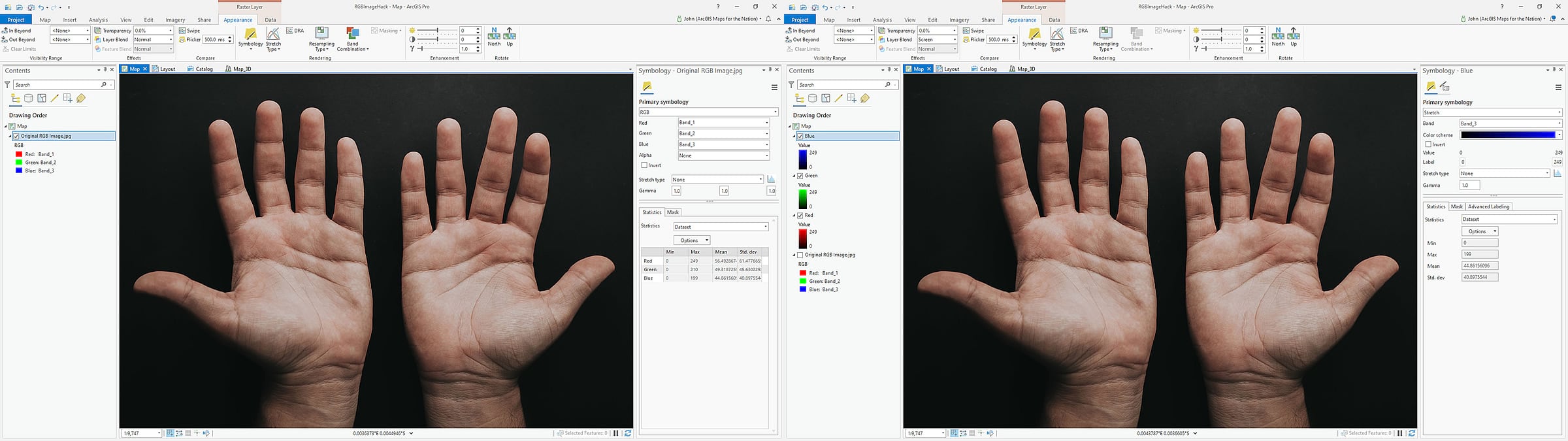
For fun, here’s a regular RGB jpeg image added to ArcGIS Pro.
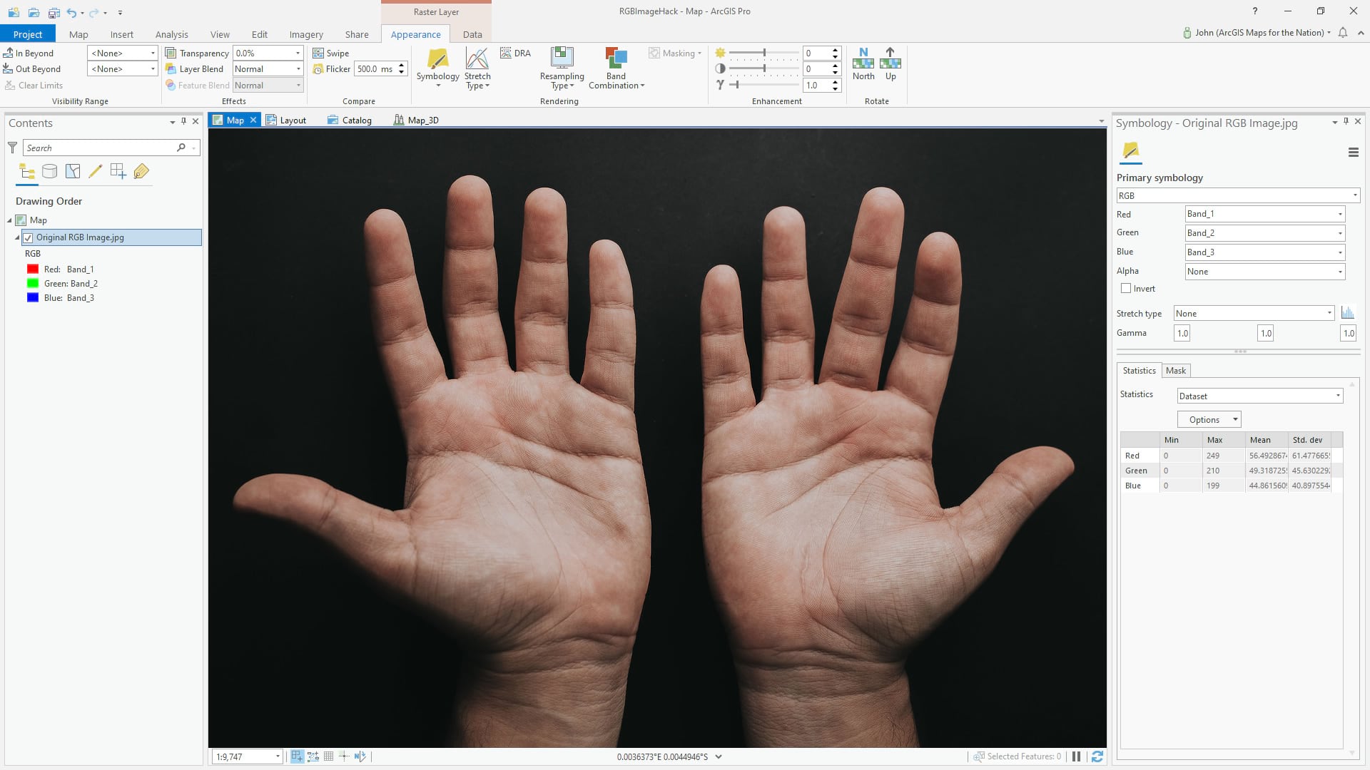
Helpfully, Pro recognizes this as an RGB image and by default shows it to me with the red, green, and blue channels assigned the correct bands (bands 1, 2, and 3, there in the symbology panel).
But we don’t have to show a three-band image with three bands. Here is a copy of the image (right-click the layer, copy/paste), with just the red band; I changed the symbology from three-channel “RGB” to one-channel “stretch” and selected band 1 (red). The result is a grayscale image of how brightly the hands reflect red light.
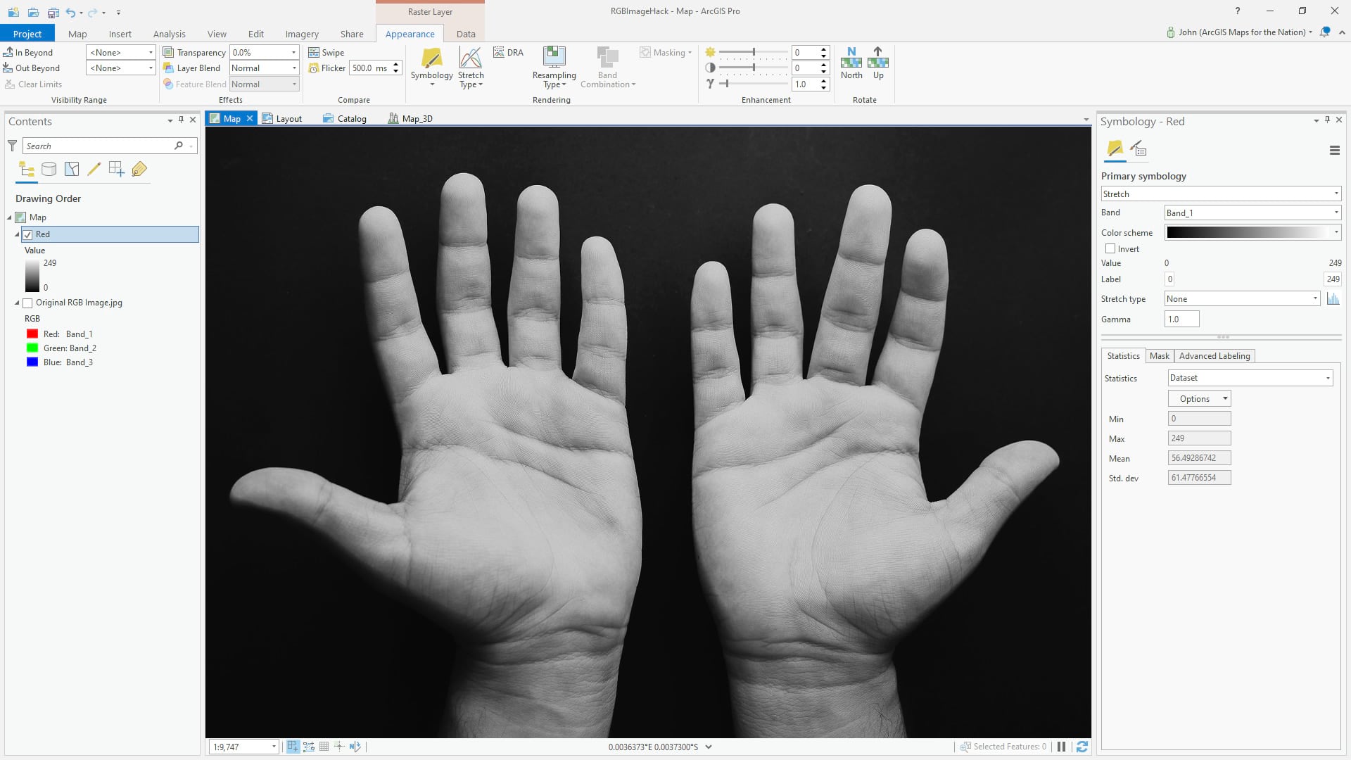
This gives us an idea of the amount of redness is present in the various parts of this picture. Like x-ray vision, but all you can see is red.
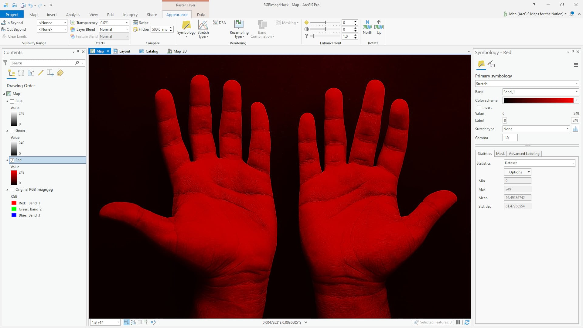
But there’s no reason we have to visualize this red band as grayscale. We can easily change the gradient to redscale (open up the color scheme editor and set a linear gradient from black to red). Makes more sense this way…
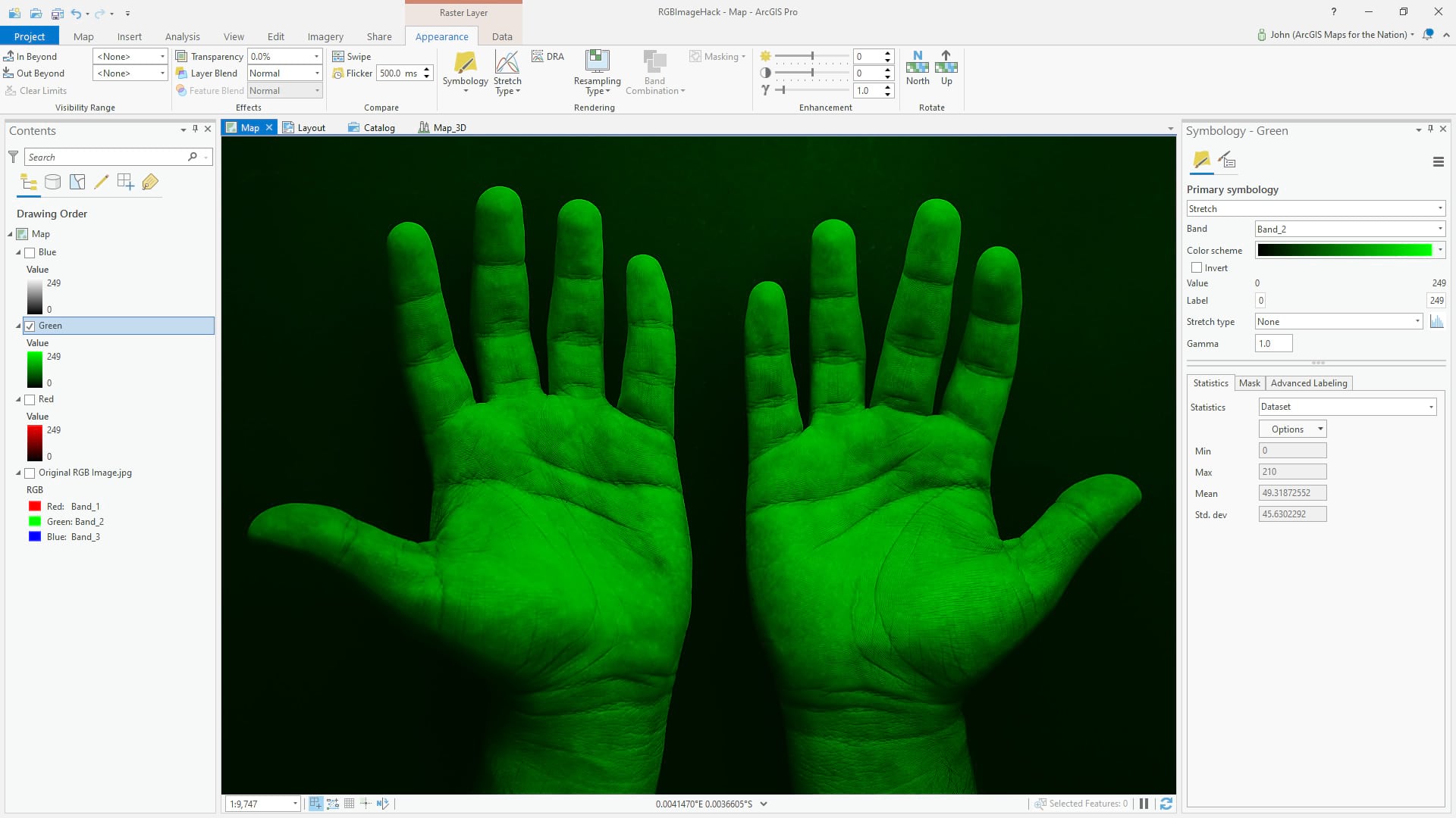
I’ve made copies of the image in the table of contents and isolated the green band in one layer…
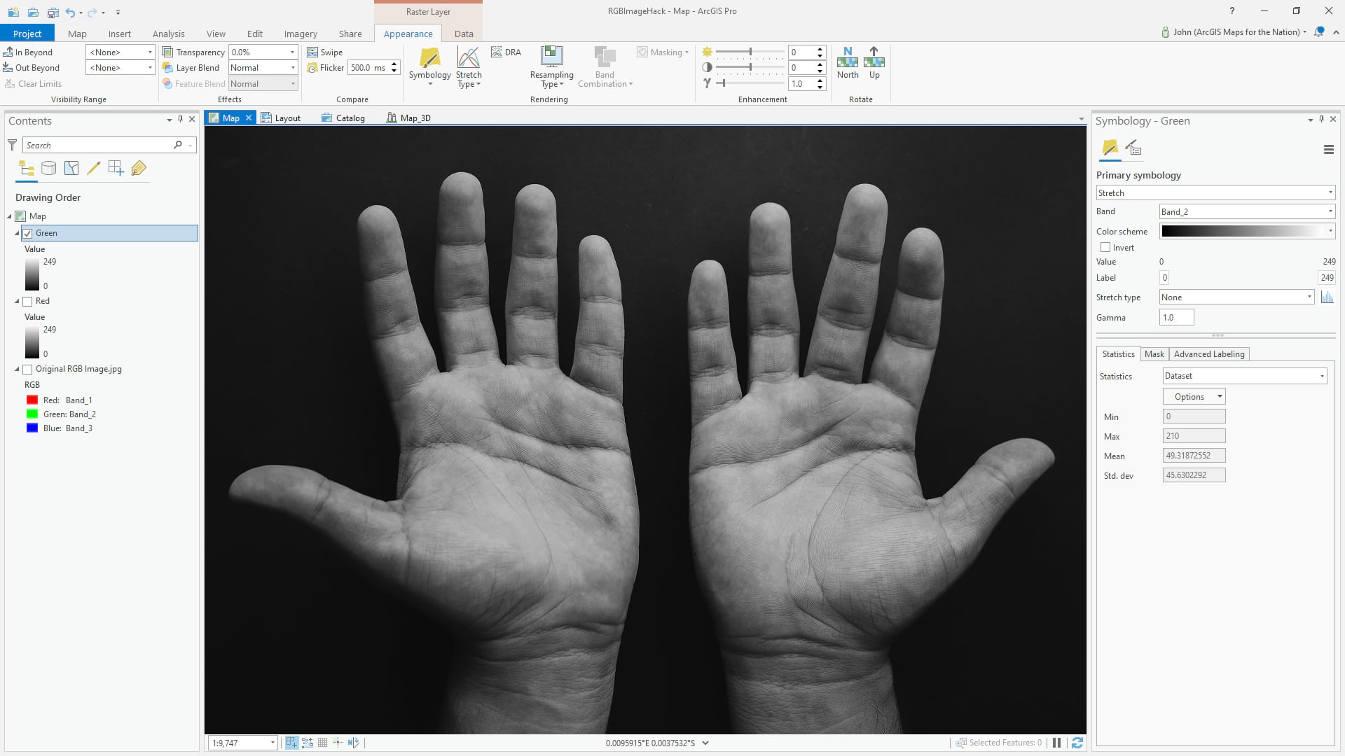
Which can easily be given a black-to-green linear gradient:
And the blue band…
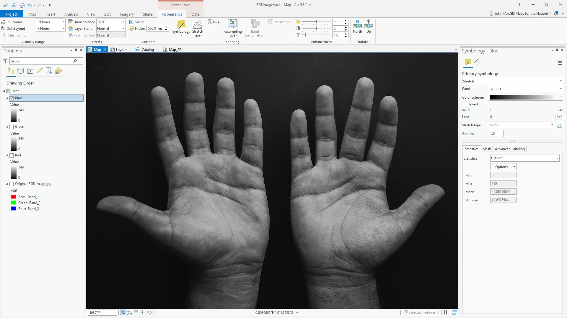
…to which we can assign a blue gradient:
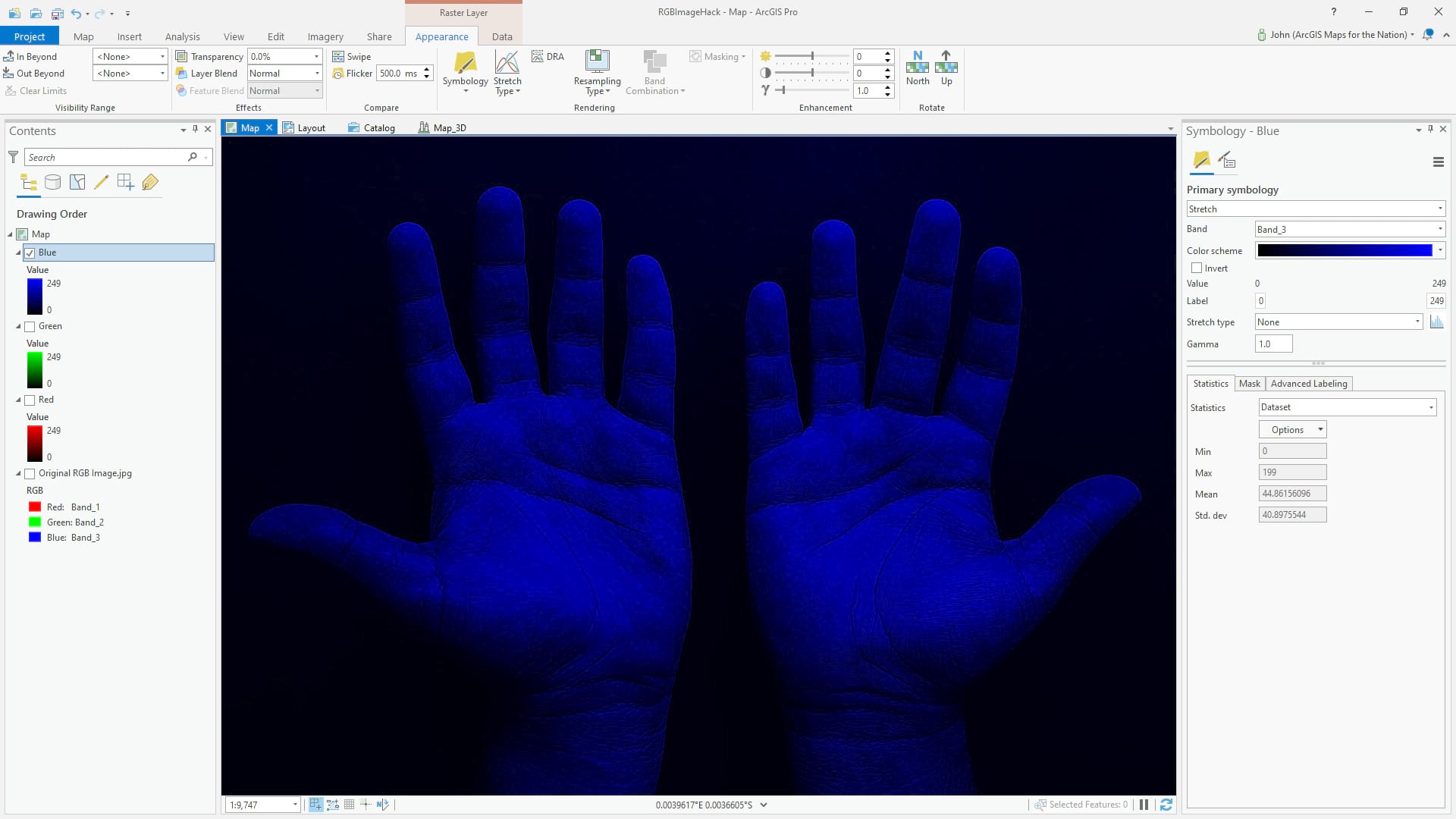
So now we have a stack of three single-band layers in Red, Green, and Blue. Now what?
Lets have some fun.
Blending Light
Rather than a convenient single RGB layer with three bands of hue that all conspire to illustrate the true color image of hands, we can manually reconstruct this effect with our three one-band colorized layers. Why? Because we can! And because we’ll accidentally grow more familiar with the adventures that lie within the algorithmic blending of layers: Blend modes.
With the red layer turned on, we can apply the screen blend mode to the green layer, to mathematically merge the red and green layers.
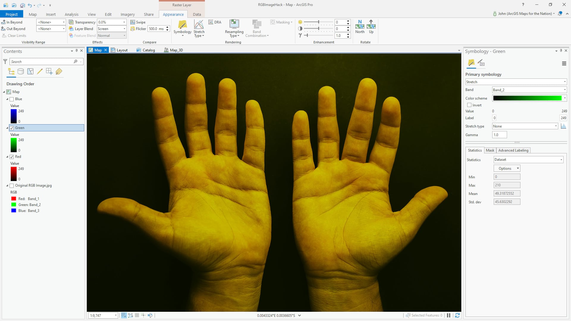
And here it is with the blue light blended in (again using the screen blend mode) so that all three layers are merged into a single full-color representation.
It appears no different than if I’d just turned on the original RGB image, but we are looking at three distinct layers (red light with red gradient, green light with green gradient, and blue light with blue gradient) all merged together visually using the screen blend mode. Here they are, side by side:
So What
So what? Because light is amazing. It’s an honor and a treat to get to paint with light—to break it into constituent hues, to merge it back into infinitely variable colors. Appreciating this capability also gives us a reminder of the incredible capacity to sense our world directly with the visual system we carry around in our skulls, and indirectly with imaging systems that we hold in our pockets or launch into orbit.
…
When I was nine years old I was desperately curious about how batteries worked. That question could be approached easily enough, I reasoned, by giving it a treatment I gave all other gadgets around the house: disassembly. I placed a d-cell battery in the bench vice in the garage and squeezed it, hoping for the top to pop off. Seems like a solid plan, right? As I twisted the lever and the battery cap bulged with pressure, I peered in closer, wide-eyed to catch a glimpse of the mysterious contents. Catch them, I did. I can still recall with clarity the hiss sound that accompanied the spurting of the alkaline powder into my right eye, like a snake bite. It was one of those times when the dose of pain can’t be immediately registered but you know something is really really wrong. I recoiled and blinked, dragging my eyelids over the caustic grit. As I said earlier, the world went immediately gray. And cloudy.
I’ll not bother describing the rest of that long day, except for this: That long first night was spent staring at the top left corner of the tv. It was the most precise place to direct my stare, because following the movement of the tv program itself triggered excruciating pain.
Pain is one of those strange windows into gratitude. Gratitude for the times when there isn’t pain. Gratitude for the parts of me that aren’t in pain at any one time. A fresh appreciation for the luxury of being on the other side of pain. This sense, in those days, was tightly woven with an appreciation for vision and color. Daily, then weekly, then monthly visits to the eye specialist gave me an opportunity to take off the patch that covered my right eye and let a little bit of light in for a short while, before the eyelids were to be glued shut once more for the healing time between visits. My eyes eventually healed and the patch came off.
Light is good. Color is fascinating. Keep asking questions and trying weird things. Take my word for it on the battery thing, though.

Article Discussion: