Among all the really nice comments I’ve received about my new Esri Press book ‘Thematic Mapping’ there has been one question posed be many. And it’s a question I also got when presenting technical workshops on the maps and their construction during the 2022 User Conference in San Diego… “how did you make the gradient border for the basemap”?
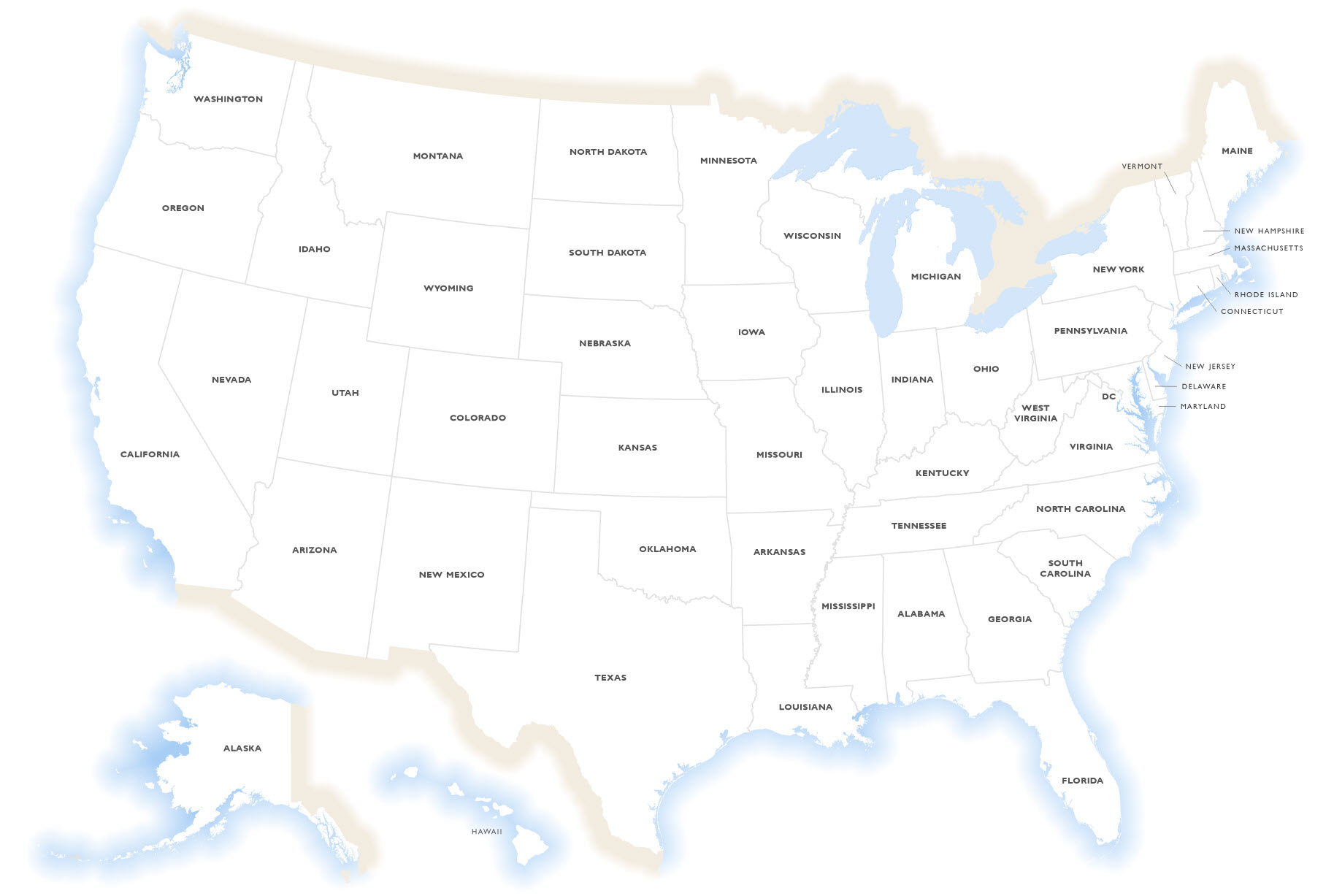
Here’s the basemap in question, designed as a consistent blank slate for all the maps in the book (well, all those except cartograms and abstract examples!). Alaska and Hawaii have been repositioned as insets to suit the printed medium of the book layout.
I’m a big fan of vignettes, which is the name for the gradient effect you can see round the external border of the United States. What they help achieve is transition from an otherwise harsh, hard map edge, to the rest of the page they sit upon. They soften the edge and give a sense that something lies beyond the map. There’s plenty of alternative vignette designs you can employ, which I discuss in my first book Cartography. (still available at all good online retailers).
Since I was working with a white background on the new book I decided something simple, and not too ornate would work well for the majority of maps so just a blended vignette of decreasing brightness from a solid colour that transitions to the white of the paper.
But of course not all the US is bordered by coastline. Some of it is land, and I felt it was important to go a little further than just use a consistent colour as a vignette around the entire map. I wanted to suggest where the map was bordered by land, and where it was bordered by water. And this is how I did it.
First, I simply created a buffered gradient fill of the country boundary polygon thinking it was that simple. Except for the states bordering the Great Lakes it just didn’t make sense. And while technically those states are bordered by water, maybe it made more sense to actually include the Great Lakes anyway, in which case I was going to need to show Canadian land beyond them. I therefore created a polygon feature that merged a Great Lakes polygon feature with the US polygon. Then I created a buffered polygon feature, and from this I simply applied a buffered gradient fill that transitioned from a watery blue by the coastline to the white of the background.

That’ll do for the watery bits, but now for the land. I created a polyline version of the background polygon used above so I was left with just an outline of the US (incorporating the Great Lakes). Then it was just a case of editing the line to remove boundary lines where there’s water, and retain those where there’s land that represents the Canadian and Mexican borders, including the Great Lakes extension because it made no sense to use the actual boundaries that bisect the lakes.
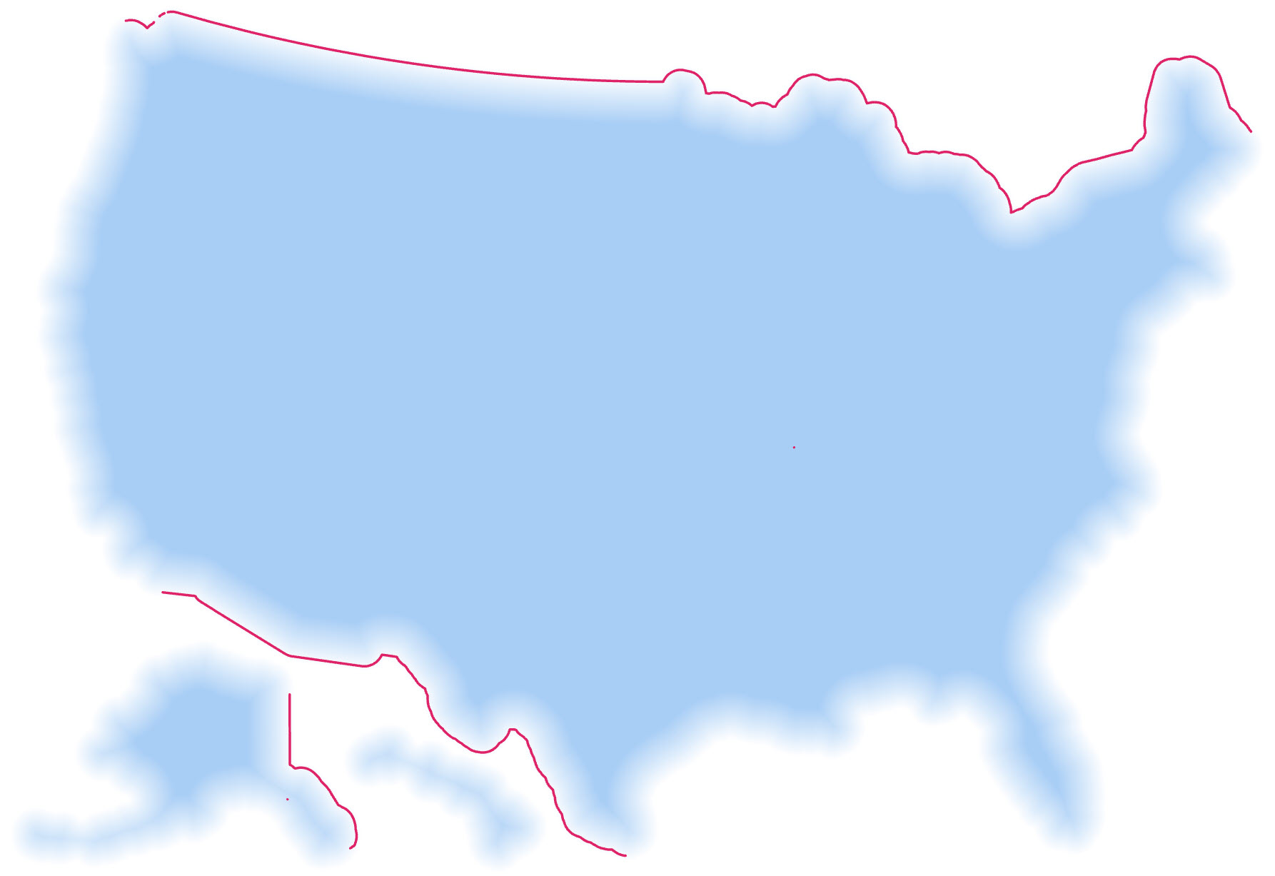
These lines then got a gradient stroke applied using a beige to represent a generic land colour, and again transitioning to the white of the background. These lines sit on top of the blue base and overprint the blue where there’s a land border.
To finish the base map off the US land area, and the Great Lakes were added as layers sitting on top to create the finished base map.
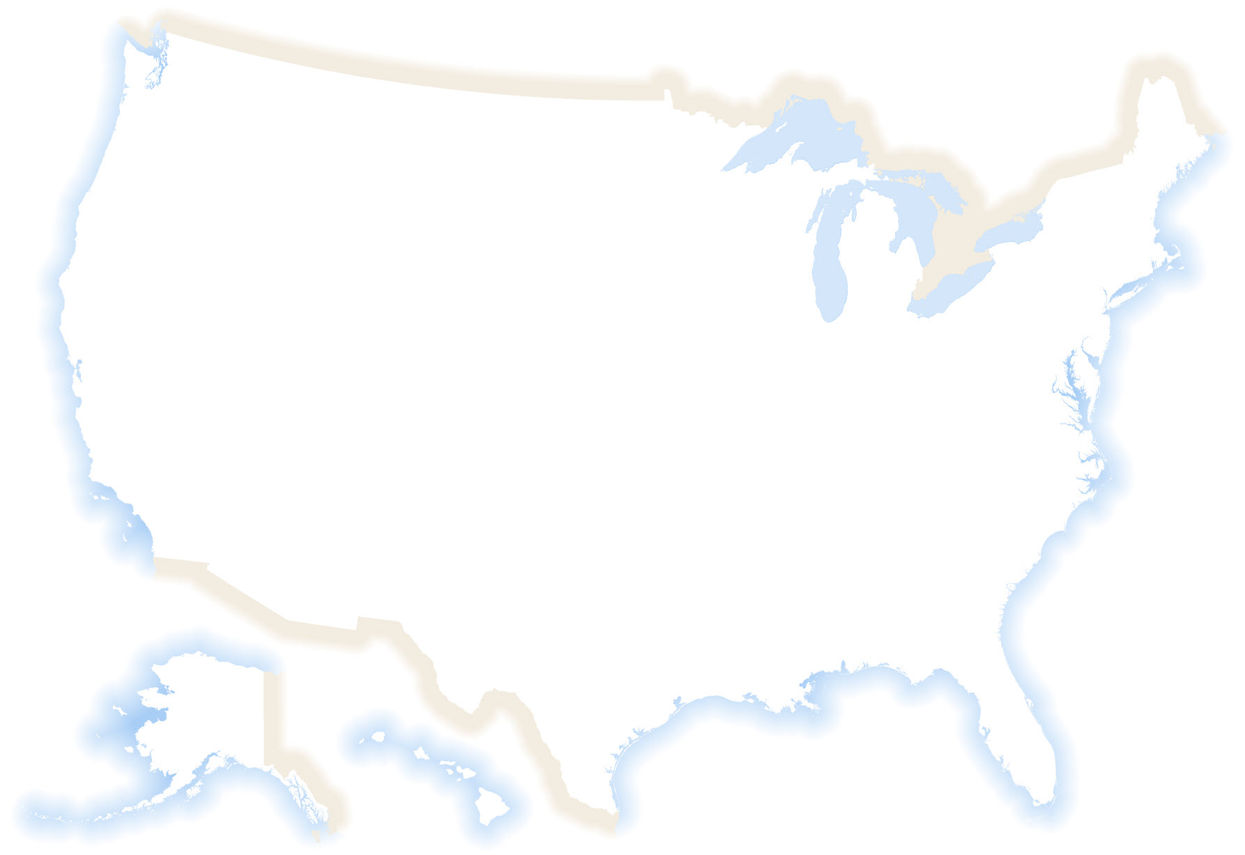
The finished effect gives the map a clean edge against either a blue or beige colour to suggest either a water or land-based continuation of physical features beyond the focus of the map. These quite quickly transition as a gradient into the white of the background. It adds interest, without being overbearing, and it also overcomes some of the problems of thematic maps appearing as their own islands on a page otherwise devoid of any real world information.
If you look carefully you’ll also notice that there’s no additional linework for the boundary of the US. That’s a useful benefit of this sort of technique because you’re making good use of negative space to create the mapped area without having to worry about the additional overhead of external border lines. Even in the map with state boundaries above only internal boundaries are used.
I like it, and it’s my book, so that’s how I made it!
But we can use these sort of techniques elsewhere too. Recently, that map hacker extraordinaire John Nelson was showing how you can make your maps go beyond the neatline. A useful technique for sure but I wanted to soften the transition of the blue background of John’s map as it protruded through the neatline.
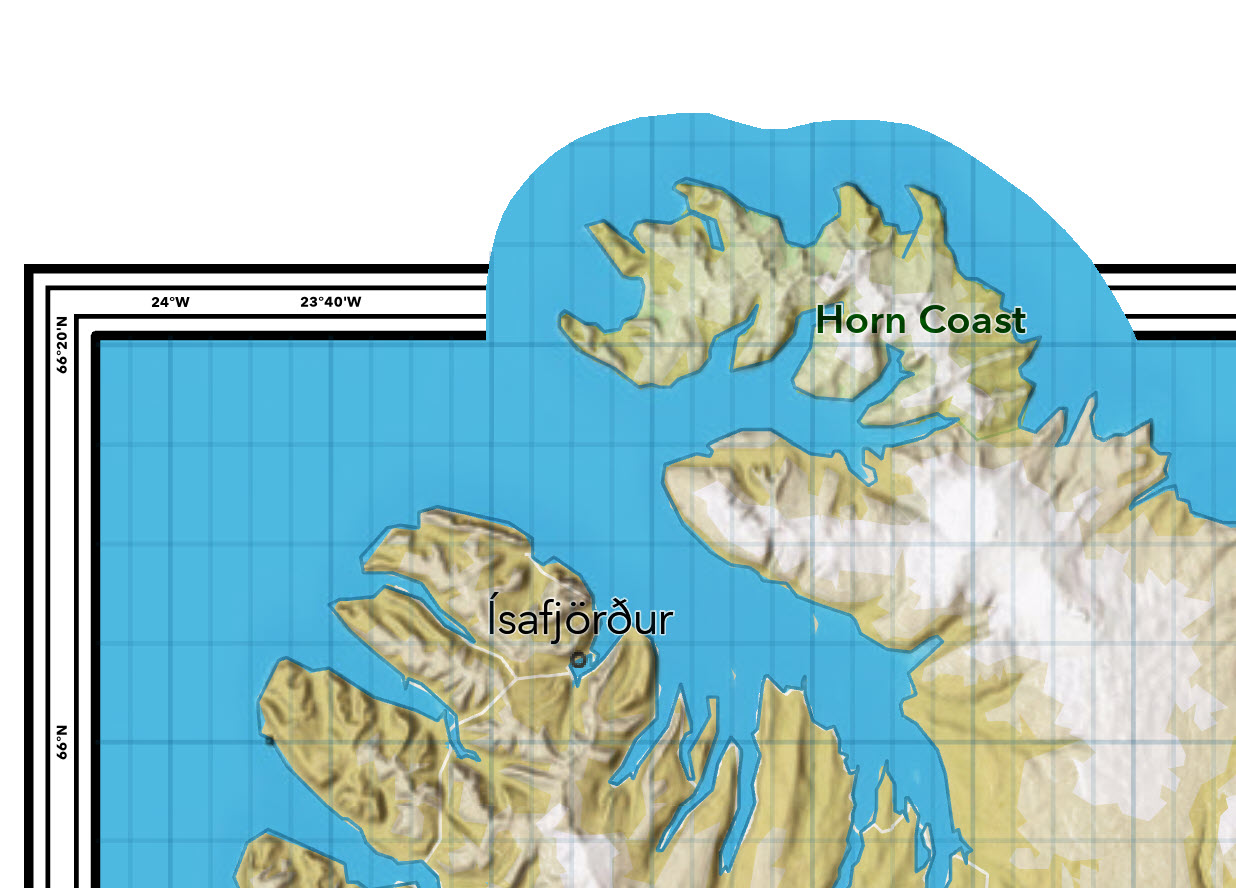
John sent me over his map because he’s a helpful fella, and I simply drew a line around the edge of the protruding piece of the map.
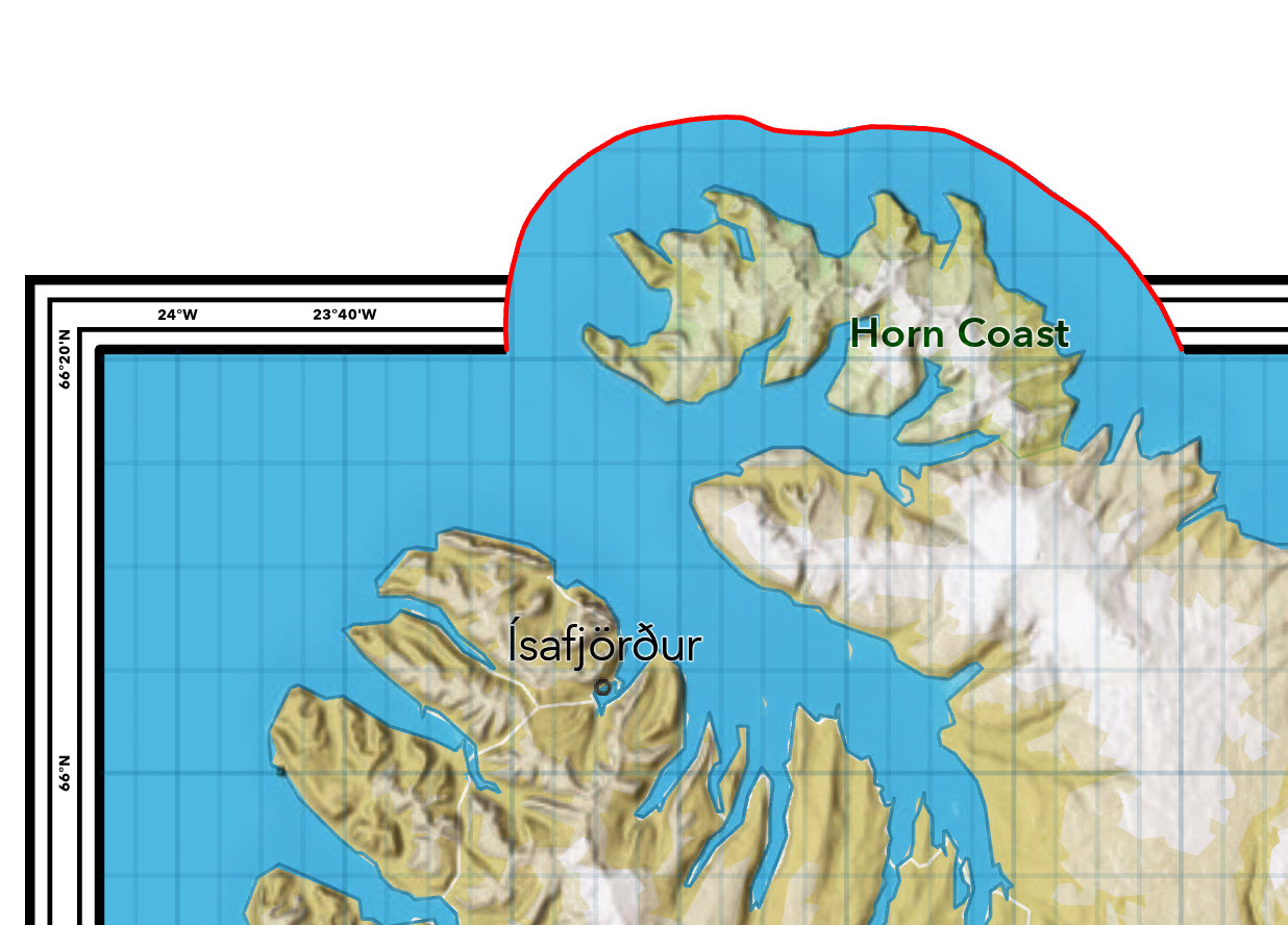
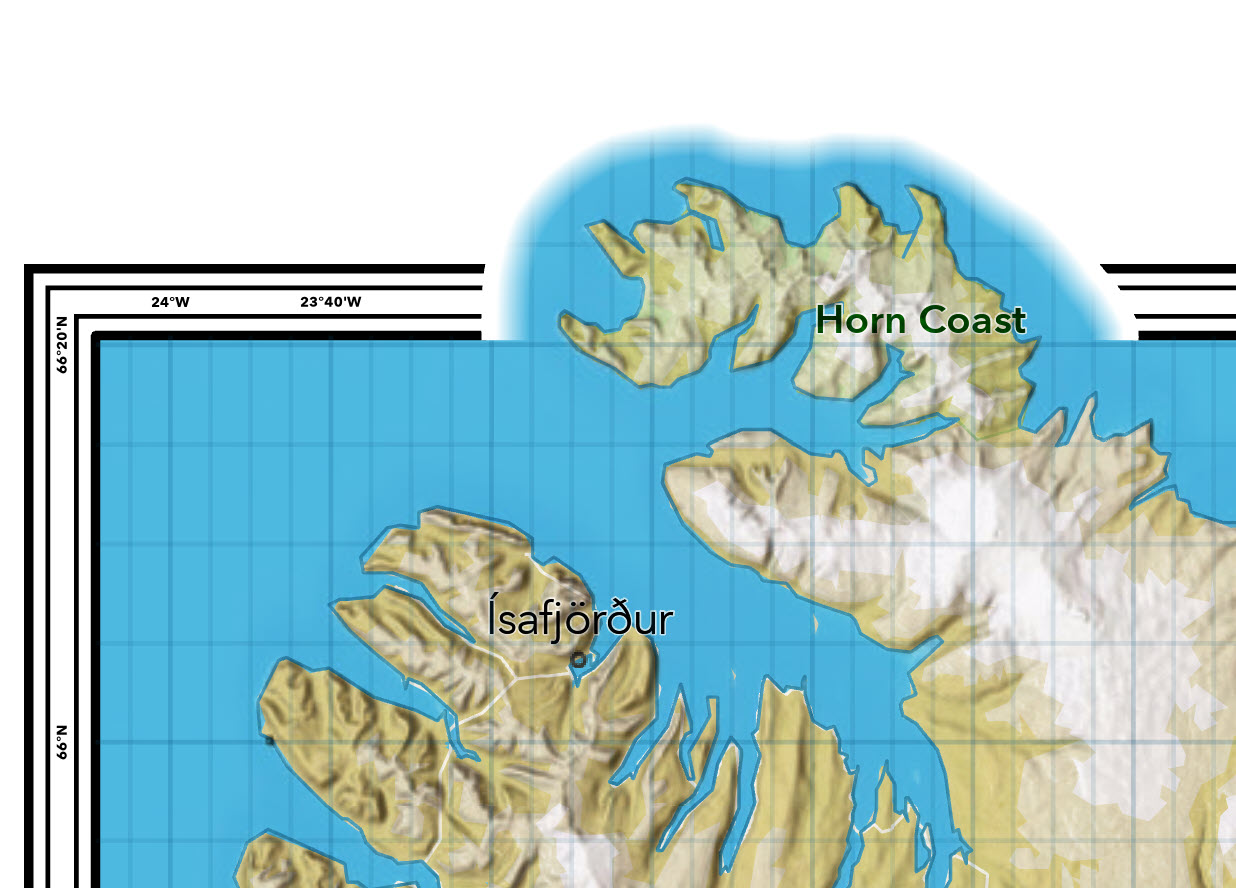
And finally, I applied the same gradient stroke to the line as I had on my land border lines transitioning from white on the outer edge, to transparent on the internal edge that blended into the map itself.
Finally, back to the Thematic Mapping book and when I got to a map I called “Stars and Stripes” which were effectively profile plots of 2016 election data across the map the original blue and beige vignette just didn’t work for me. And if something doesn’t work, that’s a pretty good reason to change it.
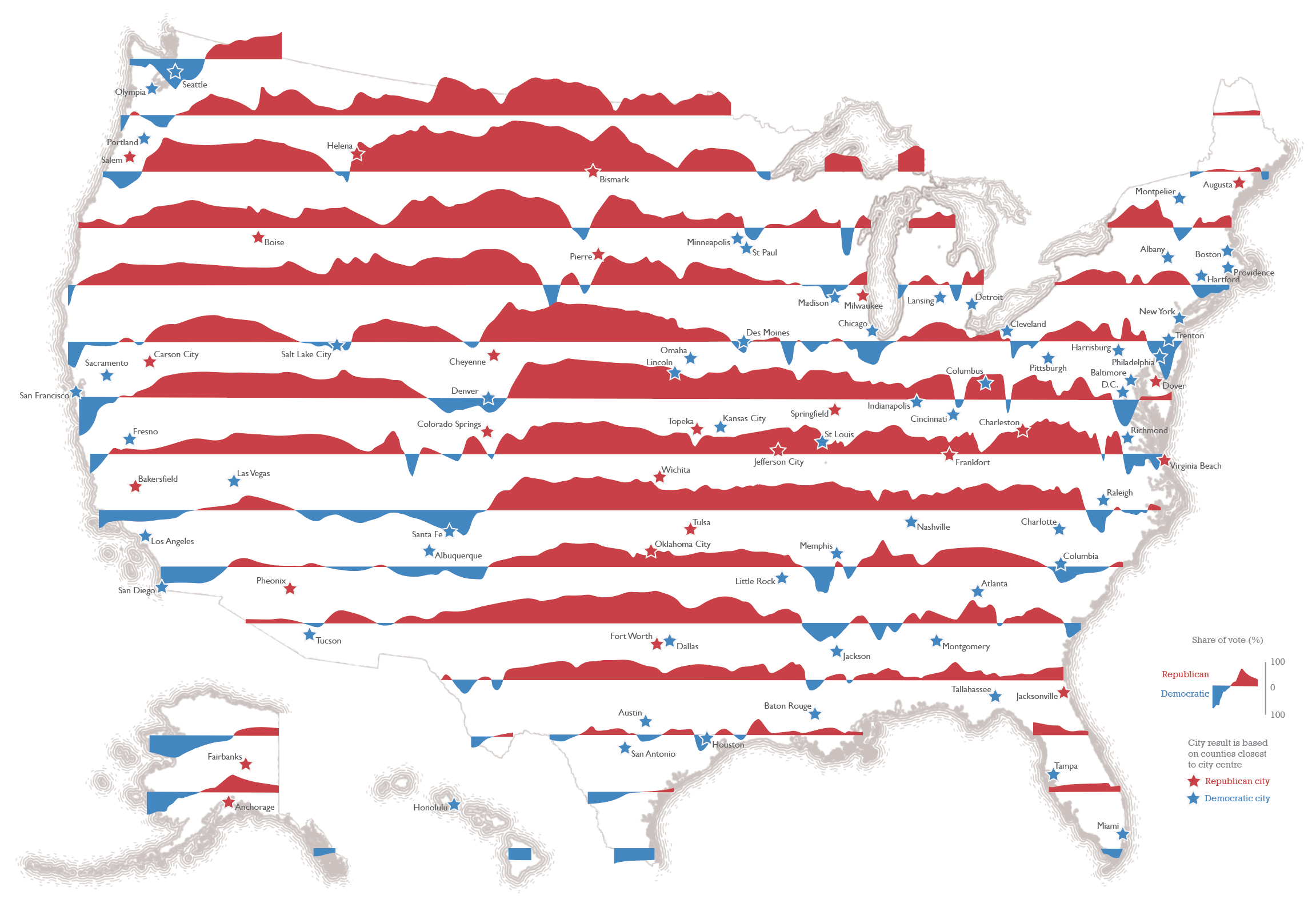
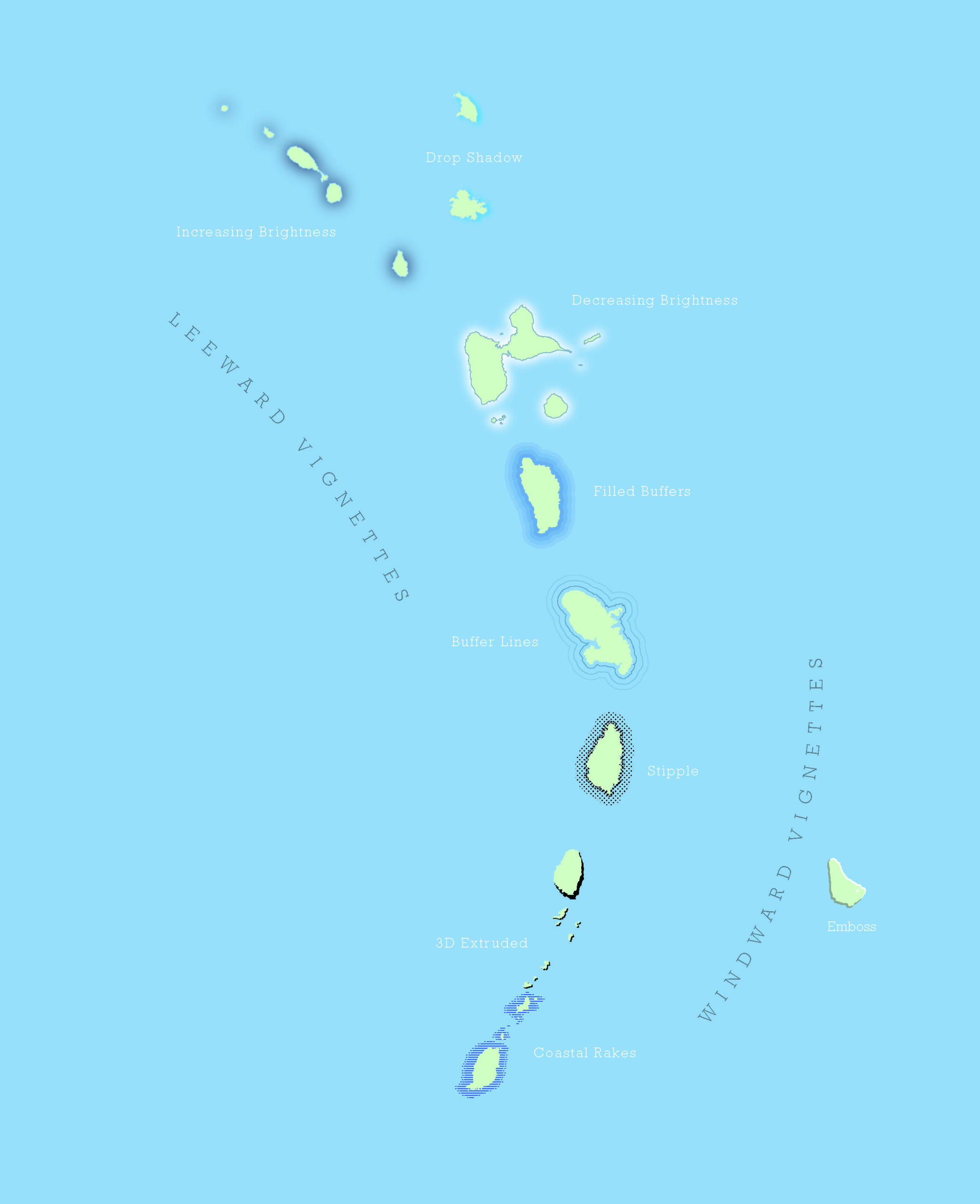
After a little experimentation I settled for a solid line for the land border, and a series of buffered lines for watery boundaries built from multiple stroke layers each with a slightly different set of parameters (e.g. solid to dashed lines with distance from the coast, and different wave effects) to create an organic, hand drawn appearance. It’s just a different way of representing borders and boundaries but for this particular map it worked better than the original template.
Happy mapping!

Commenting is not enabled for this article.