As map designers we should be considerate of accessibility…
There are an estimated 350 million people in the world with color vision deficiency. That is roughly 1 in 12 men and 1 in 200 women who are color blind. Statistically speaking the average person may know at least 25 people who are color blind.
When recognizing the impact that color can have in your map, it is important to understand the types of colorblindness that people can experience.
There are several types of color blindness:
People with deuteranopia are unable to perceive ‘green’ light or it can be deuteranomaly, which is a reduced sensitivity to green light. Deuteranopia and deuteranomaly are the most common form of color blindness.
Deuteranopes are more likely to confuse:
- Mid-reds with mid-greens
- Blue-greens with gray and mid-pinks
- Bright greens with yellows
- Pale pinks with light gray
- Mid-reds with mid-brown
- Light blues with lilac
People with protanopia are unable to perceive any ‘red’ light or it can be protanomaly, which is a reduced sensitivity to red light. Protanopia and protanomaly are less common types of color blindness.
Protanopes are more likely to confuse:
- Black with many shades of red
- Dark brown with dark green, dark orange and dark red
- Some blues with some reds, purples and dark pinks
- Mid-greens with some oranges
People with tritanopia are unable to perceive ‘blue’ light or it can be tritanomaly, which is a reduced sensitivity to blue light. Tritanopia and tritanomaly are extremely rare.
Tritanopes are more like to confuse:
- Light blues with grays
- Dark purples with black
- Mid-greens with blues
- Oranges with reds
Other people may have Achromatopsia, this means they see no color at all, only shades of gray. Achromatopsia is extremely rare.
For the purposes of this article we will focus on maps readability for Deuteranopes and Protanopes, since they are the most common type. Provided at the end of the article will be resources for all forms of color blind readability issues.
How can we make our maps readable to those who may have some form of color blind readability issue?
To start talking about color blind readability we need to take a step back and cover some color basics.
Hue refers to the wavelengths our eyes perceive. It is the color we see – red, green, blue – those are all hues. Hue is a term that is often used interchangeably for color.
Value refers to the shade of a color. A lower value represents a darker color and a value of zero is black. Value increases in the lightness or whiteness of the color.
Saturation refers to the intensity or purity of the color. An intense color is more saturated, and a dull color is less saturated and looks more gray.
Let’s look at the color swatches available in ArcGIS Pro
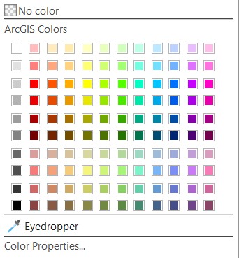
When we look at the same colors for someone with deuteranopia or protanopia – we can see how the colors differ.

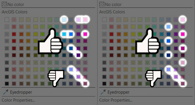
To choose the colors that work best for readability, we will first divide this color swatch into three main categories- reds/oranges, yellows/greens, and blues/purples. This is a general guidance, and you will want to check your final colors through an emulator, which we talk about later.
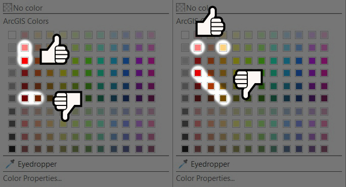
To choose colors in the columns of red hues, we want to ensure to go down the column (vertically) when choosing colors that are next to each other. Do not choose colors that are side-by-side in the same row (horizontally) as they are more difficult to distinguish.
With the orange column we can choose one orange and one red that are in the same row. But be cautious, when choosing colors diagonally in the reds and oranges, some look like the same color to someone with color blind readability issues.
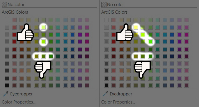
When it comes to the yellows and greens, we again do not want to choose colors that are side-by-side in the same row. We can choose colors in the same column but when we do, we want to skip every other value, or we can choose 2-3 colors that are diagonal.
With blues and purples we can choose 3 of the 4 colors in one row, typically skipping one hue in the two center columns. We can choose 2-3 colors that are diagonal to each other. If we choose all 4 that are diagonal, we may find 2colors may be too similar to each other. If we choose colors in a column, we will want to skip every other value.
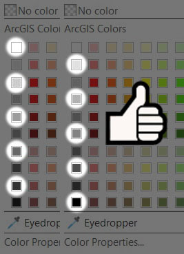
When we are working with the gray scale, we will want to skip every other value no matter who is viewing the map. Even those who have no issues seeing color will have issues distinguishing a 10% gray next to a 20% gray. So we will want to choose 10%, 30%, 50%, etc. grays or 20%, 40%, 60%, etc. grays.
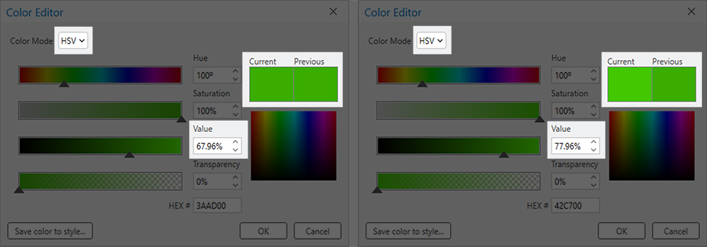
This idea can also be applied to custom colors. We can create custom colors in the Color Properties menu. If we have a color that “almost” works, we can distinguish the color more by increasing or decreasing the value by 10% from another color that looks similar. Working with the saturation is another technique to distinguish between similar colors.
In the Color Properties, we can switch from the RGB (Red, Green, Blue) color model to the HSV (Hue, Saturation, Value) color model to access the ability to change the value of a color.
Fills, point symbols, line weights, and other styles can help us make the map more understandable…
In the graphic below, we can see that the hue might not be the most helpful variable to distinguish between features.
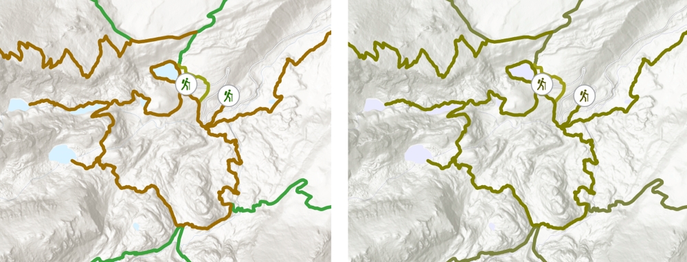
Although two of the lines might appear nearly the same as far as color – we can still distinguish between them using the dashed effect on the line, as seen in the graphic below.
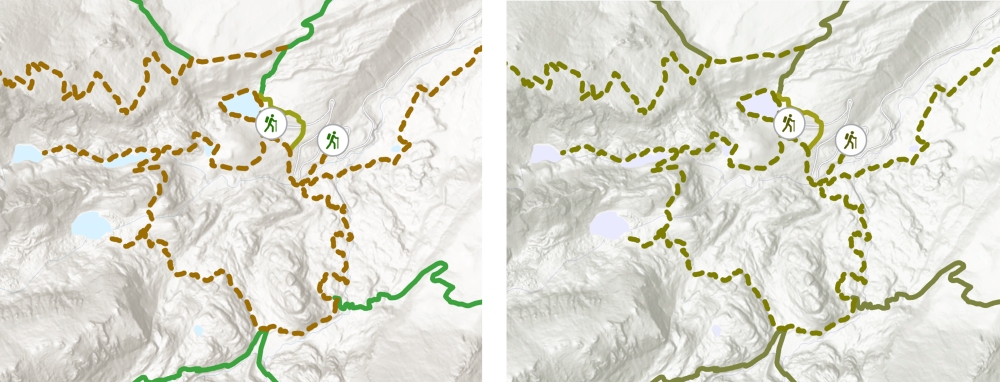
When we use our color tips to choose different hues or vary the values, we can use both hue and shape to help make that distinction between features even clearer.
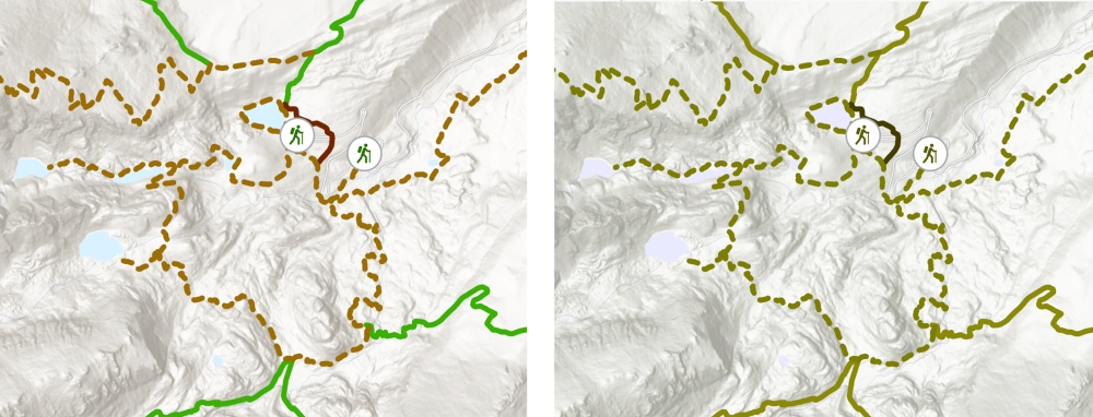
You might be saying to yourself, “Wow, this is a lot of work, is there an easier way?”
Yes, there is!
Within ArcGIS Pro 2.3+ is a color ramp called Cividis that will allow us to use colors that were pre-designed to be readable for those with some form of color blindness.
When we are choosing a color ramp, we can click on Show Names, and look for the Cividis color ramp.
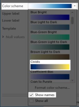
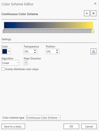
We can also choose colors from this ramp by selecting Format Color Scheme; this is also where we can reverse the color ramp. We can select any color in this scheme and save is as a Style. If you are not familiar with a Style, it is a way for you save and share your symbols, colors, color schemes, label placements, and layout items.
If we are working with bivariate symbology, a colorblind readability symbology option, called the Yellow-Blue-Black 3×3 color scheme is available as well. Bivariate colors symbology shows the quantitative relationship between two variables in a feature layer. This type of symbology uses bivariate color schemes to visually compare, emphasize, or delineate values. Similar to graduated colors symbology, each variable is classified and each class is assigned a color.
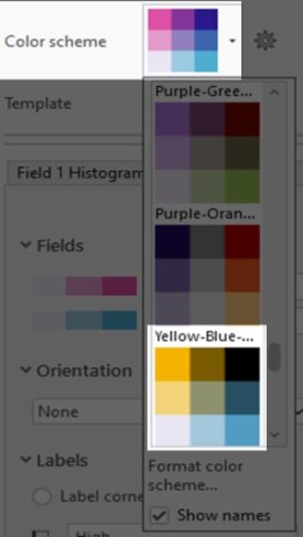
In addition, Cynthia Brewer – who created the ColorBrewer 2.0 website – has created color schemes that we can test for colorblind readability, and the colors are available as a Style in ArcGIS Pro. We can also use the ColorBrewer 2.0 website to input RGB or Hex color code ( values that tell the display that tell how much color to show) directly in the Color Properties in ArcGIS Pro.
Can we test that these concepts and changes work?
Emulators allow us to use a lens to see how our map will look to others.
In ArcGIS Pro 3.0+ is the Color Vision Simulator!
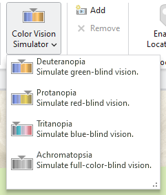
This will allow to see what your map looks like to those who have deuteranopia, protanopia, tritanopia, or achromatopsia. You can access it in the View tab and check your map through 4 filters. You can change your colors on-the-fly and see the changes.
If you want to learn more visualization tips and tricks, check out the Mapping and Visualizing Data in ArcGIS course.
I hope this article helps make your maps more accessible for everyone!
Happy Mapping!
Stephanie
Want to learn more?
Colour Blind Awareness – UK – Community Interest Company (non-profit): https://www.colourblindawareness.org/
Problematic Combinations for Color Deficient Vision – Penn State: https://accessibility.psu.edu/color/colorvisiondetails/
Understanding Color Blindness: A Guide to Accessible Design – Crux Collaborative: https://cruxcollaborative.com/insights/understanding-color-blindness-guide-to-accessible-design
Color Oracle: https://colororacle.org/ – free, color blindness simulator for Windows, Mac and Linux
Coblis: https://www.color-blindness.com/coblis-color-blindness-simulator/ – free, you can export a section of your map or graphic and run it through emulators
ColorZilla – free, Chrome and Firefox extension you can use to check colors – https://www.colorzilla.com/chrome/ and https://www.colorzilla.com/firefox/
Monosido Color Contrast Checker: https://monsido.com/tools/contrast-checker – free, a browser based color checker
WebAIM: https://webaim.org/resources/linkcontrastchecker/ – free, a browser based color contrast checker for web developers and can help with your app designs
WCAG Web Content Requirements: https://www.w3.org/TR/WCAG21/ – free, a reference guide to Web Content Accessibility Guidelines
Getting started with accessible storytelling for ArcGIS StoryMaps – https://storymaps.arcgis.com/stories/02670c9018f14cfbbaef7cba5c54d453
End of the Rainbow? New Map Scale Is More Readable by People Who Are Color Blind – Scientific American – https://www.scientificamerican.com/article/end-of-the-rainbow-new-map-scale-is-more-readable-by-peop…
Blog by Esri’s Kenneth Field – Too much rain for a rainbow – http://cartonerd.blogspot.com/2017/08/too-much-rain-for-rainbow.html
I also recommend the paper by Jenny/Kelso, Color Design for the Color Vision Impaired (they are the developers of Color Oracle).

Article Discussion: