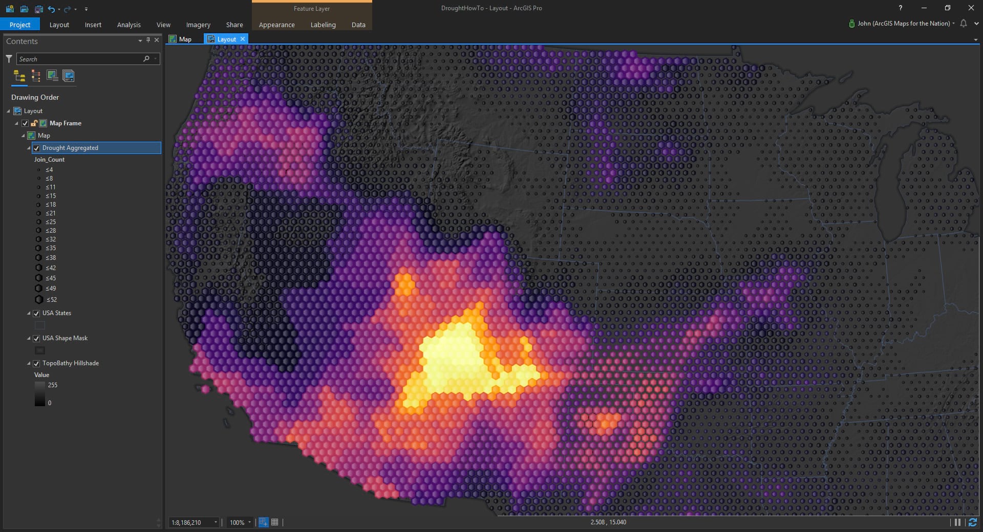
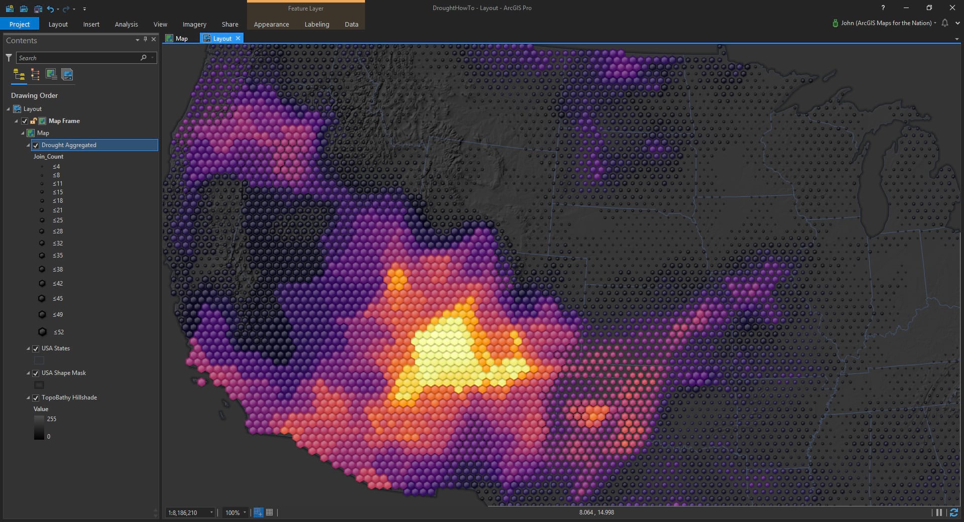
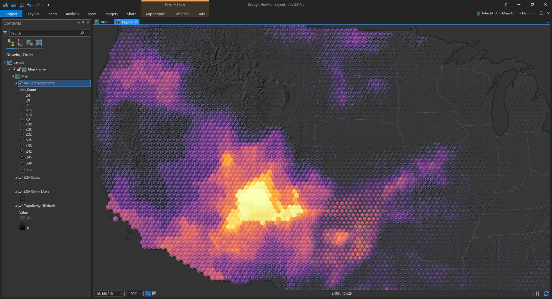
Here’s an ArcGIS Pro project bivariate map showing accumulated 2018 drought (wait, does that sound at all interesting? well shoot, I’m making a scintillating video series about how to do that! parts one and two are in the can).
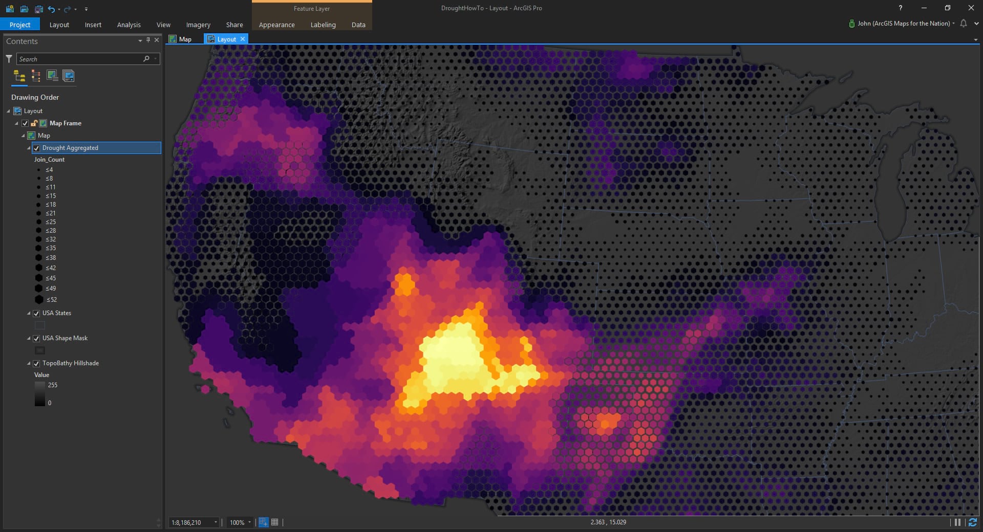
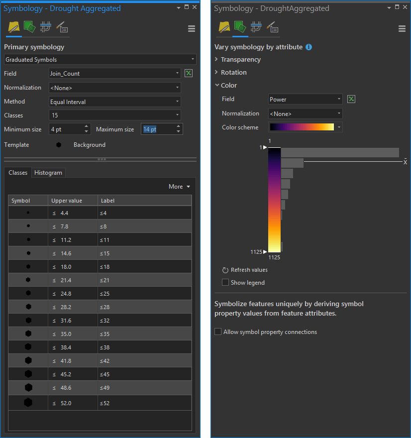
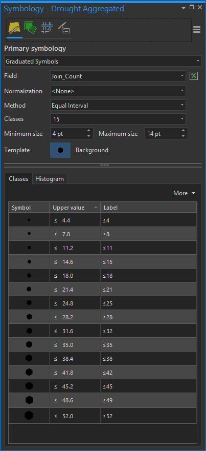
It’s a pretty simple symbology treatment for a hexagonal polygon layer. In the “Primary symbology” tab of the symbology panel I’ve assigned the number of months to be represented as graduated symbology (sneakily using a hexagon symbol for the hexagonal areas) and in the verbosely monikered “Vary symbology by attribute” tab of the symbology panel I’ve represented a drought intensity variable as color. At the same time!
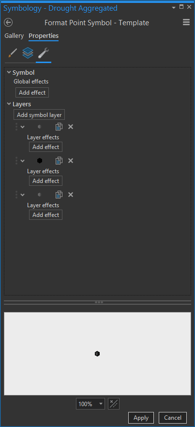
Here’s what those symbol settings look like:
All very Cartography 201. But let’s sneak across the hall to the digital design course to see if we can’t spice this up a bit.
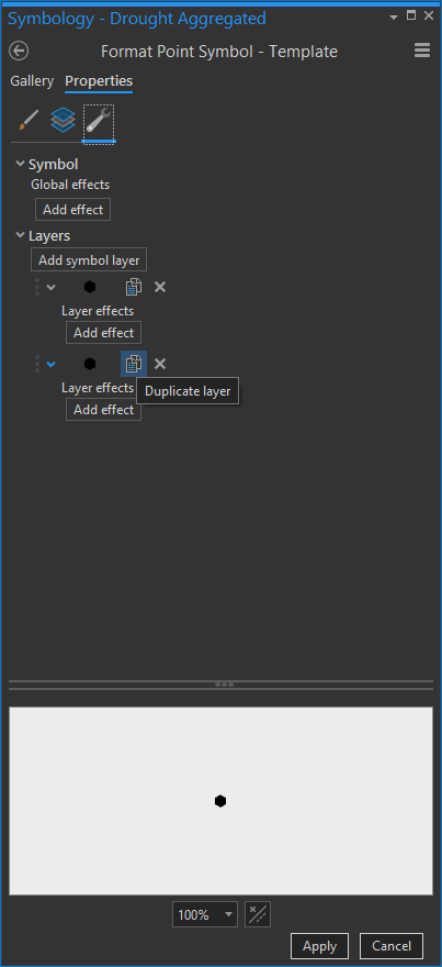
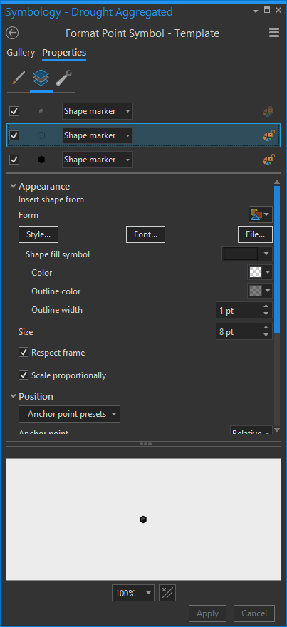
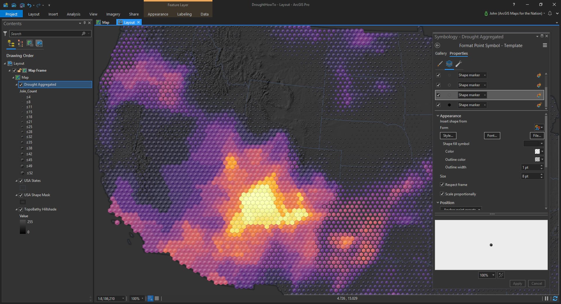
Back in the primary symbology tab, notice the little “template” symbol (I’ve already gone ahead and chosen a hexagon). You can click that thing to change the symbol, sure, but it’s also way more powerful than that! You don’t have to just select from existing symbols, you can go bananas adding complexity detail and nuance to this symbol (sometimes I find my blog-writing reads a bit like a wine pairing list). Anyway, click that template symbol to open up a bouquet of oaky tannic options.
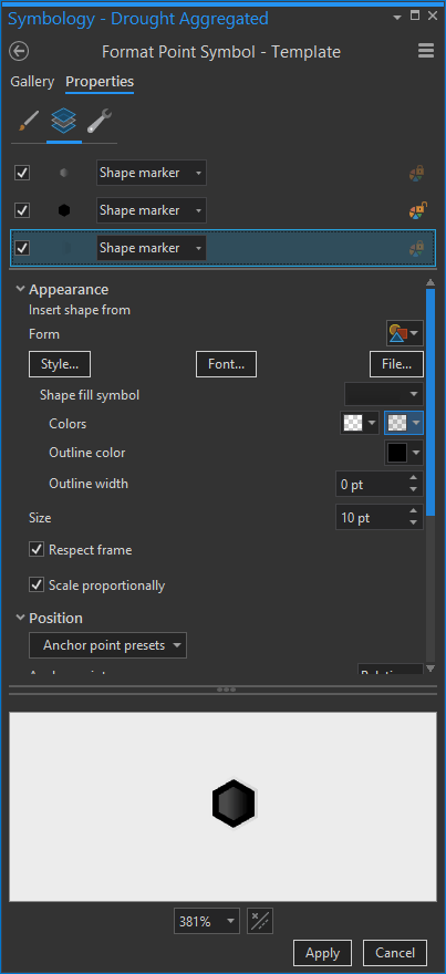
This brings up some nice familiar symbol building capabilities. Clicking the little wrench (structure) icon at top, the first step we’ll undertake together is duplicating the existing hexagon glyph. Just a nice tidy copy.
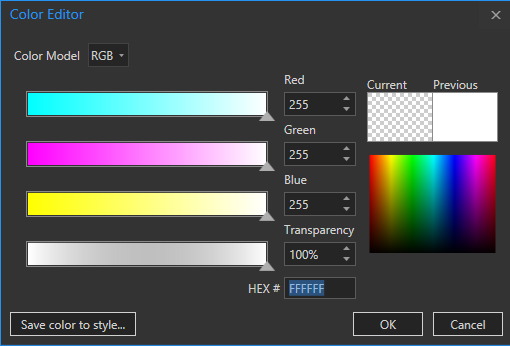
Now for the topmost hexagon, change the “Shape fill symbol” droplist selection to the one called “linear gradient fill.” Then change the two colors to be White 0% transparent and White 100% transparent. Wait, are you wondering how to change a color’s transparency? Well get ready to have your cartographic life changed. Click the “color properties” text at the bottom of the color-picker menu to open up the REAL color menu (where I spend 90% of my life I think).
Anyway, here’s what the template should look like so far…
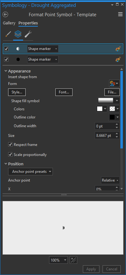
It’s a little glassy lighting effect pretty much, and it sits atop the solid hexagon shape (the one that gets magically re-colored by your data).
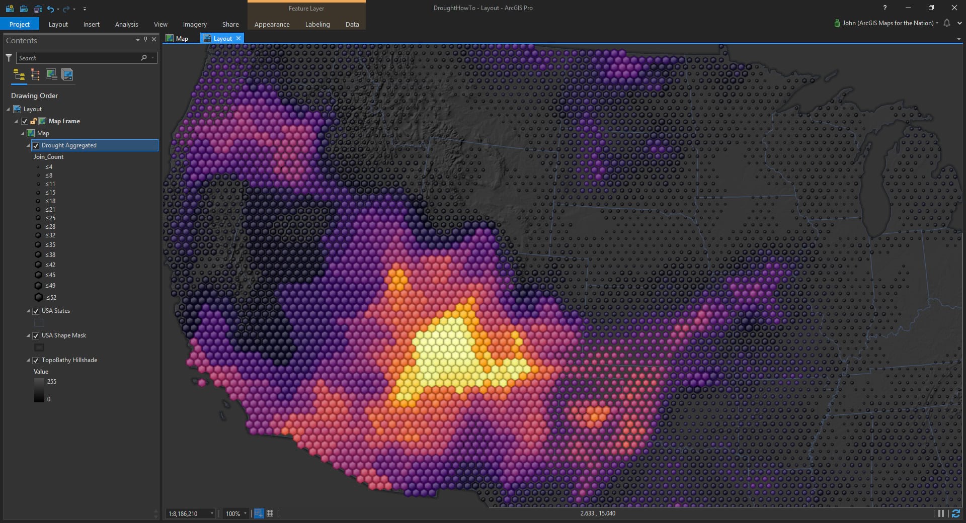
Which, when mapped, looks like this…
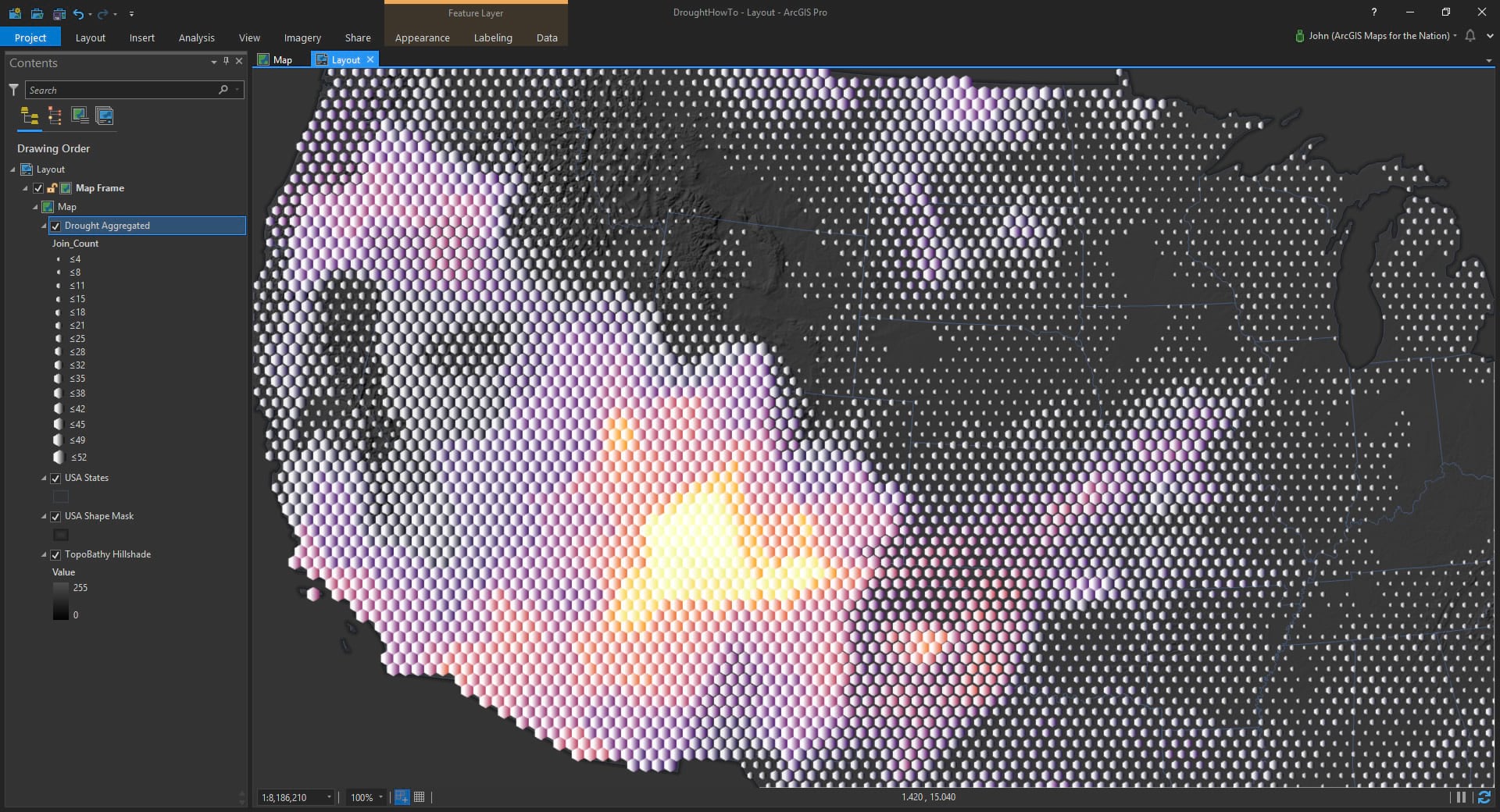
Yeesh! Well at least we see that we’re changing stuff and making progress. Lets refine this, shall we?
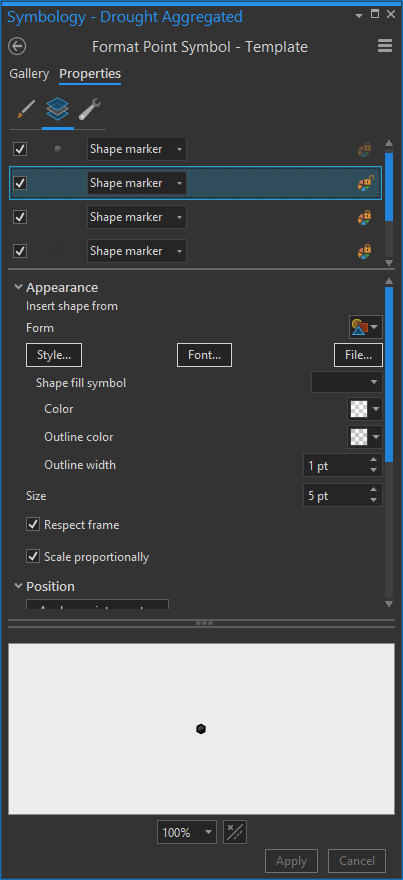
Back in the symbol template (symbology panel > click the symbol template), let’s tone down that white to be less glaring. Instead of 0% transparent, push it down to something like 50 or 60% transparent. And reduce the symbol’s size by a couple points.
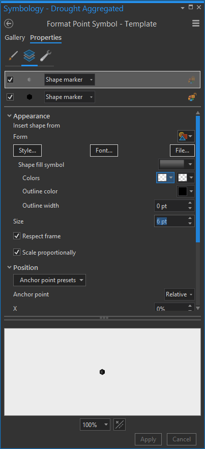
This will snug it in a bit, looking more like a reflection. Here’s the map now. Way better…
Let no one accuse me of promoting absolute garishness. I recommend your map symbols be just garish enough (I mean elegant and dimensional).
…
Please indulge me by reading briefly about enthingification. In cartography, the symbols that you use often represent something. Maybe it’s tangible, maybe is an ephemeral phenomenon. Either way, it is represented on a map via some sort of trick of ink or pixels. Sometimes the thing you are representing could benefit from having a sense of visual dimension or even a bit of realism. When you feather in some faint light and shadow play on a symbol it gains a sense of physicality and weight; it occupies its space. It’s been enthingified.
Is enthingification always the right way to go? No. It is always the wrong way to go? No.
…
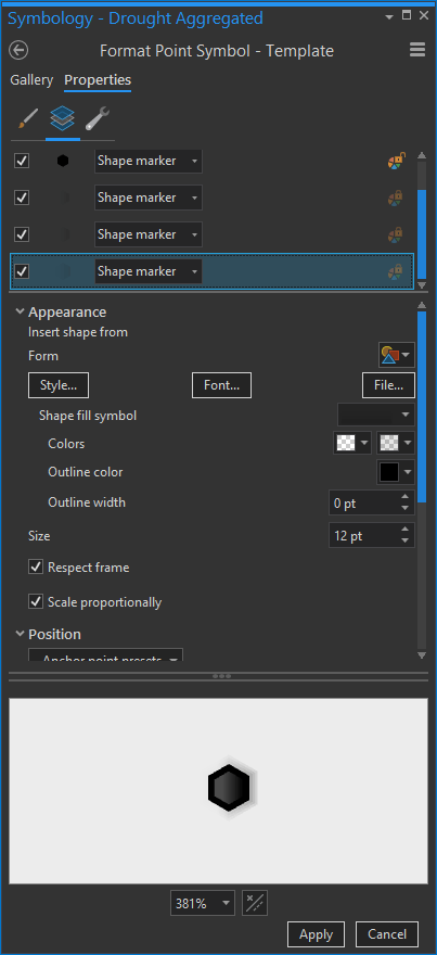
Where was I? Oh, right, gradient colors in symbol layers. Ok, so the highlight symbol layer looks pretty cool. What about shadows? Let’s give it a go. In the structure tab, duplicate the highlight hexagon we just made, and drag it to the bottom.
Then make it semi-transparent black to fully-transparent black. And make it a bigger size than the solid hexagon. This makes it a sort of shadow layer.
Then duplicate that shadow a few more times, making each new hexagon bigger. This gives it a feathered effect, softening the edges of the shadow.
Now when you see them on the map (after tweaking the graduated symbol size, so they just touch each other), they look like an intricately arranged set of shapes, each row nestled over the next, like dragon scales or something.

If making tessellated hexagons of drought duration and intensity look like dragon scales is wrong, I don’t want to be right!
So now that we’ve got some familiarity with duplicating and tweaking symbol layers, let’s start to refine these things.
By playing with the “rotation” property of the highlight and shadow hexagons, we can make the fake light source look like it’s coming from a different direction, like from above (or north).
Fun. There are so many degrees of control for these symbol layers and their effects. Play around to see what works for your map.
For example, try deleting all those shadow symbol layers. Then duplicate the original solid hexagon symbol layer and change its fill color to nothing (so it’s hollow) and give it a 1 pixel black outline. Make the black outline color semi-transparent, like 60%.
Then duplicate it a handful of times, making each outline more transparent and the symbol 1 pixel smaller in size.
This hacks a sort of inner shadow…
And if you’d rather make the semi-transparent black outlines white, then you get a sort of inner glow…
What if you recognized the benefits of both and decided to make the outermost outline semi-transparent black, and the inner outlines semi-transparent white, so you maximized dimensionality but kept a visual separation between neighboring shapes?
Whatever works best for your map! Go forth boldly, and stack semi-transparent duplicates of your symbol’s shape and play with feathering in light and shadow effects.
Happy Mapping! John

Commenting is not enabled for this article.