Adding a ribbon of color (or tinted band or inner stroke) to the inside of your map polygons is a nice visual effect and effective way to provide focus to an area of interest or denote neighboring political zones. It is a signature look of National Geographic political maps, which make elegant use of it.
You might be tempted to use the polygon’s stroke layer, with a negative offset, to achieve it—but that can result in some rendering gaps in complex geometries, or jaggies (depending on your cap/join setting). Instead use the fill layer and give it a delicious “donut” effect. This eliminates the gaps and fills in all the nooks and crannies. Chef’s kiss!
Here’s a comparison:
 vs a fill with a donut effect (recommended).")
Here is a one-minute example of how to do this in ArcGIS Pro…
…
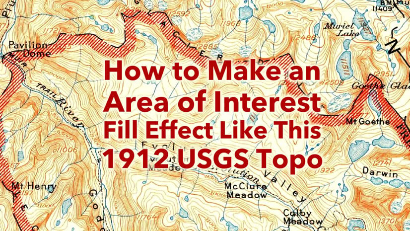
Here’s a closer look at the result.

Have fun! And have a look at the three articles below for additional methods for breathing some interest into your polygon perimeters…
Love, John

Article Discussion: