As a lefty, it has been my life-long mission to rise above, and ultimately defeat, the inevitable graphite smudge on my hand. Now, at long last, after years of research and development, I can finally rest. No longer am I constrained to the rigid unforgiving world of analog sketching. Now, with the power of pixels, and ArcGIS Pro, I can sketch to my heart’s content (which is substantial) and have no residue besmirching my cramping and exhausted left hand.
Download the Sketch style for ArcGIS Pro. Join me in this brave new world of digitally mega-sketched maps. Are you allowed, if you are right-handed, to use this style? Absolutely. There is no us-vs-them in a world bedazzled with lovely hand-wrought-looking maps. We’re in this together, my friend.
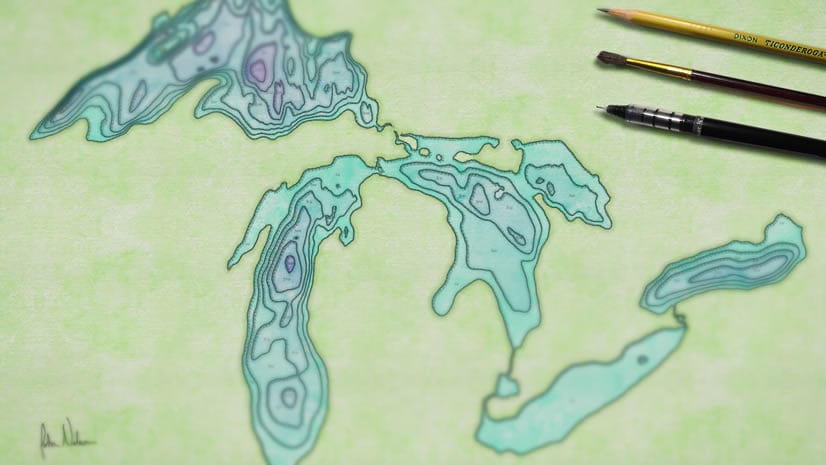
Here is a quick how-to for finding and installing styles for ArcGIS Pro. And here are some examples of maps made entirely with this style…
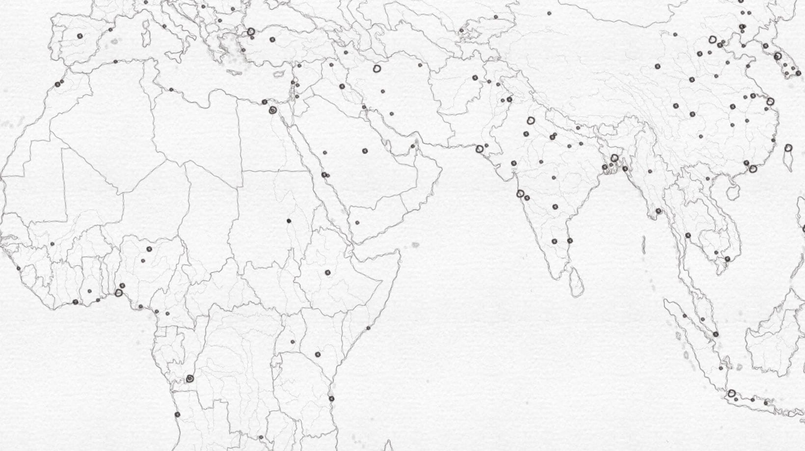
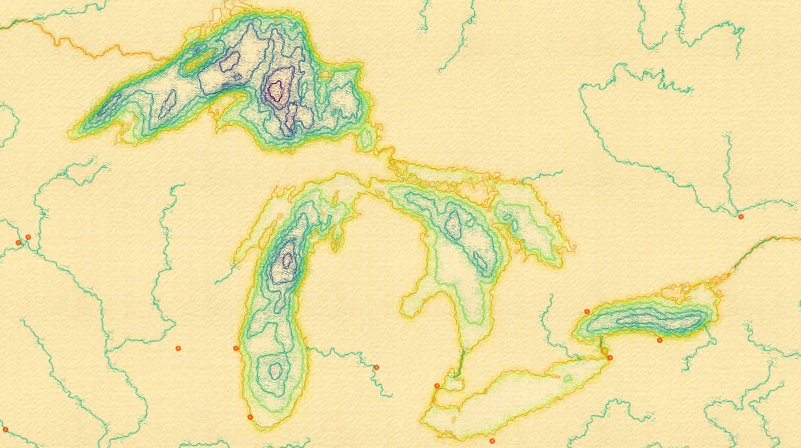
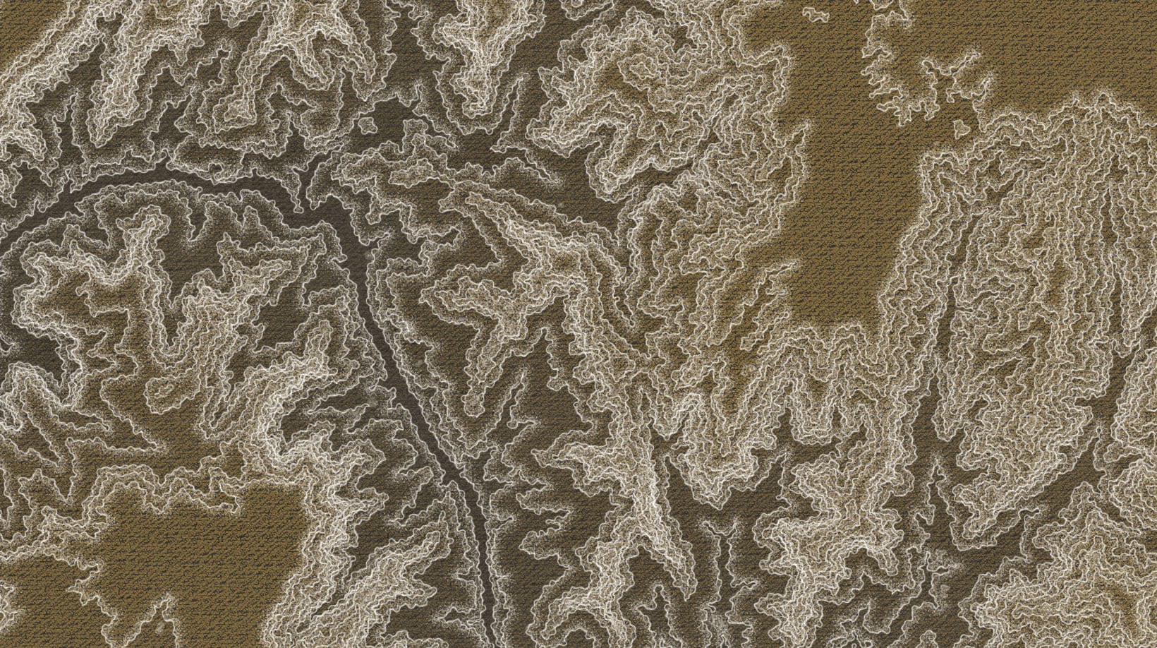
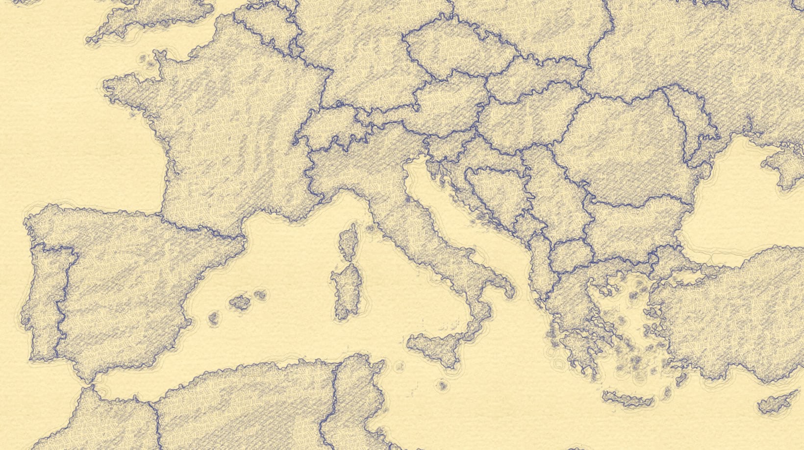
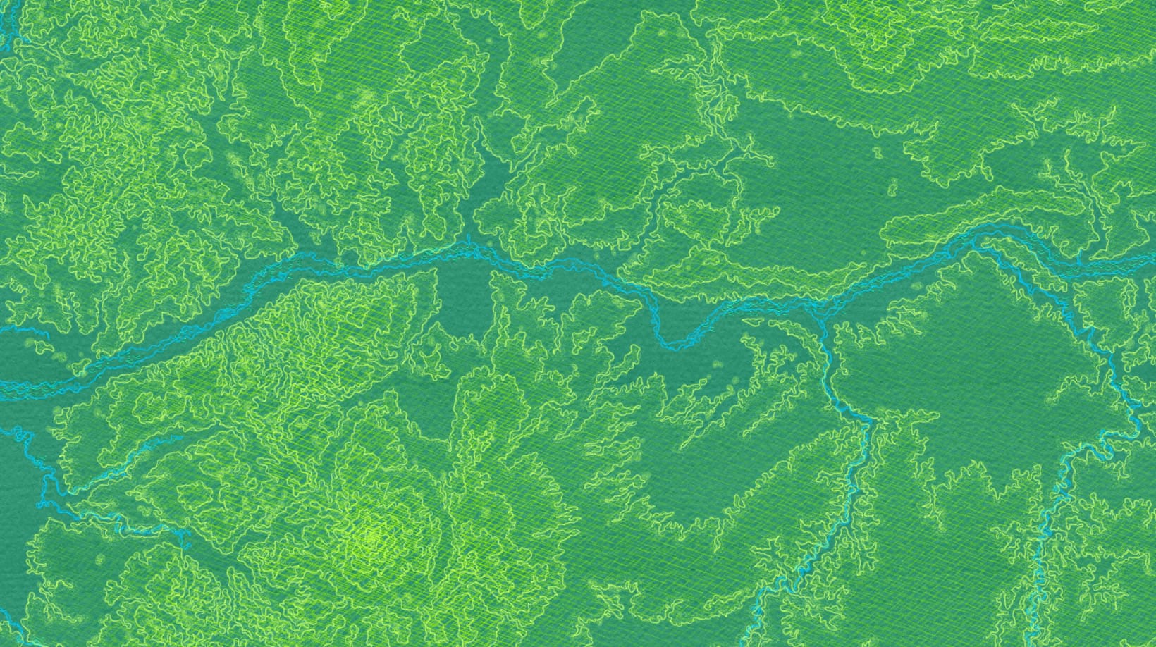
This style has an assortment of point, line, and polygon symbols. Each is slightly different in texture and treatment…
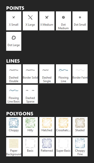
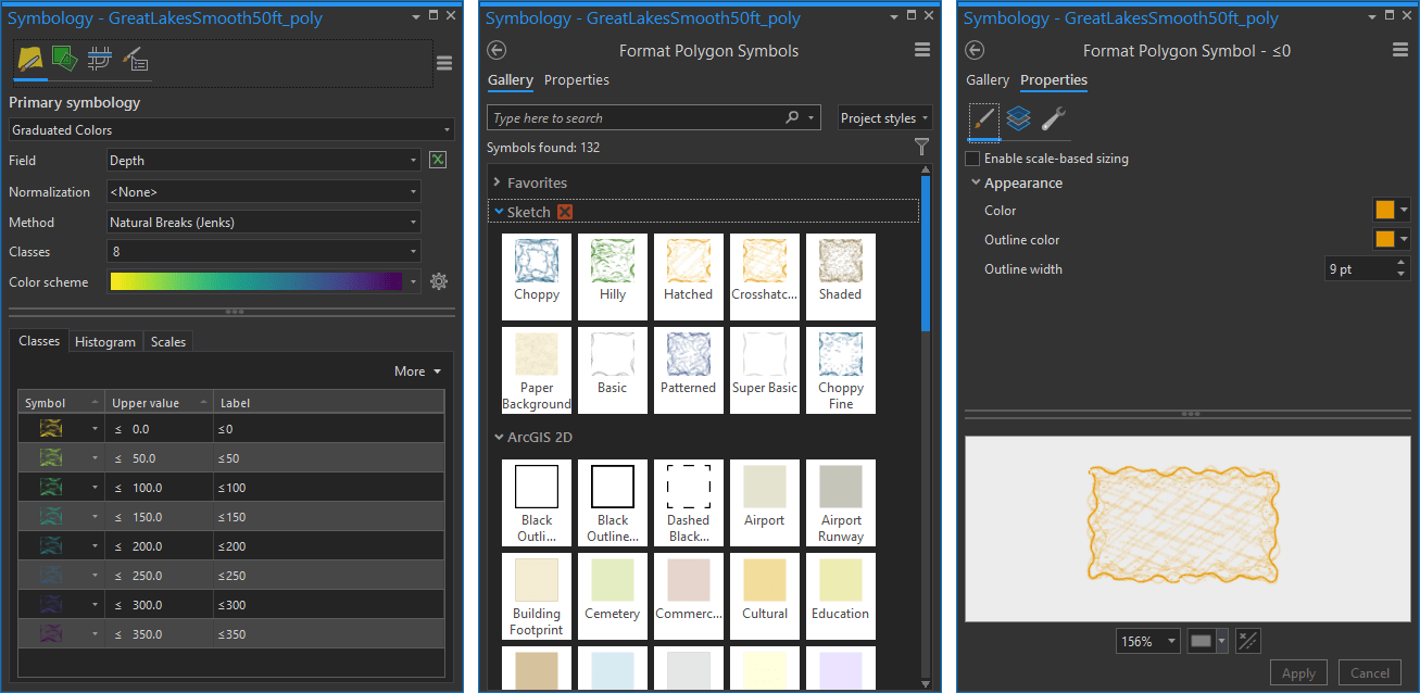
…but you aren’t stuck with these pre-packaged colors and sizes. Each element is able to be dynamically colored by a color scheme (expand the symbol panel’s “more” button and choose “format all symbols” then pick from the gallery), or overridden specifically (in the symbol properties tab you can change the colors).
So have fun! Try it out. Make maps that people want to reach out and touch. Make maps for all sorts of practical, and less practical, reasons! Because the best maps are the ones that get made, and of those, the ones that get noticed. If you make a map using this super sketchy style, I’d love to see them, so ping me on Twitter or Instagram.
Happy Sketching! John


Commenting is not enabled for this article.