Profiles or transects have long been used to show change in slope by illustrating the changes in height along a line drawn on a map. Elevation profiles are a side-view of the changes in elevation along the line as if the terrain has been sliced open and can be seen in aspect. Conceptually (or, if you want to make them by hand), straight line profiles can be constructed from a contour map along any line drawn atop. The profile is constructed by plotting the position of contours along the line and then interpolating a curve between the contour lines to represent the surface between these known points.
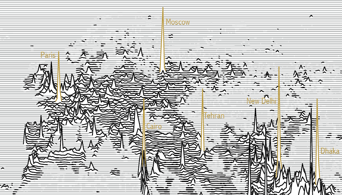
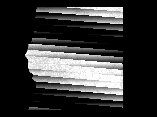
The same approach can be used to show change in some statistical value across a surface, with stacked horizontal lines displaying a value of data vertically such as in this extract of global population distribution by James Cheshire in his work entitled “Population Lines”.
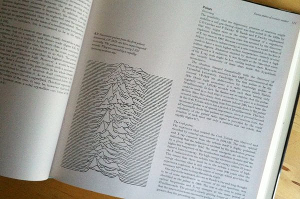
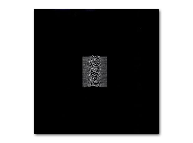
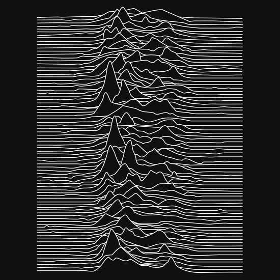
While not a new visualization technique, they have gained popularity in modern data visualization and have been referred to as Joy Plots (or, sometimes ridgelines). The name “Joy Plot” was coined by Jenny Bryan in 2017 and refers to the seminal debut album “Unknown Pleasures” released in 1979 on Factory Records by Joy Division, from Salford, England. Joy Division became one of the most important bands of the post-punk era and “Unknown Pleasures” has since received considerable critical acclaim. Even if you’ve never heard the album (and, if not, my strong takeaway from this blog is to go listen to it!) you’ll likely have seen the album’s cover. Designed by graphic designer, and Factory Records co-founder, Peter Saville, the image is a reinterpretation of the image of radio waves from the first discovered pulsar. The original was illustrated by Cornell grad student Harold Craft in his 1970 PhD thesis and subsequently published in the Cambridge Encyclopeadia of Astronomy.
Saville reversed the black on white to white on black and an iconic album cover was born.
Whatever you want to call them, the general idea is a series of statistical (or any data with a z-value) line graphs that resemble the album cover art. So, the challenge: how can you create a Joy Plot in ArcGIS Pro?
It turns out it’s actually a fairly simple process and for the purposes of this blog we’ll explain it using a Digital Elevation Model where z-values reflect elevation. Of course, you could use any surface data, real or statistical in nature.
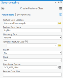
Once you’ve got your DEM (or other raster dataset), the first task is to create an empty Polyline Feature Class the same extent as the raster dataset. Use the Create Feature Class GP tool and ensure you set it to have z values.
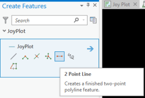
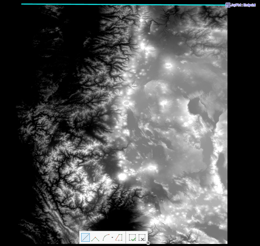
Then create a new 2 Point Line with Create Features tool (located on the Edit Ribbon).
Save the edits.
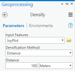
Next, use the Densify GP tool to add vertices to the 2 point line at equal intervals along its length. For this example I used 100m as the distance between vertices. The final result will, in part, be a function of the value you select here. More vertices will result in a smoother final line.
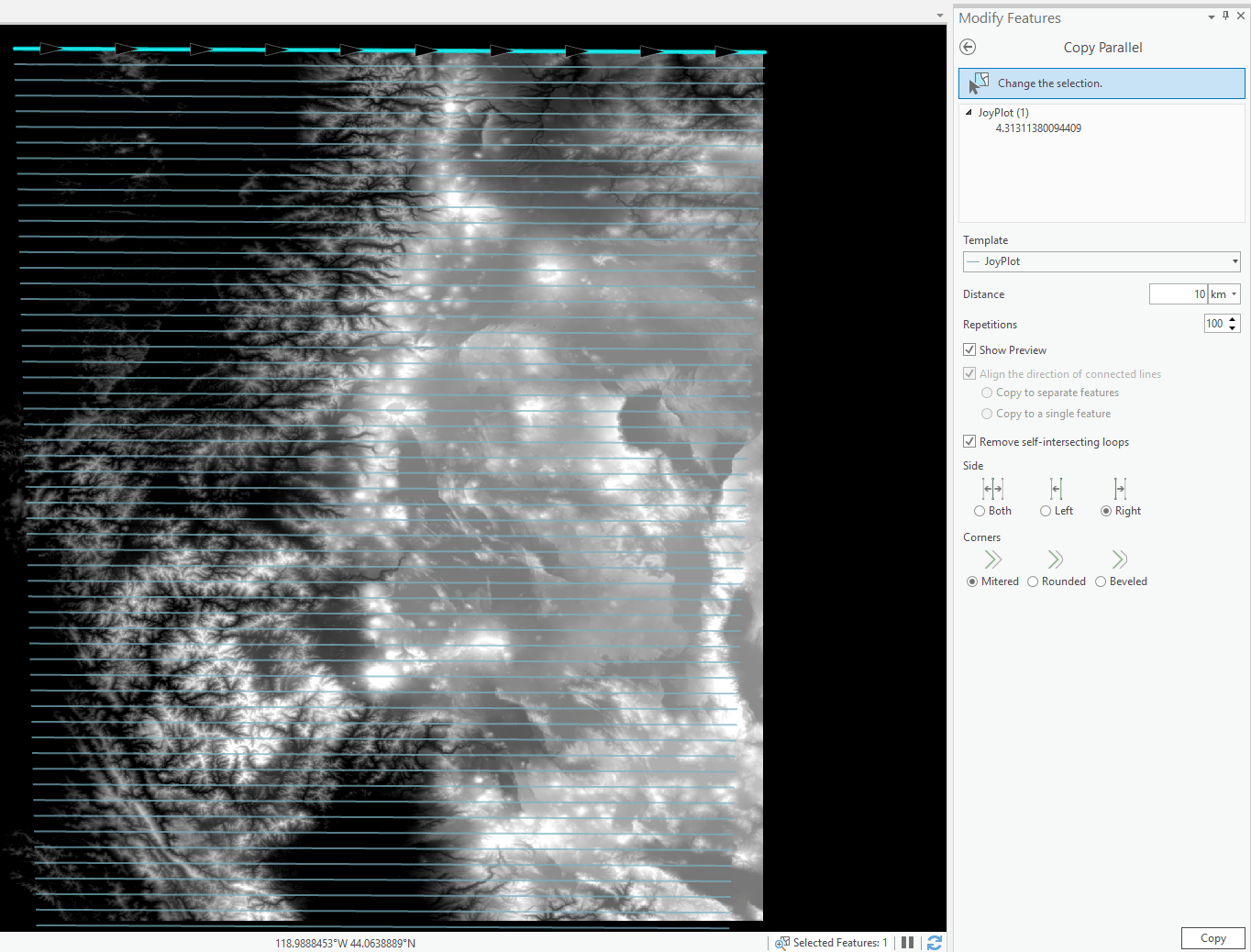
Now open the Modify Features pane (on the Edit Ribbon) and, with your line selected, open the Copy Parallel tool. Here, you’ll automatically create additional line features that have the same basic structure as the original line, but offset. In this example I set the tool to make 100 repetitions at 10km intervals. Since I only wanted lines below the original (to its right according to the direction I originally drew the 2 point line) I set the Side to Right. You can experiment with the interval and number of repetitions until you’re happy and then click Copy to create the additional lines.
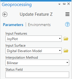
Now, we’ll add data values to the vertices of each line feature. For this, use the Update Feature Z GP tool with your polyline feature class as Input Features and the raster surface (in this case my Digital Elevation Model) as the Input Surface. Note, for vertices to be properly attributed, the polyline features MUST fall wholly within the raster surface.
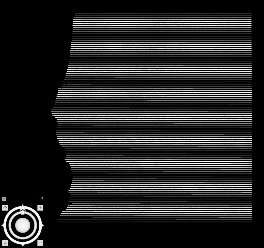
The polyline vertices are now attributed with the data values from the raster surface. They are also equal in length. An optional step at this stage is to clip the lines to the exact raster surface. For instance, in this example (of the Pacific North West USA) there’s a ragged left edge to the raster data which represents the coastline. I didn’t want the polylines to extend beyond this coastline so I used the Raster Domain GP tool to make a Polygon Feature Class of the boundary of the raster surface, then used the Clip GP tool to clip the polyline feature class to the raster polygon extent.
Once you’ve built your lines, create a new Local Scene, set the view mode to Isometric and copy the Polyline Feature Class into the scene. To get the same effect as the Unknown Pleasures album cover I’ve set the background to black and symbolized the Polylines with a white solid line.
In the Elevation Layer Properties, set elevation to use geometry z values and then you’re ready for the magic to happen…simply use the tilt control to an angle of your choosing to create the final effect. You can also modify the vertical exaggeration in the Elevation Layer Properties to change the overall appearance of the height of each polyline to create a more dramatic result.
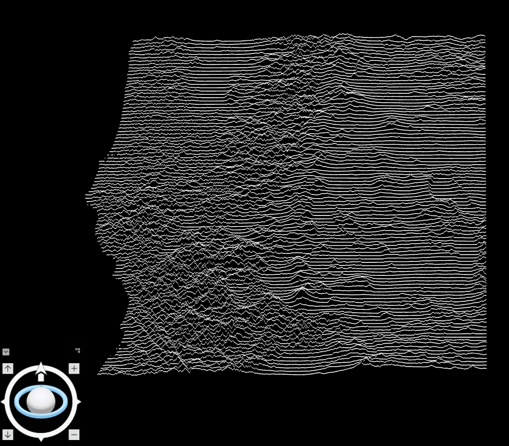
And there you have it…a Joy Plot in ArcGIS Pro.
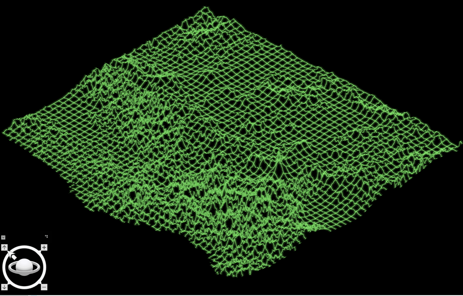
Of course, you can use any sort of surface and the potential to go beyond DEMs and use statistical surfaces is equally possible. You might also go beyond just horizontal lines and use vertical lines, or, perhaps, a grid. In the following example I used the Fishnet GP tool to create a regular grid of Polylines that I densified and attributed and then modified the symbology to create an old-skool computer monitor three-dimensional wireframe drawing. In fact, I used a modified version of John Nelson’s Firefly symbology style to get the TRON effect – but please don’t tell him, he’ll be unbearable! 🙂
Finally, you could even use the animation tools in ArcGIS Pro to share the magic moment of going from flat lines to Unknown Pleasures! Here’s a fairly low resolution gif (for web viewing) but ArcGIS Pro supports hi-res output in a number of different formats.
This workflow was developed with considerable assistance from Bojan Šavrič, ace maths and projections genius. EnJOY!!!

Commenting is not enabled for this article.