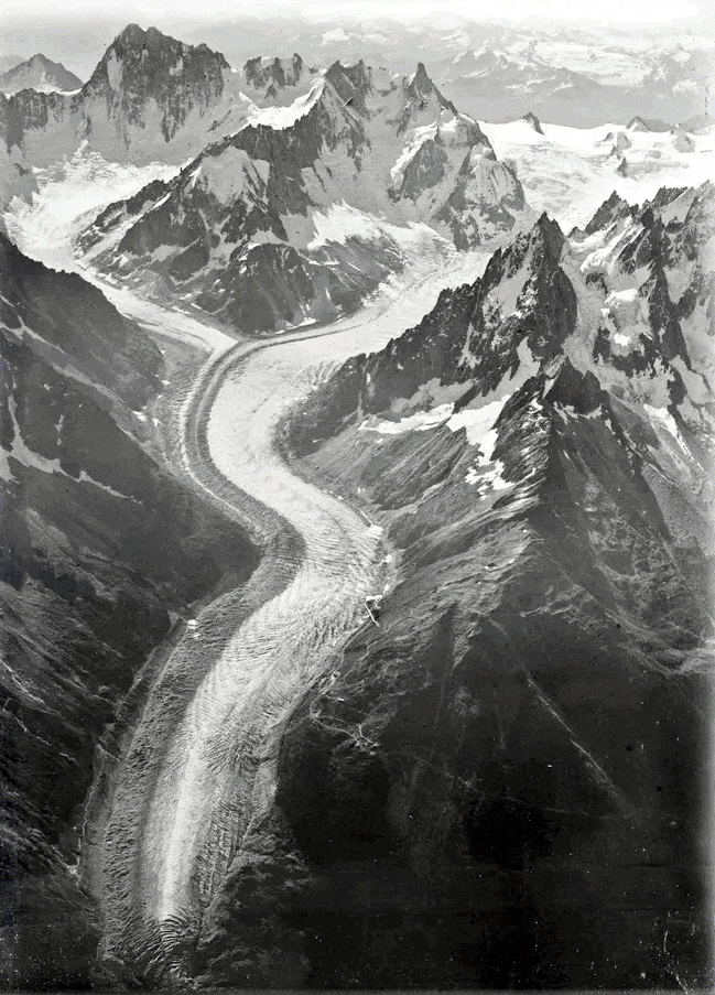
Recently I was enamored of some images showing Mt. Blanc from the air in 2019, compared to the same areas photographed one-hundred years ago in 1919. Dr. Kieran Baxter and Dr. Alice Watterson, of the University of Dundee, determined the 3D location in the air where the original photos were captured (by Walter Mittelholzer, in a biplane), and endeavored to return to those locations for a comparative photo a century on. Here is a new image of Mer de Glace glacier, shown atop the original.
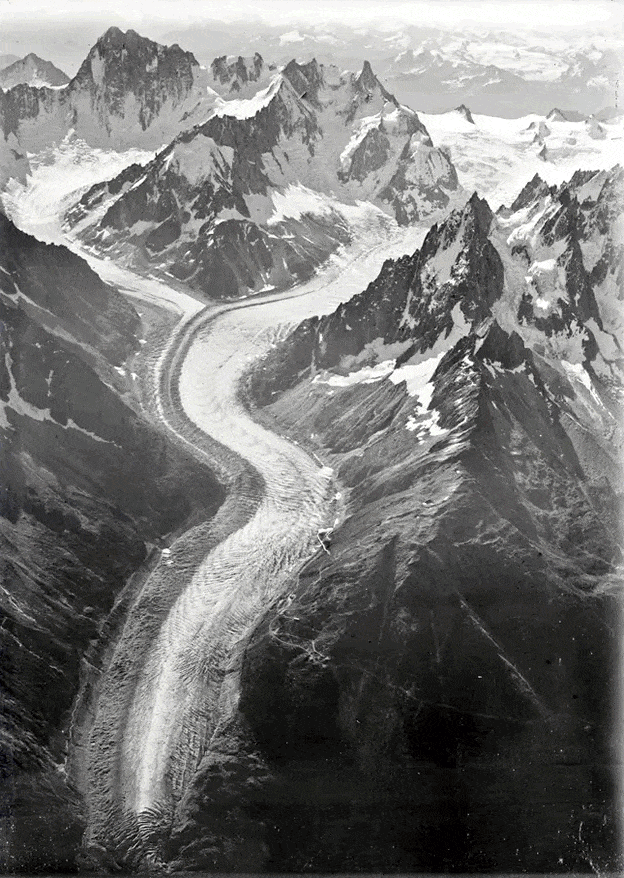
The difference in the size and extent of the Mer de Glace glacier is remarkable. I can’t help but notice, however, the slight differences in registration between the two images (let’s give the Dr.s mega credit, they were reverse-engineering a location in 3D space and hanging out of a helicopter). Even if the position was perfect, there would be little hope of re-creating the exact optical qualities of the original camera.
I wondered, though, if ArcGIS Pro’s georeferencing tools help us warp an image to location, why not warp this image to the historic image so the registration is a tighter match?
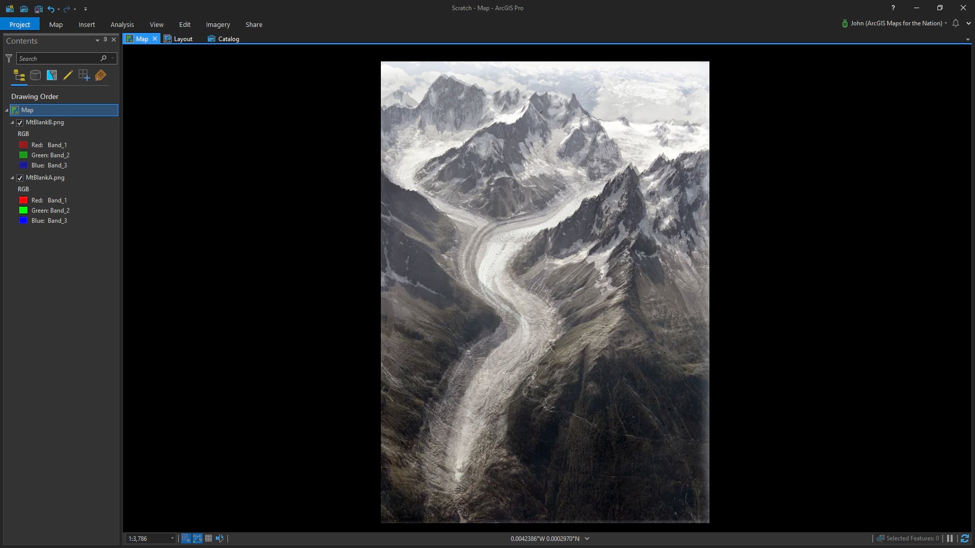
So I added both images to an ArcGIS Pro map. Of course there is no geolocation data associated with the images I downloaded so Pro dropped them off at Null Island. That’s fine. In this case the original photo served as the destination reference and the newer photo was georeferenced to align with it. Here are the two images in Pro, the older black and white image below, and the new colored (and set to 50% transparent) image atop.
Then I started adding manual control points joining pixel locations in the 2019 image to their corresponding pixel locations in the 1919 image (here’s a one-minute primer for the uninitiated). And did I ever make a lot of them. Also, pro tip, you can un-dock windows in your Pro project so if you have a second monitor (including a vertically-oriented second monitor configuration like me), you can maximize your Pro awesomeness.
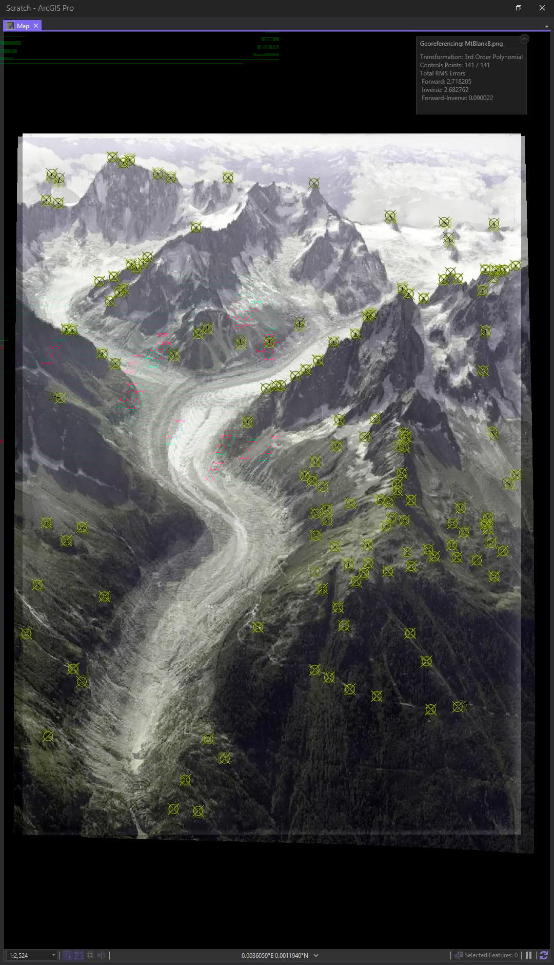
The green icons and red icons show the origin and destination of each control point. The further away they are from each other, the greater the mathematical shenanigans it takes to stretch the image. But as you add more control points, you can choose more mathematically accommodating stretch models (transformations). First order transformations are easy-math stuff like shifting, rotating, and scaling. Second-order polynomial transformations allow more curvy stuff and third-order lets you get really rubbery, like a bendy saddle shape.
And if you have enough control points, you can go into full-on rubber-sheet mode with a Spline transformation so that the input control points are perfectly aligned with each other (notice in the image below there is no difference between the input point the the registration point) and all intermediate pixels are warped to fit. Normally this is pretty risky stuff for georeferencing a map image but we are warping one photograph to another photograph so we can flout those concerns and throw caution to the wind!
This means I can pin 2019 locations to their 1919 locations, so long as I can make them out on both images. And the results are pretty fun!
With differences in registration between the two images even more reduced, our eyes can better track the (rather shocking) change in the glacier.
Happy (sort of) Mapping! John

Commenting is not enabled for this article.