Spatial analysis was historically the domain of desktop GIS software. But that’s no longer the case — and hasn’t been, for some time. In fact, Map Viewer in ArcGIS Online provides a broad suite of vector and raster analysis tools capable of fulfilling a variety of tasks. Because these tools run right in a browser window, they enable efficient, on-the-go workflows for GIS experts and part-time mapmakers alike.
On the StoryMaps team, we are big proponents of Map Viewer’s analysis tools. In some cases, these web-based tools have altogether supplanted workflows previously reserved for ArcGIS Pro. I won’t pretend to know how the Map Viewer analysis tools actually work, but I do know that they are intuitive to use, fast, and don’t interfere with other tasks while they run. And because these tools run in a web browser on any operating system, they are accessible to a wide audience without needing to install desktop software.
We recently published Mapping the eclipse: A journey through darkness, a story that explores the path of the total solar eclipse on April 8, 2024. This article covers three different Map Viewer-based workflows that we used to highlight certain geographic features and phenomena relevant to this exceptional event.
If you’d like to follow along, you can download the eclipse path data referenced in this story directly from NASA’s Scientific Visualization Studio. For more information about the Map Viewer’s analysis tools, check out the product documentation. You can also browse step-by-step spatial analysis tutorials in this gallery, and review some of the terms used here in Esri’s GIS Dictionary. To read the story, click on the animation below.

Selective highlighting
Selective highlighting is a cartographic technique commonly used in map-based stories to focus readers’ attention on specific locations or features of interest. In essence, selective highlighting involves styling a subset of features in a dataset in a particular way, in order to visually separate them from other, similar features.
In some cases, you may want to select and highlight features based on some common attribute value (e.g., belonging to the same category). This is often as easy as applying a data-driven filter. But in other cases, you might want to select features based on their locations, rather than (or in addition to) their attribute values.
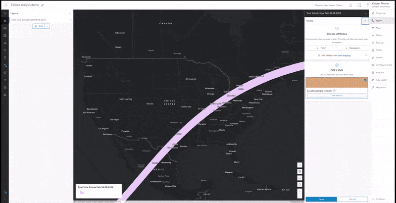
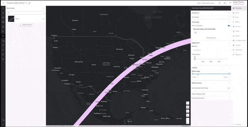
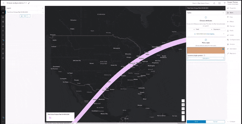
This is where the Find by Attribute and Location analysis tool comes into play. This tool extracts features from one layer based on their geographic proximity to another layer. Unlike other data management tools, this one doesn’t actually modify the geometry of the features — it just consolidates those features in a new layer that’s then automatically added to the map.
For our story, we wanted to highlight historical tornado tracks that intersected the path of the April eclipse. To accomplish this goal, we ran the Find by Attribute and Location tool on a national dataset of tornado tracks (available in ArcGIS Living Atlas of the World) to extract all the features crossing the eclipse’s path. We then used a combination of styles, layer effects, and blend modes to elevate these “focus” features in the map’s visual hierarchy. Here’s an accelerated preview of the workflow, and the result, as it appears in the story.
That’s it! The Find by Attribute and Location tool makes it super easy to extract features from one layer based on their proximity to another layer. It’s a great way to isolate features located within or near a particular area of interest. Learn more about the tool here.
Enriching a layer with demographic data
In the example above, our goal was to isolate a specific subset of features in one layer, based on their spatial relationship with features in another layer. We weren’t, however, really concerned about the attribute values of those features themselves. But suppose we wanted to know something about those features? In our story, that something was the total population living within the eclipse’s path. We didn’t necessarily plan to map this data, but we wanted to have a good estimate of the affected population.
As with many GIS operations, there are several different ways to approach this problem. For example, we could’ve used the select-by-location workflow above to isolate populated places within the eclipse’s path, and then added up their populations; or we could’ve used spatial statistics to extract population counts from a separate demographics dataset.
But both approaches would require us to furnish our own population layers — a task complicated by the fact that the eclipse will pass over Mexico, the U.S., and Canada. So instead, we used the Enrich Layer tool. As its name implies, this tool enriches author-defined features with attribute data sourced from Esri’s repository of authoritative datasets. In our case, we wanted to add the latest population totals for Mexico, the United States, and Canada to our eclipse path layer. The tool generated a new layer that looked very similar to our original eclipse path layer, but contained the combined population in a new field.
The Enrich Layer tool can be a huge timesaver, since it removes the need to manually seek out, validate, and process the equivalent data on your own. To be fair, this tool does consume credits — but your own time is probably a whole lot more valuable. The Enrich Layer tool is also well-suited for data exploration, as it supports a wide range of authoritative, thematic datasets from around the world. Learn more about the Enrich Layer tool here.
Binning cloud cover data
High-resolution raster data can be remarkably illuminating, but the extreme level of detail can also distract readers and lead them to overlook a map’s key themes or messages. As spatial storytellers, we’re always looking for ways to reduce the cognitive load the maps place on readers — and aggregation is one method for helping readers interpret dense raster data at a glance.
For the eclipse story, we wanted to show historic weather patterns along the path of totality, in order to locate areas that are reliably clear — or overcast — in April. (Spoiler alert: the prognosis isn’t great.) Rather than visualizing the raw raster data, we decided to generalize it using a technique called binning.
This process essentially involves creating a grid of regularly sized shapes covering the map’s extent — we chose hexagons, as they pack together quite nicely — and then visualizing those shapes using values representative of the individual data points within them.
This was our most complex analysis yet, and required us to string together a few different operations. First, we downloaded cloud cover data from NASA, and used ArcGIS Image for ArcGIS Online to upload it to our AGO organization. (Note that an ArcGIS Image for ArcGIS Online license is required in order to publish raster data to ArcGIS Online in an editable format.)
Next, we used Map Viewer’s Generate Tessellations tool to create a grid of identically sized hexagons covering the North American continent. (We settled on a hexagon size of 500 square miles, which hit the sweet spot between accuracy and ease of interpretation.)
Then, we used the Zonal Statistics as Table raster analysis tool to calculate the median percentage of April cloud cover within each hexagon over the past five years. The result of that operation was a table, so as our final step, we used the Join Features tool to join those values to their corresponding hexagonal features. Then, it was just a matter of styling the hexagons until we were satisfied with their appearance. See, that wasn’t so hard!
Wrap up
Within the grand scheme of spatial analysis, the three workflows above are fairly unexceptional. And to be fair, the abbreviated walkthroughs conceal some amount of trial and error.
What makes these workflows noteworthy, however, is that they were all completed entirely in ArcGIS Online — something that would’ve been hard to imagine even a decade ago. It’s no secret that Map Viewer’s cartographic capabilities have evolved leaps and bounds in recent years. But the maps in our eclipse story also testify to Map Viewer’s expanding analysis options and their accessibility to non-expert audiences. And that’s worth celebrating.
Have you used the Map Viewer’s analysis tools to help you tell a place-based story? If so, sound off in the ArcGIS StoryMaps Community, or let us know on social media — we’re always eager to see how you’re applying these tools to your own storytelling projects.


Article Discussion: