As part of the June 2025 release, ArcGIS Business Analyst Web App has a new capability in the suitability analysis workflow: a variable correlation matrix.
The suitability analysis workflow uses variables as criteria to score sites. To validate the variable selection in the analysis, use the correlation matrix. The correlation matrix provides a visualization of how variables correlate to one another and the final score.
Using the correlation matrix, we can identify variables that measure similar concepts, indicated by a high correlation coefficient. Including such variables may unintentionally give certain factors more weight in the analysis. To improve the reliability of the suitability index, you can adjust the variable selection or reassign weights accordingly.
To access the correlation matrix, perform a suitability analysis and click the new Correlation matrix tab on the Results pane.

In this blog article, we’ll use suitability analysis to rank areas in Tulsa, Oklahoma, that are in need of affordable housing. A lack of affordable housing creates financial insecurity for residents and limits a community’s ability to thrive.
To ensure that the analysis does not have skewed results, we will use the new correlation matrix capability to assess potential multicollinearity by identifying pairs of highly correlated variables. Multicollinearity occurs when variables are highly correlated and may be redundant, meaning they capture similar information, which can affect the reliability of the results. After using the correlation matrix, we can make any necessary changes to the variable selection to create a stronger analysis. This supports more informed decision-making about where to allocate resources for housing affordability.
To start the workflow, click Run analysis and choose Suitability analysis.

Set the area of interest
For this analysis, let’s set the area of interest to Tulsa, Oklahoma. Tulsa is currently experiencing a housing affordability crisis, with the city of Tulsa creating an Executive Order to address the lack of 6,000 affordable housing units for residents.
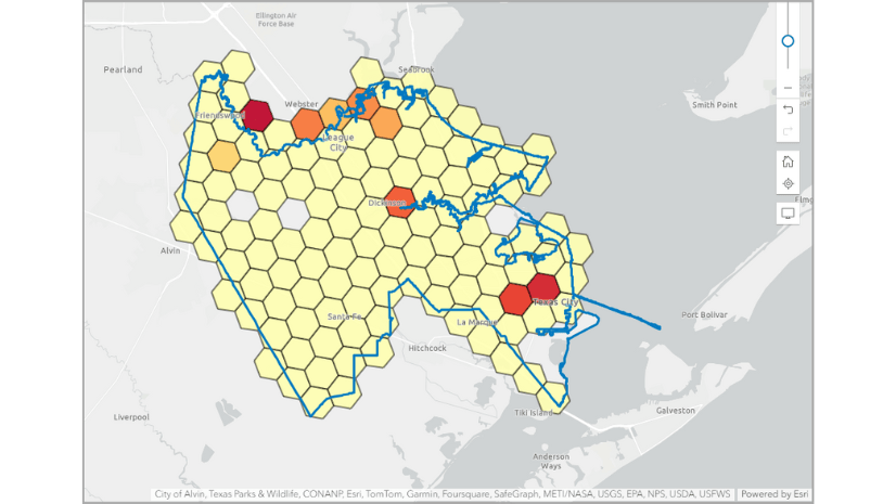
For the location type, select the Geographies and hexagons option. For the Area of interest, enter Tulsa and select the Tulsa City, OK result. Block groups are the default level of detail.

Select criteria
The next step in the workflow is to select criteria. There are featured lists that display a set of curated variable lists, including variable lists by industry, or we can pick variables from the data browser.
Click Select criteria to browse the data browser for variables related to housing affordability. Add the following variables to the analysis:
| Variable | Dataset | Calculation type |
| 2025 Housing Affordability Index | Esri Updated Demographics | Index |
| 2023 Households w/ Mortgage: Monthly Owner Cost 50+% of Income | ACS 5-Year | Percentage |
| 2023 Households with Gross Rent 50+% of Income | ACS 5-Year | Percentage |
| 2023 Households Below the Poverty Level | ACS 5-Year | Percentage |
| 2025 Average Home Value | Esri Updated Demographics | Average |
| 2030 Average Home Value | Esri Updated Demographics | Average
|
The two variables 2025 Average Home Value and 2030 Average Home Value may be redundant. Typically, homes increase in value by 5-10% per year; therefore, the 2025 home value compared to the projected 2030 home value will likely be similar. It will be important to check the correlation matrix to see if these variables are highly correlated so that we can remove one and avoid using skewed results.
Explore the results
The map and the Results pane automatically update. Before we explore the results, we need to adjust one of the variables. In the Suitability analysis pane, in the Variable section, change the 2025 Housing Affordability Index variable to use Inverse influence. Inverse influence means that the lower the value of the variable, the greater its effect on the score.

The color ramp on the map uses red to signify a high score and pale yellow to represent a low score. In this case, a high score means that the block group has highly unaffordable housing.

Let’s explore the housing cost burden. Generally, it is recommended that the cost of housing (rent or mortgage payments) should not exceed 30% of a household’s income. The suitability analysis includes two variables representing households paying more than 50% of their income on mortgage payments or rent; this shows a high housing cost burden.
Click the Histogram tab on the Results pane. Click Settings and use the Criterion drop-down menu to change the variable.
- Using 2023 Households w/ Mortgage: Monthly Owner Cost 50+% of Income in the histogram, we can see that the mean is 5.42. This means that 5.42% of the population in Tulsa is paying over 50% of their income to pay for their mortgage.
- Using 2023 Households with Gross Rent 50+% of Income in the histogram, we can see that the mean is 19.94. That means that 19.94% of the population in Tulsa is paying over 50% of their income to pay their rent.
These results show that there is a housing affordability issue in Tulsa and identifies areas that are the most burdened. However, it is necessary to validate the variable selection using the correlation matrix to determine if the results are skewed in any way.
Analyze variable correlation
Now, let’s check if the variable selection has any overlap or redundancy using the new correlation matrix. On the Results pane, click the Correlation matrix tab. Click Expand to see a larger view. By default, the correlation matrix displays each item in the chart with color-coding to visualize the strength of the variable correlation.

In this example, the dark green cell shows a strong positive correlation. Correlation is measured using Pearson’s r, which is a coefficient ranging between -1 and 1 that measures both the strength and direction of a linear relationship. Darker greens indicate stronger positive correlation (close to +1), darker reds indicate stronger negative correlation (close to -1), and near-white indicates weak or no correlation (near 0).
As expected, the two home value variables show a very strong positive correlation, with a Pearson coefficient above 0.9. Click on the corresponding item in the chart to view its metadata. The pop-up includes a scatterplot, showing how both variables are nearly identical.

A high Pearson correlation coefficient (e.g., above 0.9) between the home value variables suggests potential multicollinearity, meaning the variables may be capturing the same concept. To improve the strength of the suitability analysis design, we need to adjust the home value variables. We can do any of the following:
- Remove one of the home value variables from the analysis.
- Merge the correlated home value variables into a subindex. (See Creating Composite Indices Using ArcGIS for detailed guidance on building subindices.)
- Adjust weights to mitigate the effect of the highly correlated home value variables so that the same underlying concept isn’t counted twice. Weights represent the relative importance of each criterion as it contributes to the final score.
Always apply domain knowledge when interpreting the correlation matrix to inform variable selection.
Conclusion
This blog article describes using the new variable correlation capability in the suitability analysis workflow. We welcome your feedback! Please use the feedback option at the bottom of this blog article or post on Esri Community.

Article Discussion: