Business Analyst infographics are powerful tools for analyzing and consolidating geographic information and—perhaps just as importantly—for presenting that information to others. In addition to running infographics, you can also build infographic templates in the following applications:
- ArcGIS Business Analyst Web App (Advanced license)
- ArcGIS Business Analyst Pro

Building infographics is more than juxtaposing variables, maps, and graphics. There is quite a bit of design involved if you want your template to look just right. A major factor is text: the fonts you choose, the title you create, the logo you add, and the footer you provide for data attribution. Having consistent and legible text in your infographics is crucial for ease of interpretation and accessibility for all audiences. This article will walk through each text-related design choice to offer best practices and considerations.
Text and fonts
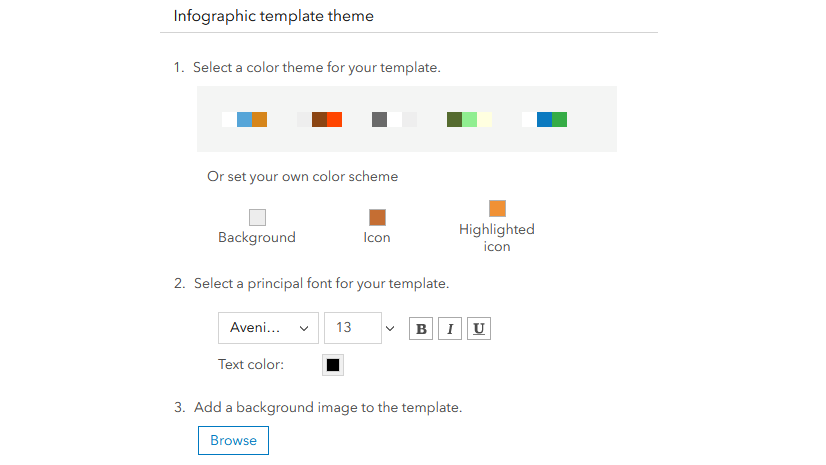
The first article in this series, Best practices for infographic themes, explained that using a theme to define design elements in an infographic template is a best practice for assembling a polished template. You can, however, customize text choices individually as needed. Many infographic elements allow you to make decisions about text style, including the text in charts, tables, infographic panels, nearby tables and summary panels, and text panels. Text styling tools can be found in some elements by clicking on the Change font button (such as in charts), or in other elements by using the Text style window accessed by clicking directly on a panel’s text.

Text font
In some ways, the fonts you choose become the personality of your infographic template. Are you going for serious, whimsical, professional, friendly? As with most GIS visualizations, it’s important to let the data shine—an overly fussy font can distract from the story you’re telling. The Business Analyst infographic builder provides a curated selection of fonts that are legible and popular, while still offering room to add your own flavor to the design.

The Avenir Next font may look familiar to you—it’s Esri’s standard font and included in the infographic builder. For a deep dive on typology choices, read Allen Carroll’s thoughtful article, Making smart type choices for ArcGIS StoryMaps.
It’s also best practice to minimize the number of fonts on any one template. Even if you’re going for a quirky feel or trying to differentiate different spaces on the template, too many fonts can prove distracting and jumbled. Best practice is to stick to no more than three font sizes in a template.
Text size
You may want to vary text size based on the meaning or importance of the text. You can create a hierarchy of panel headers, text blocks, and captions for maps or images. The Business Analyst team uses the following guidelines:
- Header text: 26 point minimum
- Body text: 14 point minimum
- Caption text: 12 point minimum

Text color
As with text size, be purposeful about the number of colors you use for text in infographics. Best practice is to use up to three complementary colors in an established hierarchy (primary, secondary, tertiary) to communicate importance.

And, as Allen Carroll recommends, maintain high contrast between the color of your text and the background color of the infographic. This helps with visual legibility and accessibility. You can use Web AIM’s Contrast Checker to assess your color accessibility.
Title
Needless to say, the title of your infographic is of utmost importance. A well-formatted title can go a long way in conveying polish and providing viewers of your infographic with the information they need.
Business Analyst team’s recommendations
For a peek behind the scenes, here are the guidelines we use on the Business Analyst team, when making standard and gallery templates:
- Write the title in title casing (all words capitalized, except minor words like “an,” “of,” and “the”).
- Include dynamic fields that provide the site name and site description as subtitles.
- Justify the title and subtitles to one side.

If you’re looking for guidance on title sizing, here are some suggestions:
- Infographic title: 36 point minimum
- [Site name]: 16 point minimum
- [Site description]: 14 point minimum
Dynamic fields
We recommend that you create a title panel that includes not just the title, but also dynamic fields that populate with information like the site name (the location where you are running the infographic) and the site description (the size and type of site, such as a 20-minute drive time).
To work with dynamic fields, you’ll want to get comfortable with advanced text editing, accessible through the Text style window.

The advanced text editor is useful for more than just titles, by the way! Many text elements in infographic panels, nearby panels, and text boxes can be formatted in this window.

One of the most important uses of dynamic text is for providing accurate data attribution for the data you use. This is most frequently placed in the infographic footer. More on that later…
Infographic title versus template file name
A final tidbit about titles: Remember to save your template with a file name that accurately describes it. This may seem self-evident, but you’d be surprised how many times we wind up with a My templates tab full of “Infographic,” “Infographic FINAL,” “Infographic2” titles. Best practice is to save the template with the file name matching the title you put on the template itself.

Logo
The infographic builder in Business Analyst was designed to allow you to incorporate your visual brand in your data visualizations. And what conveys your visual brand more succinctly than your logo? You can add your logo—and even multiple versions of your logo—in the infographic preferences.
Once you’ve set your logo, you can choose a blank infographic template to build from (with the caveat that it must contain a logo placeholder already), and your logo is automatically added to the template.

Be sure to use a logo that matches the color theme of your template, and size it for best legibility. A best practice is a 28-pixel minimum height.
Footer
Footer text is essential for providing thorough, accurate data attribution. This is where dynamic fields and advanced text editing comes in. In the Add dynamic field or notes menu, you can add data information to a text box, including the source, description, and vintage:

We recommend using the Data source description option, which includes the data source and vintage for all data in the template.
For example, the Emergency Information infographic contains the following footer, providing data attribution for demographic and points of interest data in the template:

When creating a footer for your infographic, the suggested font size is 12 point for legibility.
Hopefully this article has helped you on your infographic-designing journey. The Business Analyst team is always excited to see what our users create to showcase their data in new and compelling ways.
Data attribution
This article contains or references data from the following sources:
- Demographic Profile infographic (variables from Esri Updated Demographics)
- Economic Development Profile infographic (Labor Force by Industry variables from American Community Survey)
- Custom infographic template (created with points of interest data from Foursquare)

Hi Gemma and team, How do I keep the text in a text box from overflowing? I added a info panel so I can show property description, and realtors can get wordy. The text is spilling over the element and into the element below it. I’m not seeing anywhere I can set to keep the text inside the box and scroll.
@Corey Unger Hi there! At this time, there isn’t a way to confine text overflow in an infographic panel by using a scroll bar. This limitation exists because a scroll bar would only be functional when dynamically viewing an infographic, not when exporting and viewing as a PDF.
It’s a great idea for an enhancement request, though! Feel free to post it in Esri Community’s ArcGIS Business Analyst forum, in the ArcGIS Business Analyst Ideas section. The BA team would like to hear more about your use case. Thank you for reaching out!