Calcite Design System enables you to create beautiful, user-friendly, and consistent experiences across applications with minimal effort. It includes configurable web components along with iconography, a UI kit, and usage guidelines containing best practices.
Many key improvements and new components have been introduced since the first production release four months ago. Let’s explore some of the highlights which you can start using in your apps right away.
Navigation components
We recently introduced new components that provide a consistent structure and behavior for easily navigating your application.
- Serves as the primary component for navigating an application or experience.
- Contains an application’s information hierarchy within slotted Menu and Menu Items components.
- It is usually placed within the header slot of the Shell as a consistent location for interactive controls.
- Use this component to display the logo, name, and description of your application.
- You can use the active property to indicate that a user is at the “root” of an experience.
- For interactive maps and demonstrations, to display the title and a description of the experience.
- This component allows you to display information about a logged in user, for example their name, username, and a thumbnail image. This component can be placed within the Navigation’s user slot.
- These components provide a consistent menu structure allowing your users to access and navigate pages, routes, or functionality within your application and experience.
- They are most often slotted into a Navigation component, but can also be placed in other layout components, such as Shell Panel, Panel, and Flow.
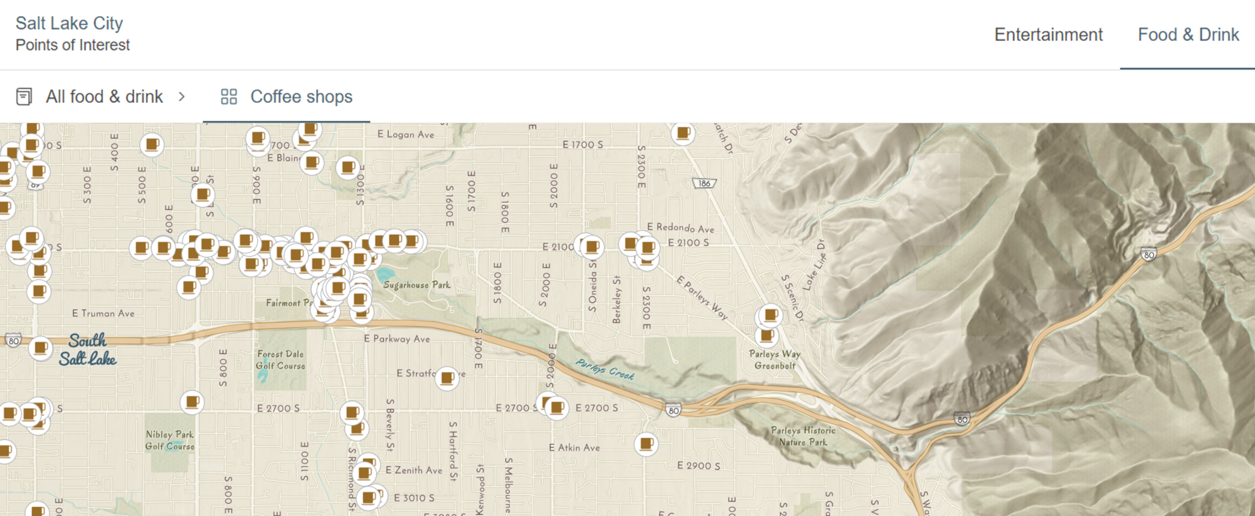
Here’s an example of how these components come together in the Navigation component:

Chip Group
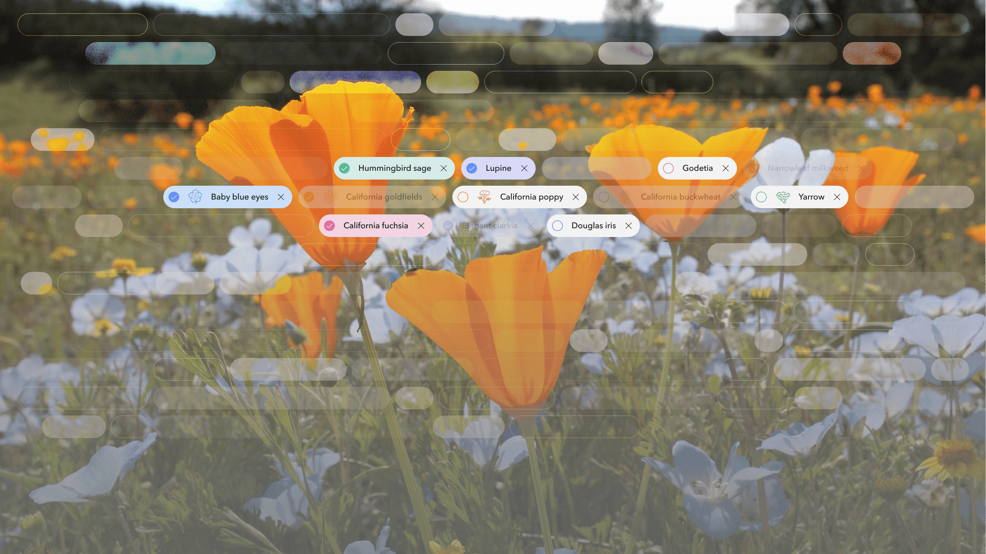
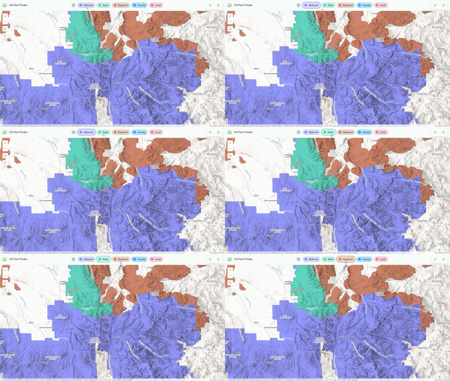
You can use the new Chip Group component in your app for selection workflows, filtering patterns, and for toggling categorical data. Chip Group provides consistent spacing, accessible keyboard navigation, and selection modes to multiple Chips.
Text Area
Text Area is a multiple line text input control, which allows users to enter a sizable amount of content in free form text. The component can collect user inputs, such as comments or reviews in forms. You can limit the number of characters input by the user, and embed components such as a Button in the footer start and end slots.

Modal: Sticky top and bottom content
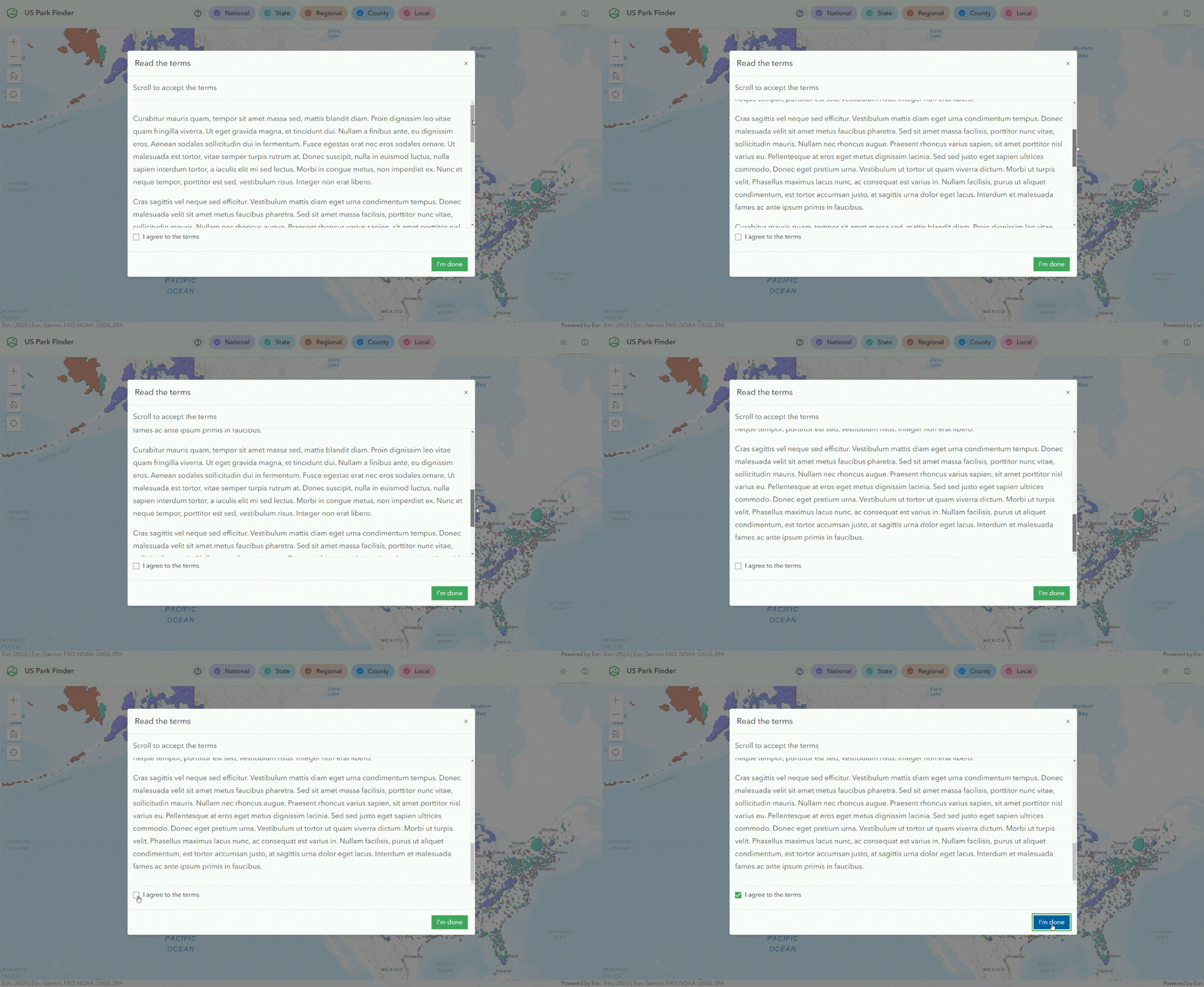
Modal now includes two new slots for placing sticky (non-scrolling) content:
- Top: add content to the component’s sticky header, enabling it to remain at the top of the component when scrolling up and down, and
- Bottom: add content to the component’s sticky footer, enabling it to remain at the bottom of the component when scrolling up and down.
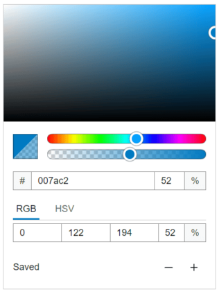
Color Picker transparency
Color Picker can be configured to include an alpha channel to enable color transparency.
List enhancements
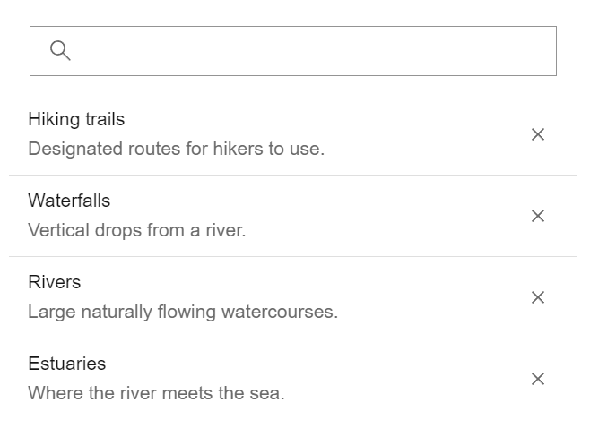
Persist a selection: Lists have several selection modes that you can use, including no selection, single selection, multiple section, and now “single-persist”, which allows you to enforce one always selected List Item. The only exception is if you decide to not have one of the items pre-selected initially. This selection option is also available with other components that offer selection, such as the Dropdown component.
Close list items: If you enable the closable property, you can allow your end users to close, or remove, items from the list.
Selection change event: You can listen to the new calciteListChange event for when the selection changes, and get access to any selected list items.
Shell slots: Organizing your content
Before we jump into the updates, let’s do a brief recap on the Shell component. Shell serves as a foundational layout component in Calcite as it organizes the overall layout of your app. It can be used for a full-page experience, or given a defined width and height. Shell can also be embedded within other experiences or narrative content, and includes a number of slots where you can choose to place your content within the layout.
In this release, Calcite includes some additional slots for placing content.
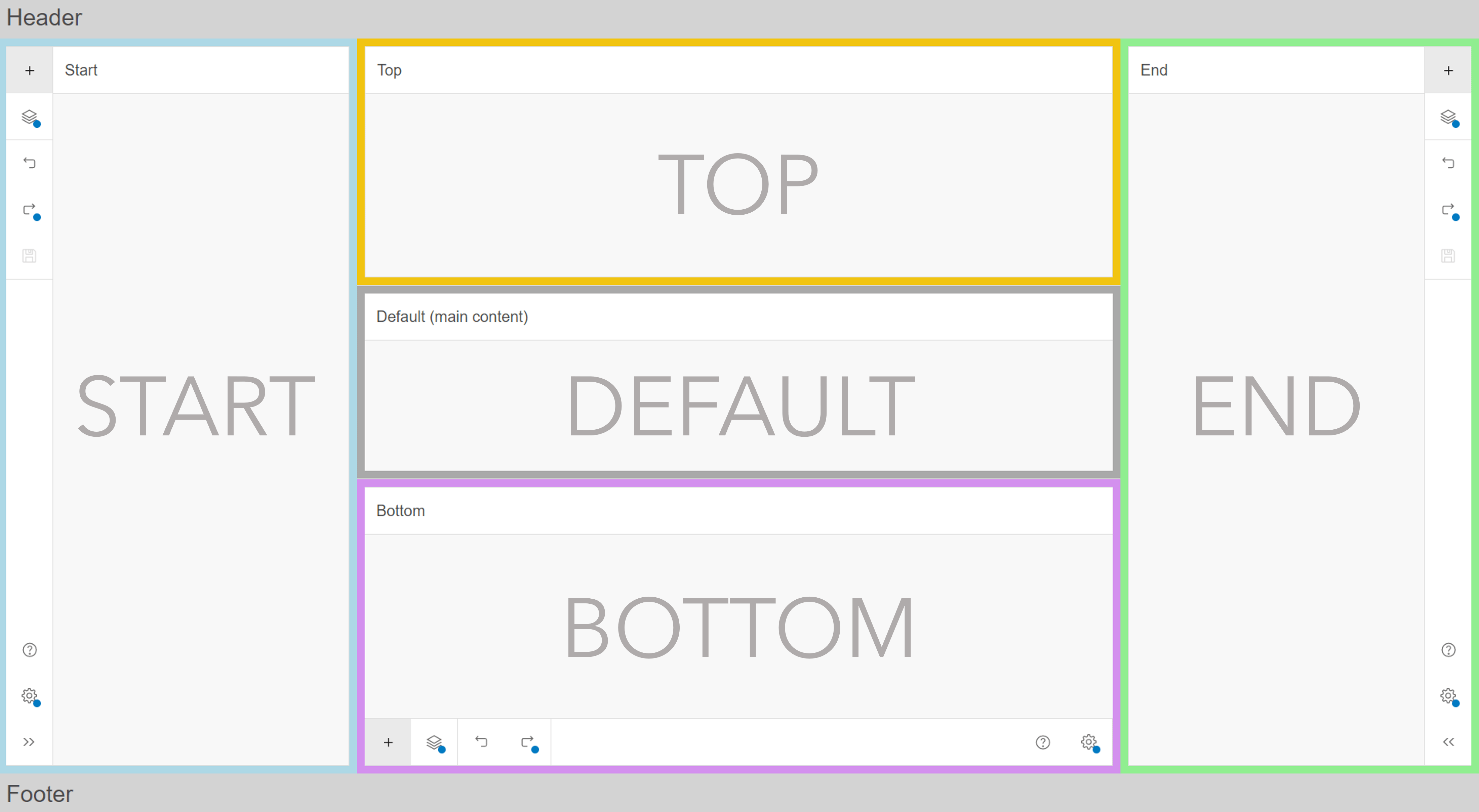
Top & bottom panel slots: In the center of the layout, there is now a “panel-top”, “panel-bottom”, and default slot.
Alerts slot: Alerts are contextual pop-up style messages that can contain actions without obstructing the application. By default, they are positioned over the browser window. With this update, you can choose to place them in a new “alerts” slot within Shell that is dedicated to alerts. When placed in the slot, the Alert is positioned over the Shell rather than the whole page. This is useful for when you have your Shell embedded within other content on a page, and you want to display information positioned over the Shell rather than the full page.
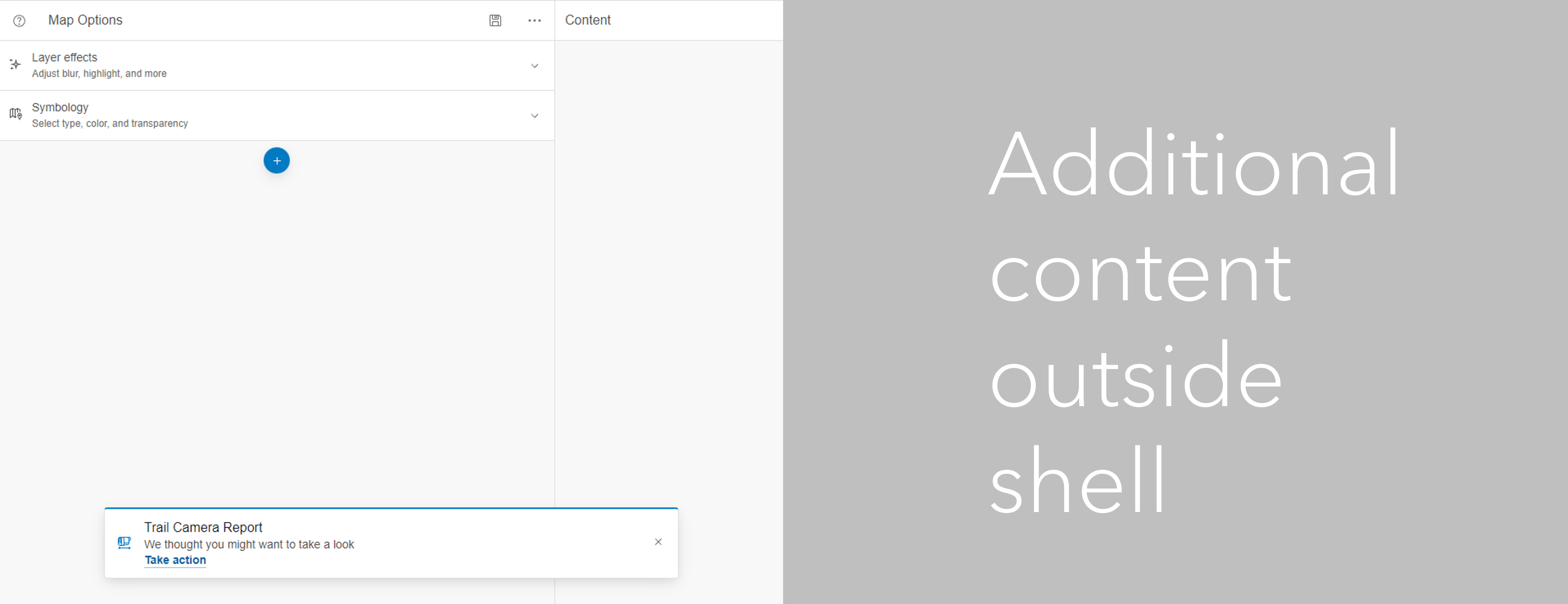
Modals slot: Modals are floating containers that can house straightforward messages or custom interfaces that are triggered contextually. By default, they are centered over the browser window. Similar to the “alerts” slot, the “modals” slot allows you to center the Modal over the Shell rather than the full page.
Resize Shell Panel & CSS variables
Resizing panels: Shell Panel now has the option to enable interactive resizing of the panel when slotted in the “top” or “bottom”. When enabled, users can drag the edge of the panel to expand or collapse the height of the component and interact with content.
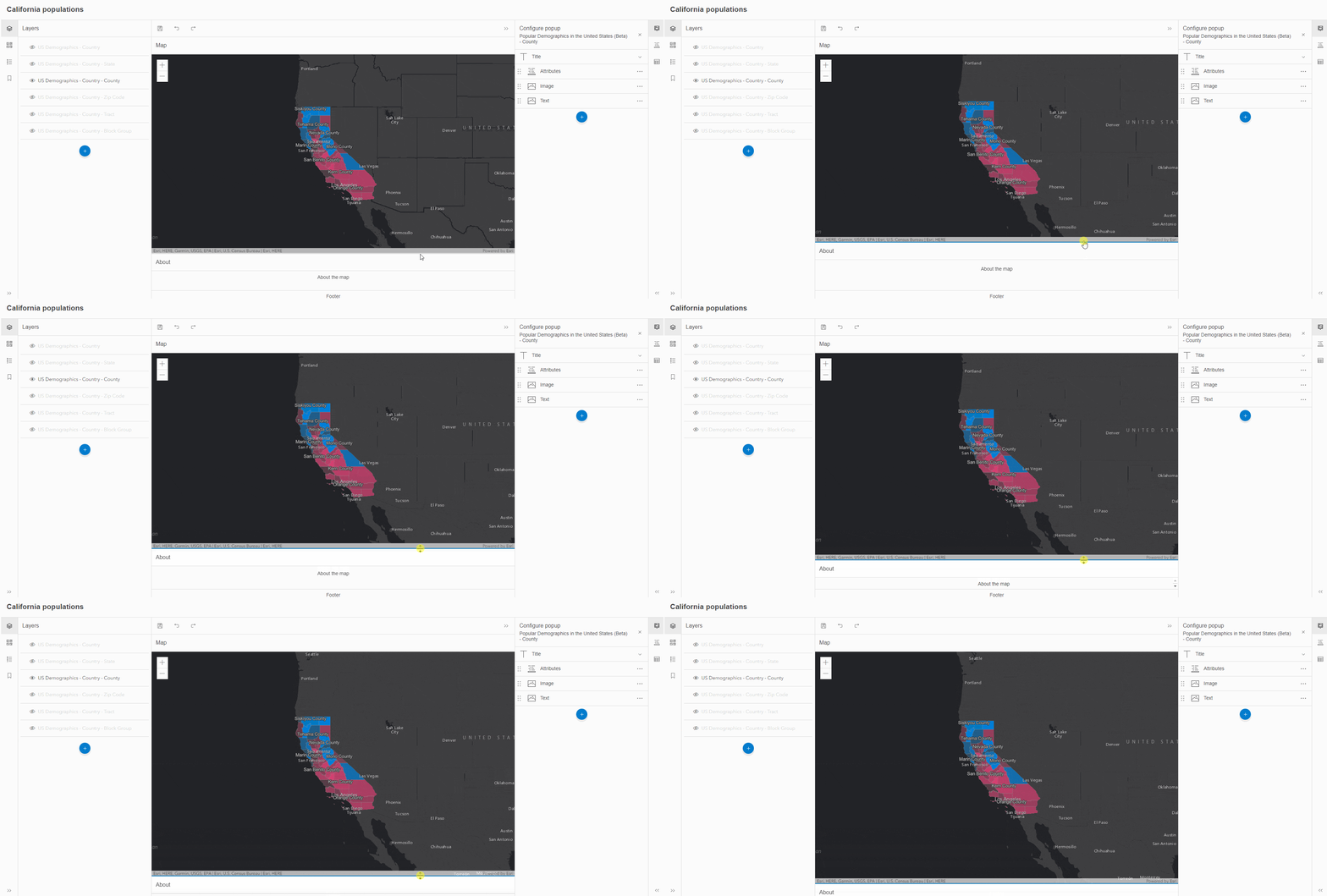
CSS variables for sizing: You can control the sizing of Shell Panels using the following CSS variables:
--calcite-shell-panel-detached-max-height,--calcite-shell-panel-height,--calcite-shell-panel-max-height,--calcite-shell-panel-max-width,--calcite-shell-panel-min-height,--calcite-shell-panel-min-width,--calcite-shell-panel-width, and--calcite-shell-panel-z-index
Action Bars on Panels and Flow Items
Action Bar is composed of Actions which are typically used for core operations in the interface, and are often seen on the left of right edge of applications. With this update, there is an “action-bar” slot, which serves as a specific placeholder for an Action Bar, at the top of Panels and Flow Items. You can use this to position an Action Bar containing functionality that corresponds to the content within the Panel or Flow Item.
Focus styling
Focus color: By default, the focus color will match the configured brand color. You can override the focus color by using a new global CSS variable available for all components, or set it directly on an individual component.
Focus placement: By default, the component focus is displayed as an outline around the component. The focus can instead be drawn inset within the component using a new CSS variable.

Accessibility
Building accessible software remains a top priority at Esri. Calcite Components leverage the W3C Accessibility Standards to ensure the applications and experiences you create are usable by a wide range of audiences. Calcite recently published a conformance report, which includes support on the US Access Board (Section 508), Web Content Accessibility Guidelines (WCAG), and current format of the Voluntary Product Accessibility Template (VPAT®).
Each release includes improvements to Calcite Components that are focused on accessibility. To learn about some of the recent accessibility-related updates, please see the Accessibility section of the May release summary.
There’s more
This blog covers some of the highlights released with Calcite over the last four months. There is a lot more to discover, such as Austrian German locale support and custom theming in the component sample playground. For a full overview of updates, please review the May Summary.


Article Discussion: