An aggregate map service can transform noisy point data into clear and informative bins. Converting points into bins is especially useful for analyzing track data (captured in either ArcGIS Field Maps or ArcGIS Tracker) because it allows you to clearly visualize the movements and patterns of your team. The map below contains the raw track points for a team of mobile users.
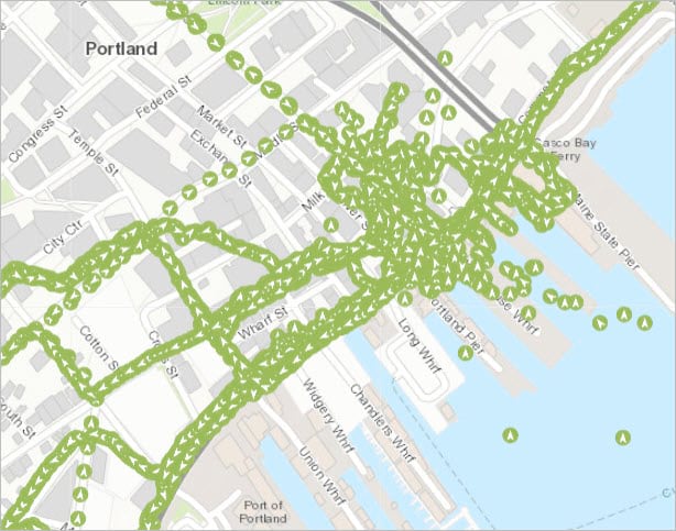
It can be difficult to makes sense of such a large amount of data when all the points are stacked on top of one another. Aggregating your data solves this problem by assigning each track to a specific area on the map. These areas can take the form of either square, triangle, or hexagonal bins. The image below shows this same track data after it’s been aggregated.
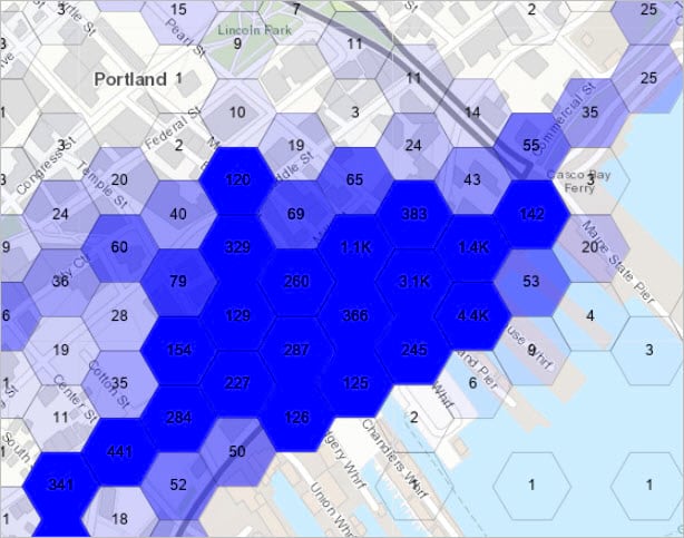
This aggregate map service uses a color scale to denote the number of tracks within each area. The darker the hexagon, the greater the track density. This visualization paints a clear picture of where your team has been and what areas they spent the most time in.
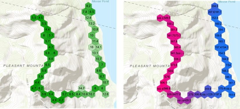
In addition to visualizing the number of track points recorded, you can also use aggregate data to visualize field statistics captured by either Field Maps or Tracker. The maps below show the average horizontal accuracy (left) and the average altitude (right) of track points within each of their hexagonal bins.
Aggregate map services are dynamic. This means that they will update as location tracking data is recorded. This is useful if you need to visualize area coverage as it updates over time – such as when conducting invasive species removal or monitoring a search and rescue mission.
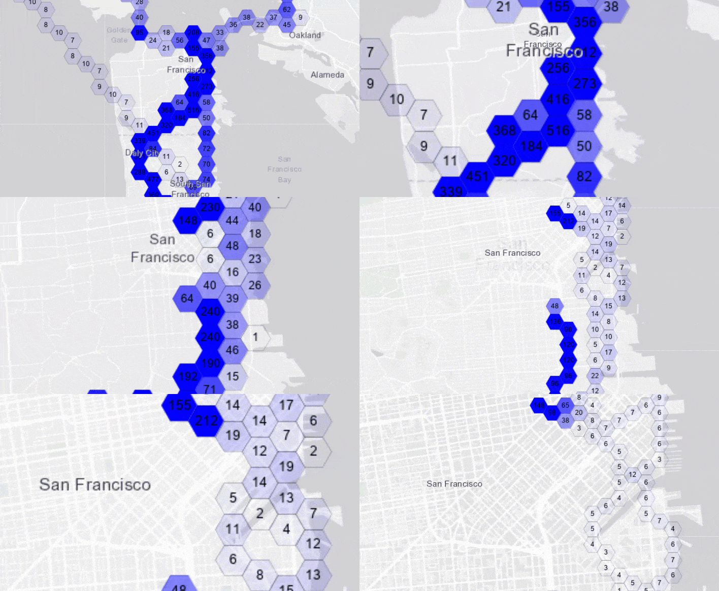
As you pan and zoom, the map is updated using the latest track data and will aggregate the tracks at different zoom levels.
You can create an aggregate map service using either ArcGIS REST API or ArcGIS API for Python. In addition to creating a dedicated map service, you can use ArcGIS Pro to visualize aggregated track data locally. Each method for aggregating tracks data is described below.
Note: Creating an aggregate map service requires ArcGIS Enterprise 10.6.1 or later. It is not supported in ArcGIS Online.
Use ArcGIS REST API
First, navigate to the item page of the track view that contains the track points you want to aggregate. Open the service URL of the track view by clicking View. This is found in the bottom right corner of the item page.
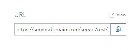
To generate a new map service, you will need to navigate to the REST administrative endpoint. To do this, add admin to the URL in your browser as shown below:
https://server.domain.com/server/rest/admin/services/...
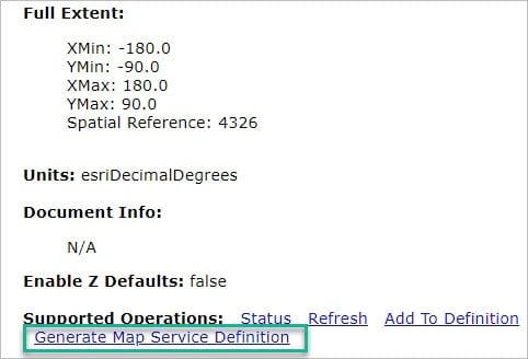
Load the page with the updated URL. Scroll down to Supported Operations and click Generate Map Service Definition.
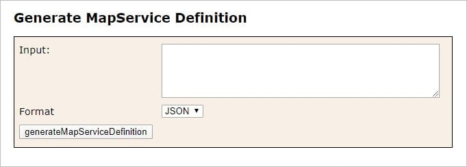
The Generate Map Service Definition window opens. Leave the Input setting blank, change Format to JSON, and click generateMapServiceDefinition.
A new map service definition is generated as a JSON file. Copy the entire JSON file to your clipboard.
Navigate to the publish service in your portal using the following link. Be sure to change it to match your Enterprise organization and username.
https://service.domain.com/portal/sharing/rest/content/users/<username>/publish
Fill out the Publish Item window with the following values:
- Item Id: the item ID of your track view
- Type: Feature Service
- Publish Parameters: the Map Service Definition JSON copied from the previous window
- Optionally, change the name of your map service by editing
serviceNamein the JSON.
- Optionally, change the name of your map service by editing
- Output Type: bdsMapService
- Format: JSON
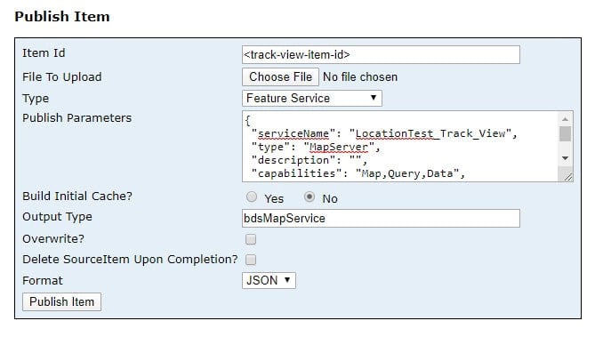
Click Publish Item. The aggregate feature service will appear as a Map Image Layer on your content page.
Open this item in Map Viewer to view your aggregate track data.
Note: Map image layers created using the REST API or the Python API do not enforce view tracks privileges. You’ll have to configure your sharing or group settings to manage who has access to this content.
Use ArcGIS API for Python
You can create an aggregate map service using ArcGIS API for Python by downloading and following the Create Aggregated Map Service Python notebook.
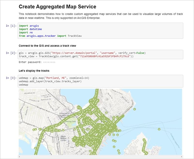
To use this notebook, first, clone or download the tracker-scripts Github repository. This is where the notebook is located.
Once the tracker-scripts repository is on your machine, follow the instructions in the readme file to create the conda environment required to work with the Tracker scripts.
In the terminal or command prompt navigate to .../tracker-scripts-master/notebooks/examples and type jupyter notebook. Press Enter to launch the Jupyter web interface. On the web page, open the “Create an Aggregated Map Service” notebook.
Edit the following code in the notebook to match your Enterprise URL, username, and track view item ID:
gis = arcgis.gis.GIS("https://server.domain/portal", "username", verify_cert=False)
track_view = TrackView(gis.content.get("track-view-item-id"))
This script is written to generate two aggregate map services – one that will visualize the count of track points and one that will visualize a field statistic contained in the tracks layer.
Generate a map service representing track count
You can customize the map service that will visualize the count of track points by editing the following code:
count_item = create_map_service(track_view,
                                 name=f"count_{int(datetime.datetime.now().timestamp())}",
                                 min_color=[0, 0, 255, 0],
                                 max_color=[0, 0, 255, 255],
                                 max_value=100,
                                 definition_expression=track_view.mobile_users.view_definition_query,
                                 feature_threshold=1)
You can edit the name of the map service as it will appear in your portal. You can also edit the min and max color values used to the symbolize the data. This script uses RGB color codes.
You can also edit the definition expression if you want to filter data or specify whose tracks will be generated in the visualization.
Using the default color values and definition expression will generate an aggregate map service that looks like the ones shown below.
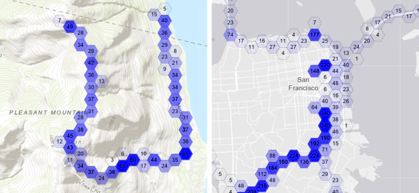
On both maps above, the darker blue hexagons represent areas with a higher number of recorded track points. If these represent one person’s tracks, like the map on the left, you can infer that more time was spent in the darker areas. If these represent more than one person’s tracks, such as the map on the right, you can infer that the darker areas were visited by a larger number of mobile workers.
Generate a map service representing a field statistic
The following code will generate an aggregate map service that visualizes a field statistic of the track data. This example uses a green color ramp to visualize the average horizontal accuracy of the data. It also sets the definition expression to filter out inaccurate data. Note that lower values represent greater horizontal accuracy.
accuracy_item = create_map_service(track_view,
                                 name=f"count_{int(datetime.datetime.now().timestamp())}",
                                 min_color=[0, 255, 0, 0],
                                 max_color=[0, 255, 0, 255],
                                 max_value=100,
                                 min_value=0,
                                 statistics={
                                     "fieldName": "horizontal_accuracy",
                                     "statisticType": "avg"
                                 },
                                 definition_expression=f"{track_view.mobile_users.view_definition_query} AND horizontal_accuracy <= 100",
                                 feature_threshold=1)
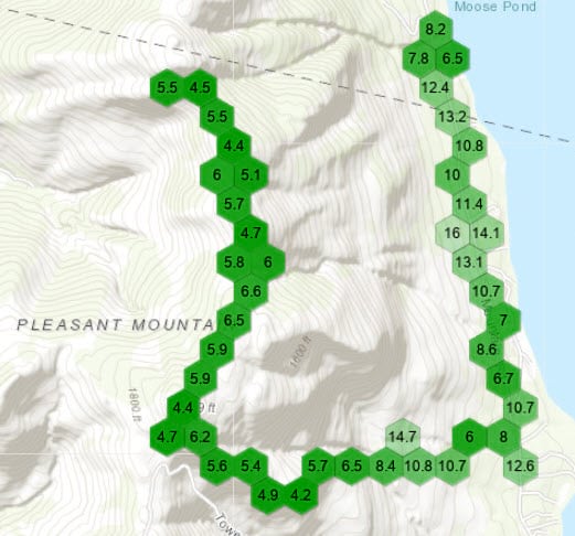
On the map above, you can see that the horizontal accuracy is high on the west side of the map, but begins to decline as the mobile worker moves east.
Use ArcGIS Pro
To aggregate track data in ArcGIS Pro, open a new project and add your tracks layer to a map. The tracks feature layer is automatically bin enabled, so the Binning contextual tab will be available when you highlight the layer in the Contents pane. Use the Bin tab to aggregate your data and to edit the statistics, type, size, and symbology of the layer. For more information, see Work with binned feature layers.
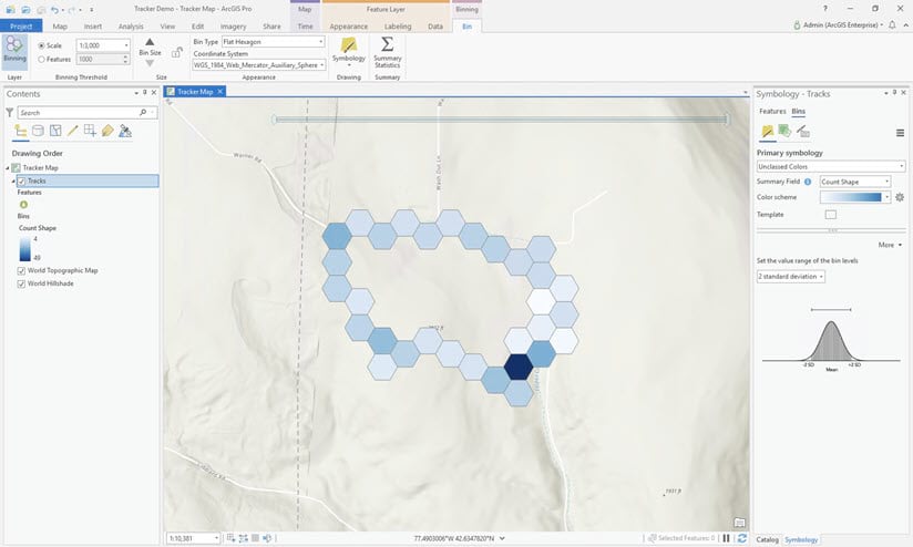
Now that you’ve learned three different ways to visualize aggregate data, think about how you might use them to better analyze and monitor your own track data.


Article Discussion: