As much as we like authoring web maps full of data, there are times when we need to suppress low counts, even if they’re right there in the layer’s tabular data. Whether you’re working with the source data, or you’re working with data that came with low counts already suppressed, we have some tips to deal with either situation.
What are “Low Counts”?
If there are only two cases of some rare disease, or only one female veteran age 25-34 in a zip code, these are often called “low counts” or “small cell sizes.” Often times, such small counts can be identifying, much like how just three pieces of information (the combination of zip code, date of birth, and sex) can identify the vast majority of Americans. Sometimes we try to make these counts bigger by aggregating categories such as “all rare diseases” or “all female veterans,” by aggregating up geography levels (e.g., instead of individual zip codes, do cities, metro areas, or counties), and/or by combining years of data.
Other times, data analysts are required to leave the categories, geography levels, and years alone, and simply suppress low counts. For example, the Commonwealth of Massachusetts’ Department of Public Health requires that all counts under 5 for a given place with under 50,000 residents be suppressed for any health event (e.g., preterm birth, suicide) or case of a disease (e.g., Lyme disease, Hep C). This ensures confidentiality and also complies with Department of Public Health policy.
Ways to Suppress Data in Pop-ups in ArcGIS Online
Publish a New Service or Hosted Feature Layer with an Added “Display Field”
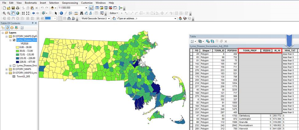
Go back to the original source of your data (or export it from ArcGIS Online as a shapefile if it’s shared publicly), and work in either ArcGIS Desktop or Pro. Add a field with field type = text. When calculating the field, use the original data field(s) along with any suppression rules as your logic. For example, the layer and attribute table in the screenshot below show the count of Lyme Disease per township in 2016. The count is in the field named YR2016 and the new text field is named YR16_TXT. For those townships with fewer than 50,000 in population, and a count under 5 (field YR2016), the value of the new text field will be “less than 5”, otherwise, the value will be the original count:
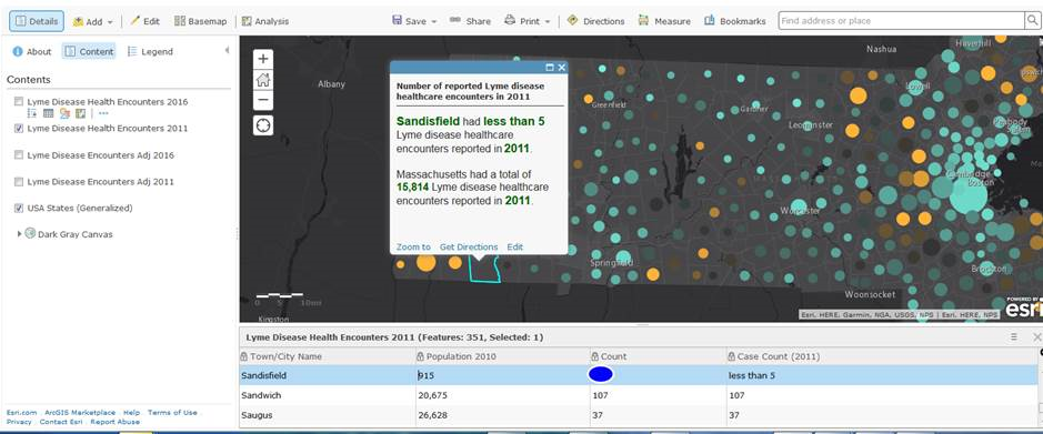
Remove the original field, then save, export data, save in a geodatabase, and publish this new layer to your ArcGIS Online account, and use this new display field for your pop-up needs. The screenshot below shows the township of Sandisfield with a suppressed count in 2011:
If the tabular data (not just the web map) will ever be visible to the public, make sure that the original field is not able to be viewed!
Use Arcade Expressions
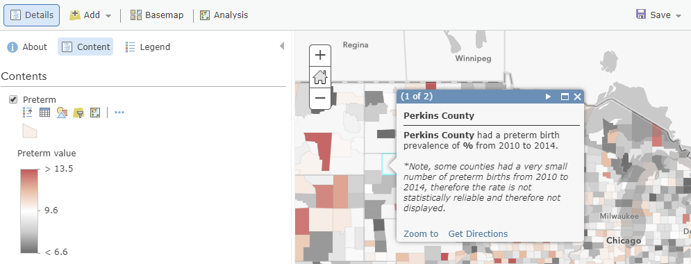
Other times, GIS analysts are not working with the source data directly, but with a data set from some other agency that has already suppressed the low counts. For example, I have a layer of the rate of preterm births (defined as births before 37 weeks of gestational age) by county from 2010-2014. I downloaded this data from a government FTP site (Centers for Disease Control and Prevention’s Health Indicators Warehouse, formerly healthindicators.gov). The downloadable data already had null values if the county had a “low count” of preterm births, too small of a count to yield a statistically reliable rate. Before Arcade expressions came along in ArcGIS Online earlier this year, I added a footnote to my pop-ups to explain the null values:
Now, I can do conditional text in the pop-ups using Arcade expressions. Arcade expressions takes your layer’s tabular data that needs just a few more calculations and allows you to dynamically symbolize the data in your map and to display any data or text in your pop-ups the way you want to. If the county does have a valid rate, then I can display my original sentence. If it has a null value, I can display a new sentence stating what the footnote says.
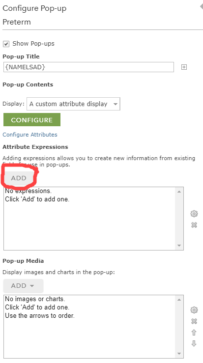
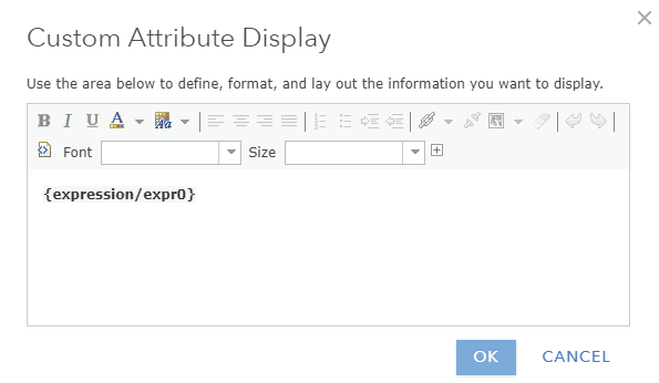
How, you ask? On the layer in the Table of Contents side panel, I click the three dots right underneath the layer name to display More Options -> Configure Pop-Up. In the Configure Pop-Up dialogue panel that comes up, I change the contents to “A custom attribute display.” Then, I’ll click the Add button under Attribute Expressions:
An Expression Box appears. I’ll first change the word “Custom” to the name of this new variable that I’m creating on the fly: “Pop-up Text.” In the Expression Box, I type simple Arcade syntax to apply any if/then logic or other customized steps. The Globals are all the fields that exist in your attribute table, and the functions are common scripting functions (for numeric data, functions that you could find on a scientific calculator and then some; for character data and date/time data, there are additional Arcade functions available). If there were any previous expressions created for this layer (say for symbology or labeling), there would be an Existing tab in addition to Globals and Fuctions so that these previous expressions would be available for use.
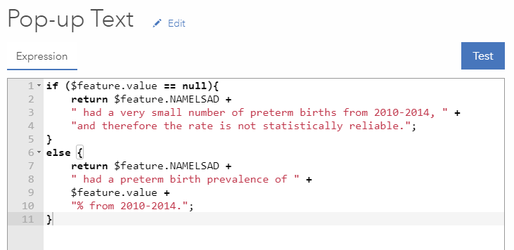
Recall that I want to display a simple sentence if the rate is valid: “{County} had a preterm birth prevalence of {value}% from 2010 to 2014.” If there’s no valid rate, then I’ll say what I said in the footnote: “{County} had a very small number of preterm births from 2010-2014, and therefore the rate is not statistically reliable.” Here’s what this looks like in my Pop-up Text expression:
I can then click the Test button to make sure I don’t have any syntax errors, then click OK. Once I have this, I can now configure my pop-ups using a Custom Display to show our sentence above. I’ll build it in the Custom Attribute Display window like this using that plus sign to add field names. Scroll down, as expressions are added at the very end of the list of attributes:
My beautiful pop-ups now display the correct sentence based on whether or not the rate was suppressed in the data I was able to download. For example,

vs.

Now you have some techniques you can use when you need to display data in which low counts have been suppressed. Do you have any other techniques that you use?
Many thanks to Scott Troppy, MPH and Susan Soliva, MPH who are surveillance epidemiologists at the Commonwealth of Massachussetts’ Department of Public Health for their examples and method of adding a new display field!
See this story map for some step-by-step examples of how to use Arcade within ArcGIS Online.

Commenting is not enabled for this article.