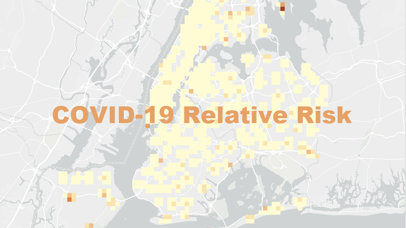
With a few short steps, you can leverage ArcGIS Insights to run scripts and expand what’s possible in your analysis. This article explains how to use Insights to run a script to analyze the impact of COVID-19 on hospitals in your health care region
The CHIME (COVID-19 Hospital Impact Model for Epidemics) application was developed in collaboration between Code for Philly and Penn Medicine to analyze hospital capacity. The application uses an SIR (Susceptible, Infected, Recovered) model to determine required capacity.
The code from the CHIME application can be run in the scripting environment in ArcGIS Insights, which is available to agencies responding to the COVID-19 pandemic through Esri’s Disaster Response Program (DRP). The code creates an output dataset, which can be used in Insights to create spatial and nonspatial visualizations to analyze epidemiology at a county level.
See the full page example here.
This workflow was last tested on November 25, 2022.
Before you begin
Insights in ArcGIS Enterprise and Insights desktop support connections to a Jupyter Kernel Gateway, which can be used to open a scripting environment and run scripts in Python and R. If you have access to Insights in ArcGIS Online, either through your organization or from the DRP, you can download Insights desktop and use it to access the Insights scripting environment. You can use your Insights in ArcGIS Online account to activate Insights desktop.
You must also set up a Jupyter Kernel Gateway. Steps to set up a Jupyter Kernel Gateway can be found in the Insights Scripting Guide on GitHub.
The dataset used in this example contains the following fields. If you want to run the script using data from your own region, you will need a dataset with the equivalent information and field names.
- countyname – County name
- Unacast_ch – Doubling time in days (contact rate)
- Hospitaliz – Currently hospitalized COVID-19 patients
- Population – County-wide population
- Hospital_1 – Hospital market share (%)
Open Insights and connect to your Jupyter Kernel Gateway
- Download the CHIME_Example.zip file. Extract the compressed CHIME_Example folder, but do not extract the HA_2018 folder. The HA_2018 folder contains a shapefile, which must be in a compressed format to upload in Insights.
- Open Insights in ArcGIS Enterprise or launch Insights desktop.
If you are opening Insights desktop for the first time, you will be asked to activate your account. You can activate Insights desktop using an Insights in ArcGIS Enterprise account or Insights in ArcGIS Online account.
If this is your first time signing in to your Insights account, the Welcome to Insights window appears.
- If necessary, in the Welcome to Insights window, click Skip.
- Click the Workbooks tab.

- Click New workbook.
A workbook is created and the Add to page window appears. Your content is shown by default. You will upload a shapefile in a compressed folder to use in the script.
- In the Add to page pane, click Upload file.

- Browse to the CHIME_Example folder and open the HA_2018.zip file. Repeat the steps to open the BC_Covid.xlsx file.
- Click Add.
The datasets are added to the data pane. Next, you will open the Insights scripting environment and run a script.
- Click the Scripting button to open the scripting environment.

- In the Kernel Gateway connection window, enter the URL for your Jupyter Kernel Gateway. The web socket will be updated automatically using your URL.
- Click Connect.
The scripting environment opens. The script was written using Python, so you will select the Python kernel.
- Click Select Kernel and choose Python 3 from the menu.

The scripting environment is ready now to start creating and running scripts.
Run a script in Insights
In this step you will open and run a script using the data you added to Insights.
- Click Import file.

- Open the CHIME.ipynb file you downloaded with the data (in the CHIME_Example folder).
- Click the first cell in the script and click Run. You can also use the keyboard command Shift+Enter to execute the code in the selected cell.

The script executes. There will not be any outputs for the first cell in the script. Next you will use fields from the dataset in the data pane to populate the second cell in the script.
- Scroll down to the second cell in the script. The comment says that five fields are required.

- Expand the Cases.March2020 dataset to display the field names.

- Select countyname, Hospitaliz, Unacast_ch, Hospital_1, and Population.
- Drag the fields to the scripting environment and use your pointer to drop them in the code in the second cell after chime_df =.

The fields are added to the code in the data frame definition.
- Select the second cell and click Run.

The cell executes but once again does not create an output. The dataset created by the script can be added to the data pane using the code in the third cell.
- Select the third input cell and click Run.
The cell executes and a dataset called Layer is added to the data pane. You can give the dataset a more descriptive name.
- Click Rename dataset to make the name editable. Give your dataset a descriptive name (for example, BC_Regions_Model) and press Enter to apply the change.

- Expand the output dataset to review the fields.
The dataset includes the fields calculated using the script, but does not include a location field. You will use the location in the original dataset to create a location field in the output dataset.
- Click the Dataset options, then choose Enable location from the menu.

- In the Enable location pane, click the Geograhy tab.
- For the Location fields parameter, choose countyname. For the Matching geography level parameter, choose HA_2018, or a layer with the boundaries for your region.

- Click Run.
A location field is added to the dataset.
You are now ready to use the dataset to create visualizations like maps and charts.
Create visualizations to analyze regional epidemiology
In the final section of this activity, you will create maps, charts, and tables that will help you understand the epidemiology of each county or region.
- Minimize the scripting environment so you can see the entire page in your Insights workbook.

- Expand the output dataset, if necessary, and select the status field.
- Drag the field to the page and drop it on the Map drop zone.

The map shows each county with a value for status. However, there can be more than one status per county. You will change the map to show the proportions of the statuses using pie charts.
- Click the arrow next to status on the map to expand the Layer options pane. Click the Symbology tab.

- For Symbol type, choose Pies.
The map is now styled by pies. Some of the symbols may overlap other counties or regions. You can change the maximum size of the symbols to fit the size of the areas on the map.
- Click the Appearance tab. Change the maximum size to 20 px. Close the Layer options pane.

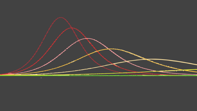
Next, you will create a chart to show how the model predicts statuses to change over time.
- In the data pane, select date, Value, and status.
- Drag the fields to the page and drop them on Time Series.

You will also create a summary table that summarizes the data for each health region.
- Select the countyname, Value, and type fields. Drag the fields to the page, hover over Table, and drop them on the Summary Table drop zone.

A summary table is created showing the type and value field grouped by health authorities. You want to look at the data for each health authority individually. To do that, you will create cross filters on your cards, which will allow you to filter your data using selections on other cards.
- Click the map card to activate it and click the Enable cross filters button. Repeat to enable cross filters on the chart and table.

The final visualization you will make is a summary table showing the count for each value in the type field.
- Select the type field and drag it to the page to create a second summary table.
You now have all the summary tables needed to analyze the impact of COVID-19 on hospitals in health authorities in British Columbia, or in your own region. You can select health authorities on your table or map to filter the time series to show the epidemiological model for an individual authority.
Next steps
Try other scenario-based lessons for responding to COVID-19 with the Use ArcGIS Insights for Understanding and Responding to COVID-19 discovery path.
Use the following resources to learn more about the skills developed in this lesson:


Article Discussion: