Sensor data is pivotal in helping communities prepare for large scale coastal events.
While I probably will never be a forecaster (or work for the National Hurricane Center), I wanted to put myself in an official’s role and use Insights for ArcGIS to explore ocean sensor data. The sensors I looked at were mounted on bouys floating in the Atlantic Ocean. In particular (after hearing a news cast) I wanted to discover how unusual an 83 foot wave is during hurricane season and see what kind of data analysis I could apply to add context for those who may appreciate a little frame of reference.
Let me say, if you want to skip to the end, that an 83 foot wave is huge. It’s big compared to other waves. It’s big compared to other bouys measuring wave height.
For the analysis I used data from the National Data Bouy Center. This team tracks a range of nautical observations from wave heights, water temperature, air temperature to water clarity and much more. If you want the data (from 2017) which includes lat / long coordinates ready to go, I posted that data here.
To learn about my workflow – I have shared my approach. It focuses on a few foundational features in Insights, which I’ve broken out in sections below.
- Data pane – to explore field roles, switch field roles and filter data
- Field calculator – to create fields with context and value
- Box Plots – to surface key statistics and outliers
Also my results are shared publicly, here.
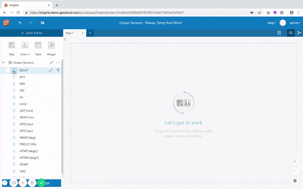
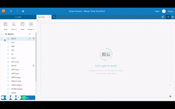
Data Pane, Field Roles and Filter
The data pane reveals what type of fields are in a data set. The data pane exposes many capabilities (this blog only covers a few of them). From the data pane, I can tell that the oceans data is completely numeric. This is apparent by looking at the Field Role icons next to the field’s name. See some of the images below.
Field roles guide the possibilities for creating different kinds of charts, maps, and summary tables. Field roles can be temporal, locational, numeric, categorial or rates.
Consider the following.
- What if I wanted to show bouy locations on a map?
- What if I wanted to categorize wave height in a chart?
A map requires at least one field with a location role. If I want a bar chart showing wave heights grouped into categories like small medium and large – I will need a field with a string role. If I want to show the seasonality of wave height over time, I will need data with a date role and a number role (such as wave height).
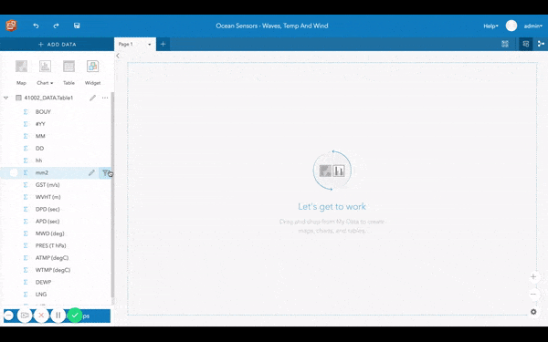
Insights can let you swap and change field roles.
In the oceans data, I chose to update the following roles:
- Bouy field to use a string role (since it represents the bouy’s name)
- Latitude and longitude values to use a location role
- Date and time fields to use a single date roll
I did this to better reflect the intended context of the data, which in turn gave me more options for analysis.
The below image shows how to take latitude and longitude fields and enable location to create a location role. Location roles provide a way for showing data on a map. In Insights, a single data set can have many location roles.
Filter
Insights enables filtering from the data pane. There are various types of filters included with Insights (such as card filters and cross filters). When filtering data from the data pane (using the filter icon) – every map, chart and table will include that filter. Since the National Data Bouy Center denotes missing data using numerals 99 and 999, I had to filter these out.
Field Calculations
Field calculations are perfect for cleaning data and adding value to data. I applied field calculations to the oceans data to create a proper date role, which helped me to understand the seasonal variation in ocean wave height over time. This was important because I wanted to see how abnormal an 83 foot wave was in hurricane season.
For this dataset, I use field calculations for the following things.
- Creating dates by calculating several numeric fields
- Classifying wave height into 3 easy to conceptualize categories (small, medium, large)
- Converting meters to feet
Create dates
Create dates using the DATE() function.
Classify and Convert
Use AND and IF functions to create meaningful categories. Here’s the field calc expression I wrote. Use calculate functions, like division, to convert meters to feet.
Box Plot
Now that we’ve classified wave height into a few meaningful categories and converted meters to feet adding context, let’s quickly quantify ocean waves so we can better understand the distribution of height values at each bouy. Box Plot is great for this, as it not only succinctly reports key statistics like quartiles and the median, it identifies outliers within your data.
Here’s how that works.
From a Box Plot I can quickly access information about median wave height at each bouy and compare statistics side by side. I can also see min and max wave height values. I can say definitively that an 83 foot wave far surpasses the highest wave height reported at these two sensors in 2017 – by 59 feet.
But why stop there? After creating Box Plots I too can see that offshore bouy (orange) experiences waves that are typically just over 1 foot higher then the nearshore bouy (blue). What I found interesting is a comparison on normal wave ranges. The normal wave range of the offshore bouy (data between the top and bottom line) is larger then the inshore bouy. In simple terms it says the further you go offshore, the chances are you will see bigger waves ranging between 1.5 – 12 feet. Another fun way to interpret Box Plots would be to look at the outliers and summarize that waves on rough days can range anywhere between 12 to 24 feet offshore.
Conclusion
An 83 foot wave is huge! To see my completed workbook, which highlights how hurricane season does in fact produce the largest of waves checkout the publicly shared page. From the workbook, there is the following content to review.
- A map showing the location of the bouys used in the analysis
- Scatter plot charts explaining wave height based on atmospheric pressure
- Scatter plot charts explaining wave height based on water temperature
- A time series showing the seasonal effect on wave height
- And a column chart classifying wave height categorically (in groups – small, medium and large)
Want to read more? Visit our documentation.
Want to try analyzing sensors with your data? Don’t have access to Insights for ArcGIS, follow this link to get a free trial!


Commenting is not enabled for this article.