
Alluvial diagrams are a type of flow diagram showing changes in group composition between category fields. The thickness of each stream or link shows its proportional value.
We call these links flows because they show end-to-end flow between common fields known as dimensions, each represented as a set of category “gates” that the flows pass through that we refer to as nodes.
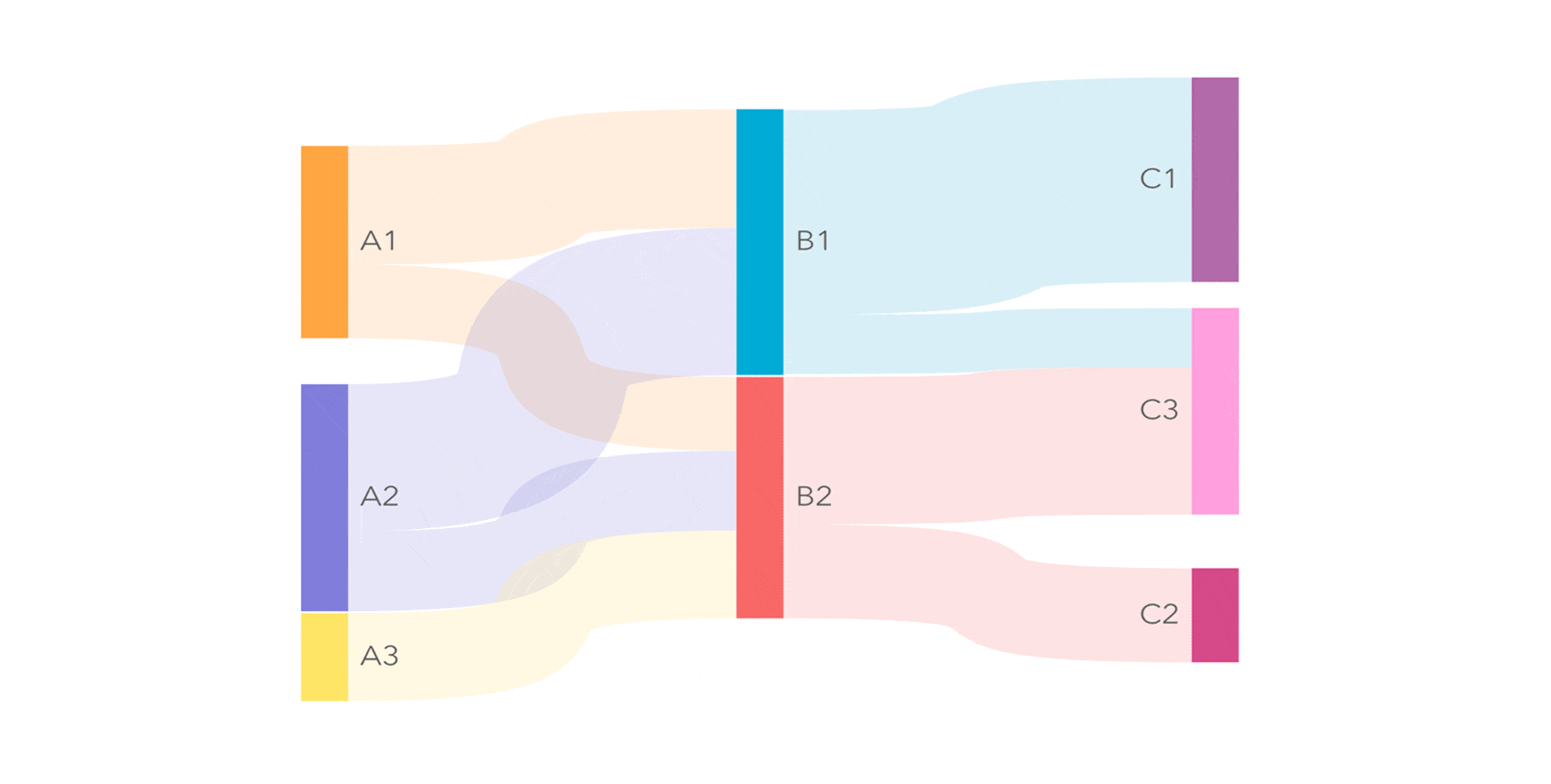
Imagine what the dimensions A, B, and C above could represent:
You could have 20 items that you group by genre (A), size (B) and color (C), showing composition.
You could have 20 staff grouped by department (A), team (B) and level (C), showing hierachy or structure.
You could have 20 skiers and their routes down the mountain; showing flow.
If used well, they are visually appealing and easy to understand. They can allow for simple comparison yet can concisely articulate otherwise complex combinations of data.
Unlike Sankey diagrams, they do not allow for irregular sets and looping.
Benefits over other charts
An alluvial diagram allows people to follow the path of a count.
It is a unique way to see the breakdown of totals across multiple measures at once: The reader can see at a glance from the nodes which categories are bigger and smaller, and from the flows the links that exist between categories across measures (dimensions).
In short, it is easy to see what is connected, and how much of the total is where through any column.
So, when might I use it?
Use alluvial diagrams to show many-to-many mapping between groupings, identify relative strength of links, or trace multiple paths through a hierarchy.
They might help answer questions such as:
-
- How were last year’s profits reinvested?
- What does our supply chain look like?
- What is the make up of our order book?
- What does out consumer profile look like?
- What kind of products are popular at which locations?
Further use cases include demographics; land degradation by type, region and use; educational courses on offer; breakdown of hospitalizations by categories such as illness, variant, age, gender, waiting time, treatment time, and/or outcome.
Links between two sets of countries such as investment, trade, or migration; tracking user journey through an application; media content by levels of genre and audience or count; sports tournaments or award entries.
Government spending at different levels of granularity; breakdown of energy consumption or emissions; predicted change in parliamentary seats; or the income/expenditure of a business.
What makes a good alluvial chart?
Before we make any charts, let’s address the common pitfalls and how we can counteract them.
- Counting nodes. A busy alluvial chart is not going to communicate well, so avoid diagrams with too many nodes. Try grouping nodes and if still too many, try separating the analysis into themes or using a table.
- Sensible order. Sometimes there will be an obvious flow or hierarchy to adhere to. Other times it is worth thinking about order and consequence as explained in our ferry example below.
- Context. Most charts can benefit from explanatory text or at least sensible titles and labels that tell us what data is being represented. This is especially true for alluvial chart.
- Approprate size. The chart must be legible so, as we often find with time series and maps, it may benefit from enlarging the card if you have room to do so. Although there is a zoom button.
How do I structure my data?
In the generic example, top of page, the 3 columns of nodes represent 3 text fields. You can have as many of these as you wish.
The associated values can either come from a count of how many times each occurs in your dataset, or you can use a number field to supply the values.
With a number field, we are looking for input something like this:
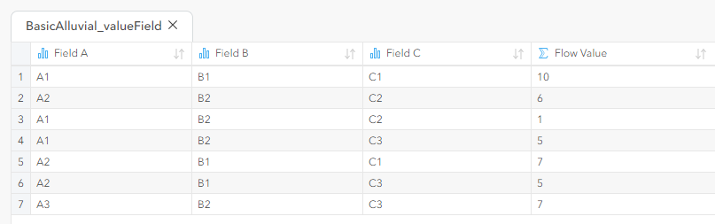
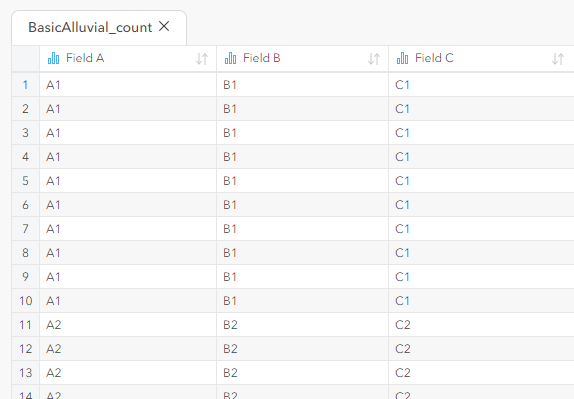
It is perhaps more common to just have text fields, and rely on the tool to calculate counts of how often each permutation occurs.
For example, the same chart could be achieved from this table, below.
Note: Only the top of the table is shown in this illustration.
Be aware that any nulls or blanks will result in unwanted streams or links called <None>.
So, ensure each row of your data has a valid category value (text) for each field column.
Fields will be displayed on the chart as columns in the order in which you select them in the data pane. The order of everything else is calculated by the chart tool to limit path crossing and optimize legibility.
Examples with real world data
A. Emphasis
Like all charts, with a bit of careful thought, Alluvial flow can be used to make a highlighted point. Take the stark difference revealed in US Census data between inward and outward (net) migration seen in California in the two eras shown below.
B. Basic two-column
With just 2 dimensions, Alluvial diagram can be used as a simple visual of flow from/to. In this example, adapted from various British news articles using Spanish open data*, we see the investment into Spain from different world regions.
Alluvial diagrams are sometimes criticized for being too hard to read, but with the exception of some of the smaller flows, I feel the clarity in deciphering flows between the two sides in this example allows it to show a lot of detail in an easy-to-understand format.
In fact Alan Smith’s version of the same chart that appeared in the Financial Times managed to do this while using shades of only one color.
C. Composition & Connectivity
Next, we have arguably the most common use case: breaking a topic, or group of items, down into its constituent parts.
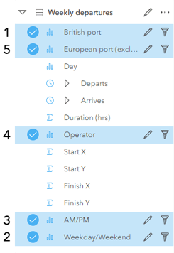
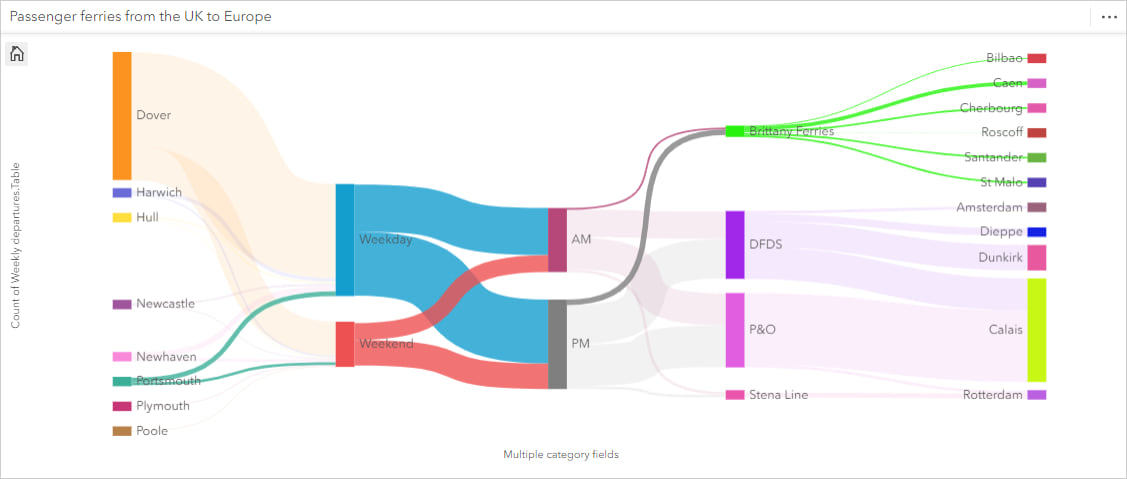
In this example, we have weekly passenger ferry crossings from the UK to mainland Europe broken down into a flow of which port they set sail from, the day of week, the time of day, the service operator, and the port to which they arrive.
Let’s explain this one in a bit more detail.
First we have an extensive dataset that shows all weekly scheduled departures and lots of information about departure times and so on.
We simplified this a little by creating two new fields of Weekday vs Weekend, and AM vs PM, calculated by these two straight-forward IF clauses:
IF (OR (day=”Saturday”, day=”Sunday”), “Weekend”, “Weekday”)
IF (hour_departs < 12, “AM”, “PM”)
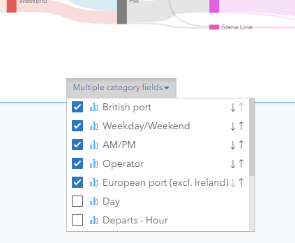
Selecting the fields from the data pane that we want to show on the chart (in the order we want to show them)…
And then, either from the chart button or simply by dragging these fields to a new Alluvial chart on the page, we get our required chart.
From the data pane, we can see the data table for the resulting chart, which looks as follows:
And with the chart, we simply added a title to the card and resized it for better appearance and legibility.
We can see from the chart the dominance of the Dover to Calais crossing route, and how any disruption to it would have a profound effect on UK–Europe traffic. Conversely, we also see how important Brittany Ferries is as sole provider to half of the routes.
Please note this data is for conceptual purposes only. It was compiled in 2021 from browsing online schedules. It is UK origin only, excludes Ireland and Scandinavia, and might not be correct or up to date.
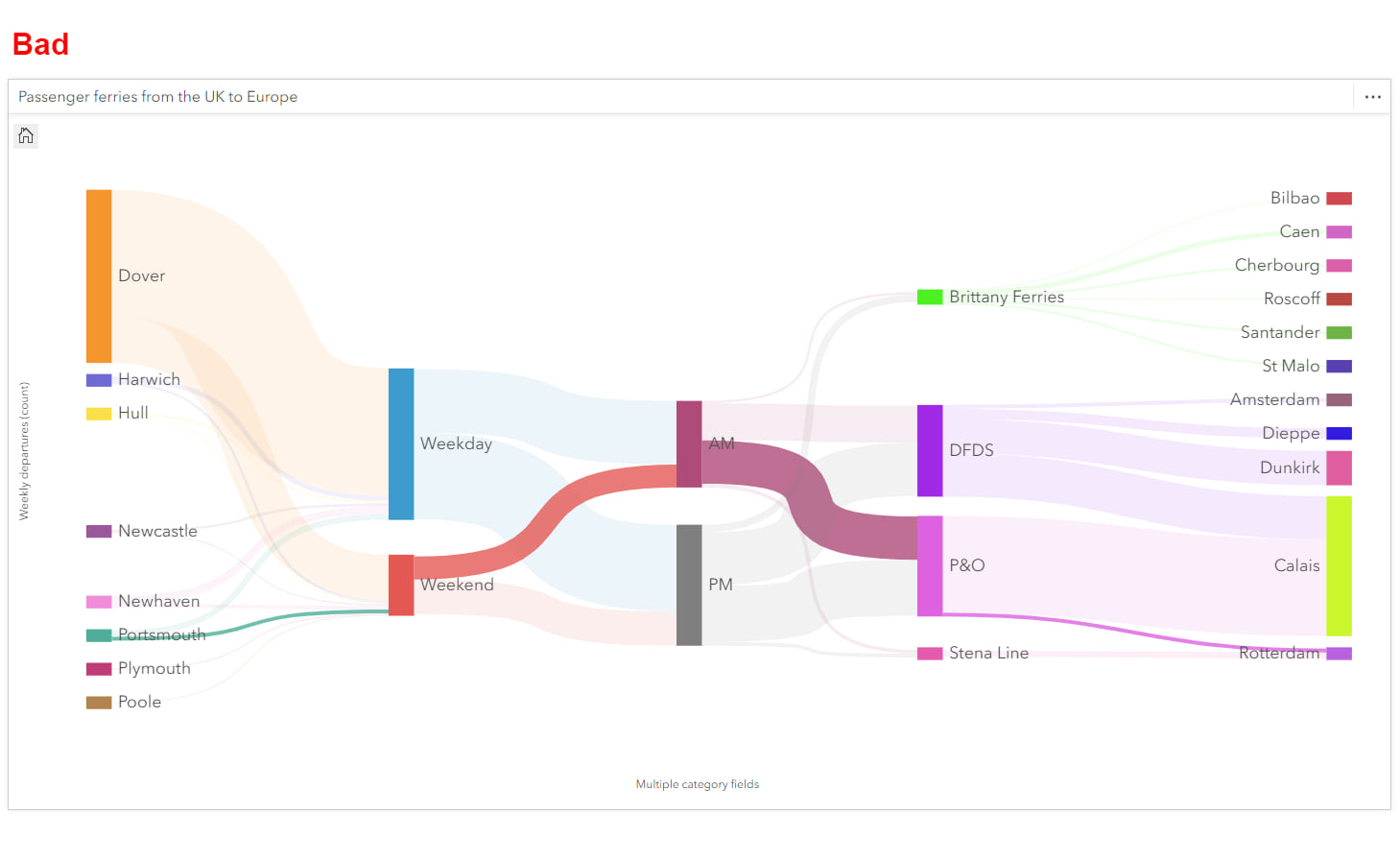
Notice how important the order of the fields is to the information portrayed in the chart. Without interacting with the chart, we cannot trace or link a British Port with an Operator because we have chosen to group the links by time of week before the flows reach the Operator column.
For this we could re-order the chart to be something like this:
However, we can avoid having multiple versions of the same chart on our page by making use of interactions with the chart, in particular highlighting.
Highlighting paths of linked data flow
The chart allows us to easily trace an individual path of flow through from left to right. All we have to do is click on a node, and we will see highlighted all the associated links.
For example, if I click on Portsmouth, I see all of the permutations associated with that port. All other links are by comparison muted and faded into the background.
It is also possible to select individual links to highlight them. But a note of caution if highlighting multiple paths through the diagram. It only really makes sense if the dataset and the order of the chart has a clear hierarchy, i.e., the flow of data is continuously branching out and never grouping back together.
We can do this by using group select (Control + left click on Windows, Command + left click on Mac).
Above we are implying to the reader that this is all flow between Portsmouth and Rotterdam, yet in reality we are showing only some of the data that is linked and some that is not linked at all. It is not even possible to catch a ferry between these two ports!
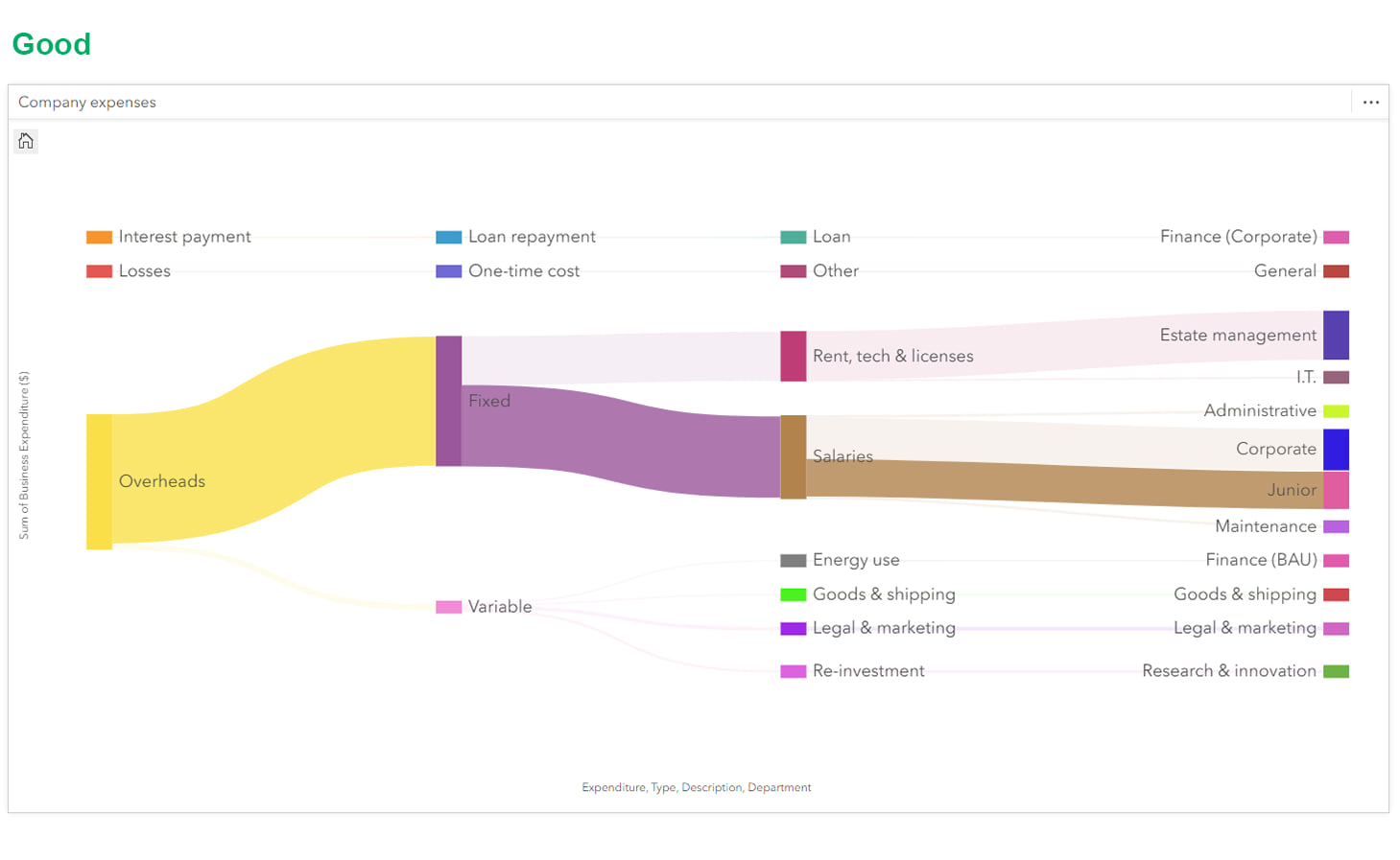
Here, our initial flow continues to split or fork as we sub-categorize down from Overheads to Junior pay. So, the selections make sense. Although the figure above can be achieved far more easily by just clicking on the Junior node!
You can explore this example from the link further below.
Final advice
Date/Time
As the chart is always proportional, for data with regular patterns, the values will often be indicative of any timeframe. However, this is not always the case.
So,
- We would encourage you to label the card title and y-axis accordingly to explain what the values are showing and for what timeframe.
- Where possible, share the chart electronically so that readers can interact with it to see exact values and highlight the various pathways through the nodes.
Special use cases
Alluvial diagrams are best reserved for when you want to specify and emphasize the mapping between two or more categories of data. We see it as a very useful new tool that we hope you will love, but there is good reason why it is not as commonplace as a bar chart.
Color
As with our other charts, it can be recolored via Layer Options, in this case via the legend. This is useful if you want to either emphasize or group particular items within any given column.
Keep it understandable
Lastly, as I mentioned earlier, don’t throw too much information at it! Adding too much information to a chart eliminates the advantages of processing data visually. Each scenario will be different but as a rule of thumb, I would suggest a maximum of 30 nodes across the whole diagram – if possible, less.
You may have encountered many examples in the wild to the contrary, in fact complex network path analysis was one of the things that popularized alluvial diagrams in the first place, so I’m just going to suggest that too many nodes often makes the diagram difficult to read.
Note: More than 20 different nodes within a dimension may yield undesirable results.
That brings us to the end of the run through our new tool.
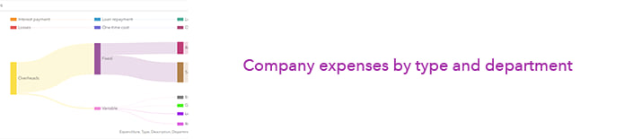
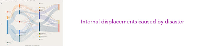
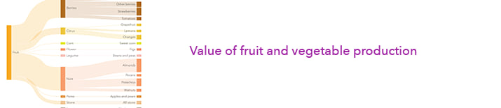
Below are a few more examples we created using the tool, and we hope the explanation and examples in this post inspire you to add alluvial charts to your own Insights.


Sources
DataInvex. Ministerio de Industria, Comercio y Turismo (Spanish Government).
Net Migration Between California and Other States. Census visualizations (US Government).
Based on open census data and the Census 2000 and 1960 Census Subject Reports, Migration Between State Economic Areas.
Online timetables of the various ferry providers: Brittany Ferries, DFDS, P&O, Stena Line.
* Note the original version of Investment into Spain, as published by various news agencies, used licensed data. My take on the chart uses open data.
With thanks also to the following for their inspirational examples and guidance:
BBC News, DensityDesign Lab, Dukes University, Eurostat, Ferdio (Data Viz Project), Financial Times, LinkedIn, The Data Visualisation Catalogue, The Economist.

Article Discussion: