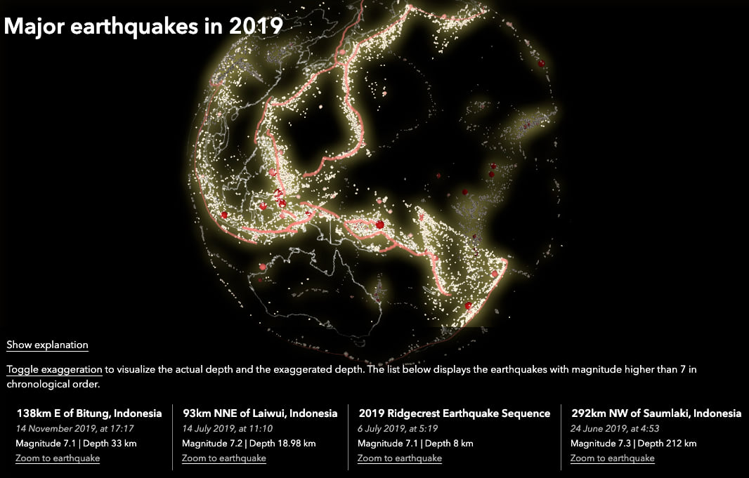
Some months ago I visualized earthquake data from USGS on a globe. The goal of the map is to give users an overview of the earthquake locations, discover the major ones and see where earthquakes occur at lower depth compared to other regions. What made it special is the fact that the depth is exaggerated, so you can see the tectonic activity patterns in the depth dimension much better.
In this blog post we’ll have a detailed look into what works in this visualization and what doesn’t, and we’ll also go through the main concepts needed to create it with ArcGIS API for JavaScript. If you just want to re-create this visualization with your own data, then follow the instructions in this file.
Exaggerating the earthquake depth
When looking at earthquakes from far away, it’s hard to see differences in earthquake depth. The radius of the Earth is much bigger than the depth of the earthquakes, so a difference of 200km is barely noticeable in a global view. This is how the idea of exaggerating the depth came about. Let’s have a look at an example of earthquakes in the area of the Ring of Fire:
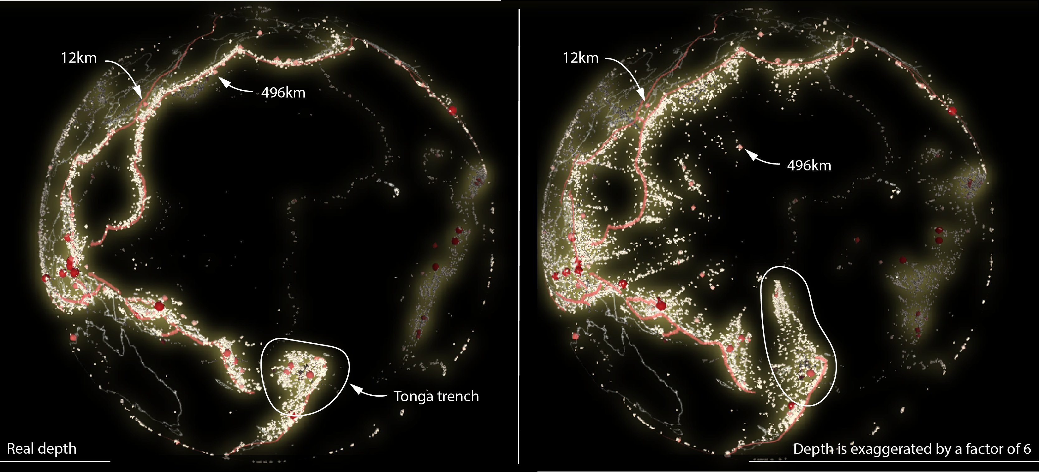
The screenshot on the left is using real depth. Notice how you couldn’t really tell the difference between a 12km deep earthquake and a 410km deep earthquake. On the right, the earthquake depths are exaggerated by a factor of 6. The earthquakes are stretched now much more and you can notice differences between regions. Take for example the Tonga trench, a very active tectonic region with many earthquakes reaching very deep, all the way to 700km.
How to exaggerate the depth of the earthquakes? With ArcGIS API for JavaScript you can set the featureExpressionInfo on the elevationInfo property of the CSVLayer. In this case featureExpresionInfo.expression = "-$feature.depth * 6". See the code on GitHub.
Take the globe for a spin!
In images of 3D maps it’s sometimes hard to figure out where the features are in space. In this map, the exaggerated depth makes it even harder! The basemap is also very minimal, containing only the borders of the countries and those of the tectonic plates. However, it becomes easier to locate the points in space when the scene is in motion. This is why the application initially starts with the globe rotating:
How did I rotate the globe? Rotating basically means moving the camera around the globe. In ArcGIS API for JavaScript I am waiting for the view to finish updating to make sure that all the points are loaded, and then I call the goTo() method moving 0.1 degree longitude east on every frame. See the code for this on GitHub.
Bigger dots for bigger earthquakes
The magnitude of the earthquake was mapped both on the size and the color of the symbols. I wanted to have a clear distinction between earthquakes that go beyond a magnitude of 6 and produce catastrophic damage and the ones lower than 6. For this reason, the earthquakes between 4 and 6 are represented as small, yellow spheres and the ones stronger than 7 as large, dark red spheres. Between 6 and 7 the values are interpolated, which is why there are also middle sized, orange spheres. It is an interesting mix between a visualization with classes and a continuously mapped values. I made this decision because I wanted to see the nuances when it comes to bigger earthquakes (which also occur less frequently). For the smaller earthquakes, I think it’s important to see that they are many, but the differences between them are not so important, so a small symbol for all of them works as well.
To create this type of visualization, I used a SimpleRenderer with two visual variables: a colorVariable and a sizeVariable. See the code for this part on GitHub.
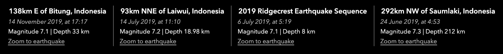
The list of biggest earthquakes of 2019
To provide a quick overview of last year’s most important earthquakes, I’m displaying a list of all earthquakes with magnitude 7 or greater. A “Zoom to” makes it easy to find a specific earthquake on the map.
To do this, I use the queryFeatures() functionality of the CSVLayer. See the code on Github.
I hope you enjoyed the breakdown of the main features that helped to build this visualization. If you want to re-create it with your own data, follow the instructions in this readme file. You won’t need to do any coding, but you will need a GitHub account.

Commenting is not enabled for this article.