USGS publishes a live feed of earthquakes from the last 30 days. In this blog post we will go through the steps of creating a globe visualization that displays these earthquakes and allows the user to filter and interact with them.
So let’s get started!

Step 1. Define the goal of the visualization
We want to show the latest earthquakes classified in such a way that the user can immediately see which ones were extremely dangerous (major earthquakes that cause severe damage) and which ones were moderate (can cause damage but only to buildings which are not earthquake proof). For the sake of consistency, we will also show the minor earthquakes that generally don’t cause any damage. To help the user get a better overview of earthquake magnitude distribution and where the earthquakes occur, we’ll also add a histogram and a filter slider. In addition, we want to allow the user to get extra information about each earthquake by clicking on it.
Step 2. Map design
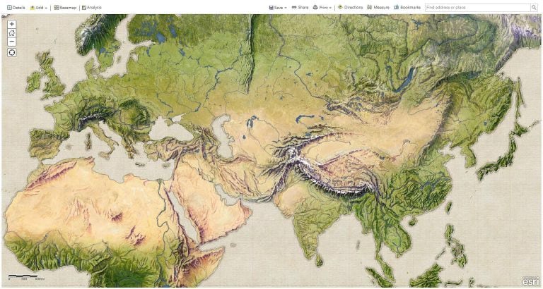
The look and feel of the app should remind us of a school atlas, with the advantage that everything is interactive. This effect is given by the wonderful vintage physical map that John Nelson created. You can read more about the creation process in this blog post. We’ll use this map as a basemap in our application.
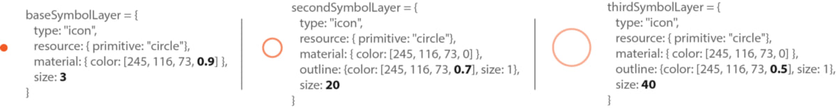
The symbology for the earthquakes is based on the classical concentrical circles symbol:

This symbol is intuitive because it reflects the seismic waves starting from the epicenter of the earthquake. The more concentrical circles, the higher the magnitude of the earthquake. When working in 3D with the ArcGIS API for JavaScript you can achieve this by using a PointSymbol3D with multiple symbol layers, each IconSymbol3DLayer representing a circle:
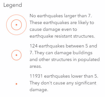
As mentioned in Step 1, in this map we’re using a data classification schema that will allow us to differentiate between earthquakes that cause extreme damage (even to earthquake resistant structures), moderate earthquakes and minor earthquakes that don’t cause any damage. The minor ones are actually the big majority and they are interesting to map because they show the areas with a lot of tectonic activity.
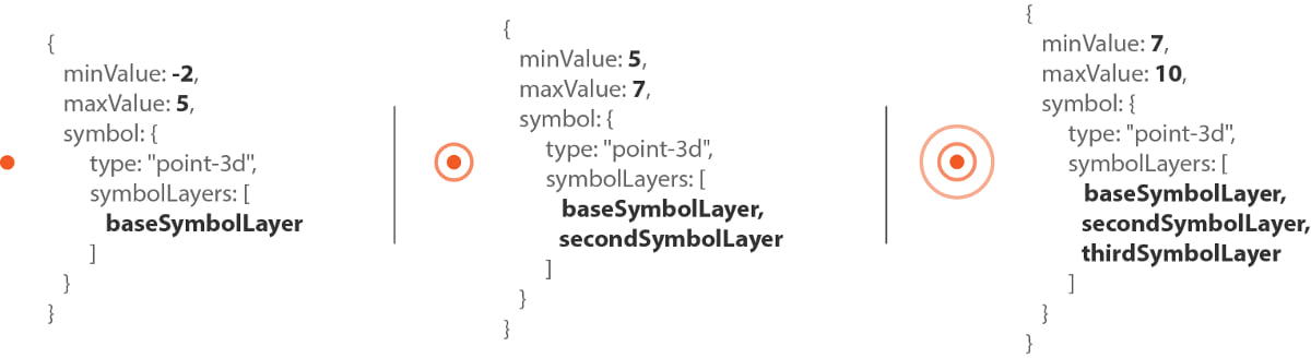
To visualize classified point data we’ll use a ClassBreaksRenderer, where each class has a symbol with concentric circles, depending on the earthquake magnitude:
The data is dynamic, every time a user opens or refreshes the application the data changes. Generally, the last class with earthquakes with magnitudes higher than 7 is likely to stay empty (we sure hope that’s the case!). Having empty classes is not a best practice when classifying data because it confuses the user. We could reclassify the data, but these classes are based on the effects that earthquakes have, rather than clusters within the data. So we’d like to keep the classes as they are and to give the user information about how many earthquakes are in each class, we use outStatistics with the queryFeatures method to obtain the number of earthquakes in each class. We set these numbers in the labels of each class, so that they are displayed nicely in the legend:
Step 3. Earthquake data
As mentioned in the beginning, the data comes from USGS earthquake live feed. It comes in different formats, but for our app, we’re going to get the GeoJSON live feed for the last 30 days and set it in the url of the GeoJSONLayer. And that’s all there is to it, no server or data processing needed in this case.
Step 4. User interaction
A SceneView comes with default 3D navigation like pan, zoom and tilt. The user can freely navigate in the scene, but zooming in to city level doesn’t really make sense for this app, so we’re going to set a constraint to limit the min altitude to 400,000m. When the camera reaches that height, the user can’t zoom in anymore.
The user can interact with the earthquakes by clicking on a symbol to get more information about the earthquake. For that we’ve set a popupTemplate on the layer.
When the user needs to focus on a certain data range, a useful technique is to only display those features in the data range. So if the user is interested in earthquakes between a certain magnitude range, then we filter out all the earthquakes with magnitude values outside of that range. With ArcGIS API for JavaScript we can use a HistogramRangeSlider as a filtering tool and use the filter property on the GeoJSONLayerView to hide features that don’t satisfy the filter criteria.
Summary — putting things together in JavaScript
So the final app has the following sections:
- Create the map: contains the vintage basemap from John Nelson loaded as a TileLayer. See the code for this on Github (lines 18–28).
- Create the SceneView that the map will be rendered to. On the SceneView there are several properties related to the user interaction, like the navigation constraints, the color of the highlight when the user clicks on an earthquake, the environment settings for the lighting in the scene and removing the stars and the sky and making it transparent. See the code for this on Github (lines 30–60).
- Create the GeoJSONLayer with the earthquakes. The popupTemplate sets the information that should be displayed when the user clicks on the earthquake. In this case, we want to show the magnitude of the earthquake, where it happened and what time it happened. We want the size to represent the magnitude of the earthquakes and no be influenced by perspective, so we’re going to set
screenSizePerspectiveEnabledtofalse. See the code for this on Github (lines 68–89). - The next part of the code is about setting the renderer on the layer. The data is split into 3 classes based on magnitude as discussed in Step 1, so we’re going to use a ClassBreaksRenderer. For each of the classes we want to count how many earthquakes are in each class, so we define outStatistics definitions that we later on pass to the layer query. Once we get the results from the statistics, we define the renderer. See the code for this on Github (lines 142–176).
- Finally, the HistogramRangeSlider needs to know how many features are in each histogram bin. We can get that information using the smart mapping histogram method. Once the histogram slider is created, we define an event listener that will filter the data on the layer view when the user drags the thumbs of the slider. See the code for this on Github (lines 193 — 233).
You can have a look at the full code on Github or play around with the live version.

Commenting is not enabled for this article.