The ArcGIS API for JavaScript was updated today with some enhancements that we are really excited about! Overlay both images and videos on the map, style your layers with pie charts, play around with faster heatmaps, use client-side binning for your dense datasets, and lots more. Read on for an overview of some of the highlights of today’s release.
Overlay images and videos
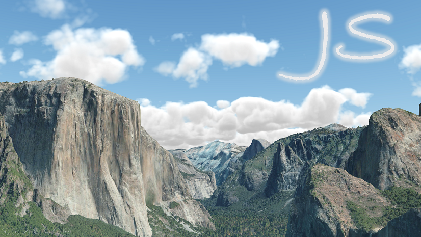
The new MediaLayer (released in beta) is used to overlay static images and videos on the map. For example, you can use it to display scanned historic maps, weather data, aerial imagery, and drone images or video. This capability not only matches the 3.x MapImageLayer’s ability to overlay images, but exceeds the scope of what 3.x offered by including support for:
- Both 2D map views and 3D scene views
- Images and videos
- Ability to easily add and remove images/videos on the fly
- Layer blending & other bells and whistles that are unique to 4.x
- Like in 3.x, an image can be geolocated using an extent, but with the new layer, the media corners can also be placed individually

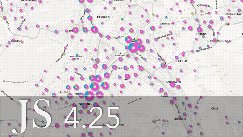
Pie chart style
The PieChartRenderer allows you to create a pie chart comparing multiple attribute values for each feature in a point or polygon layer. Pie charts are very useful to present proportions of more than one category within a region; a good example is age or ethnic demographics or highest school level attainment shown below.
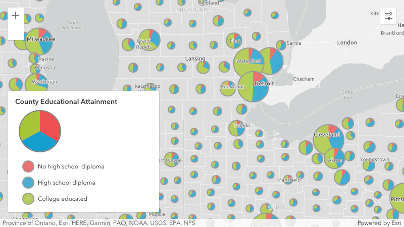
On the topic of pie charts, if you have pie charts configured in your popups, the colors will now match your layers when using predominance, dot density, or the new pie chart renderer.
Client-side binning
Binning (released in beta) is a method for visualizing densities of points, similar to clustering and heatmaps. While clustering aggregates points into varying boundaries depending on the density and dispersion of the data, binning aggregates the data into an equally divided grid of cells. You can define how you want to aggregate the numerical fields within each bin and use them in the configuration of the bin’s labels, popups, and rendering.
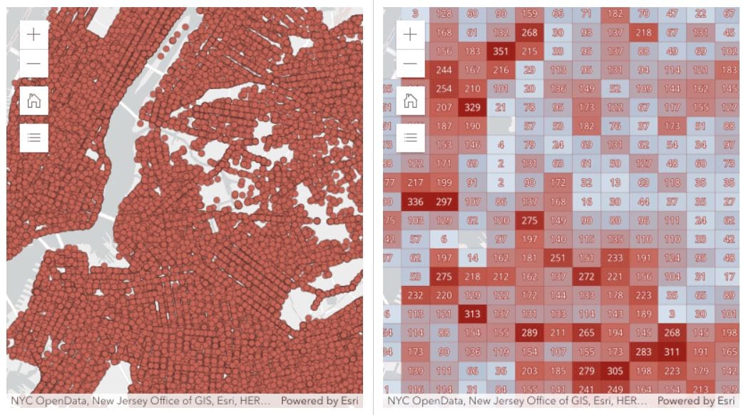
Server-side binning, which will allow you to display aggregates of very large datasets, will be added at a future release.
Want to understand binning vs clustering better? Check out this sample description.
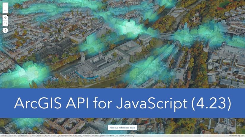
Better, faster heatmaps
Last release we introduced heatmaps in 3D scenes. With this release, we’ve enhanced the HeatmapRenderer capabilities for both 2D and 3D visualizations.
Popups (2D and 3D). Underlying points in a heatmap display popups and can be returned in a hitTest operation.
Faster and smoother experience in 2D. Heatmaps now render with WebGL, enabling it to render a lot faster, handle very large datasets, and provide a smoother experience when interacting with the map.
New bells & whistles in 2D. You can include labels in 2D map views, and filter and apply effects to features with dynamic updates to the heatmap.
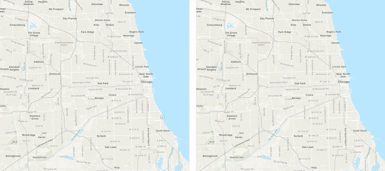
Static heatmaps. Until now, heatmaps in 2D always recalculated as the user zooms in and out, resulting in different heatmap visualizations based on the scale. With today’s update, you can choose to keep this default behavior, or preserve a heatmap across various scales. By setting the referenceScale property (originally introduced last release for 3D), the heatmap visualization is locked at a specific scale so it will appear consistent when zooming in and out.
 heatmaps at various scales above and below the reference scale.")
To learn more about these next-generation heatmaps, see the release notes and this blog.
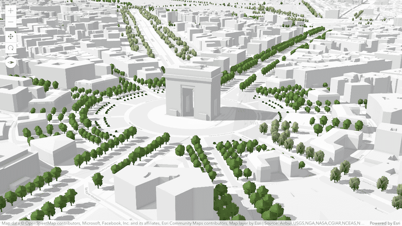
Worldwide buildings and trees!
Did you know that ArcGIS Living Atlas was just updated with a new global expanse of 3D buildings and trees based on OpenStreetMap (OSM) data? That means you can build your apps using this new layer, add context in your scenes and apply spatial filters for areas where you want to place your own data. This presents an exciting opportunity for many developers, including those that would like to visualize their 2D data in a 3D context.
Visit your favorite places in the new OSM Buildings scene:
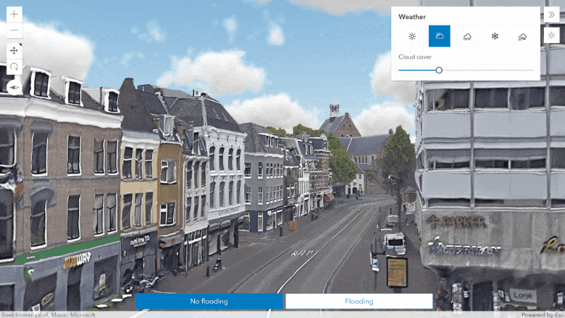
Rain and snow effects
Make your scenes more immersive by adding weather effects for rain and snowfall. You can adjust the amount of precipitation or have your 3D content covered in snow. Weather settings are now persisted in web scenes and slides, making it easier to author and share different scenarios.
A new sample uses the weather effects to visualize extreme weather scenarios in Utrecht:
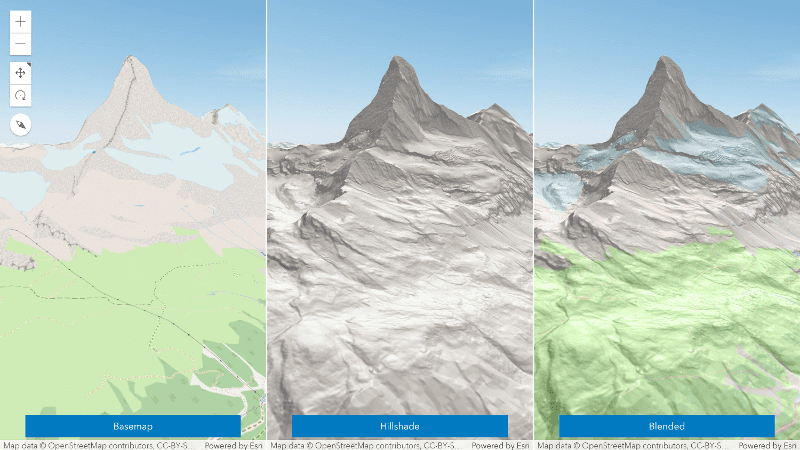
Layer blending in 3D scenes
Create new terrain visualizations using blend modes in 3D. You can use the same blend modes already available in 2D to combine multiple tiled layers in your scene.
Check out a new sample that blends a hillshade layer over an OSM basemap to provide more contrast and spatial awareness.
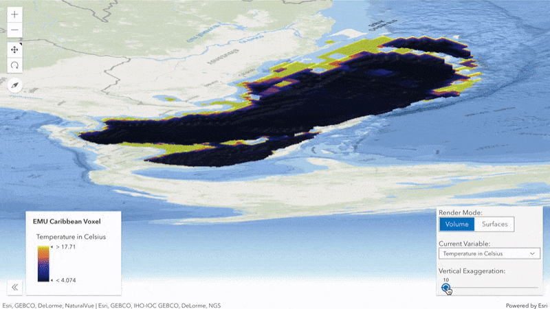
Voxel layer variables
Change the appearance of your voxel data using previously published variables. Toggle between visualizing the variables as surfaces or using the full volume of the layer. In addition, you can configure the voxel to exaggerate and offset the rendered voxels to better understand its spatial characteristics.
Try out these new rendering capabilities in a new voxel layer sample:
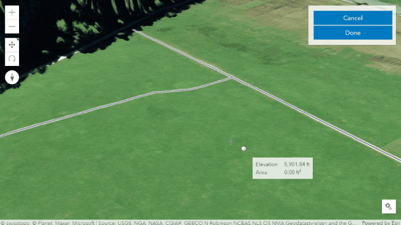
Improved drawing in 3D scenes
New tooltips and labels display measurements when creating or updating existing features with the Sketch or Editor widgets. Labels indicate the length of Polygon and Polyline segments while tooltips show the total length for lines or area for polygons, as well as rotation, scale, and distance. Additionally, elevation is shown when editing absolute heights.
These tooltips and labels will be added to the drawing experience in 2D map views in a future release.
Directions widget saves routes and lots more
Last release, we introduced the Route Layer which offers an easy and powerful way for visualizing, solving, and even saving routes.
The power of the route layer comes into focus by enabling some important enhancements in the Directions widget with this release. Now powered by the route layer, the Directions widget includes the following advancements:
Save routes. Your users can get directions, and then save the route to their ArcGIS Online or Enterprise organization.
Open routes. Open, view, and modify existing routes from the end user’s ArcGIS Online or Enterprise organization.
New workflows. You can easily build new workflows for your users by taking advantage of the ability to pre-load the widget with a route or dynamically add or remove stops programmatically. For example, you could add a custom action to your popup that allows the user to add another stop to the clicked on location and recalculate the route.
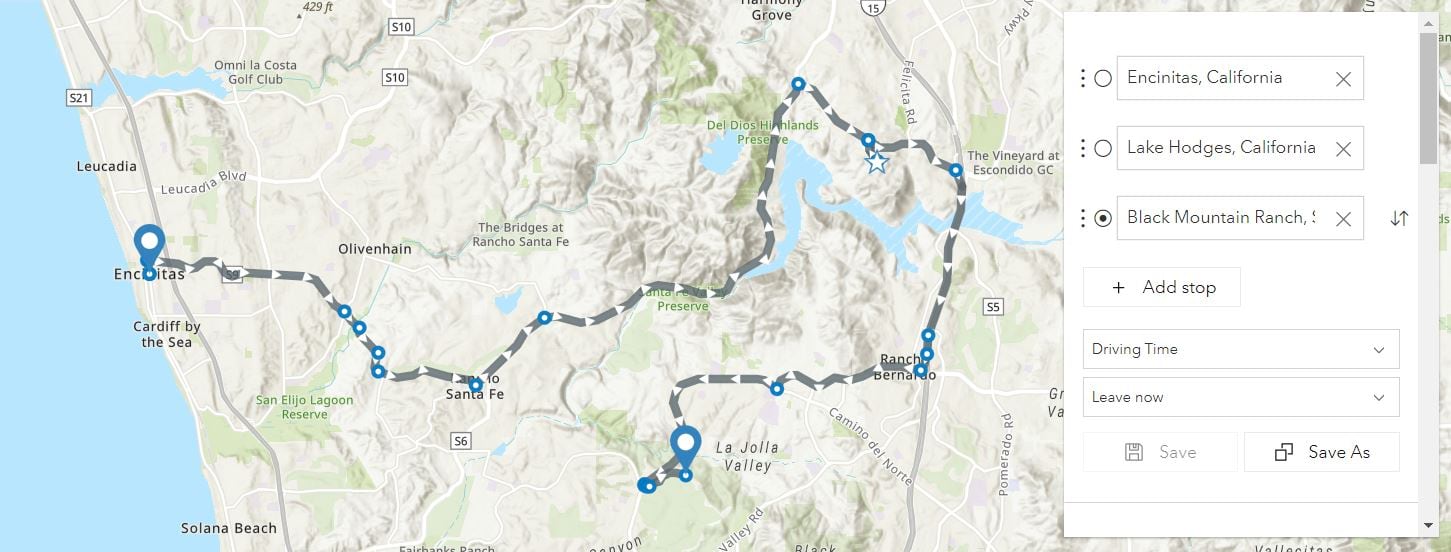
To take advantage of these new capabilities in the Directions widget, it must be instantiated with a new or existing RouteLayer. The old workflow of creating a Directions widget without a RouteLayer is deprecated and will not be supported in a future release.
There’s more in store for the Directions widget, including the ability to print directions and place barriers coming in a future release.
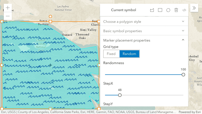
Improved vector symbology and a new experience
Have you tried out the new vector symbol styling capabilities in the Map Viewer? It allows you to design vector symbols for layers and for sketched graphics, with fine grained control over symbol layer characteristics like color and line thickness. Under the hood, it is creating CIMSymbols which have been available in the API for three years. However, this tool makes it easy for you to design vector symbols just the way you like them, load them in your web maps or layer items, and enjoy their crisp display at any scale.
New in this API release is the ability to choose between random and fixed patterns for polygon fills, which is also accessible in the Map Viewer symbol styler.
For Arcade fans…
Arcade is an expression language that allows you to calculate values and create custom content in various profiles, such as popups, renderers, labels, and forms. Most of the time, the Arcade profiles that are part of the API are adequate for application requirements. However, sometimes developers want the ability to execute Arcade expressions in their own custom profiles. Starting at version 4.24, this is possible. That means you can use Arcade where you want, how you want. In your custom profile, you get to define the valid data inputs, functions, and return types in addition to the context where they can execute. For example, a web map might contain a popup that uses an expression to generate content. In your app, you could take the expression result and display it outside the Web Map, summarized in a chart. See it in action in this new sample.
Saving feature layers
The June release of ArcGIS Online added the ability to save feature layers in the Map Viewer. That means that you can work with it just like a webmap – define the layer style, popup, filtering, clustering, etc, then save it as a new layer item (or replace an existing item) in Online, and load it in your apps by referencing the item ID. Everything the user configured comes alive when the layer item is loaded. The key difference with layer items is that they are individual layers rather than a sandwich of layers like web maps. So you can build apps that contain distinct mashups of layers, and still have many of the benefits of webmaps.
This is all possible because feature layer saving was added to the API. So in addition to being able to save feature layers in the Map Viewer experience, you can allow your end users to make modifications to layers or create new layers and save them in ArcGIS Online and ArcGIS Enterprise.
Learn more
This is only a portion of the updates included in 4.24. There is so much more, like:
- We’ve moved to WebGL2 which provides improved support for the capabilities of modern GPUs. The API will use WebGL2 if your browser supports it, otherwise falls back to WebGL1.
- When hovering over a list of features within the popup, the corresponding feature will automatically be highlighted in the map.
-
The new LineOfSightLayer allows to store line of sight analyses in web scenes and use them in slides for presentations.
Read the release notes to get the full scoop, and play around with the new samples!

Article Discussion: