If you’ve ever thought “I have too many points on this map, I can’t see the forest from the trees” a heat map is there for you. This post covers the next generation of Heat Mapping in the June 2022 update of Map Viewer. It also covers some of the things I’ve learned making heat maps that should help you get the most from them.
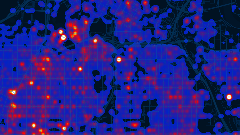
One of the most common maps in ArcGIS Online is also one of the simplest: Pushpin maps. They recall the age of physical pins pushed into wall maps, and they are popular because often we just need to show where things are. What’s great about digital cartography is we can add a lot of pins to our maps. Lots and lots. But this creates a problem: Those pins become illegible pretty quickly as they stack on top of each other. That means it’s hard to tell if there are 3 pins or 300 pins tightly grouped without zooming really far into the map (and who has time for that?)
Heat Maps are one great solution to this problem. A heat map takes all of those pins and calculates a density surface. It can reduce overwhelming complexity into something understandable and beautiful.
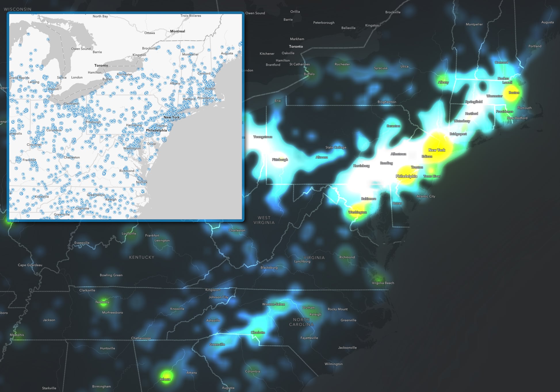
The examples here show all of the colleges and universities in the US (source). However, since the original feature layer contains over 6,500 schools it is hard to gauge density differences once the symbols start to overlap. Turning these point symbols into a heat map reveals far more detail about the relative density of schools. The hotter temperatures show where more schools are clustered together.
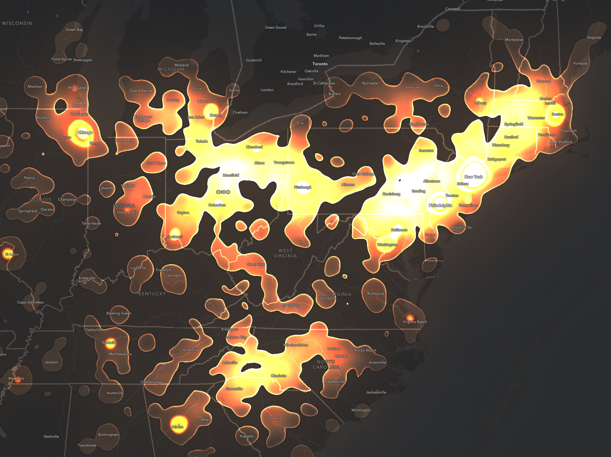
The same data as before but with a different color ramp, different heat map settings and without the Blur effect. I share this to underscore the flexibility of this map style, especially when paired with blend modes (vivid mode is used here) and effects (bloom is used). It really pays to take a minute or two to “play with the dials” and find those awesome unplanned maps (like this one).
The Big Change: Enhanced Performance
First and foremost heat maps have all new wiring under the hood. The API team has switched to using a high performance, live-updating WebGL renderering engine. What that means is your heat maps will look smoother, have fewer interpolation artifacts, and render much faster. We will have in-depth posts on this soon, so check back, but the short version is you’ll notice big speed and quality improvements.
Redraw at every zoom level, or lock it down?
A simple addition to the heat map style turns out to be a big deal. Previously a heat map would “redraw” at every zoom level (aka, regenerate the density surface) which kept the map legible across a wide range of zoom levels. However, it sometimes felt to me like the story was changing at each zoom level since things were being recalculated; what were previously white hot clusters evaporated as I zoomed in to them leading me to wonder “where do it go?”
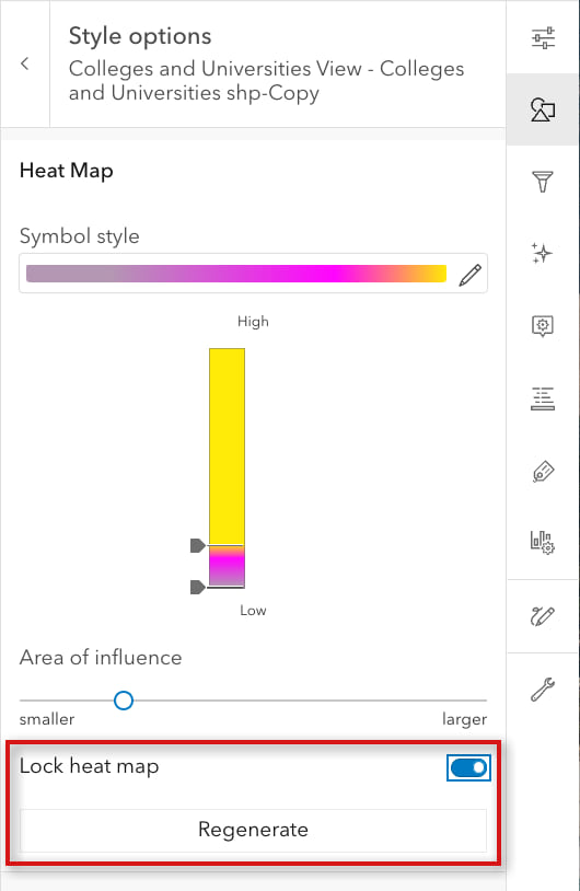
Now you have another choice: You can lock a heat map so that the density surface is generated at one zoom level and only that surface will be used for all the other zoom levels. In other words, the map will visually remain as you zoom in or out. If you don’t like the look of the heat map, go to a different zoom level and use the Regenerate button to re-calculate the surface. That will now become the locked view of the data. Word of warning: A heat map that looks great at one zoom level can be much too strong when you zoom out, so be sure to view your map across many zoom levels to see how it holds up before committing to this option.
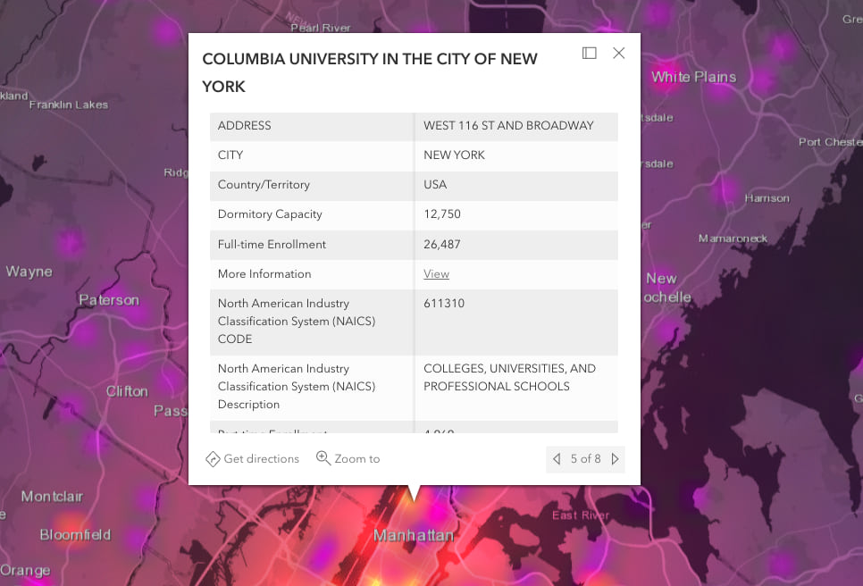
Heat Maps now have pop-ups
Clicking on a heat map can now generate a pop-up. If there is more than one underlying feature the pop-up will show forward and back arrows to tab through all of them. Be sure to configure pop-ups with human-friendly text and prune the list of fields that might not be relevant (or understandable) to your audience.
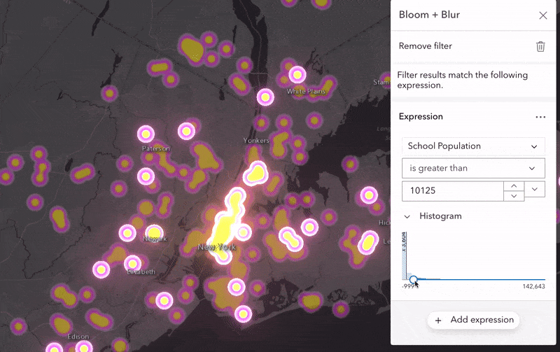
Filtering on Heat Maps
Heat maps can now take advantage of Feature-specific filtering with this update. This kind of filtering lets you selectively emphasize some features on a map while de-emphasizing others. For example, you might want to highlight clusters of schools with more than a 10,000 students. This animation uses a filter expression to allow me to brush through student population values and dynamically highlight clusters of the biggest schools. In other words, while the original map doesn’t show school size directly, this field can be used to “condition” or filter things on to or off of the map.
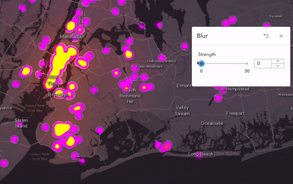
Design Tip 1: Blur is your friend
Blur and heat maps go together beautifully. Counterintuitively, I find adding a healthy amount of blur helps to clarify the map by smoothing out hard color breaks and feathering the edges of the shapes. You don’t have to use it, and sometimes hard boundaries will work better for you, but give it a spin. Fortunately blur is relatively immune to scale changes—unlike the bloom effect—so it’s a reliable choice for maps that will be viewed across a wide range of maps scales.
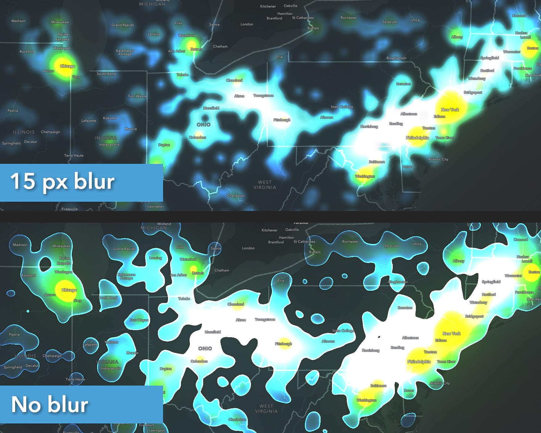
Here, both maps have layer blending (vivid), and a strong bloom effect applied. This helps to smooth out the color gradients and add some visual interest. But by adding a blur as well it really softens the edges and merges things nicely. It also feels more representative of many real world geographic phenomena which vary smoothly across space.
Design Tip 2: The Three Critical Controls
To adjust the look of a heat map, experiment with
- the position of the handles beside the color ramp to compress or expand the data range to which the colors are applied,
- change the Area of influence slider, and
- try different color ramps.
All three controls interact with each other, so be sure to experiment with all of them simultaneously. Don’t just set one and forget about it 🙂 Your heat maps will look really different based on these three controls.
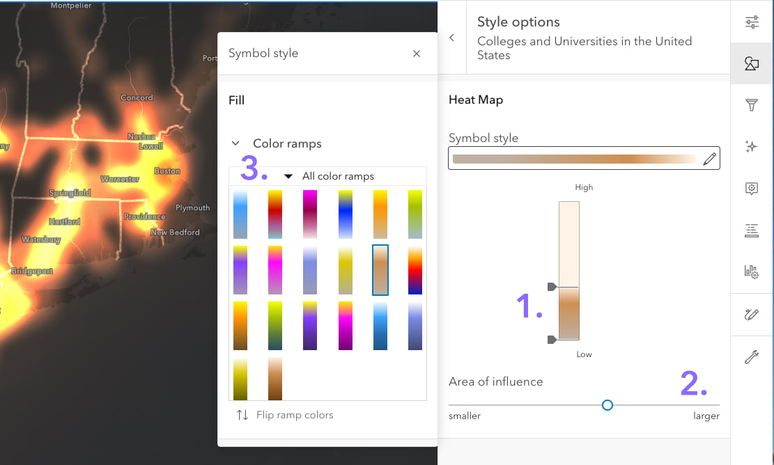
Color ramps are critical? Absolutely. If you’re like me, I mostly pick color ramps subjectively as a simple artistic choice. With Heat maps, however, I’ve noticed the choice is more than that: Ramps that have “inflection points” in them (from one color to another) will translate into noticeable boundaries on the map. Single hue ramps create smooth gradients from low-to-high density, but those multi-hue ramps with distinct color shifts will help to emphasize certain density break points. It all depends on what you want to highlight (or not).
Word to the wise: The color gurus at Esri have designed heat map-specific color ramps for both light and dark basemaps, which are the only choices in the ramp selector. These special ramps have a distinct “hot” and “cold” end of the ramp which is required for this concept to work!
Next Steps
In this post I have deliberately NOT shared links to the sample maps because I want folks to see for themselves how easy it is to make these. Start here with this map showing the locations of the schools (and here is the source feature layer in the Living Atlas which is updated weekly), then use the Styles tab to select heat map to instantly create one. From there, fine tuning the colors, data handles, blending and effects to produce your own work of art. The substantial performance improvements to the ArcGIS API which powers these maps means you can throw a lot of data at this renderer and instantly try a bunch of styling options without waiting to see the results.
Along with clustering, heat maps are a great way to convert maps with far too many points into something wonderful. Happy mapping!

Looks great! How can I create a heat map for elevation? (I’m focused on the San Francisco Bay Area.) I would like to see elevation using a change in color instead of relying on the flattened version of the same information using a terrain/hiking map. Thank you!
Hi Jen – Heat maps won’t help you depict elevation using color (they’re just for showing clusters of points) BUT the great news is there are lots of ready-to-go maps and layers from the Living Atlas that show exactly what you’re after. Go to the Living Atlas search page here and search of “elevation tints” or “tinted hillshade”. If you want to learn how to make these kinds of maps in either ArcGIS Online or Pro my first stop would be John Nelson’s awesome videos