
Here’s a tip to help you make better maps with ArcGIS for Power BI. Geocode your location data and start seeing patterns and trends for better decision-making!
Your Power BI data may already have fields that contain location information—fields such as address, city, state or province, country, ZIP or Postal Code, or latitude and longitude coordinates. You can use any of these fields to quickly see locations on a map.
If you plan to use addresses to create a map, you’ll need to geocode those addresses, meaning you’ll transform them into coordinates that can be rendered on the map. Depending on the geographic region of your organization, address data can be composed of several elements, including street address, neighborhood, city, subregion, region, state, province, postal code, United States ZIP Code, country, and so on. The more address elements your data contains, the more accurate your results will be. In many cases, these location elements are stored in separate columns in your Power BI data.
Because the Location field well in Power BI can only contain a single value, it’s recommended that you create a new column in your dataset that combines all the address information into a single, comma-separated values column that you can then use to add location-based information to your map.
1. Add a new column to your Power BI dataset
In Power BI Desktop Report Editor, open the dataset you want to edit. Do one of the following:
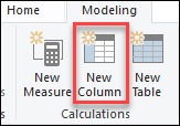
• On the Modeling tab in the Calculations section, click New Column.
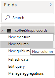
• In the Fields pane, click More options next to the dataset you want to edit and choose New Column.
A new column appears in your dataset.
2. Convert addresses to text format
Convert address and Postal Code values to text format (Format:Text) before combining the values. This avoids any potential problems with preformatted data.
3. Combine address fields into a single column
In the new column, create a custom DAX formula that combines fields from multiple address columns into a single column. For example, the following formula will combine entries from the Address, City, Province, and Postal Code columns.
Column = [Address] & ", " & [City] & ", " & [Province] & ", " & [Postal Code]
You can omit the commas by using only spaces between the field value. For example:
Column = [Address] & " " & [City] & " " & [Province] & " " & [Postal Code]
Give your new column a name that lets you easily identify it as your combined location data.
Save the dataset. You can now use the new location column to map your data.
4. Map your data
In your Power BI report, click the ArcGIS for Power BI visualization to add a map to the report.
Sign in to access your ArcGIS account, or use the Standard account included with Power BI.
As a Standard user, you can geocode up to 3,500 points per map. If you’re signed in to your ArcGIS account, you can geocode up to 10,000 points per map.
From the Fields pane, drag the new location field into the ArcGIS for Power BI Location field well. You can also drag the location field directly onto the ArcGIS Maps for Power BI visual.

The locations appear on the map.

By default, ArcGIS for Power BI uses the World location type when drawing locations on the map. To further refine your locations, choose a specific country from the Location Type pane. For example, if your locations are all within a single country, click the Locations area in the drop-down menu and choose One country, then specify the appropriate country.
Now that your business data is drawn on a map, there’s a lot more you can do to start noticing patterns or trends in your data, and enhance the story you want to tell: change the basemap to provide more contrast, style the data layer using other attributes such as size or color, and add reference layers and infographics to provide context for your data, among other features. Explore the features of ArcGIS for Power BI and start making amazing maps!


Article Discussion: